Am I The Only One That Hates The New HUD?

Try as I might, I just can't get used to the newer HUD in Beyond. I'm assuming it was made to cater to the console players, but nothing seems to be where it ought to be anymore. I have to tab through so many things to get to a stat or setting that used to be on the main status window.

Am I the only one that hates it? Can we PLEASE get the old HUD back?

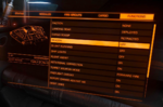
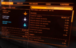
Edit: Adding the original HUD screenshots from my post further down the thread for people reading the thread at a glance.
 

Attachments

  • Capture 2.PNG
    Capture 2.PNG
    1,011.8 KB · Views: 254
  • Capture 3.PNG
    Capture 3.PNG
    956.3 KB · Views: 266
  • Capture.PNG
    Capture.PNG
    921.1 KB · Views: 244
Last edited:
I actually like it very much to be honest, although I do understand the point about consoles.

My only gripe is that you can not simply click once to change certain settings anymore. Instead you have to select the other option from a very small dropdown menu now (especially notable in the music options)
Makes it a bit more tedious.
Aside that everything feels much more streamlined.
 
Dislike the current UI and never got used to the one before it.

If UI designers got stuff right the first time around, then they wouldn't be needed anymore. And that's all I'm going to say about that.
 
So no its got nothing to do with consoles, its just typical Frontier wanting to add more tedium into the game.

Although a great deal of the panel info isn't much to do with flying the ship, the menus kind of remind me of what it would be like to have a super complicated flight computer. For that reason I actually like the drop downs, though I do use a numpad to navigate, which might give it a more intuitive real cockpit feel. I would say I'm still getting used to the moving of BGS info but I don't have any problem finding it and I think it's probably better where it is now.
 
I’m trying to give it a chance. I’ll adapt but one thing that bugs me is having training on the systems panel. I think its a waste of screen real estate and quite frankly do any of the seasoned players use this now? I can understand when starting out but it should be outside of the main panels IMHO. Anyway, just my two cents but otherwise more positive than negative view of the changes. I just noticed CQC is still there - grrrr - 😆
 
I'm fine with the updated UI. I can't remember what it used to be like to make a proper comparison or what I had for breakfast. I'm flying and fighting as badly as ever. Maybe you have some specific problems which could be addressed?.
 
Please take me out back & Shoot me!! Is my first thought
WTH happened to the main menu & the unnecessary modifications to the in ship UI ?

Sorry Devs but i really don't like them & my muscle memory now needs reprogrammed
 
Here's the old one for comparison. It was a lot more functional than the new one, and you got more immediate information at a glance on the first panel. Now I have to go into the Codex panel to see most of the stats, and even on that, a few of the stats that I liked to watch are just outright missing. The old UI just flat out looks so much better from a functionality and usability perspective.
 

Attachments

  • Capture 2.PNG
    Capture 2.PNG
    1,011.8 KB · Views: 145
  • Capture 3.PNG
    Capture 3.PNG
    956.3 KB · Views: 120
  • Capture.PNG
    Capture.PNG
    921.1 KB · Views: 145
Last edited:
Try as I might, I just can't get used to the newer HUD in Beyond. I'm assuming it was made to cater to the console players, but nothing seems to be where it ought to be anymore. I have to tab through so many things to get to a stat or setting that used to be on the main status window.

Am I the only one that hates it? Can we PLEASE get the old HUD back?
You are not. I don't like it as well... Tiles everywhere. On PC Elite feels more and more like a console port.
Thing is, that in this case it's not that nobody bothered to change it for PC players, but that the look is constantly changing into a console interface direction, which for me just looks gamey and unfitting. The new main menu is the absolutely worst in my opinion. I mean, it's just the main menu, but if this is visually the new direction the game is going, the devs have a completely different idea what Elite is about than I do.
 
Which stats are missing?
All three of those are old HUDs, the new right panel has tiles for things like the Codex, Powerplay, Squadron, etc. unless the update changed it.

I play on PC with an XBox 360 controller, and I love the interface, BTW. Or I did, haven't played since the update.

Changing the color from the hideous orange is a must though.
 
I play on PC with an XBox 360 controller, and I love the interface, BTW.
But does it feel like you're on a gaming console playing a game or like you're sitting in an actual space ships when you look at the controls?
For me that's the critical point. The illusion and simulation. For me the tiles and overall interface changes take that away bit by bit.
 
Here's the old one for comparison. It was a lot more functional than the new one, and you got more immediate information at a glance on the first panel. Now I have to go into the Codex panel to see most of the stats, and even on that, a few of the stats that I liked to watch are just outright missing. The old UI just flat out looks so much better from a functionality and usability perspective.

I can't remember HUD changing in Beyond updates until you showed the right panel :sneaky: 
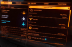
I reckon the left, comms and right panels are more functional now except:
  • dislike scrolling down Faction page to exit; and
  • colour stacked bars for factions are confusing.
 
What annoys me is we have an additional click to select a target in supercruise.

My research on that matter is unconclusive though, as I got kicked from the game due to server shenanigans yesterday.
Can someone test if it's standard that you always have to move the cursor "one up" to select the target when using the left hand menu?
 
Back
Top Bottom