Does Frontier think Horizons' UI is bad?

I picked up on the lead community manager saying that the UI changes were made with new players in mind, and that they need something that will service both veterans and those new players. This to me implies that Frontier thinks the Horizons UI is bad for new players. I find this kinda baffling, because all-in-all I think the Horizons UI is one of the best game UIs I've encountered. If you go back to my early days of playing on PS4, you'll see even then as a new player I had great praise for the UI. Of course my opinion may be influenced being a console / game controller player (even on PC I use a controller), but I've also used the UI with K&M and found it pretty good.

That's not to say there aren't some bugs with the UI, along with some silly decisions (like burying the frequently used docking request feature), and the way fleet carriers are represented in the system map is an abomination, but the ship and station menus, along with the galaxy and system maps, are great IMO in Horizons. In fact, the reason I was inspired to post this new thread is that I've been playing X4 Foundations exclusively since I decided to pass on Odyssey, and holy cow is that an obtuse UI! I feel like it's always fighting me, like a bad dog always pulling against the leash in the wrong direction instead of walking beside me. I personally think X4 does a lot of things better than ED, but ED Horizons blows X4 out of the water when it comes to the user interface (pre-Fleet Carriers).
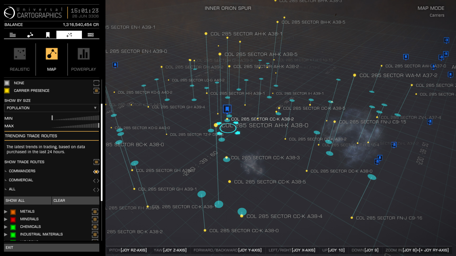
Carrier Bubble.jpg


So why change the user interface so radically in Odyssey? Is this change for change sake, or does Frontier really believe that kids won't be able to play Elite unless they incorporate a cellphone UI in the game? Do they really look at Horizons UI and think, "New players will never figure this out this old UI - we need to completely change it!" Is this some sort of "Okay Boomer" moment inside Frontier where the new young designers look at the old, established work and feel the need to replace it because a stereotypical "Old is bad!" mentality? I'm just baffled that Frontier felt the need to change what was one of the best game UIs I've personally experienced (bugs and a couple QoL issues notwithstanding) and so dramatically rewrite it so that new players would find Odyssey engaging... Kinda reminds me of this old but apt meme (except that the new UI is nowhere near as pretty as the girl in red):

iu


ps - Frontier, if you don't like the Horizons UI anymore, please consider donating it to X4 Foundations, because that game desperately needs a UI as good as Horizons!
 
I like the new UI, overall. There's just a few things that need tweaking.

Horizons had plenty of things that needed tweaking. Honestly, I don't understand all the furor. People just don't like change.

As for you, Sir Duck, you should probably actually try it before getting too bent out of shape about it. Maybe. ;)
 
My guess would be an almost complete change of crew and wanting a 'new era' meant a dumb decision for "clean slate". Jacques isn't bartending at Jacques station.

It is one of the more weird decisions I've seen from FD, which to me seem to make a lot of weird decisions (like Power Play not being baked into the BGS and integral to the game but instead injected as a meta game for 'reasons'.)

This release is why I thought they would leave feet for last and do gas giants next. I guess the FPS craze and some other games made them want to show FD could do it in a couple of years without T-poses and dropping through geometry and such constantly. And that they did. While it has promise, like every Elite release to-date, it also suffers the same fate of needing another year or two of development to really get it to a great place versus just ok and just 'promising'.

The on-foot UI is similarly disconnected from the excellent in-ship UI that had been updated over the years but not tossed out. Imagine being on foot with a tweaked UI but basically the same functions and panels as in the ship. All the needed functions were already there, the interface was familiar, and it would ease transition between foot and ship with lower learning curve. PIP management in suits? Implemented as Holo panels on watches or in a helmet or even contact lenses- that's for sure where I would have started.
 
When i first started Elite almost 5 years ago, there was so much to learn almost overwhelming. Then i found help on the internet with great videos from many Youtubers.
one of the strongest points for the newbee was all to UI's were easy to understand and use, they are straightforward to use and understand.

Now with 3500 hours in Elite and having a good understanding of the game I find the new UI's confusing and difficult to use. it funny to think that the new UI's were made to make it easier for the beginner, That though is just Hilarious.

The Galaxy map, I see that it could be streamlined to be a improvement with more storage and our own made folders.
Outfiting, This new UI is total garbage just replace with old UI with more Module storage and sorting
Shipyard, Just go back to old UI it was fine.
Mission board, go back to the old UI where each faction had their own list of mission worked great and less confusion.
System map, streamline ,make it so as we highlight each body we get body info with landing possible with geo/bio features.

Thank goodness you didn't mess with the cockpit UI's they are one of the best though out UI's in gammining.

Why you though it was necessary to mess with the UI's and take that time away from game deployment is beyond me.
 
I agree, the old UI was excellent, especially when controlled entirely by keyboard, which new players probably won't prefer. But it takes time to get used to, and that's where it's not really newcomer friendly. The new UI breaks a lot of habits, so it hurts veterans the most, I think. It really starts to hurt when you have to manage a lot of ships with a lot of module swaps. So I would say that it has no future in its current form. Sooner or later everyone stops being a newcomer...
And the old UI's worked great with HOTAS
 
In autumn, if things go according to Frontier's plans, Horizons players will get the new UI and the new renderer for free. Space legs will remain paywalled.

Now imagine they'd do the opposite: give away space legs and keep the UI and the renderer paywalled instead. Do you think anyone would buy Odyssey?
 
Something different is something to sell, I guess. 🤷‍♂️
You know, the newer is better "people are afraid of change" crowd.
Just speculation on my part. Six of one, a half dozen of the other.
 
... Implemented as Holo panels on watches or in a helmet or even contact lenses- that's for sure where I would have started.
This was proposed by Frontier themselves some years back with art mockups.
 
Last edited:
I don't use VR (hence my Avatar tag), but I think every controller should be available in VR. This would be just one more nail in the coffin for me to give VR a wide berth in the near future.
You no Idea what you are missing, Elite in VR is outstanding best VR experience out there.
When I climb into VR my computer room, desk, computer, ugly wires disappear and I am inside of the Elite Dangerous Universe.
No matter where you look up,down, left, right all you see is Elite in 3D, no flat screen even comes close.

I have not played any flat screen games in almost 5 years.
 
[pre post edit: Sorry for the wall of text, I kinda got carried away there 😅]

I would love to see a Discovery Scanner with the UI designer(s) one of these days to walk us through the development process of those changes. Lots of people around here claim that "whoever wrote the new UI never played the game" or that "the Horizons UI was perfect, why change it?", neither of which match reality from what I've seen during alpha and post launch so far. But without the ability to tap the brains responsible any reasoning about the UI changes practically boils down to mind reading - in other words I could be horribly wrong about everything and maybe FDev did in fact hire a web designer straight out of college and let them loose with their radical ideas about turning ED into a smartphone game. 🤷‍♀️

I find it more likely though that they had a good look at the various UI parts, came up with a bunch of improvements, and then totally underestimated the workload and had to release something half finished again (as is tradition). As a result it is currently next to impossible to tell bugs and (missing) features apart - a prime example of that is the new "favorite" feature for bookmarks, which does precisely nothing right now. Obviously this isn't working as intended but in the current UI layout it is not even clear what the intention even is - is a favorite bookmark supposed to appear in a category of its own? Or is it supposed to affect the sort order so the bookmark appears at the top of the list (similar to what some of us do by prepending certain characters like a '!' to the name)? Maybe it is something else entirely, or maybe work on this feature got cut short when they had to scramble to meet the deadline.

Anyhoo, while I do agree that the old UI is extremely well made it nevertheless has a bunch of issues that would be extremely hard to solve w/out a redesign. One of them pops right out of your screenshot (to me at least): scrollbars. Practically every tab on the left hand panel has been overloaded with information over the years to the point where it is not just overwhelming from a new players perspective but also getting more and more impractical to use for veterans alike. Try searching for a planet with a favorable material composition for example: Selecting or hovering a planet auto refreshes the info tab but because the composition table is located at the very bottom of a long list of other stuff you then have to manually scroll down every single time. Once or twice would be tolerable but when looking for e.g. Jumponium out in the black I've had at times a few dozen planets to check in a row, and it is at those times where this gets super annoying.

The core problem of this is a very common one that appears throughout the game: too much information for not enough screen space. Solving this has basically three options:
a) Remove information entirely. Seldom a good choice if possible at all​
b) Increase the presentation area. For Horizons Map UI this is only possible in one direction, towards the middle. Not the best choice either in this case because the left hand panels fixed width would permanently obscure an even larger part of the screen, though EDO does this in some places like switching from a list to a tiling layout for the bookmarks (which in turn is only possible because of the new UI having variable width)​
c) Rearrange and split up, which is the most common solution and the one used for EDO. It removes the fixed width panel and distributes its five tabs vertically along the screen border instead of horizontally. This frees up a ton of space and allows to add more tabs to distribute existing information as well as adding new elements. At this point they went a bit overboard though, because seeing two dozen icons without text labels feels a bit like playing Memory on expert level to me. Again assuming that the UI redesign (the big picture, not just bugs) isn't fully finished it is a bit of a mixed bag right now, but overall I can see why they did it and, more importantly, would prefer it over the old UI if it actually gets finished. Splitting up planetary info into two tabs for example, at least in theory this eliminates the need for scrolling I mentioned earlier. At the moment those tabs auto close when selecting a different planet, so not much has been won, but if this gets rectified it would be a very welcome improvement.​
Another example is plotting a route to a mission target, probably one of the most frequent use cases for the Map UI. Clunky at best in Horizons but super easy now that the new UI has gained a mission list. While not impossible it would be quite difficult to accommodate that list in the old UI.​
 
Not this again. I've seen it, my son is developing VR applications among others (and thus I have access to VR devices whenever I want to). Don't even try to proselytise me, ok? Sometimes I feel like I took heroin once and now I'm going to publicly announce how much I think it sucks. No junkie can believe that, of course. I even understand that, the other way around seems to be infinitely more difficult. But it's getting annoying.
Each to his own, No problem.
Let me get this straight your son is developing VR applications and in you avatar tag is ’ NO VR ‘ ……Ouch
 
You could say I'm an old dog, haven't played any video games since the Atari/Commodore64 era, yep skipped it all until ED. Never played nintendo, sony play station, pc's, none of it, but just recently got myself an Xbox and I'm loving Horizons. Well, except for the combat part, I'm not into the game to shoot at or be shot at, but love the trading, mining, exploring, and passenger missions.

I've only been playing ED for about a month now, and as ALL DEVELOPERS DO just when I'm getting the menus figured out they want to change it all! I hate my cell phone, my email, my computers, all of them for this very reason! I don't mind if you add some functions to a given menu, or move ONE THING to a more convenient place, or improve say the search function in the Galaxy Map (what Frontier?) or maybe add a docking request button on one of the main screens instead of it being buried in the panel.

PLEASE DO NOT CHANGE THE MENUS IN HORIZONS! I can guarantee you I will lose all interest in the game if I have re-learn how to do basic things.

Feel free to change it up all you want in Odyssey, but please just leave Horizons alone.
 
The big underlying question is "What are their objectives for the UI" that led them to change the existing UI and deliver what we have in Odyssey? I mean, the outcome of what they have delivered should align with their objectives for the UI and therefore either of two things have happened: [1] What they have developed in Odyssey UI does not deliver on their objectives; or [2] Our objectives don't align with theirs. The other alternative that they just made changes for the sake of it is unthinkable for a company of this size.

Communicating their objectives should be part of their new communication strategy, so we can at least hold what they deliver accountable to these, regardless of whether their objectives align to ours or not.
 
Top Bottom