You are using an out of date browser. It may not display this or other websites correctly.
You should upgrade or use an alternative browser.
You should upgrade or use an alternative browser.
ED Astrometrics: Maps and Visualizations
- Thread starter Orvidius
- Start date
That could be non stellar hot object ... who knows. Point is ....remember it was in galaxy news almost year ago - guy stole ship and had visions of light etc. Well, if you go to one of such NS in list you will see his vision on your screen. So next logical step is to check if there is any other object such hot.Not sure what you're looking for. Neutron Stars and White Dwarfs have distinctive graphical effects, because of what they are. Any other hot star will just look like regular stars, but with a color matching their temperature. So you'd just be looking at O-class blue stars, mostly.
I just visited 3 stars from list total. All 3 are bright shine in the center when you hyper jump to them - differs from anything else.
Or look easier to check ...among all that 1800 list is any which is colder then 100 millions ? Could be anomaly as well.
So basically I search for anomalies which could fit mysterious things from codex and beacons descriptions.
Here how that looks:
Last edited:
If my memory serves me right, that looks like a White Dwarf in Witchspace.
But that is massive NS in witchspace. Other objects aren't so bright ...or get close to picture last moment. But this one is such since 1st moment till last.If my memory serves me right, that looks like a White Dwarf in Witchspace.
Added a couple of graphs.
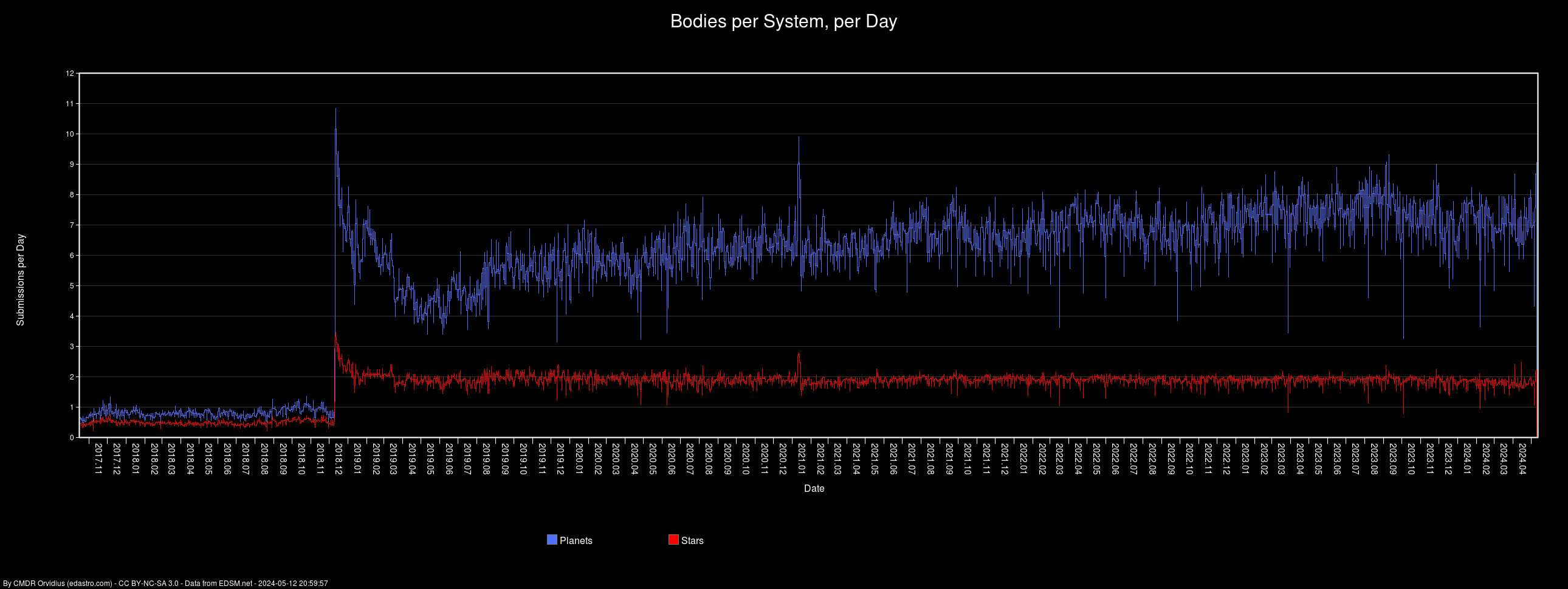
Bodies per system, per day. I've capped the graph at 25 for the moment because of those anomalous days where the numbers went over 80, and I want the rest of the graph to be visible. The next run will bring the cap down to 15. It'll automatically undo the cap if it starts getting a bunch of days that go over it again.
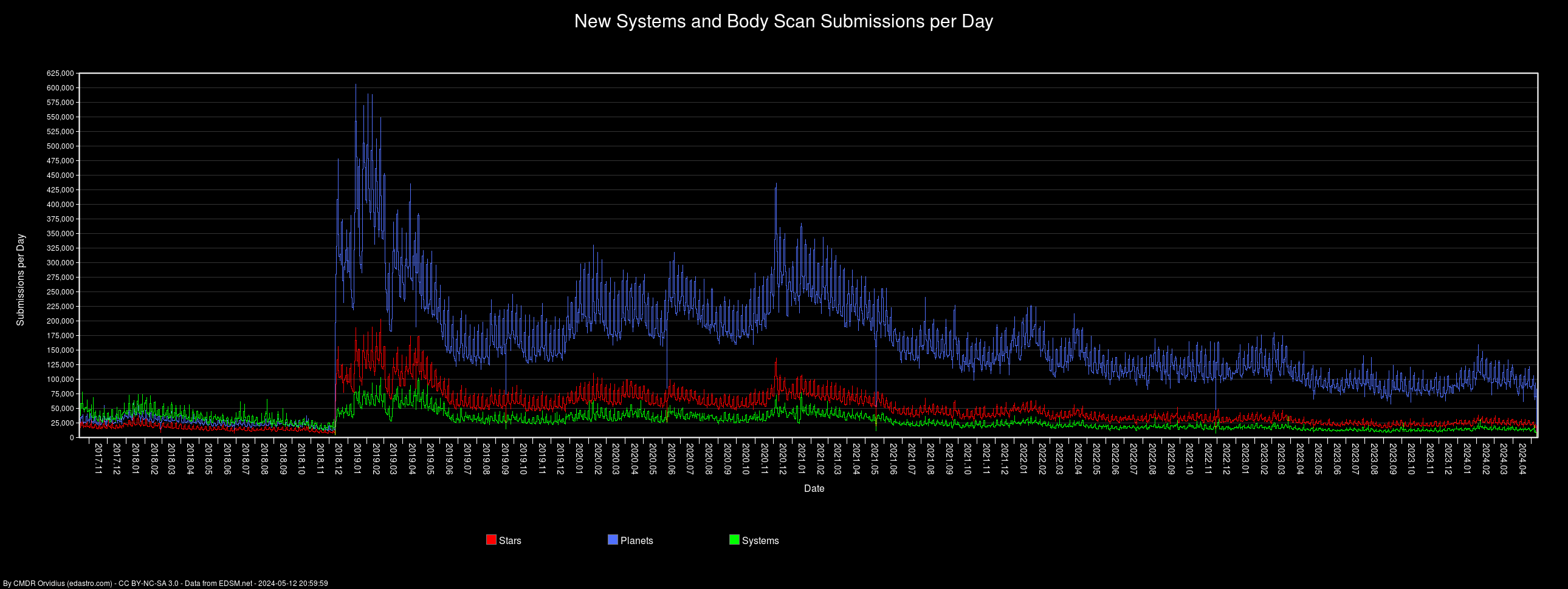
And based on the same data, here's the view as overall submissions per day, not divided into the system count:
These graphs make it super obvious when the FSS was introduced, and the DW2 exploration spike.
Bodies per system, per day. I've capped the graph at 25 for the moment because of those anomalous days where the numbers went over 80, and I want the rest of the graph to be visible. The next run will bring the cap down to 15. It'll automatically undo the cap if it starts getting a bunch of days that go over it again.
And based on the same data, here's the view as overall submissions per day, not divided into the system count:
These graphs make it super obvious when the FSS was introduced, and the DW2 exploration spike.
What the graphs also appear to illustrate is that there is far more exploration activity now than there was in, say, August 2018... So all of the naysayers who say exploration is dead since December 2018 are proven wrongAdded a couple of graphs.
Bodies per system, per day. I've capped the graph at 25 for the moment because of those anomalous days where the numbers went over 80, and I want the rest of the graph to be visible. The next run will bring the cap down to 15. It'll automatically undo the cap if it starts getting a bunch of days that go over it again.
And based on the same data, here's the view as overall submissions per day, not divided into the system count:
These graphs make it super obvious when the FSS was introduced, and the DW2 exploration spike.
")
(Only, I assume as the FSS now makes it considerably quicker and easier to scan full systems in very little time)
Oh hey, reminds me of this - much of which I made from your sheets
But there's something wrong with your system graph. Here's how it should look like, starting from 2017/04/01:

Or just after the FSS reveal on 2018/09/12:

Yet on your last graph, the green Systems line is much lower prior to 2018. Dec., not even reaching 25,000 on the graph - even though it rarely dipped that low.
But there's something wrong with your system graph. Here's how it should look like, starting from 2017/04/01:
Or just after the FSS reveal on 2018/09/12:
Yet on your last graph, the green Systems line is much lower prior to 2018. Dec., not even reaching 25,000 on the graph - even though it rarely dipped that low.
Last edited:
Huh, I'll have to investigate. I wouldn't be surprised if there's something goofy with how it's tabulating it, since it's shoehorned on top of the other stats tracking for the other graphs.
EDIT: I suspect it's because it's skipping systems without coordinates. Arg. It was doing that because of the altitude graphs. I'll see if I can separate that out better.
EDIT 2: Hmm, probably not that far off actually. There were a few days late in January that nearly hit 6 planets/system, which the graph shows.
Last edited:
Just noticed another error on that graph: Planets seems to include Stars as well. If it were Bodies, that would be correct. The labels on bodiespersystem.png are wrong, but that's just text. That might also count Stars in the Bodies / Systems, it's a bit more difficult to tell - plus it might be intended.
Just noticed another error on that graph: Planets seems to include Stars as well. If it were Bodies, that would be correct. The labels on bodiespersystem.png are wrong, but that's just text. That might also count Stars in the Bodies / Systems, it's a bit more difficult to tell - plus it might be intended.
How did you arrive at that? Looking at the graph, in the last few weeks the planets top out around 270k - 280k on some days, with about 50-70k systems, averaging about 4-5 planets per system. That appears to match between spreadsheet and the graphs.
EDIT: I think I see what you noticed, some of the numbers look like they're +1 or so. I'll look into it. Not sure how that could be screwed up, unless it's also tied to how I was tallying systems.
Last edited:
EDIT: I suspect it's because it's skipping systems without coordinates. Arg. It was doing that because of the altitude graphs. I'll see if I can separate that out better.
I think it's a combination of this and also skipping over soft-deleted items, which should be included in the history. I'll run an update again, but it'll take a while, and I won't know if I've fixed it until it completes
I was in the process of testing some changes but then decided to just have it graph the spreadsheet, since it's already there. I've updated the graphs. Some of it hasn't changed much, but some looks a lot better. I also think some of what we're seeing is that in the areas where the lines overlap, the draw-order matters, and so the upward ticks of the lower lines get cut off / drawn over. I might think about adding the colors or something, but I might have to rework how the lines are drawn to do that. In the meantime, the numbers should match the spreadsheet 100% now, since I'm using it to draw the graphs now.
Regarding the "bodies per system, per day" graph. It is (kind of) "normalized", isn't it. So it doesn't matter how many submissions there have been a day.
If that is true, the star-line seems to suggest a steady decline of stars per system, even after DW2 was over. Whereas the planet-line seems not to be affected. The period is probably to short to say sth. for sure, but one could speculate that pilots are visiting less systems with more than one star, while the scanning activity stays the same.
But I may be totally wrong.
Added spreadsheets for catalog star systems, with two methods. One is generated by excluding proc-gen names, so it catches not only catalog systems, but also anything with a "real" name, including the fictitious ones (Beagle Point, Colonia, etc). The second one looks for names belonging to specific catalogs, and some simple generic catalog formats (short abbreviation followed by a number). The difference between the two spreadsheets is about 20k rows.