ED Astrometrics: Maps and Visualizations

Deleted member 38366

D
Hmm.. True, a few issues.

I guess it might help to
  • only indicate Carriers with public Docking Permission (assuming "No Docking" Carriers prefer to be anonymous anyway)
  • only display Carriers with last update not older rhan x days (INARA now uses this technique to some extent after I recommended it to combat data obsolescence)

That would limit it to Carriers that are "confirmed" within some reasonable timeframe (long-term fixed passive positions of DSSA Carriers obviously.exempt).
 
I've started making some code changes on the back-end to make it less dependent on EDSM's table keys (instead rely on my own, and the id64 system addresses). It's possible I might break something, so let me know if you see anything that looks strange all of a sudden. Spreadsheets have been reworked a bit already, and I'll do the maps soon.

Right now it feels like a lot of script reworking for little gain, but it'll add the possibility of mixing EDDN data into it later, if I want, or use other additional sources as well.
 
Today there are a few zero-length spreadsheets, and the sector overlay is missing from the maps that should have it. I'm aware. It's all growing pains from the code changes I'm making. I'm regenerating a few things, and the rest should get cleared up in the coming days.
 
I had a question re the plots on the website,

As I dabble in data analysis in my day to day life in Particle Physics, and as the boredom of lockdown etc kicks in I grabbed a chunk of data from bodies data EDSM and thought...

I wonder what the distributions of planets vs star type look like, along with I wonder what systems are the best to look for ice rings. I went ahead and bashed out some plots for all the planet types, terraformables and ring types normalized to the main star class.

Asking around I was pointed at ED Astrometrics and kinda slapped my forehead and said "Obviously someone has done this!" (great work btw id only seen the travel videos and heat maps before!)

I did just want to ask though, I have a few differences that I believe to be sample size and selection bias.

Is the data you present the result of the total dataset? I think the json file I parsed was something like 2,000,000 bodies, so obviously not the full set. I ask because I have a massive under-representation in the O class and Brown Dwarfs. Naturally people don't tend to look much at Brown Dwarfs, far too many icy worlds and not scoop able and O class is very rare on the grand scheme of things, so I was just interested if you remembered anything like this when starting looking at smaller data samples.

Also any ideas if the distributions of planet types change dependant upon location in the galaxy... like centre vs outer?


I was going to do a short video talking about some trends but I likely need a few more data sets. (iv not dabbled in the API for EDSM, EDDB etc, so have no idea how id go about pulling a json batch of bodies if that's even possible so im going on the downloads from EDSM) Id obviously point here for more info, not sure my couple day effort warrants any kind of new breakthroughs lol... except to say what people already guessed, icy rings tend to be in the cooler stars haha

Cheers!
 
Hi there! Yeah, we suffer a lot from selection bias. The EDSM data set is influenced by that to a large degree, so any statistics we draw from it have to be viewed in that context. I'm certain that brown dwarfs and icy bodies are severely underrepresented. Whereas the confidence with regards to ELWs is probably quite a bit higher, since people are more likely to go out of their way to scan those.

There are definitely some quirks too. The order in which bodies have been numbered in EDSM is unusual. Their internal IDs appear to have been remapped at some point in the past, since the bodies don't follow a nice chronological order that you'd expect if it were auto-incrementing the ID from the start. In that regard the system data looks normal, but the bodies don't. So if you took something like the "first" 2 million rows of bodies, I wouldn't be surprised if the sample was skewed somehow.

In terms of galactic distribution, I'd say "yes and no". The maps of body types show some oddities, in that the "rules" around mass codes change dramatically inside the core, where the density crosses some threshold. Stars out on the very edge tend to be mostly main sequence stars, and not very many brown dwarfs. And when you look at altitude, there's this mysterious brown-dwarf layer slightly below the galactic plane, where M-class and brown dwarfs trade places for population density (nearly an order of magnitude difference), which you can see in this graph just a little left of center at the top of the image.

But yes, all of my graphs and maps use the entire data set, as much as they can. For maps, I have to skip systems that are missing coordinates (about 2.6 million of them!), and for certain kinds of things I have to skip systems where I can't determine the main star type, or whatever, due to incomplete data. Most of the maps show how large the data set was that actually got included, and it's always a number that's smaller than what's in the database.
 
Thanks a lot Orvidius! This really helps and makes me more sure im not going crazy or doing anything really really wrong.

my experience parsing the json data from a batch file is pretty basic so all I am doing is looping over data and matching id's and making sure its the main star and then sorting counting things... then a final pass to normalize it based on the total number of stars.

I found obviously nested loops with 2million objects is extremely slow, even when I break out of a loop because I found what I needed, it still takes a long time on my old 2013 MacBook Pro haha (doing it in c++ because...thats what im comfortable with)
So to speed things up I do an initial pass to store just the main star types and IDs which I then use to match up the planets.

So in total its about 250,000 main stars with the rest of the 2million or so planets.

Ill go ahead and make the guide of sorts... and point out the oddities for what they are (as you say brown dwarfs are massively underrepresented for example.) There might also be some bias for example for Earthlikes where explorers scan a system, and don't really finish the full system because they just want the big bucks.

I fear however me making statements like "If you are after biggest payouts on average look in these systems" will only make our selection bias worse... lol
 
Hehe, yeah, there's always the danger of encouraging cherry-picking when you want to do some statistics on the data afterward. :D

Churning through the data is quite slow, for sure. My server spends most of the day building maps and spreadsheets, hammering the database pretty hard. I already upgraded the box once just to get more memory in there, and now I'm building a separate database server, to try to manage the load. It's a lot of data, and its only going to increase. ;)
 
Ill Just throw up some plots because :) plots

Screen Shot 2020-07-20 at 11.41.35 AM.png

So this one is the distribution of stars in the data set I got - it looks roughly as id expect, odd drop off in g-type? and brown dwarfs are somewhat rare compared to what id expect.

Screen Shot 2020-07-20 at 11.41.29 AM.png

This is the distribution of icy bodies, so far so good this is also what id expect going on my memory. Cooler stars tend to have more icy bodies and gas giants around those bodies tend to have icy rather than rocky moons. again, so far so good.

Similar drop off in Brown dwarf stars, but then we normalize it and get the following

Screen Shot 2020-07-20 at 11.41.49 AM.png

After normalization I looks a bit better, with the cooler bodies being dominated by icy bodies, to me this looks pretty good. My counting doesn't screen out main stars that have no planets, so this represents kind of 'average' planets per star in general, I thinks calling them like you have might make more sense, planets per x many stars.

Maybe I need to do a count of lone main stars ill have to stare at the db fields a bit more.

haha it is a lot of data, the json file is 2gb as raw text, loading that into memory expands it to about 10gb of ram... good job this MacBook has 16 haha
I think ill make a habit of collecting the 7 day snap shots from EDSM and adding them together :)
 
Last edited:
FYI, no map/spreadsheet updates yesterday or today, and tomorrow is uncertain. (minor exception for POI and carrier updates). The updates are disabled while I do a database migration.
 

Deleted member 38366

D
@Orvidius

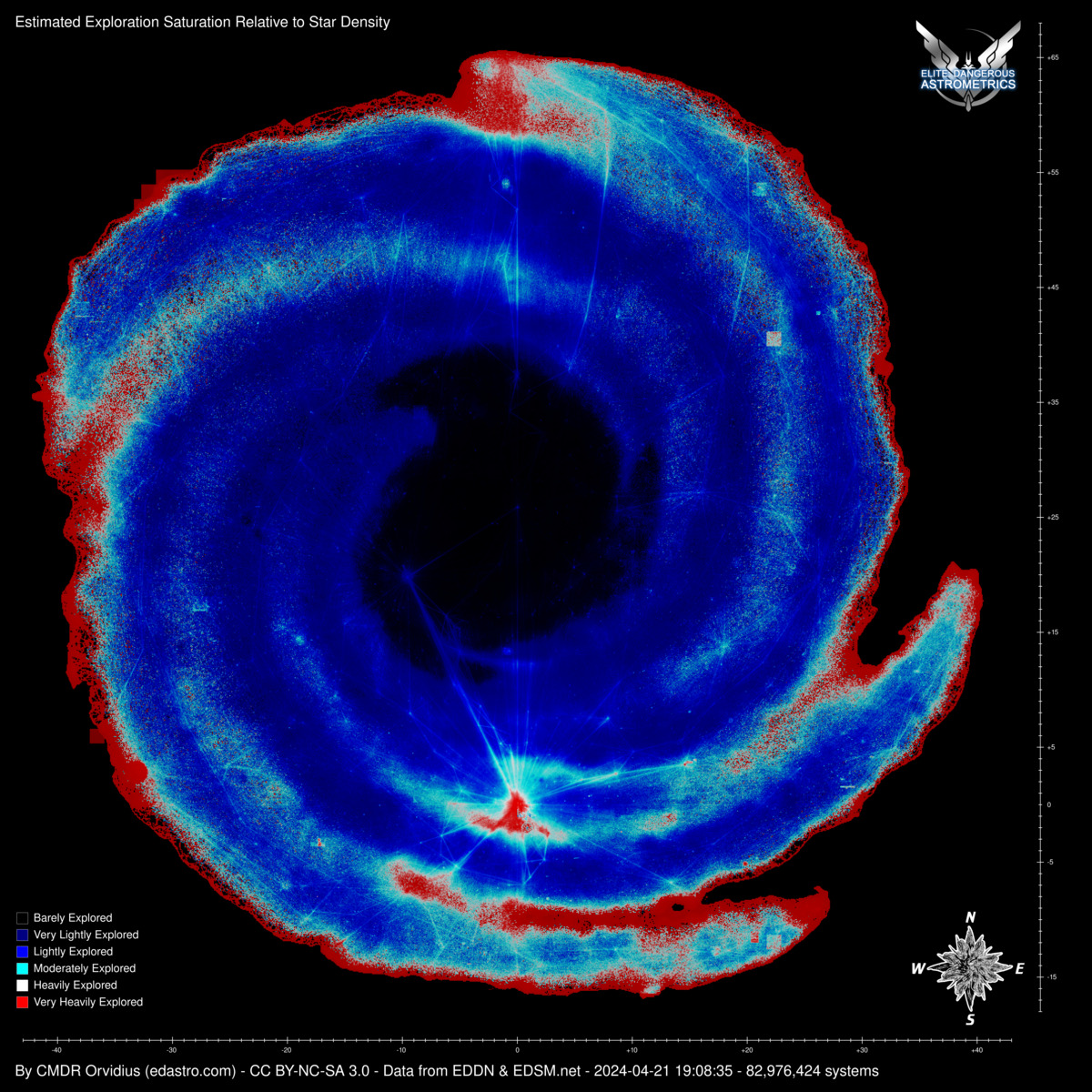
I noticed that the interesting Saturation Map isn't updated and still dates 14 May.
Any chance of getting this cool Map into some regular update cycle like all the other maps?
 
Many of the maps got turned to total blackness over night. Don't worry, I'm on it. ;)

I've been making code changes for the last few weeks to try to remove the dependency on EDSM's internal IDs to tie tables together. I'm pretty much there now. But one of the changes had a typo in it, and so none of the systems or bodies were being read properly in the main mapping script.. LOL.
 
I just fixed a long-standing bug in the saturation map. It was stupidly simple, but I just never really investigated it. Some of the most sparse gaps and outer edges that should have had more red were just blank.

These are boxels that have only one star present, and it's the #0 star. When dividing stars found over the maximum ID number, that ID number being "0", I had it skipping these cases to avoid a division by zero error. But it really should have been dividing by "max+1" anyway, because it's inclusive of zero.

slaps forehead ;)

 
I just fixed a long-standing bug in the saturation map. It was stupidly simple, but I just never really investigated it. Some of the most sparse gaps and outer edges that should have had more red were just blank.
...
Interesting - I would have expected it to be more of a "negative" view of the galaxy, with the scarcely populated gaps between the arms better explored than the arms. But this seems more like people choose an arm they want to ride along and then barely ever cross between them, which leaves the gaps still mostly unexplored. As it happens, I am just about to veer in on the Sagitarius-Carina Arm out in the "east" to slowly return to the bubble - I might consider staying in the gap instead...

Edit: I wonder, is it possible to estimate the relative star density of arms vs gaps, is it closer to 10:1 or to 1000:1 or whatever? I guess the answer will be something along the line of "it depends" (on the arm/gap you are looking at).
 
Last edited:
Actually this is very much what we're seeing in the map. The gaps are much more lit up, and the more dense regions (arm interiors and the core) are very dark since they've hardly been touched, proportionately speaking. The main exception being the bubble and its immediate surroundings, of course.

It's hard to draw accurate conclusions about how many stars are actually present. That's a level of statistics I haven't looked into. It's a complicated problem to took at an available number sequence, and based on how sparse or complete the number sequence is, make a determination on how much higher the numbers actually go. In a way this is what the map is already doing, but it's not trying to guess how many more numbers there are beyond the ones that are in the database, but rather just looking at how complete the sequence is within the numbers that are present. Plus, it's not making guesses about boxels that are absent in the data either, which would have to be taken into account to make this sort of projection.
 
Top Bottom