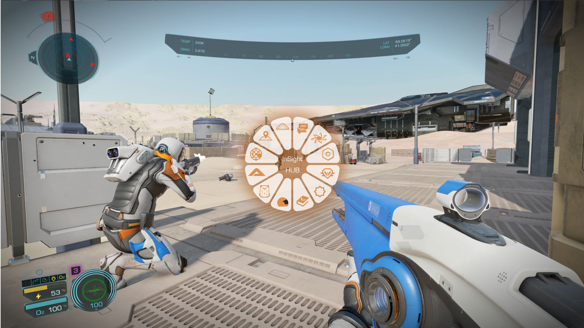
I would like to propose this new menu design that we have when we go on foot, called InSight HUB.
1- Put it in the center of the screen. Since when activated we immobilize completely and we can only use it, since it is well visible and a little larger. And if it can be with a fan animation unfolding.
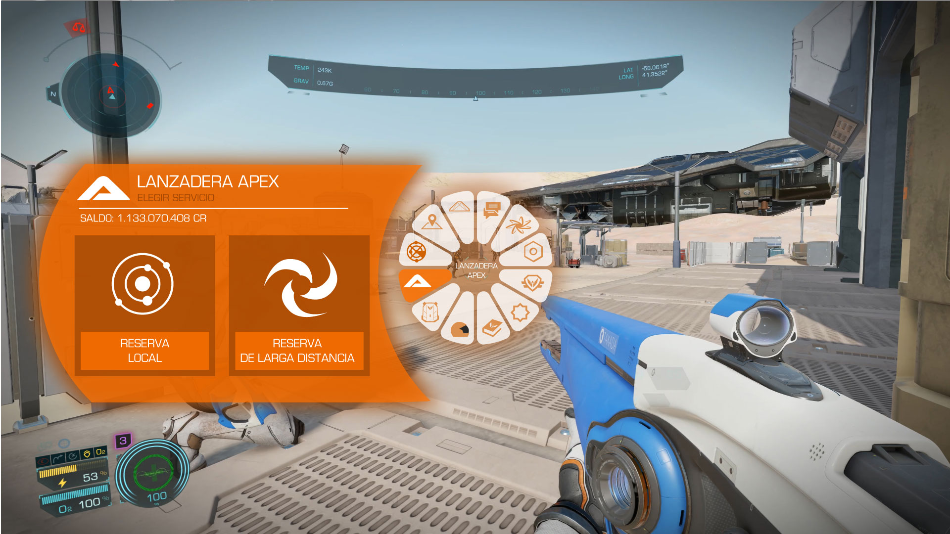
2- When selecting an option, a panel / frame is displayed on the left side of the screen with the current information and the wheel of the central HUB remains. I see it illogical to select something, that the HUB wheel disappears and a frame appears in the center.


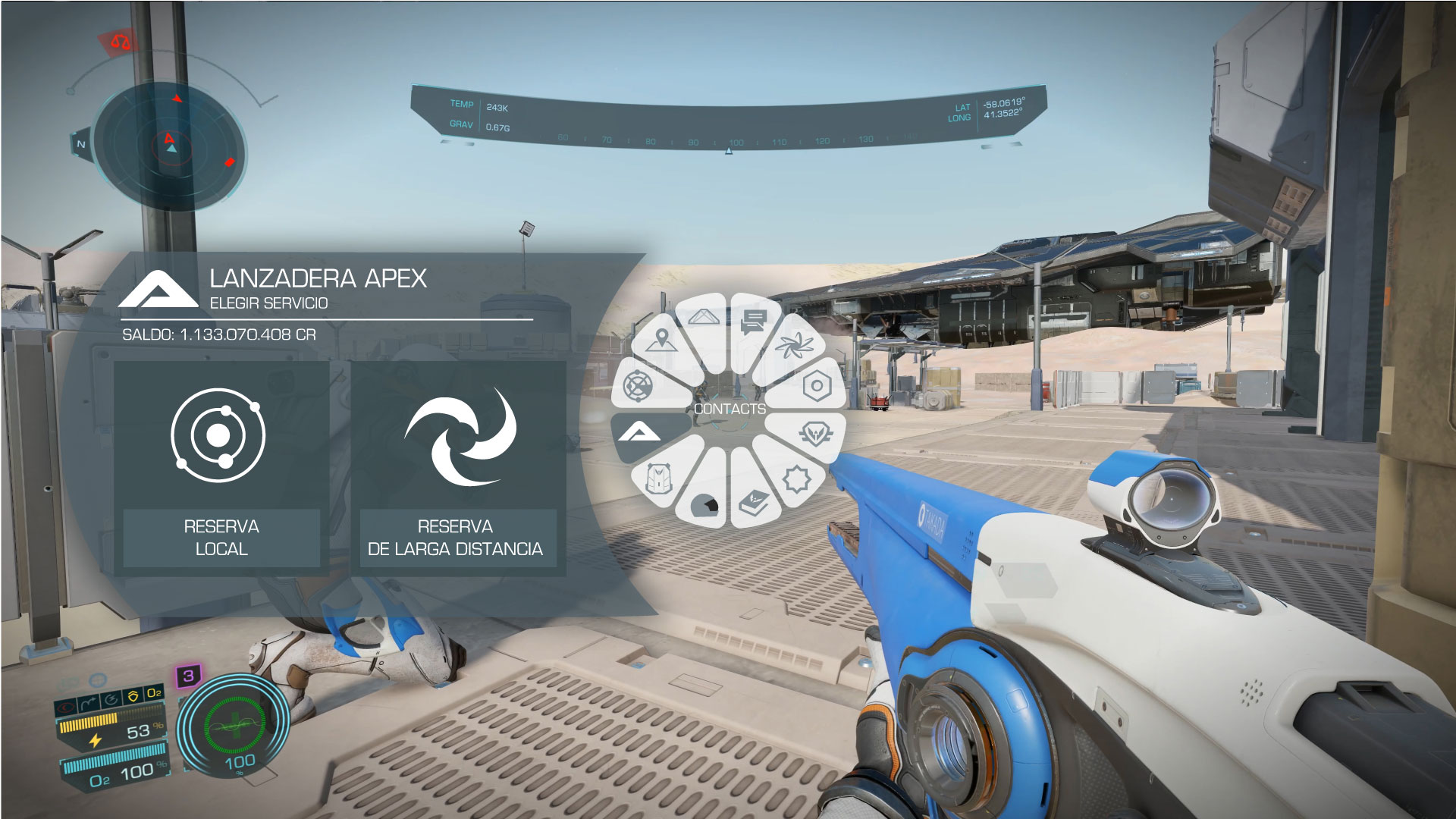
Color variant for the new ones.

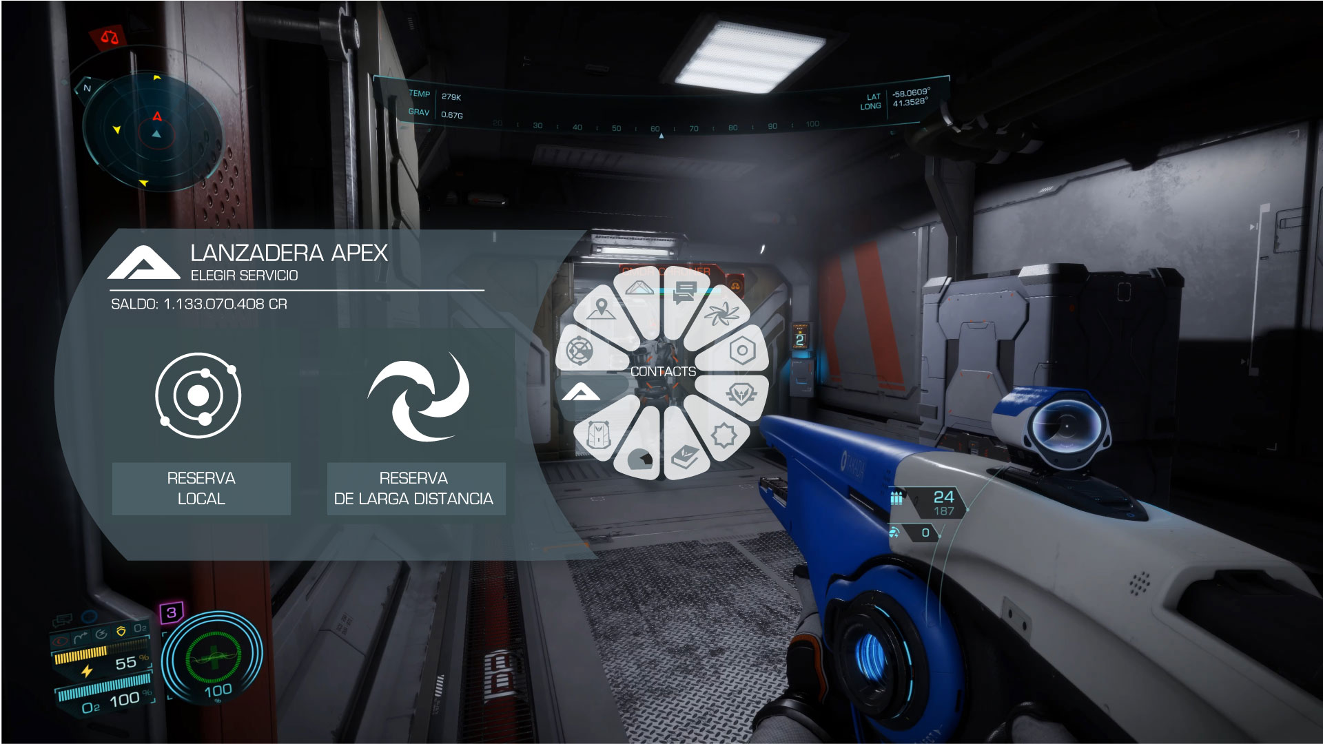
Version in dark environments.

I hope you like it and find it useful.
Greetings
1- Put it in the center of the screen. Since when activated we immobilize completely and we can only use it, since it is well visible and a little larger. And if it can be with a fan animation unfolding.
2- When selecting an option, a panel / frame is displayed on the left side of the screen with the current information and the wheel of the central HUB remains. I see it illogical to select something, that the HUB wheel disappears and a frame appears in the center.
Color variant for the new ones.
Version in dark environments.
I hope you like it and find it useful.
Greetings
