Since I bought ED post-launch I most busied myself not as much with actually playing the game, as with thinking up a comprehensive 3D map/mapping system of the inhabited part of the galaxy. After a lot of work, I think I managed to put together a pretty good system.
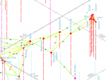
So, since an image is worth a thousand words, I give you... Edgepixel's Rare Trades Map (detail):
View attachment 11490
You can download the BIG IMAGE >> HERE <<.
It should be pretty self-explanatory. A nifty feature is that due to the properties of the isometric projection, on this map the horizontal grids for each multiple of 100 vertical lightyears superpose perfectly. That is a huge advantage--only one horizontal grid for all vertical sets of data. It can look confusing at first glance ("What's up with all the lines labeled X=0, Z=0?"), but there are guiding lines that should help you mitigate this. Read the map legend.
The map works basically like walking on the surface of a frozen lake, with crystal-clear ice, and being able to see different things at different levels, like in this Youtube video: logs, boulders, fishes.
Making-of story on my blog.
UPDATE
Added travel paths with length marked.

Download the BIG IMAGE >> HERE <<, and a PDF version >> HERE <<
UPDATE 2 -- Recommended Version
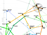
A top-down view (X-Z plane projection), with travel paths marked. The thicker, the shorter.
Depth on the Y axis in conveyed by color. Highest to lowest: Pink, Magenta, Red, Dark Orange, Medium Orange, Light Orange, Light Green, Green, Dark Green, Light Cyan, Cyan, Dark Cyan, Blue, Blah-blah.
Probably the most comprehensible so far.

Download the BIG IMAGE >> HERE <<
So, since an image is worth a thousand words, I give you... Edgepixel's Rare Trades Map (detail):
View attachment 11490
You can download the BIG IMAGE >> HERE <<.
It should be pretty self-explanatory. A nifty feature is that due to the properties of the isometric projection, on this map the horizontal grids for each multiple of 100 vertical lightyears superpose perfectly. That is a huge advantage--only one horizontal grid for all vertical sets of data. It can look confusing at first glance ("What's up with all the lines labeled X=0, Z=0?"), but there are guiding lines that should help you mitigate this. Read the map legend.
The map works basically like walking on the surface of a frozen lake, with crystal-clear ice, and being able to see different things at different levels, like in this Youtube video: logs, boulders, fishes.
Making-of story on my blog.
UPDATE
Added travel paths with length marked.

Download the BIG IMAGE >> HERE <<, and a PDF version >> HERE <<
UPDATE 2 -- Recommended Version
A top-down view (X-Z plane projection), with travel paths marked. The thicker, the shorter.
Depth on the Y axis in conveyed by color. Highest to lowest: Pink, Magenta, Red, Dark Orange, Medium Orange, Light Orange, Light Green, Green, Dark Green, Light Cyan, Cyan, Dark Cyan, Blue, Blah-blah.
Probably the most comprehensible so far.

Download the BIG IMAGE >> HERE <<
Last edited:
