Well, even if you remove the funnels, I think that there are still a bunch of details that I thikn make that design look better.
Funnily enough, I think the huge windows of the ship make it look worse. Obsidian Ant mentions how the size of the windows mak it look like a small ship while it isn't and I agree on that point. There, the size of the windows make it look look large. I think it looks much sleeker there. In the end it's all a question of taste =P
If you compare both of them, I think in the artwork you definitely get a better feel of the actual size of the ship.
It does ended up being more like the butter. But I still prefer the concept art there. I wish they stayed around that style. I feel like the details they put there made it look "meaner" and more military.
The current imperial ships give me a bit of a "leisure" type of ship or a bit emissary kind of ship.. in my opinion. Though I do like them.
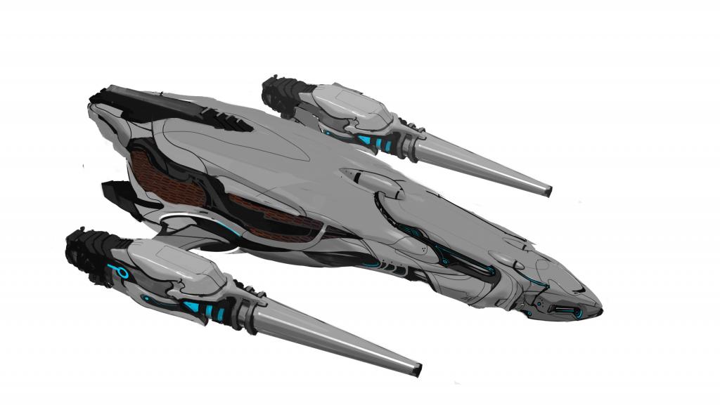
I think Zaptruder's design is interesting but I'm not a fan of the wings. Well, mostly what's attaching them to the body of the ship. Looks like it would break quite easily and I think it would have looked better if the side thrusters didn't have that polyhedron style but more curvy style that would match the body.