It's bad enough that his faction's color looks like a highlighter ink. But the LOGO ??? Clearly, this after thought faction drew the short straw on the PP logo roulette. What exactly is that symbol supposed to be anyway? A ringed planet that exploded into the shape of two fangs? I am being perfectly serious when I say, that his LOGO is the major reason why I cannot join his power, or take it seriously. Nevermind that it has the weakest lore and pretext for existence possible. A greedy company that pays 3x the usual amount for useless exploration data? Yeah, that's plausible. If it had been a science based faction like Antal's, the rank 5 bonus might make more sense. Or if we could colonize planets after gathering enough exploration data... but still, those utterly stupid fangs make me think, "if FD ever allows us to paint our ships or have faction Logo's, I would never go out in public looking like a Vampire Sharpie"

For comparison, look at the Alliance logo. I HATE trading to death, because it is utterly and unceasingly boring. But Mahon's logo screams "join US! we are the cool power that every one want's to say they are a part of, like being Irish on St. Patty's day in Boston ". Such a friendly shade of green too. Not the radioactive vomit green of Li Yong-Rui. Maybe FD is trying to emphasize that corporate goverments seriously lack imagination, or really just don't care at all about inspiring their population to unity. Nothing says, "hey what are you looking at, get back to work!" like a logo that is too boring and senseless to be anything but a corporate placeholder for patriotism.
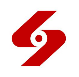
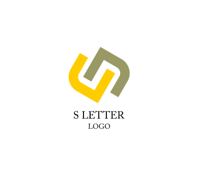
Apparently this is supposed to be an "S". In which case here is a small mountain of superior S logos for FD to "borrow" ideas from in case they decided that Sirius Corp wants to rebrand itself:


For comparison, look at the Alliance logo. I HATE trading to death, because it is utterly and unceasingly boring. But Mahon's logo screams "join US! we are the cool power that every one want's to say they are a part of, like being Irish on St. Patty's day in Boston
". Such a friendly shade of green too. Not the radioactive vomit green of Li Yong-Rui. Maybe FD is trying to emphasize that corporate goverments seriously lack imagination, or really just don't care at all about inspiring their population to unity. Nothing says, "hey what are you looking at, get back to work!" like a logo that is too boring and senseless to be anything but a corporate placeholder for patriotism.Apparently this is supposed to be an "S". In which case here is a small mountain of superior S logos for FD to "borrow" ideas from in case they decided that Sirius Corp wants to rebrand itself:
Last edited: