Please add Outfitting FILTER

Do you want Outfitting Filter to be added?

  • Yes, it is needed!

    Votes: 39 92.9%
  • No, all OK now

    Votes: 2 4.8%
  • Your suggestion in comment

    Votes: 1 2.4%

  • Total voters
    42
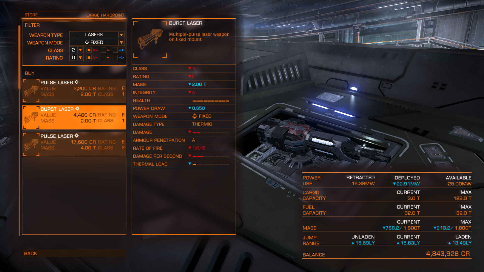
FD, please add Outfitting Filter for more comfortable weapons and equipment searching.
This is a sample image:
58e11511ed233200b7a5fe9bc041ca85.jpg
I think, no comments needed :)
Note that first field is Weapon Type - not Thermic or Kinetic, but Lasers/Cannons/Missiles/Others. If is it really to make - it will be more comfortable. Simply one more field in a database :)
Equipment Filter will be similar, but instead of Weapon type must be Equipment type with fixed equipment for thrusters, powerplant etc, and a dropdown list of all available equipment for Internal compartment.
Second way, Filter may be aligned at top-right of a detail table, and may contains checkboxlists instead of dropdown lists - to select several options.
 
Last edited:
Even the ability to sort the list would be useful. Especially for the internal compartments, that's all over the place!
 
Me want! Soon!

The higher tier my ship gets, the more urgent such a filter becomes, so i'd really appreciate it a lot.
 
Could add tabs on the left side of the actual list we scroll. There is space there to add "FSD", "SHIELDS", "LASERS", "CANNONS", "POWER", "SCANNERS", "SCOOPS" etc. Or even make buttons instead on the left side of the outfitter list. There is space to add something like this there. Its indeed very hard to go through the outfitters lists when there is tons of modules. All mixed so its hard to see whats what.
|
Also, your installed module is hard to distinguish from modules you cant afford. The small text saying "you cant afford this" or "already installed" has the same color. Would be neat if the color of the installed module is different. The whole module "square" could have another color, or the text "already installed" being highlighted. It takes longer time than needed atm to work the outfitter.
 
Last edited:
Could add tabs on the left side of the actual list we scroll. There is space there to add "FSD", "SHIELDS", "LASERS", "CANNONS", "POWER", "SCANNERS", "SCOOPS" etc. Or even make buttons instead on the left side of the outfitter list. There is space to add something like this there. Its indeed very hard to go through the outfitters lists when there is tons of modules. All mixed so its hard to see whats what.
|
Also, your installed module is hard to distinguish from modules you cant afford. The small text saying "you cant afford this" or "already installed" has the same color. Would be neat if the color of the installed module is different. The whole module "square" could have another color, or the text "already installed" being highlighted. It takes longer time than needed atm to work the outfitter.
Yes, good idea about tabs/buttons at left!
 
Quick PS. Something like this (image). Also look at the installed module and those i cant afford. Looks the same which is hard sometimes when you have a lot of modules. Easier and faster overlook lessens the time spent in the outfitter and also might improve your choice making a bit. :)
|
tabs.jpg
 
I think, currently fitted modules could be drawn grayed (disabled), not red...
And it must be both tabs at left and filter - because even you have selected, for example, shield cell bank, list of it may contains many combinations of different classes ant ratings and filter will hide modules below interesting level.
 
Last edited:
+1... or some variation.

I would also add a simple option "don't show anything worse than what I have already". In any way except mass/power draw would be fine. If you're trying to keep mass or power draw down, you're probably not looking for an upgrade (although obviously sometimes more effective items are lighter).
 
Back
Top Bottom