Please can unexplored asteroid belts be listed as "unexplored belt" in the L/H panel

(Instead of them being simply listed as "unexplored.") Would make it considerably less exasperating (and keyboard wearing out ;) ) because we wouldn't have to keep repeatedly clicking on unexplored asteroid belts, in order to find the next nearest planet and so on that is actually worth scanning.

Thanks!
 
Agree with the sentiment 100%

Or change the icon or allow filtering of the list or automatically put the full description in as that seems to turn up without anybody actually scanning the wretched things.

I don't care what the mechanism is just do something so we don't have to keep looking at the same stupid rocks in the list over and over again to find the stuff worth scanning.
 
Or- and I know this sounds totally crazy.... you could make them actually worth scanning.


As I have stated numerous times: Asteroids contain easily accessible resources, which makes them more valuable than ice planets, actually.

It is high time the in game stats reflected that. Exploration data for asteroid belts should be more valuable than for ice planets.
 
Thanks guys and I'm glad I'm not the only one who finds it extremely tiring!

Yup, any of those suggestions would work just as well also.
 
Last edited:
when i started exploring i had the same problem. then i realized that when you look at the main left hud panel (in this case with navigation tab active) you can actually also see the small extra hud thingy that shows you what the target you've just locked is. so my tip: go through the "unexplored" items in the nav list one by one, and for each just quickly glance to the right/down and you'll immediately see if it's a planet or an asteroid belt etc.
 
when i started exploring i had the same problem. then i realized that when you look at the main left hud panel (in this case with navigation tab active) you can actually also see the small extra hud thingy that shows you what the target you've just locked is. so my tip: go through the "unexplored" items in the nav list one by one, and for each just quickly glance to the right/down and you'll immediately see if it's a planet or an asteroid belt etc.

That is exactly what people here are complaining about, that we have to do this instead of seeing icons that show us what we are dealing with.

BTW, has anybody ever noticed that in the NAV panel, all mailslot stations are represented by a coriolis icon, even though they are not coriolis stations?

I don't understand why they did this - they already have perfect icons for every station type, they just need to actually use them!
 
when i started exploring i had the same problem. then i realized that when you look at the main left hud panel (in this case with navigation tab active) you can actually also see the small extra hud thingy that shows you what the target you've just locked is. so my tip: go through the "unexplored" items in the nav list one by one, and for each just quickly glance to the right/down and you'll immediately see if it's a planet or an asteroid belt etc.

True but once you've moved to scan one object the order changes and to find the next object you have to go through the whole list (or a large portion of it) again. Also it depends on what ship you are in as the amount of the front view that can be seen from the left is not consistent.

Another possibility is make the asteroid belts just one "object" and not a list of 10 or so like it is at the moment, but I suspect that was a fundamental design choice that could not be easily changed now.
 
That is exactly what people here are complaining about, that we have to do this instead of seeing icons that show us what we are dealing with.

ok i guess i don't feel like i'm being forced to do something unspeakable just by moving my eyes a bit :). it actually kind of felt good to find out that the huds (and their positioning in the cockpit) worked together nicely in this case.

BTW, has anybody ever noticed that in the NAV panel, all mailslot stations are represented by a coriolis icon, even though they are not coriolis stations? I don't understand why they did this - they already have perfect icons for every station type, they just need to actually use them!

i think the whole nav panel needs a rework in order to help distinguish different targets. at the moment it's little bit more than a glorified excel table. taking into account how great the game looks otherwise i can only speculate that they know that and want to change it, but for some reason are focusing their resources elsewhere.
 
ok i guess i don't feel like i'm being forced to do something unspeakable just by moving my eyes a bit :).

Somehow I suspect you've not done a lot of really serious exploration, when you get your 10th system in a row with 60 or 70 objects where 50% to 75% of them are rocks that you have to scroll through 10 or so times for each system in order to find the objects worth scanning, then tell me it's not a problem.
 
Somehow I suspect you've not done a lot of really serious exploration, when you get your 10th system in a row with 60 or 70 objects where 50% to 75% of them are rocks that you have to scroll through 10 or so times for each system in order to find the objects worth scanning, then tell me it's not a problem.

ok, you got me :)
 
... Also it depends on what ship you are in as the amount of the front view that can be seen from the left is not consistent ...

Yes - I use a Cobra for my exploration and luckily I can just see enough of the front panel from the left to see what I'm targeting by its graphic, and it's bad enough having to repeatedly scroll through the list even then, but if you can't see any of the front panel at all I would imagine it's even worse ...
 
+1 to the filtering/icon/anything else proposal

I would be happy even with a 'select next/closest unexplored astronomical object' bind...
 
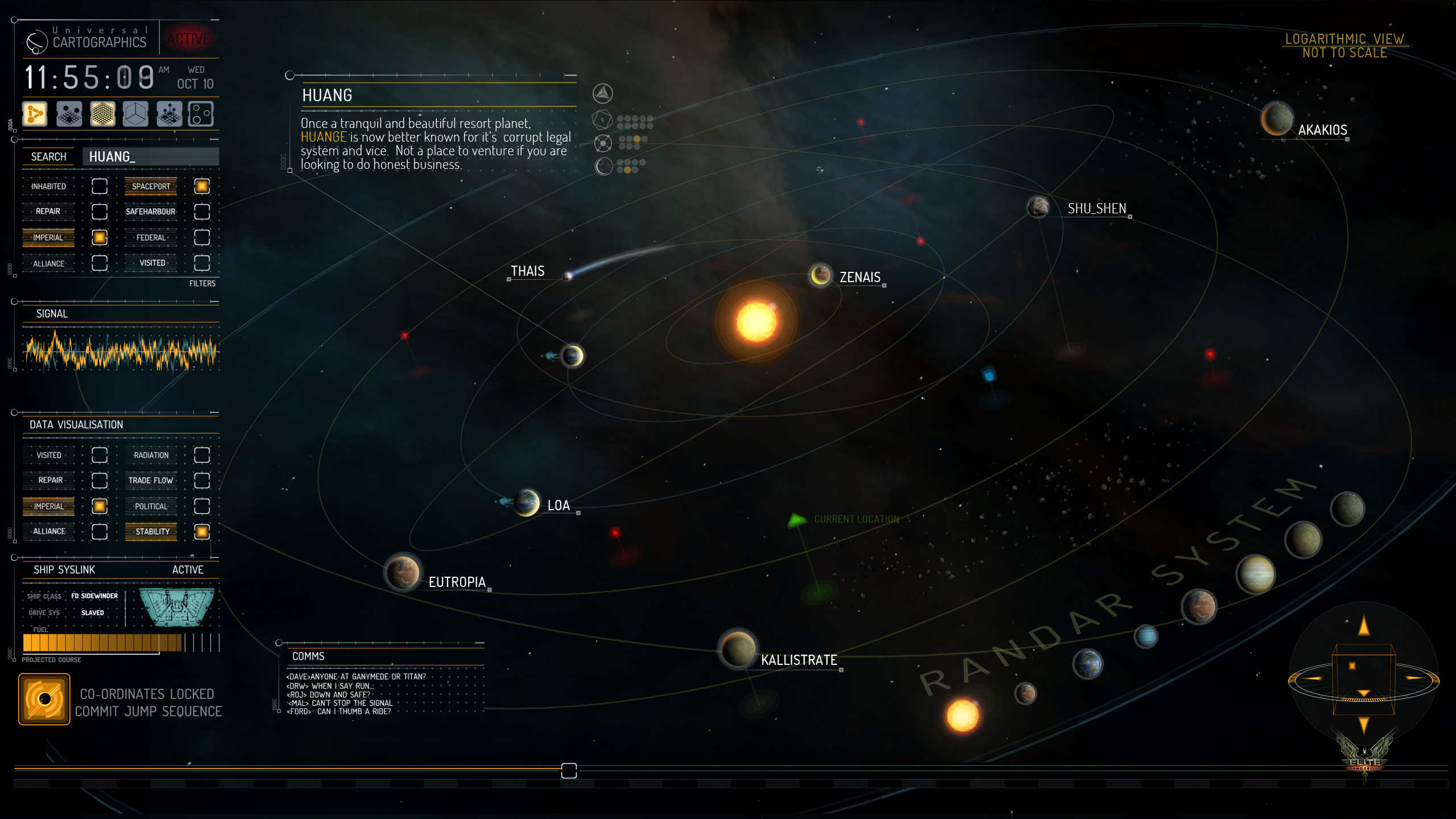
Or this...

18_Starchart.jpg


Come on already FD! Get it done! :D
 
Wow! That's really nice!!!
The only other thing the system chart needs is to let me click on something and target it.

That WAS suppose to be in the game with the 1.2 update, but didn't quite make it. We will get that in 1.3. The ability to select nav targets from the system view that is...when we will get the orrey view is still unknown.
 

Very nice indeed. :)

... The only other thing the system chart needs is to let me click on something and target it.

Yes, that would be even better and of course, would also solve the problem of identifying which unexplored objects are asteroid belts and which are stars and planets. I would imagine that kind of system map is some way down the line to appear though - we'll see.
 
Back
Top Bottom