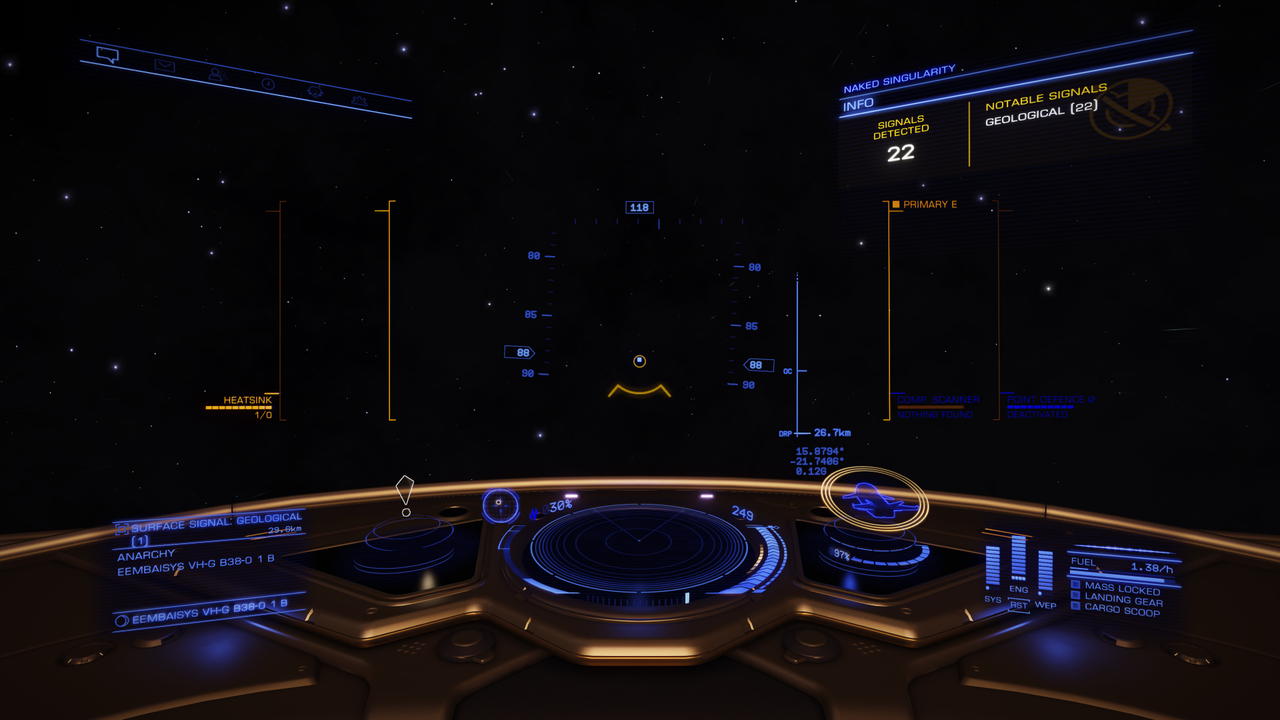
The animation on the speed chevrons is really annoying!
The chevrons themselves are great - the animation isn't necessary to give further information. Worse, pretty much everything else on the HUD changes/moves only when the underlying information changes - but this moves all the time, so constantly draws the eye.
I know, not the most important thing, and with a few weeks to get used to it I'll probably learn to blank it out - but the UI really needs a good go-over to split it into
- things which should be urgently highlighted
- things which should be highlighted
- routine information
- detail that isn't normally relevant
...and then use things like movement, size, colours etc. consistently to put things in that hierarchy rather than seemingly at random. This would really help newer players get the hang of things, too.
YOU ARE NOW GOING FORWARD
Also your power plant is one shot away from critical failure
")