You are using an out of date browser. It may not display this or other websites correctly.
You should upgrade or use an alternative browser.
You should upgrade or use an alternative browser.
Show Real Photos of Minerals in the Commodities Market
- Thread starter Cosmo
- Start date
I don't see how this adds to the game in the slightest.
But I wouldn't mind seeing a basic orange outline image like you can see in the shipyard.
But I wouldn't mind seeing a basic orange outline image like you can see in the shipyard.
I don't see how this adds to the game in the slightest.
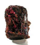
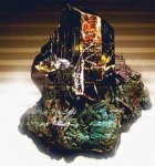
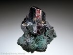
It's for visual representation of commodities like minerals and metals so people can recognize it and learn more.
But I wouldn't mind seeing a basic orange outline image like you can see in the shipyard.
An orange outline doesn't show details like the true color, texture etc.
Last edited:
I don't see how this adds to the game in the slightest. If people wanted to learn more they can read the item's description or consult the google.It's for visual representation of commodities like minerals and metals so people can recognize it and learn more.
I don't see how this adds to the game in the slightest. It would look odd and out of place in the UI I think. Not to mention I don't want to load 25 detailed colored images every time I dock or look at the commodity market.An orange outline doesn't show details like the true color, texture etc.
Last edited:
Im sure that any graphic artist worth their salt could come up with something that fits in. I juts had a go in photo shop and came up with some okay treatments just using the builit in filters and playing around with colorising portions. It could be do by a professional with a bit of time and look great.
Until then I hope we get stuff like this

and

and this last one took me about 5 seconds by pulling a pencil draw from the wbe and inverting it and pulling some levers
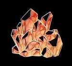
So a professional would have no trouble.
Until then I hope we get stuff like this

and

and this last one took me about 5 seconds by pulling a pencil draw from the wbe and inverting it and pulling some levers

So a professional would have no trouble.
Last edited:
Im sure that any graphic artist worth their salt could come up with something that fits in. I juts had a go in photo shop and came up with some okay treatments just using the builit in filters and playing around with colorising portions. It could be do by a professional with a bit of time and look great.
Until then I hope we get stuff like this
View attachment 31715
and
View attachment 31716
and this last one took me about 5 seconds by pulling a pencil draw from the wbe and inverting it and pulling some levers
View attachment 31719
So a professional would have no trouble.
None of this possibly with the exception of the last one looks like it would at all fit with the current UI. The last one is basically undetailed orange outlines, which is what I suggested in post #2.
None of this possibly with the exception of the last one looks like it would at all fit with the current UI. The last one is basically undetailed orange outlines, which is what I suggested in post #2.
The first two are from Frontier. Feel free to crrect me if Im wrong
What do you think of this
View attachment 31721
The first two are from Frontier. Feel free to crrect me if Im wrong
What do you think of this
View attachment 31721
I know the first two are from FD, but they are not in the game. If my commodity screen looked liked that blue one it would stick out as the only blue screen in the game.

Please tell me where on this screen would be a good place for a detailed color picture of the commodity.
I know the first two are from FD, but they are not in the game. If my commodity screen looked liked that blue one it would stick out as the only blue screen in the game.
View attachment 31722
Please tell me where on this screen would be a good place for a detailed color picture of the commodity.
Top right next to the name.
What do you think of the life like full color character image adn the blue and red icons like the ones used in wings?
Does it work for you?
Last edited:
+1. It would be nice to have some visual idea of what we're shipping (assuming the commodity is refined, should the example image not be of refined painite, rather than what looks like a raw chunk?). I'm quite happy to see more colour in the UI - I'm bored with endless orange.
Also, since we'd presumably be getting pictures of all the commodities, animal meats (or whatever they're called) can rightfully be depicted with a picture of tasty, delicious bacon. That is clearly a win.
Also, since we'd presumably be getting pictures of all the commodities, animal meats (or whatever they're called) can rightfully be depicted with a picture of tasty, delicious bacon. That is clearly a win.
and this last one took me about 5 seconds by pulling a pencil draw from the wbe and inverting it and pulling some levers
View attachment 31719
So a professional would have no trouble.
That looks nice, some details are lost with the artistic drawing though. Because it doesn't show the true color and texture of the mineral. If they use better drawings it should include those things.
The drawing resembles Rutile which often has a reddish brown color.
I don't see how this adds to the game in the slightest. If people wanted to learn more they can read the item's description or consult the google. .
You repeat the same argument and I explained that visual information can teach people more about commodities and make trading more interesting.
Last edited:
I'm sure ity could be done by someone who knows what they are doing.
Just had a play with the other image and came up with this
View attachment 31862
That looks good. I think permission is required to use those photos in ED. They could make a 3D model or colored drawing.
Last edited:
I've repeated the same argument because it's still valid and unanswered- how does learning about your commodity add to the game, when they could all be renamed commodity 1 commodity 2 commodity 3 without any practical impact on the game at all?You repeat the same argument and I explained that visual information can teach people more about commodities and make trading more interesting.
A visual aide would allow players to recognize commodities faster. This isn't what you've said (though I think it's what you're getting at), and it's true. But that kind of association doesn't require high detail and color. In fact, it's probably more powerful without it.
The commodity screen is very clean and functional. High res detailed color images would detract from that, add to loading times, etc etc. I suppose we disagree on that point. That's all I have left to add.
or well atleast to show any images of the product would be nice really instead of just text.
or well atleast to show any images of the product would be nice really instead of just text.
Yeah, photos and images make the commodities more tangible for people.
I've repeated the same argument because it's still valid and unanswered
You're not being constructive, it has already been answered. If you don't like the answer there's no need to repost your opinion.
Last edited:

