The Shipyard menu is offensive to my eyes. Please make the UI better.

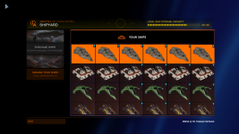
This is the current shipyard. It uses approximately 25% of the space for anything actually usable, while wasting ridiculous amounts of space on ENORMOUS buttons, one of which is literally unusable in this particular case. Why.

I8g4Bxb.png


At the bare minimum, you could do something like this:

PncOBmC.png

That would double the usable area, but even this leaves huge amounts of wasted space, like around the titles.

FAR better would be to add a toggle to remove the names and locations entirely, and instead load the paintjobs on the ship models. This could allow you to TRIPLE the usable area.

bUBFgkm.png


PLEASE fix these incredible inefficient menus.
 

Attachments

  • 1661298996207.png
    1661298996207.png
    823.1 KB · Views: 63
Last edited:
agreed
I think it is at least 3 times less efficient as the shipyard menu in Horizons just because it has no sort option, there is really no difference between 2 of the options other than how they look on the menu and the 3rd is pointless in showing ships not available and no help/hints where to get them

then try multiplying that uselessness by how many stations it takes to contain all your ships and with out any way to filter or sort
 
FD have spent time updating the menu and i must admit for me it is a mixed bag. I like the suggestions in the OP. also there is stuff now which whilst it does look a bit tidier in EDO, it does seem to need more key presses to do the same thing compared to ED:H.

i wonder, now that consoles have been canned, there is no need to build a ui assuming 100% pad use. maybe it should be PCified a little bit - at least as an option.

i remember a fan mod for Skyrim and it revolutionised the UI. Not saying i hate it in ED:O but, there are too many button presses to drill down for me.
 
Regarding "console UI", I think people use that term because everyone knows what's meant with that. But in the case of Elite, dropping console support won't change anything in that regard, since people still play with gamepads and joysticks on PC which has always been one of the main considerations regarding Elite's UI and UX design.

@OP Good feedback, would probably work out better for you if you had avoided the word "offensive" in the title.
 
One of the things I'd love on the shipyard menu is some means to choose the sort order.
The current order appears to be price and it's pretty rare that I want my cheapest ship to be the top of the list for whatever I want to use right now.

Having an option to change the sort order to things like "most recently used", "Laden FSD range", "cargo capacity", "DPS" and so on would be fantastic.
 

rootsrat

Volunteer Moderator
One of the things I'd love on the shipyard menu is some means to choose the sort order.
The current order appears to be price and it's pretty rare that I want my cheapest ship to be the top of the list for whatever I want to use right now.

Having an option to change the sort order to things like "most recently used", "Laden FSD range", "cargo capacity", "DPS" and so on would be fantastic.
"Name" :D

But Elite sucks quite a but when it comes to sorting lists. Anyone with a few hundred people on their friend list, who tried to invite those 3 friends who play CQC to squad will know :D That's just one example.

Anyways, sorry for digressing. Yes, sorting option in Shipyard menu would be a great QoL addition!
One of the things about the Odyssey UI is stored modules. You can't just... go to a list that shows "all stored modules" and transfer them all. You have to search for whatever type of module it is and then transfer it.
Which is... well. Fine if you can remember what modules you have stored around the place. Not so fine if you want to consolidate all your stuff in one place.
 
FAR better would be to add a toggle to remove the names and locations entirely, and instead load the paintjobs on the ship models. This could allow you to TRIPLE the usable area.

bUBFgkm.png


PLEASE fix these incredible inefficient menus.
Why? You've just changed the top level Shipyard screen, which is designed to let you choose one of two options, to a new version that lets you choose one of two options.

But slightly different.

It's not supposed to be the screen to manage your ships. That's the Manage Your Ships screen.
 
UI in ED in general could do with an overhaul or at least a tweak.

There are too many clicks in some menus that could be eliminated, inconsistent (or not working?) buttons for BACK/EXIT, system map zooming in and out as you are scrolling through text (!), there is info buried under countless windows but on the other hand there info not present at all and we also have screen space management on some occasions.


This Shipyard screen is one of the nice examples.
 
Last edited:
Regarding "console UI", I think people use that term because everyone knows what's meant with that. But in the case of Elite, dropping console support won't change anything in that regard, since people still play with gamepads and joysticks on PC which has always been one of the main considerations regarding Elite's UI and UX design.

@OP Good feedback, would probably work out better for you if you had avoided the word "offensive" in the title.
i would never want the game changed so as not to be playable with a pad... but now every commander has access to a keyboard in ED:O then imo it is a no brainer to allow players to configure all those keys as shortcuts as well as make the ui more configurable to a point.

those who like it as is, the status quo could also still remain an option.

but stuff like requesting docking could be linked to a single keypress rather than cycling through a menu....... and the combat vs navigation hud setup to me is not intuative at all....... i have to be in the right hud mode to be able to fire my weapons to defend myself? sometimes i wonder who comes up with this stuff.

i am a little biased as i used to suffer from RSI so am all about minimizing clicking and keypresses unless absolutely necessary but (and i havent counted) but i feel quite confident saying there is a lot more menu cycling in ED:O than in ED:H (which had more of it than the launch game)
 
Heck I'm not even as annoyed by the layout (though that could definitely use some change.)
My biggest gripe with Odyssey is that horrendous blue background.
Shipyard screen, CMDR Holo-Me screen, Weapons and suit loadout screen.
Holo-Me in Horizons has your Commander standing in the back of your ship, it feels right and immersive.
This Odyssey blue background is atrocious with terrible lighting and is just visually jarring to be plopped into when you click on the shipyard or something.
Not to be insulting here but the UI in general, honestly looks like the work of an intern.
 
Regarding "console UI", I think people use that term because everyone knows what's meant with that. But in the case of Elite, dropping console support won't change anything in that regard, since people still play with gamepads and joysticks on PC which has always been one of the main considerations regarding Elite's UI and UX design.

@OP Good feedback, would probably work out better for you if you had avoided the word "offensive" in the title.
I still play games on my console, and I would not call this shipyard UI a console UI. It feels more like a phone UI, Windows Phone to be precise. Now I actually like the Windows Phone UI, on a phone, but I think it's stupid to force such a UI onto a big screen. If anything, this UI is the antithesis of a console UI, because consoles usually are connected to very big screens, so having buttons that are literally a foot across is pure absurdity.

As for offensive, I'm offended by this UI. I find it offensive when I buy a product and the company makes it worse over time rather than better, devaluing that product after I've already bought it. I also found the livestream where the developers defended the UI to be offensive. They were like, "We've got a dozen years of UI experience, and we're telling you this UI is better whether you like it or not." Not an exact quote. It reminds me of the cliche, "The beatings will continue until moral improves."

Though on the other hand, I must give Frontier credit for allowing me to keep the actual product I originally bought (that is, Horizons 3.8), which is something not every company does.

You do know that no matter what changes, a significant group will not like it.
Customers do not like change.
Most customers like IMPROVEMENT. Change that makes something worse rather than better is never good. I'd even argue that a purely horizontal change - something that is neither better nor worse, is not good, because change for change's sake serves no purpose, except to waste the time of developers and users alike.

The OP is asking for change, so people's dislike of the new UI cannot be dismissed as "People don't like change, and that's why they hate the new UI."
I didn't invent the "customers do not like change" axiom.
They don't. I've dealt with it. I deal with it all the time. Even change they ask for when it is done they do nothing but complain.
In general, give them about 2 weeks and it becomes the new normal for them and they move on. A subset will never be happy.

I don't have a problem with the new UI. It is totally subjective.
 
Improvements are making it better
that the ship menu is NOT sortable in any way, makes it useless for some of us.
I keep saying it, I know I am the 'rare' case. still
312 ships
I have no choice but to switch to Horizons 90% of the time to find the ship I want.
I try to remember and I have a database that tells me what parts and what ships are where, etc...doesn't help in that utterly useless EDO menu

rare case or not, if you can buy 10,000 ships and you have no way to sort through them, what does that tell me about forward thinking, planning ahead, possible thing that people might do....
IF there is NO limit to ship buying, why does such a crap menu become even a thought?????
WHO makes a list of ANYTHING on a computer and make it NON-sortable.
in programming, these need to work together, one is useless without the other(menu)
if this were reality, I would prefer to use an old fashion card holder, or library index cards or post-its
the guy at the counter would for sure have many bruises and cauliflower ears.
this is why I tend to get insulting often, I am a programmer and I would have to be very lazy and likely angry to create such a poor menu
if it is a display of a list or lists of things, it needs to be sortable or it is a post-it, a picture, a photo, an image, static, a bad memory, a memorial, a warning.
I know the programmers do as designed, fault is elsewhere.
pipefitter's design.

dunno why ships ever got numbered, they don't match any type of sequence that I know of and I still have every ship ever bought, there is no #1 or #312 that match what those are in my database, not even close. so those don't help at all.

ship #397 not the last ship bought, not at this station, scrolllllllllllllllllllllllllllllllllllllll - arg alt +F4 kill me now
Horizons. sort, scroll, click
 
Last edited:
The issue with "change" is usually centered around what's practical, and what's not.
Change for change's sake is one thing... but change for efficient use of the UI/UX is definitely a practical case.

IMO, the biggest problem is when you're trying to make things "efficient" for different types of HID input devices- and they're mutually exclusive in the way they operate.

For example... "Aim Assist", which isn't necessary for keyboard/mouse but almost certainly is for controllers.
 
all fine if the changes were done with a flow chart that was also used for the original, as well as any other documents, notes, etc..
so that any new programmers or designers can see everything and not leave important functional components out.

to me this is more like a contract programming job and there was a paragraph describing it, no flow chart no reference to what it is for or what it does.
frames, if any , drawn on a napkin . a rush job, get it done.
And then created by non frontier programmers that have never heard of elite dangerous or space ships.
backyard mechanic style

I said this on the day it was released too, much more vigorously.
 
Back
Top Bottom