I'm a bit unsure on where to put this here, but considering I 'created' this tutorial, I'll leave it in the community creations section for now. Mods, if there is a problem with this please don't hesitate to rectify it or put this in the proper place.
------------------------
So a little while ago I started looking at how lighting behaves in RCT3 and how to deal with some of the shortcomings presented in that system. I also outlined some of the basic qualities of archtiectural lighting and how they pertain to a typical building installation. That thread is here for those who care to browse the terminology.
http://www.shyguysworld.com/index.php/topic,18667.msg425672.html#msg425672
I won't be restating this narrative so if you have questions regarding anything on these topics you can reference them here. I will try and be as generic and inclusive as possible so that you won't have to, but there will be circumstances where you might want to backtrack. The general gist of the thread there was that RCT3 has a garbage lighting engine and you have to trick it to do anything. With Planet Coaster lots of opportunities have opened up and I intend to explore them and this new tool we've been given.
--------------------------------------------------------------------------------------------------------------
As you all may or may not know, I study architectural engineering at college, and in particular am within the lighting/electrical focus. This means that I essentially study everything about buildings and architecture and how things get built, but focus heavily on how to light them up. I'm also studying theatrical lighting as well so I have a bit of that area to fold in as well. This obviously transfers to RCT and PC and I kind of obsess over lighting. I find it to be equally, if not in some cases, more important than the architecture itself. Lighting can make or break a space. Good lighting can make an average building look amazing and bad lighting can make the Vatican look like a broom closet.
--------------------------------------------------------------------------------------------------------------
Sources
I'll start by getting into the different light sources the game gives you and where they are useful. This list will hopefully grow over time as I start to analyze different things.

Boxlight - This light is very useful for small accentuation purposes. It can create very tight beams of light with an easily disguisable fixture that can be mounted within walls, beams, ceilings, etc. If you are struggling at getting something to feel important and want to add a little extra pop, these little lights work great. They have the downside of not being recolorable, which can create conflict when paired with other sources.

Arm Mount - This light creates a very wide beam spread that can be manipulated easily with rotation. This fixture is great for lighting vertical surfaces and has the benefit of actually resembling a real wall mountable fixture. This light has incredible versatility and you can tweak it to do lots of great things. It puts out a lot of light for its size and puts it all in the same direction for great application efficiency. They put out a lot of light for the9r size and put it all on the same general plane which makes them great for facades.

Uplight - I hate how the game names this thing because it really sucks as an uplight. It mounts at a really strange angle and a lot of the light isn't even going up, it actually goes down when you mount it on a wall. This light does a good job at washes surfaces with just general light. It creates a spot near the source and the rest of the light just goes everywhere. This is awesome when you just want to light something easily but it sucks at creating any real sort of focused beam.

Colored Event Light - This is the workhorse of lights in the game. It produces far more light than any of the other little dinky fixtures they give you anywhere else. For this reason, it is essentially the only light that is functional on larger areas. They have the downside of being rather bulky and require some extra planning to make sure they stay hidden.
They also work great as floodlights, producing overall light on facades, trees, and other important architectural elements. As you start doing lighting you'll find yourself using these everywhere. They also have the benefit of being colorable which makes them infinitely more versatile.

Path Lamps - These are for general decorative purposes on pathways. They theoretically would be all you would need to light up a pathway, but they are terrible at this and really just add some color and a point of luminous interest. Your goal should be to trick guests into thinking these are what's actually lighting the pathways, as that's typically how it works in the real world.
They enhance theme and provide a very familiar light source. Use these frequently along paths regardless of how much light they put out. They are great at filling in decorative details and people generally expect them. If your path feels empty, try adding a few more of these. Be careful to choose lamps that fit your theme.

Hanging/Mounted Lamps - These are basically the same things as the pathway lamps only they are mounted on or near a building. You can attach these to custom poles if you wish, or se them as wayfinding pieces on building facades. They again don't provide much light. They again don't provide much light but are good decorative cues for guests that fill in details that they generally expect.
As I go forward I will try and make note of which of these fixtures I am primarily using to achieve the effect.
-----------------------------------------------------------------------------------------------------------------------
The Lesson
So to begin, there will be a few things that I will harp on frequently as I go. I will start by emphasizing them here for easy reference.
1. Layers, layers, layers. The basis of lighting design is that you are adding many many layers of light to your buildings to create a collective effect.
You should not be lighting a whole facade with one floodlight. You use the floodlight to wash the whole facade, then you emphasize your column lines with uplights, then you emphasize a sign with a wall mounted fixture, then you add some stringlights along the cornices and windows to make them pop out. This process can go on forever and it's an iterative process of going over and over things till it's right.
A note of warning when doing your lighting, more layers = more money. Every. Single. Time. The more light fixtures you are placing the more money it will cost realistically. In the real world there's obviously tricycle level fixtures vs. Ferrari, but you don't get that choice in PC. If you want a park to look cheap, use less layers and less fixtures. Places like Disney spend millions on lighting and have 4 or 5 layers of light on one facade. A dinky fairground would probably just install some general floodlights and call it a day.
2. Emphasize the EFFECTS of light, not the fixtures. The goal of lighting is to emphasize the pre-existing architecture and space. In rare cases, the actual fixture is meant to be the centerpiece, but generally speaking, you are simply adding lights that fit an already present architectural style or theme. They are there to highlight your buildings, signage, etc. Visible fixtures often make a space feel very cluttered.
When fixtures must be visible, say for lights mounted on lampposts and things of that nature, they should try their best to mimic the architecture and theme that is already in place. Look at Disney, Frontierland poles look very different than the ones outside Space Mountain. This should be obvious, but it sometimes gets overlooked.
In cases of facade lighting and general illumination purposes where artistic looking things aren't important, the best thing is to have your light source be as invisible as possible. Floodlights should be out of sight lines, wall mounted fixtures should be as tiny as possible. The only reason to have a light source be visible is if it somehow contributes to the overall scene. Which brings me to my next point..
3. PURPOSE. Each light you add should be doing something. If you shine a spotlight at a random wall that has nothing on it you should be asking yourself, "why do I need light there?" If you cannot justify it, then remove the light. Things like signage and pathways and facades are very important to illuminate, as they contribute to the purpose of the park and give valuable information about what is there. Lighting up some random plant in the corner has questionable merit.. In the real world, there is limited money and you can't light everything. Which brings me to my final point..
4. It's ok not to light certain areas. Infact, it's recommended. A pitfall I often see with nighttime parks is that there's a tendency to light EVERYTHING up super bright. Don't do this. You wouldn't load up your facade with 600 windows or columns, so why are you loading it up with tons of light? Light is a tool to accentuate and heighten the experience. It is meant to be nuanced and modest. Areas of contrast are usually very desirable and only make your lighting look better. A few windows on a building create a much more telling building than a thousand, and the same goes for lighting. Be selective and critical, just as you would for a building.
*Other minor caveats are certainly present and worth considering but these are the big ones and the basis of all lighting design.
-----------------------------------------------------------------------------------------------------
The Installation
So now it's time to move into how these things play out in a typical installation. I've built a small section of a mainstreet with pathways and landscaping. I'll begin with the facades and move downwards onto the pathways. This was how I moved forward when I built this so it seems only logical to explain it in this fashion.
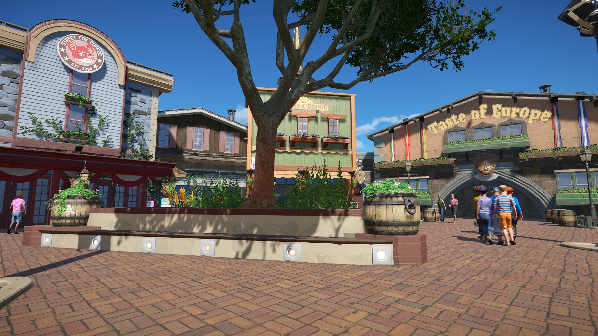
Here is how the space looks in the daytime.
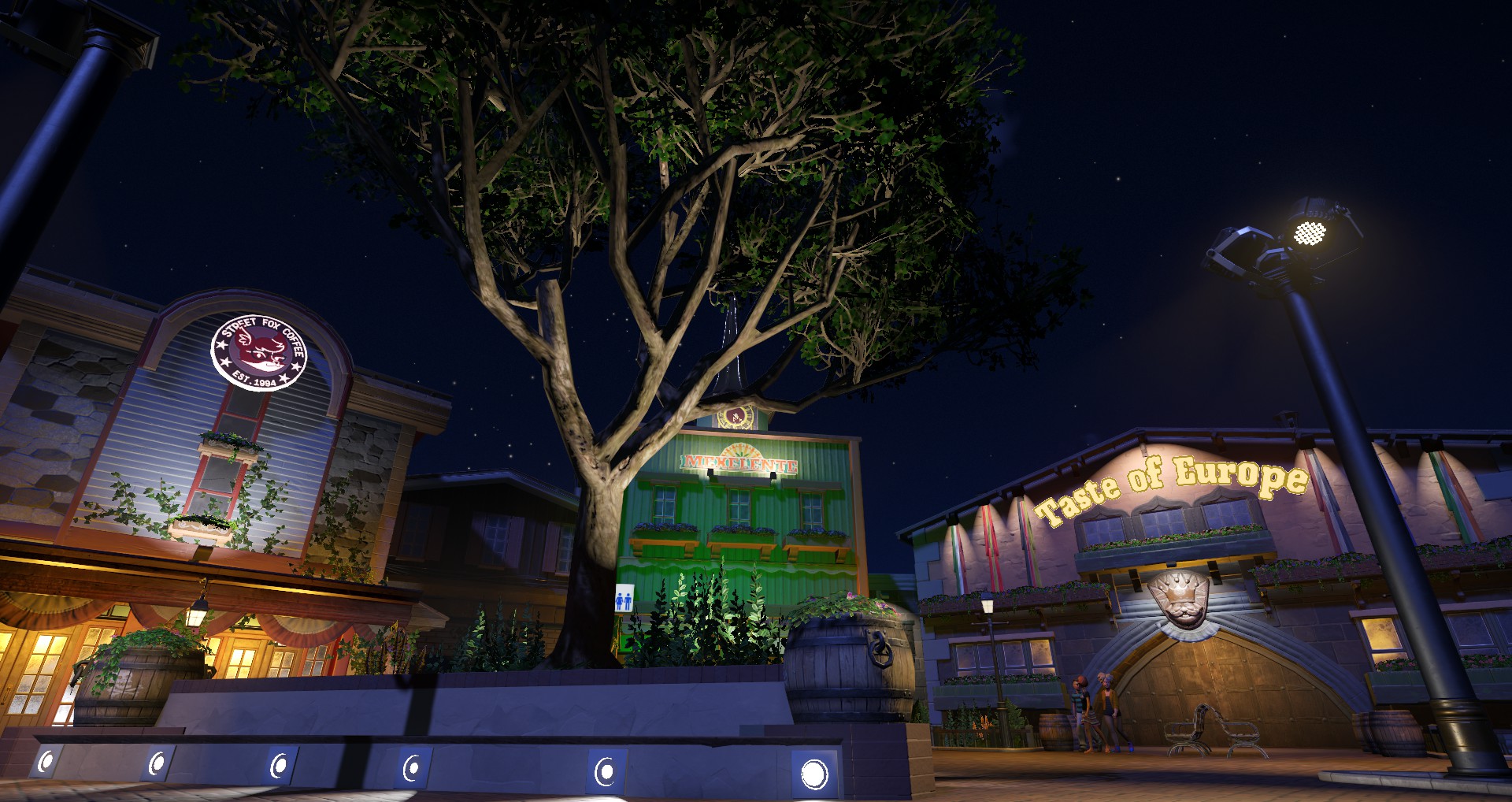
And here it is at night. Notice the areas your eye goes at night are the same areas that your eye wants to go during the daytime.
------------------------------------------------------------------------------------------------------------------------
Facades


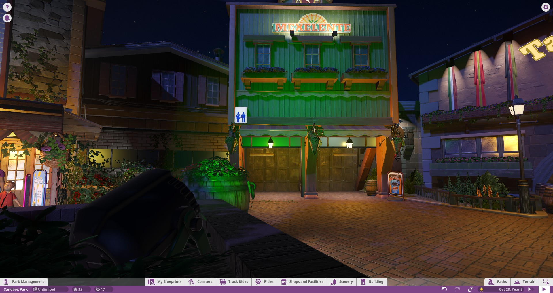
Here I have illuminated the entire face with a single arm light. It hasn't been aimed and it is disguised from the pathway by being mounted right above the awning. The wide beam angle creates a wash up the face that brings out various textures and creates some nice shadows. It emphasizes the wall extrusion as well as the windows. The sign at the top is self illuminated so adding additional light to it is unecessary. This is how I have chosen to accentuate the architecture. There are other solutions but this one highlights what I find to be important.
There is an opportunity to light the flanking wall space, but reiterating that you shouldn't light everything, if they were illuminated it would likely draw away from the extruded space with its windows and the signage at the top. There is also nothing on this space really worth lighting. It is just wall mass. If I decided to add another layer of light I would probably put some string lights along the top. This would emphasize the top of the structure and give it a proper border.

Moving right, I found this intermediate facade to be unimportant. There is no information of importance that needs to be gathered from this facade. There is no signage, no wayfinding keys, and no interesting architectural features. I have left it dark to give contrast between the two facades which neighbor it.

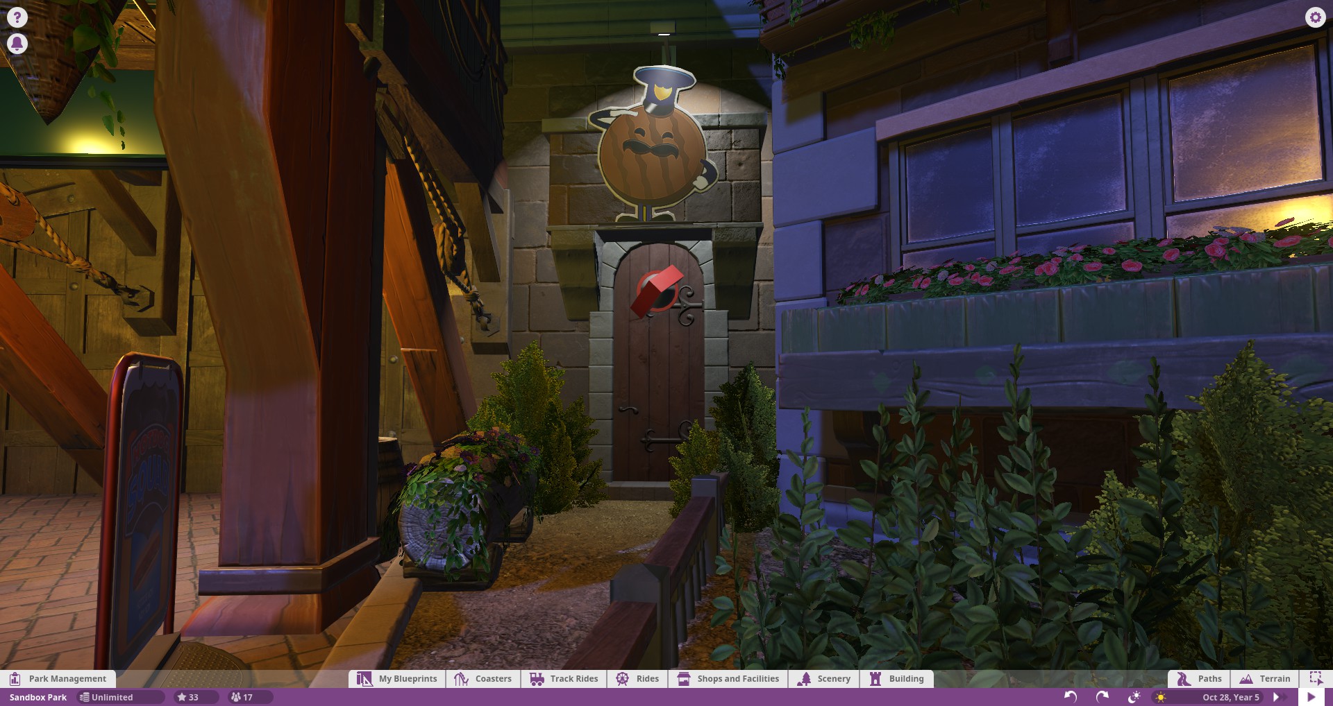
On the side of the shop which was just discussed, I did however decide there was something here worth highlighting. The ivy is an interesting feature that would feel strange if totally darked. Illuminating this wall gives depth to the building and makes it more than just a 2d facade. Additionally, I have imagined that some sort of electrical box and equipment may lay here. These would likely need to be illuminated in case they needed to be reached. This effect was done with a simple boxlight buried here.
Something I wish I would have done was bury some sort of light beneath all the ivy to make this planter glow at night.

Moving right further, this signage was a must for illumination. Being different than the self illuminated sign previously, I had to mount some type of fixture here. I tried working with the arm light, but found that the wide beam spread and excessive brightness made for an unrealistic look. I moved to the basic uplight and found its tighter beam worked better. In order to combat the light which actually doesn't go up.. I rotated it up towards the sign to manipulate where the light was going. I also pushed the source as close to the wall as I could prevent too much light from leaking up the wall.
To harp again on previous points.. "what is the purpose of this light?" To which I answered, to light up the sign. Since my intent was not to light the wall, I have kept the beam very close to the wall and made sure that I am lighting the sign, and as little else as I can. I have also tried to hide the fixtures as much as I can. They are ugly and especially in the daytime they will look ugly when they aren't doing anything.

At the top of this facade I have put a clock tower type.. thing. I asked myself the same question, "what is the purpose of this light?" To me, seeing the time on a clock seems like something that is very important. As such, I have decided to place a light here that maximizes the ability to see the clock.
Now, looking back at my solution, I would have to say, the uplight maybe produces results that don't work great at that. A simple boxlight could easily be hidden up here to produce a much stronger spot onto the clock. But, if you look at the facade as a whole, you also have to ask yourself, "is the clock more important or is telling guests whats in the building more important?" Now I have told myself that the signage is much more critical than the clock. As such, I have opted to go against this initial solution and choose the softer uplight that does not distract as much from the main facade. This is, again, ok. Remember, you can't light everything. Creating contrast is essential to producing effective lighting.
Now simply lighting the signage is not nearly enough, the rest of the facade needed lighting as well. So I looked at other wall mounted fixtures and things, but they all just added clutter to the facade. There is nowhere else on the facade that a fixture can realistically be disguised. More fixtures on this wall would just look ugly. So I looked to nearby areas for help.
Luckily, I had placed a planter adjacent to the buildings that see all of these facades. It is raised slightly and a great way to hide potentially dozens of fixtures. I decided ultimately to place a colored event light here and point it towards the facade. I highly suggest that you give yourself as many free areas available as possible to hide fixtures in. You'll find it very very difficult to get enough light on your pathways and buildings as you widen your pathways more and more.

Here you can see where I've strategically hidden plenty of fixtures in a planter where they will never adversely affect what I already have in place.
**Short Color Discussion**
Now.. my next consideration here was color. A bright white light would totally wash out the facade and ruin the contrast I wanted to create with the signage lighting. My solution was to create a colored light. So here's where the colored light becomes invaluable. With the full color palette that is present in PC you get total control over brightness. You see, when you move towards black you are essentially changing what I will call 'relative power'. That is, within the same shade of a color you can make it appear darker or brighter simply by moving the slider towards or away black. Be careful to avoid full white colors if you can help it. I've discussed this in my RCT3 study a bit more fully. Pure white colors are unnatural and what we perceive as 'real white' is just an illusion presented by our shiny computer screens.")

The top layer of colors are the brightest in a given hue, as you move up and down, you are essentially making that light less bright, and the hue will remain exactly the same. Saturation can be independently manipulated too to produce even more results. This is great for tweaking light levels when you have many fixtures present.

Illustrated another way here. Total black, at the bottom, produces no light. As you increase brightness, you have a much wider range of color values available to you. What I did with this facade was manipulate this brightness level until I got something that looked appropriate in the overall setting.
Moving over a bit more, I have envisioned that some sort of employee entrance would exist at some point along this facade. It would not be unbroken. SO, how do you illuminate these entrances without directly making them a point of interest? Well.. ask yourself what the purpose of the light is. Here, the answer is simply to put some light on the ground so employees don't hurt themselves getting in and out.
In these instances, a very small light that doesn't leak over into other areas, is probably the most desirable. So my answer was to put a small little wall mounted thing here and bring it as close as I could to hide it while still keeping the door and immediate ground in front lit up. Usually, there isn't any need to aiming these little lights as you'll find the beam spread to work pretty well for this type of general illumination.

You can see here how much of a difference the beam angle makes. To achieve the top affect, I have simply angled the boxlight into the wall. This causes the beam to tighten up a bit. In the case of this facade, I found it overwhelming to have all of the beams overlapping. To accentuate the flags, the tighter beam works. I simply asked myself, "what is the purpose of this light?" My answer was to highlight the flags, so my choice was to find the best light to highlight the length of the flags.
You will notice that when I angled the beams inward, some of the wall texture and shadowing created by the rockwork on the wall is removed. This is an important thing to note and may not be what you want. It is of course up to you which type of solution you prefer, but don't forget to compare.


A bit more obvious of a comparison here. Again, trying to hammer home the idea of intent. If you were to choose the bottom solution you would no doubt have guests wandering around wondering "of? what is so important about of? is this a cafeteria for of? What do they do here?" It would make far more sense to try and illuminate the entirety of the lettering, since that is, after all the intent of why you shined a light there, right?
------------------------------------------------------------------------------------------------------
Landscaping
I'm going to start a small section on landscaping here and will hopefully expand it in the future. For the purposes of this small main street space I've not included much landscaping.
Illuminating nature in your theme parks is one of the most powerful ways you have to enhance the nighttime perception of a space. There is obviously landscaping present and visible in the daytime so why should you ignore it at night?


Perhaps the easiest and most dramatic measure for landscape lighting is to uplight trees. It is not only simple and easy, but remarkably effective. Nearly every single experience you will have with a themed environment in your lifetime will have a floodlight illuminating a tree. Without fail, designers absolutely adore using this technique because any idiot can point a light at a tree and the results are almost always positive.

All I've done here is hide a floodlight in a planter and aimed it up at the tree to try and illuminate as much of it as possible from as many angles as I can. The real benefit here is that any spill light that's not hitting the trees just goes into the sky and doesn't hit anything else. (In real life this creates about a billion code problems but who cares, it's a game.)
-------------------------------------------------------------------------------------------------------
Pathways
So when you start to look at providing illumination for pathways the narrative changes entirely. No longer are you trying to create artistic effects and such. You're putting sufficient light to see people and where they're going. You can advantageously manipulate overall light levels on pathways at entrances to guide people towards things, but this is really secondary to the prime directive of making sure people can see where they're going.
This is where my education divulges. The field of design is typically separate from the field of illuminating engineering. Illumination engineering is concerned with getting enough light on a surface and making sure its uniform. It is highly driven by codes and there's really no art there whatsoever. It's very boring and involves hundreds of calculations and charts that take forever and are the bane of my college existence. Now thankfully none of that stuff matters in PC, but the ideas are certainly important to be aware of.
1. Uniform light is key. If you were walking down the street at night you wouldn't want a single super bright light on a mile long stretch of road. This would create tons of complications not the least of which is glare. Your eyes would constantly be adapting and your pupils dilating and expanding and it'd be a disaster.
You would ideally have a million low powered fixtures creating perfectly uniform light, but that's not the case so you find the happy medium that costs the least to get the job done. To be clear, uniformity means that if you move one foot to the right or left of some location, the light you are seeing is pretty much identical. There are all sorts of metrics and limits to what can really be perceived, but for the purposes of Planet Coaster, uniformity means that everywhere on a pathway has basically the same amount and quality of light. In other words, as you build down a pathway, nothing should change and people should look identically lit no matter where they are on that path.
2. You are constantly in a battle of raising your fixture height and changing brightness. Basically, to create really good uniform light, you'd want something like the sun, that is, very high in the sky and far away to create very diffuse light that doesn't really shadow much. Low angled lights create really bad shadows on objects, but they also tend to be able to be placed much closer to the object so they don't need to be as bright. A 5 foot pole can be half as bright as a 10 foot pole, but the quality of light will also be half as good. You want your light to be pointing vertically down if you can help it, but not have to be so far away that you need it to be excessively bright.
3. The more overlap you have, the less shadows you have. The takeaway here may be more intuitive than people realize. The more light you shine on an object from different angles, the less you will see shadows or the object in darkness. One point source can only illuminate one side of an object. Add one to the other side and you illuminate both sides. Add 10 sources and you've effectively eliminated any shadows.
When you overlap the effects of lighting, you are increasing the chances that something at a given point is being illuminated by more than one point source. Ideally, there are no scenarios where a moving object is ever captured by just one beam of light.
5. Wayfinding - As important as it is to see in front of your face, there are also scenarios where seeing yourself is pretty useless. For example, if you are alone walking through a garden, you don't really need to see anything else but the garden. So the solution most used in these cases is lower height lighting to simply illuminate the ground. You see this everywhere. I'm sure if you went outside your house or took a walk down the street you'd probably see half a dozen houses that have little path lamps leading up to their house. This essentially amounts to wayfinding. Being able to see the ground so you don't trip on things.
5. Global Illumination - Yikes, let's just leave this one out of the discussion for now. ;D All you need to know is that global illumination affects the default lighting that strikes surfaces based on how obstruted areas are by other things. It helps to iron out problems with lighting engines since they are not doing full ray trace calculations. This is more important in the daytime when you have a very intense source, but nonetheless, it's important to be aware of this setting, especially when playing on higher graphical settings. I'd love to discuss this topic more if people are interested, but since it obviously doesn' t exist in the real world, it's merely a curiosity confined to the PC world. (Planet Coaster or personal computer I suppose, haha.)
Now when you look into Planet Coaster, they essentially give you a couple options for this type of lighting. And they both suck.
You get a few low powered lights that have a bit of variation on their color temperature or whatever to these, but if you have a pathway that's more than maybe 10 feet wide, they don't give you nearly enough light.
That's where these come into play. You will unfortunately have to use these if you want to have sufficient pathway light. Problem is, they don't have any sort of discernable theme and are very large. You have to hide them.
Now what I have come up with is basically a pole with fixtures 'mounted' to them. It's just an iron pole with as many event lights as I need. They are a bit bulky so I'd recommend thinking where you might need them when planning for your facades. If you make your pathways very wide and bare, these lights will stick out like a sore thumb, and look back at consideration 2. Your lights shouldn't be the emphasis. It could very well look ugly if it is not your intent to have them visible. Little dark corners and planters are great places to disguise these types of larger fixtures in a park. Rhythmic patterns along streets work ok but you may not want this in your park. It's good to get a feel for how many of these you'll need before you go crazy with layouts.
Now to go back to my previous point on how crap the standard lamps are. Here you see a typical person on my pathway. Half of their body is in the dark, even though they are directly facing a lamp. They are not nearly visible enough.

Adding in a pole of event lights helps to diffuse this low visibility.

Here is an overhead comparison of how the light levels differ with just a handful of event lights turned on. The above picture they are 'blacked' out, as in the color they are is set to black. This effect translates to higher visibility and less ugly shadows and unphotographable peeps. RCT3 had serious problems with this type of thing since it could only handle so much light in a given spot but with PC the doors are wide open to exploring this type of stuff.
I won't delve too much into the aiming of the fixtures, this is largely at the discretion of the individual, but you will likely find yourself re-aiming things as more peeps pour in. It is best to do these aimings with a full pathway of peeps.


Here you see another example of how this lighting plays out. The shadows reduce with added sources. The typical pathway sources that the game gives you are added alongside the event lights. The path lamps can give an interesting lighting effect for very close by objects that draws focus to entrances, but it is important to augment this with lights that create visibility. If there weren't any people you would see almost no difference in the lighting effects on the ground plane.
The last little thing I wanna touch on is accent lighting for pathways. Often times to indicate where you're going it's easier to just put light directly onto the pavement. It is very efficient considering how close the source is to the path and can look really pretty if used to create rhythm. There's a billion different ways to do things like this. You've no doubt seen bollards and low path lights to light the way.


Here's a handful of installations that do this to varying artistic degrees. All equally valid approaches to the same design.

Now what I have initially explored is just recessing the boxlights into wall surfaces. If you recess them just right you can even get the effect of optics and glare control. (Real light sources aren't just a flat piece of white luminescent material, they have reflectors etc.. Optics are one of the biggest problems in real light sources and for now, Planet Coaster has basically decided to ignore the problem entirely and make everything point sources.) The goal here is to create a rhythmic lighting pattern that is both interesting and functional. A quick Google of pathway lighting will return hundreds of creative design solutions and there is some real opportunities in the future with PC if they choose to expand their lighing capabilities.
--------------------------------------------------------------------------------------------------------------------
That is all I have for now. I plan on expanding the scope of this thread in the future to include things like floodlighting for supports and coaster structures, lighting ride structures, station lighting, landscape lighting, and others.
I'm barely scratching the surface here, but I'm hoping to do my due dilligence here to spread my knowledge of lighting to the forums. Lighting is one of those weird things that you don't notice until you notice.. but then you notice it all the time. Especially bad lighting. It's inherent purpose isn't really to celerate itself but to celebrate the work of others so it often gets swept under the rug but I hope I can change that.
Apologies on having such a formal presentation approach as well.. I suppose endless college reports have conditioned me into intensely organizing and justifying every little meaningless thing.
Thanks for reading, all. If you have any questions or really anything at all you wish to contact me about please do! I will try and make myself available if I can.
------------------------
So a little while ago I started looking at how lighting behaves in RCT3 and how to deal with some of the shortcomings presented in that system. I also outlined some of the basic qualities of archtiectural lighting and how they pertain to a typical building installation. That thread is here for those who care to browse the terminology.
http://www.shyguysworld.com/index.php/topic,18667.msg425672.html#msg425672
I won't be restating this narrative so if you have questions regarding anything on these topics you can reference them here. I will try and be as generic and inclusive as possible so that you won't have to, but there will be circumstances where you might want to backtrack. The general gist of the thread there was that RCT3 has a garbage lighting engine and you have to trick it to do anything. With Planet Coaster lots of opportunities have opened up and I intend to explore them and this new tool we've been given.
--------------------------------------------------------------------------------------------------------------
As you all may or may not know, I study architectural engineering at college, and in particular am within the lighting/electrical focus. This means that I essentially study everything about buildings and architecture and how things get built, but focus heavily on how to light them up. I'm also studying theatrical lighting as well so I have a bit of that area to fold in as well. This obviously transfers to RCT and PC and I kind of obsess over lighting. I find it to be equally, if not in some cases, more important than the architecture itself. Lighting can make or break a space. Good lighting can make an average building look amazing and bad lighting can make the Vatican look like a broom closet.
--------------------------------------------------------------------------------------------------------------
Sources
I'll start by getting into the different light sources the game gives you and where they are useful. This list will hopefully grow over time as I start to analyze different things.
Boxlight - This light is very useful for small accentuation purposes. It can create very tight beams of light with an easily disguisable fixture that can be mounted within walls, beams, ceilings, etc. If you are struggling at getting something to feel important and want to add a little extra pop, these little lights work great. They have the downside of not being recolorable, which can create conflict when paired with other sources.
Arm Mount - This light creates a very wide beam spread that can be manipulated easily with rotation. This fixture is great for lighting vertical surfaces and has the benefit of actually resembling a real wall mountable fixture. This light has incredible versatility and you can tweak it to do lots of great things. It puts out a lot of light for its size and puts it all in the same direction for great application efficiency. They put out a lot of light for the9r size and put it all on the same general plane which makes them great for facades.
Uplight - I hate how the game names this thing because it really sucks as an uplight. It mounts at a really strange angle and a lot of the light isn't even going up, it actually goes down when you mount it on a wall. This light does a good job at washes surfaces with just general light. It creates a spot near the source and the rest of the light just goes everywhere. This is awesome when you just want to light something easily but it sucks at creating any real sort of focused beam.
Colored Event Light - This is the workhorse of lights in the game. It produces far more light than any of the other little dinky fixtures they give you anywhere else. For this reason, it is essentially the only light that is functional on larger areas. They have the downside of being rather bulky and require some extra planning to make sure they stay hidden.
They also work great as floodlights, producing overall light on facades, trees, and other important architectural elements. As you start doing lighting you'll find yourself using these everywhere. They also have the benefit of being colorable which makes them infinitely more versatile.
Path Lamps - These are for general decorative purposes on pathways. They theoretically would be all you would need to light up a pathway, but they are terrible at this and really just add some color and a point of luminous interest. Your goal should be to trick guests into thinking these are what's actually lighting the pathways, as that's typically how it works in the real world.
They enhance theme and provide a very familiar light source. Use these frequently along paths regardless of how much light they put out. They are great at filling in decorative details and people generally expect them. If your path feels empty, try adding a few more of these. Be careful to choose lamps that fit your theme.
Hanging/Mounted Lamps - These are basically the same things as the pathway lamps only they are mounted on or near a building. You can attach these to custom poles if you wish, or se them as wayfinding pieces on building facades. They again don't provide much light. They again don't provide much light but are good decorative cues for guests that fill in details that they generally expect.
As I go forward I will try and make note of which of these fixtures I am primarily using to achieve the effect.
-----------------------------------------------------------------------------------------------------------------------
The Lesson
So to begin, there will be a few things that I will harp on frequently as I go. I will start by emphasizing them here for easy reference.
1. Layers, layers, layers. The basis of lighting design is that you are adding many many layers of light to your buildings to create a collective effect.
You should not be lighting a whole facade with one floodlight. You use the floodlight to wash the whole facade, then you emphasize your column lines with uplights, then you emphasize a sign with a wall mounted fixture, then you add some stringlights along the cornices and windows to make them pop out. This process can go on forever and it's an iterative process of going over and over things till it's right.
A note of warning when doing your lighting, more layers = more money. Every. Single. Time. The more light fixtures you are placing the more money it will cost realistically. In the real world there's obviously tricycle level fixtures vs. Ferrari, but you don't get that choice in PC. If you want a park to look cheap, use less layers and less fixtures. Places like Disney spend millions on lighting and have 4 or 5 layers of light on one facade. A dinky fairground would probably just install some general floodlights and call it a day.
2. Emphasize the EFFECTS of light, not the fixtures. The goal of lighting is to emphasize the pre-existing architecture and space. In rare cases, the actual fixture is meant to be the centerpiece, but generally speaking, you are simply adding lights that fit an already present architectural style or theme. They are there to highlight your buildings, signage, etc. Visible fixtures often make a space feel very cluttered.
When fixtures must be visible, say for lights mounted on lampposts and things of that nature, they should try their best to mimic the architecture and theme that is already in place. Look at Disney, Frontierland poles look very different than the ones outside Space Mountain. This should be obvious, but it sometimes gets overlooked.
In cases of facade lighting and general illumination purposes where artistic looking things aren't important, the best thing is to have your light source be as invisible as possible. Floodlights should be out of sight lines, wall mounted fixtures should be as tiny as possible. The only reason to have a light source be visible is if it somehow contributes to the overall scene. Which brings me to my next point..
3. PURPOSE. Each light you add should be doing something. If you shine a spotlight at a random wall that has nothing on it you should be asking yourself, "why do I need light there?" If you cannot justify it, then remove the light. Things like signage and pathways and facades are very important to illuminate, as they contribute to the purpose of the park and give valuable information about what is there. Lighting up some random plant in the corner has questionable merit.. In the real world, there is limited money and you can't light everything. Which brings me to my final point..
4. It's ok not to light certain areas. Infact, it's recommended. A pitfall I often see with nighttime parks is that there's a tendency to light EVERYTHING up super bright. Don't do this. You wouldn't load up your facade with 600 windows or columns, so why are you loading it up with tons of light? Light is a tool to accentuate and heighten the experience. It is meant to be nuanced and modest. Areas of contrast are usually very desirable and only make your lighting look better. A few windows on a building create a much more telling building than a thousand, and the same goes for lighting. Be selective and critical, just as you would for a building.
*Other minor caveats are certainly present and worth considering but these are the big ones and the basis of all lighting design.
-----------------------------------------------------------------------------------------------------
The Installation
So now it's time to move into how these things play out in a typical installation. I've built a small section of a mainstreet with pathways and landscaping. I'll begin with the facades and move downwards onto the pathways. This was how I moved forward when I built this so it seems only logical to explain it in this fashion.
Here is how the space looks in the daytime.
And here it is at night. Notice the areas your eye goes at night are the same areas that your eye wants to go during the daytime.
------------------------------------------------------------------------------------------------------------------------
Facades
Here I have illuminated the entire face with a single arm light. It hasn't been aimed and it is disguised from the pathway by being mounted right above the awning. The wide beam angle creates a wash up the face that brings out various textures and creates some nice shadows. It emphasizes the wall extrusion as well as the windows. The sign at the top is self illuminated so adding additional light to it is unecessary. This is how I have chosen to accentuate the architecture. There are other solutions but this one highlights what I find to be important.
There is an opportunity to light the flanking wall space, but reiterating that you shouldn't light everything, if they were illuminated it would likely draw away from the extruded space with its windows and the signage at the top. There is also nothing on this space really worth lighting. It is just wall mass. If I decided to add another layer of light I would probably put some string lights along the top. This would emphasize the top of the structure and give it a proper border.
Moving right, I found this intermediate facade to be unimportant. There is no information of importance that needs to be gathered from this facade. There is no signage, no wayfinding keys, and no interesting architectural features. I have left it dark to give contrast between the two facades which neighbor it.
On the side of the shop which was just discussed, I did however decide there was something here worth highlighting. The ivy is an interesting feature that would feel strange if totally darked. Illuminating this wall gives depth to the building and makes it more than just a 2d facade. Additionally, I have imagined that some sort of electrical box and equipment may lay here. These would likely need to be illuminated in case they needed to be reached. This effect was done with a simple boxlight buried here.
Something I wish I would have done was bury some sort of light beneath all the ivy to make this planter glow at night.
Moving right further, this signage was a must for illumination. Being different than the self illuminated sign previously, I had to mount some type of fixture here. I tried working with the arm light, but found that the wide beam spread and excessive brightness made for an unrealistic look. I moved to the basic uplight and found its tighter beam worked better. In order to combat the light which actually doesn't go up.. I rotated it up towards the sign to manipulate where the light was going. I also pushed the source as close to the wall as I could prevent too much light from leaking up the wall.
To harp again on previous points.. "what is the purpose of this light?" To which I answered, to light up the sign. Since my intent was not to light the wall, I have kept the beam very close to the wall and made sure that I am lighting the sign, and as little else as I can. I have also tried to hide the fixtures as much as I can. They are ugly and especially in the daytime they will look ugly when they aren't doing anything.
At the top of this facade I have put a clock tower type.. thing. I asked myself the same question, "what is the purpose of this light?" To me, seeing the time on a clock seems like something that is very important. As such, I have decided to place a light here that maximizes the ability to see the clock.
Now, looking back at my solution, I would have to say, the uplight maybe produces results that don't work great at that. A simple boxlight could easily be hidden up here to produce a much stronger spot onto the clock. But, if you look at the facade as a whole, you also have to ask yourself, "is the clock more important or is telling guests whats in the building more important?" Now I have told myself that the signage is much more critical than the clock. As such, I have opted to go against this initial solution and choose the softer uplight that does not distract as much from the main facade. This is, again, ok. Remember, you can't light everything. Creating contrast is essential to producing effective lighting.
Now simply lighting the signage is not nearly enough, the rest of the facade needed lighting as well. So I looked at other wall mounted fixtures and things, but they all just added clutter to the facade. There is nowhere else on the facade that a fixture can realistically be disguised. More fixtures on this wall would just look ugly. So I looked to nearby areas for help.
Luckily, I had placed a planter adjacent to the buildings that see all of these facades. It is raised slightly and a great way to hide potentially dozens of fixtures. I decided ultimately to place a colored event light here and point it towards the facade. I highly suggest that you give yourself as many free areas available as possible to hide fixtures in. You'll find it very very difficult to get enough light on your pathways and buildings as you widen your pathways more and more.
Here you can see where I've strategically hidden plenty of fixtures in a planter where they will never adversely affect what I already have in place.
**Short Color Discussion**
Now.. my next consideration here was color. A bright white light would totally wash out the facade and ruin the contrast I wanted to create with the signage lighting. My solution was to create a colored light. So here's where the colored light becomes invaluable. With the full color palette that is present in PC you get total control over brightness. You see, when you move towards black you are essentially changing what I will call 'relative power'. That is, within the same shade of a color you can make it appear darker or brighter simply by moving the slider towards or away black. Be careful to avoid full white colors if you can help it. I've discussed this in my RCT3 study a bit more fully. Pure white colors are unnatural and what we perceive as 'real white' is just an illusion presented by our shiny computer screens.
The top layer of colors are the brightest in a given hue, as you move up and down, you are essentially making that light less bright, and the hue will remain exactly the same. Saturation can be independently manipulated too to produce even more results. This is great for tweaking light levels when you have many fixtures present.
Illustrated another way here. Total black, at the bottom, produces no light. As you increase brightness, you have a much wider range of color values available to you. What I did with this facade was manipulate this brightness level until I got something that looked appropriate in the overall setting.
Moving over a bit more, I have envisioned that some sort of employee entrance would exist at some point along this facade. It would not be unbroken. SO, how do you illuminate these entrances without directly making them a point of interest? Well.. ask yourself what the purpose of the light is. Here, the answer is simply to put some light on the ground so employees don't hurt themselves getting in and out.
In these instances, a very small light that doesn't leak over into other areas, is probably the most desirable. So my answer was to put a small little wall mounted thing here and bring it as close as I could to hide it while still keeping the door and immediate ground in front lit up. Usually, there isn't any need to aiming these little lights as you'll find the beam spread to work pretty well for this type of general illumination.
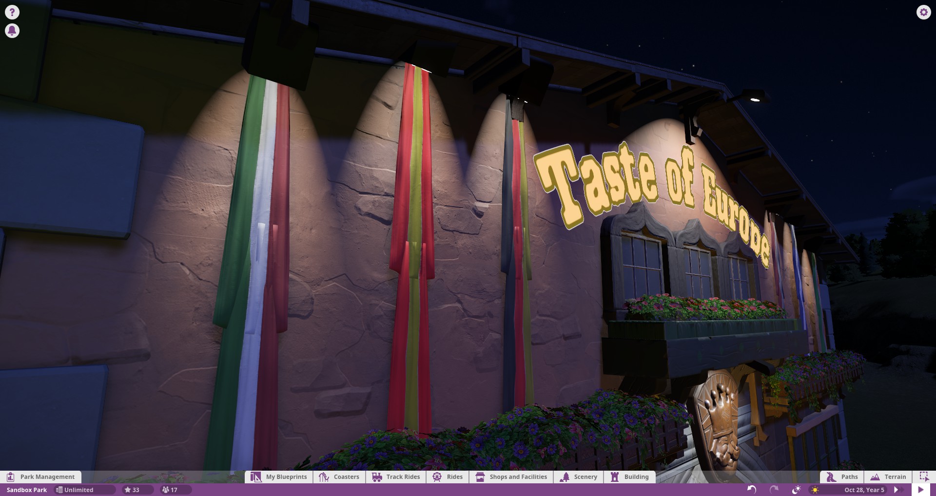
You can see here how much of a difference the beam angle makes. To achieve the top affect, I have simply angled the boxlight into the wall. This causes the beam to tighten up a bit. In the case of this facade, I found it overwhelming to have all of the beams overlapping. To accentuate the flags, the tighter beam works. I simply asked myself, "what is the purpose of this light?" My answer was to highlight the flags, so my choice was to find the best light to highlight the length of the flags.
You will notice that when I angled the beams inward, some of the wall texture and shadowing created by the rockwork on the wall is removed. This is an important thing to note and may not be what you want. It is of course up to you which type of solution you prefer, but don't forget to compare.
A bit more obvious of a comparison here. Again, trying to hammer home the idea of intent. If you were to choose the bottom solution you would no doubt have guests wandering around wondering "of? what is so important about of? is this a cafeteria for of? What do they do here?" It would make far more sense to try and illuminate the entirety of the lettering, since that is, after all the intent of why you shined a light there, right?
------------------------------------------------------------------------------------------------------
Landscaping
I'm going to start a small section on landscaping here and will hopefully expand it in the future. For the purposes of this small main street space I've not included much landscaping.
Illuminating nature in your theme parks is one of the most powerful ways you have to enhance the nighttime perception of a space. There is obviously landscaping present and visible in the daytime so why should you ignore it at night?
Perhaps the easiest and most dramatic measure for landscape lighting is to uplight trees. It is not only simple and easy, but remarkably effective. Nearly every single experience you will have with a themed environment in your lifetime will have a floodlight illuminating a tree. Without fail, designers absolutely adore using this technique because any idiot can point a light at a tree and the results are almost always positive.
All I've done here is hide a floodlight in a planter and aimed it up at the tree to try and illuminate as much of it as possible from as many angles as I can. The real benefit here is that any spill light that's not hitting the trees just goes into the sky and doesn't hit anything else. (In real life this creates about a billion code problems but who cares, it's a game.
)-------------------------------------------------------------------------------------------------------
Pathways
So when you start to look at providing illumination for pathways the narrative changes entirely. No longer are you trying to create artistic effects and such. You're putting sufficient light to see people and where they're going. You can advantageously manipulate overall light levels on pathways at entrances to guide people towards things, but this is really secondary to the prime directive of making sure people can see where they're going.
This is where my education divulges. The field of design is typically separate from the field of illuminating engineering. Illumination engineering is concerned with getting enough light on a surface and making sure its uniform. It is highly driven by codes and there's really no art there whatsoever. It's very boring and involves hundreds of calculations and charts that take forever and are the bane of my college existence. Now thankfully none of that stuff matters in PC, but the ideas are certainly important to be aware of.
1. Uniform light is key. If you were walking down the street at night you wouldn't want a single super bright light on a mile long stretch of road. This would create tons of complications not the least of which is glare. Your eyes would constantly be adapting and your pupils dilating and expanding and it'd be a disaster.
You would ideally have a million low powered fixtures creating perfectly uniform light, but that's not the case so you find the happy medium that costs the least to get the job done. To be clear, uniformity means that if you move one foot to the right or left of some location, the light you are seeing is pretty much identical. There are all sorts of metrics and limits to what can really be perceived, but for the purposes of Planet Coaster, uniformity means that everywhere on a pathway has basically the same amount and quality of light. In other words, as you build down a pathway, nothing should change and people should look identically lit no matter where they are on that path.
2. You are constantly in a battle of raising your fixture height and changing brightness. Basically, to create really good uniform light, you'd want something like the sun, that is, very high in the sky and far away to create very diffuse light that doesn't really shadow much. Low angled lights create really bad shadows on objects, but they also tend to be able to be placed much closer to the object so they don't need to be as bright. A 5 foot pole can be half as bright as a 10 foot pole, but the quality of light will also be half as good. You want your light to be pointing vertically down if you can help it, but not have to be so far away that you need it to be excessively bright.
3. The more overlap you have, the less shadows you have. The takeaway here may be more intuitive than people realize. The more light you shine on an object from different angles, the less you will see shadows or the object in darkness. One point source can only illuminate one side of an object. Add one to the other side and you illuminate both sides. Add 10 sources and you've effectively eliminated any shadows.
When you overlap the effects of lighting, you are increasing the chances that something at a given point is being illuminated by more than one point source. Ideally, there are no scenarios where a moving object is ever captured by just one beam of light.
5. Wayfinding - As important as it is to see in front of your face, there are also scenarios where seeing yourself is pretty useless. For example, if you are alone walking through a garden, you don't really need to see anything else but the garden. So the solution most used in these cases is lower height lighting to simply illuminate the ground. You see this everywhere. I'm sure if you went outside your house or took a walk down the street you'd probably see half a dozen houses that have little path lamps leading up to their house. This essentially amounts to wayfinding. Being able to see the ground so you don't trip on things.
5. Global Illumination - Yikes, let's just leave this one out of the discussion for now. ;D All you need to know is that global illumination affects the default lighting that strikes surfaces based on how obstruted areas are by other things. It helps to iron out problems with lighting engines since they are not doing full ray trace calculations. This is more important in the daytime when you have a very intense source, but nonetheless, it's important to be aware of this setting, especially when playing on higher graphical settings. I'd love to discuss this topic more if people are interested, but since it obviously doesn' t exist in the real world, it's merely a curiosity confined to the PC world. (Planet Coaster or personal computer I suppose, haha.)
Now when you look into Planet Coaster, they essentially give you a couple options for this type of lighting. And they both suck.
You get a few low powered lights that have a bit of variation on their color temperature or whatever to these, but if you have a pathway that's more than maybe 10 feet wide, they don't give you nearly enough light.
That's where these come into play. You will unfortunately have to use these if you want to have sufficient pathway light. Problem is, they don't have any sort of discernable theme and are very large. You have to hide them.
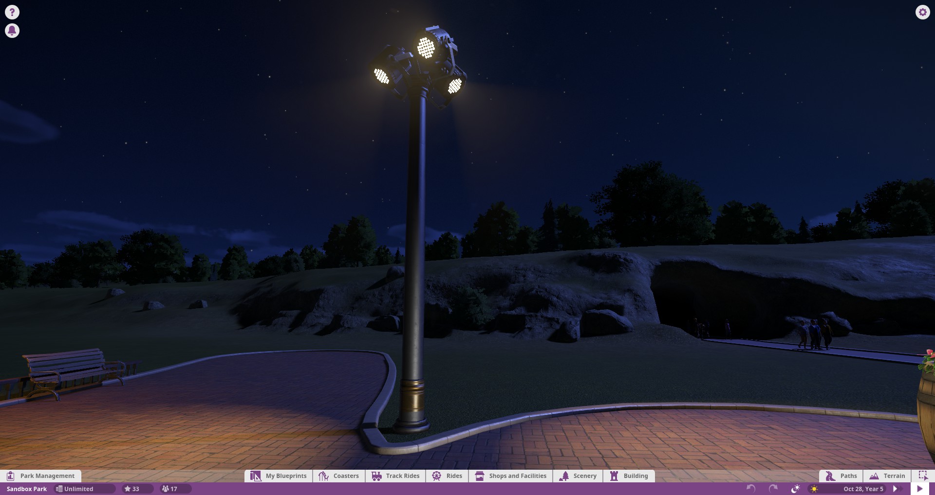
Now what I have come up with is basically a pole with fixtures 'mounted' to them. It's just an iron pole with as many event lights as I need. They are a bit bulky so I'd recommend thinking where you might need them when planning for your facades. If you make your pathways very wide and bare, these lights will stick out like a sore thumb, and look back at consideration 2. Your lights shouldn't be the emphasis. It could very well look ugly if it is not your intent to have them visible. Little dark corners and planters are great places to disguise these types of larger fixtures in a park. Rhythmic patterns along streets work ok but you may not want this in your park. It's good to get a feel for how many of these you'll need before you go crazy with layouts.
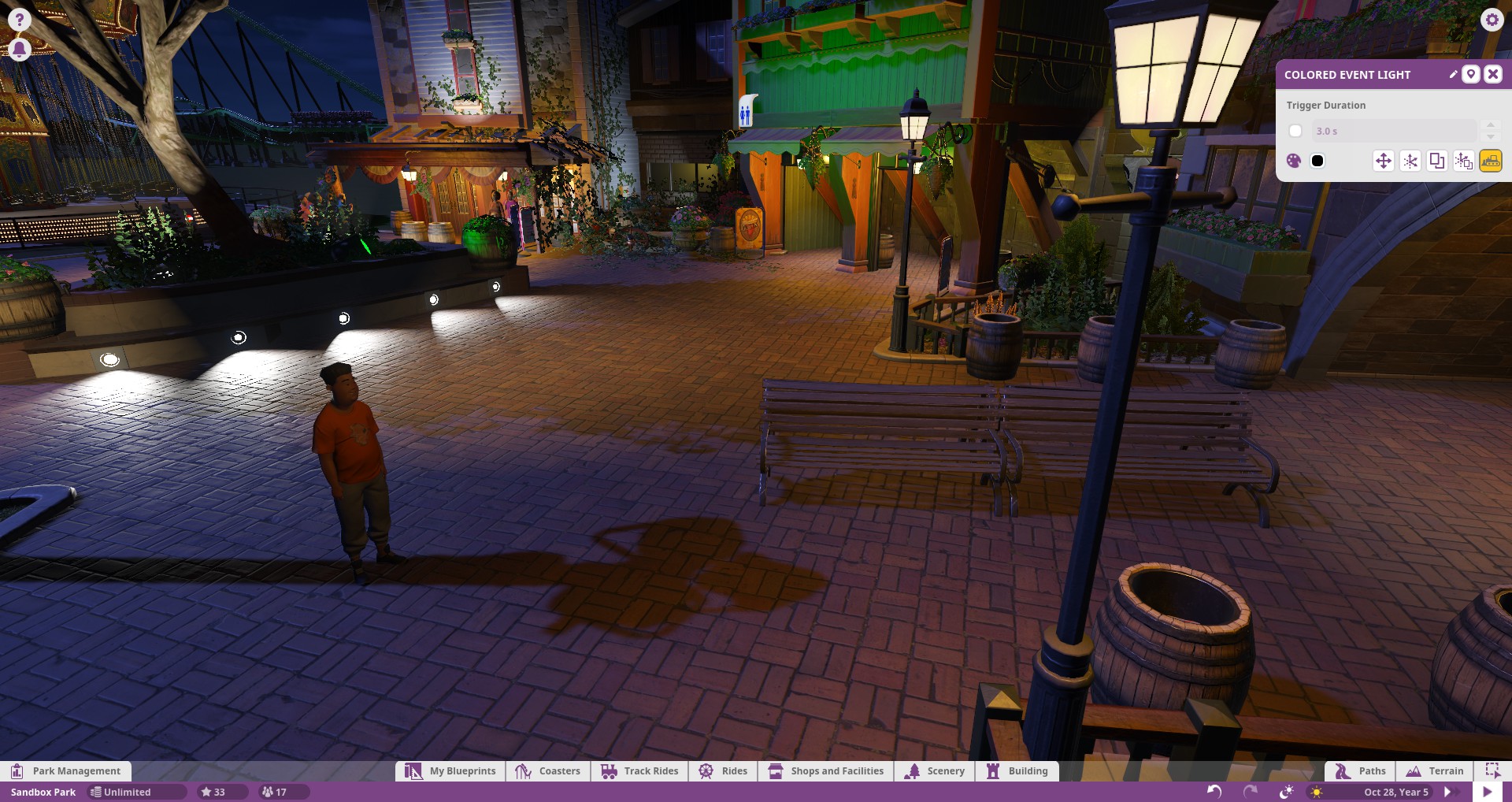
Now to go back to my previous point on how crap the standard lamps are. Here you see a typical person on my pathway. Half of their body is in the dark, even though they are directly facing a lamp. They are not nearly visible enough.
Adding in a pole of event lights helps to diffuse this low visibility.
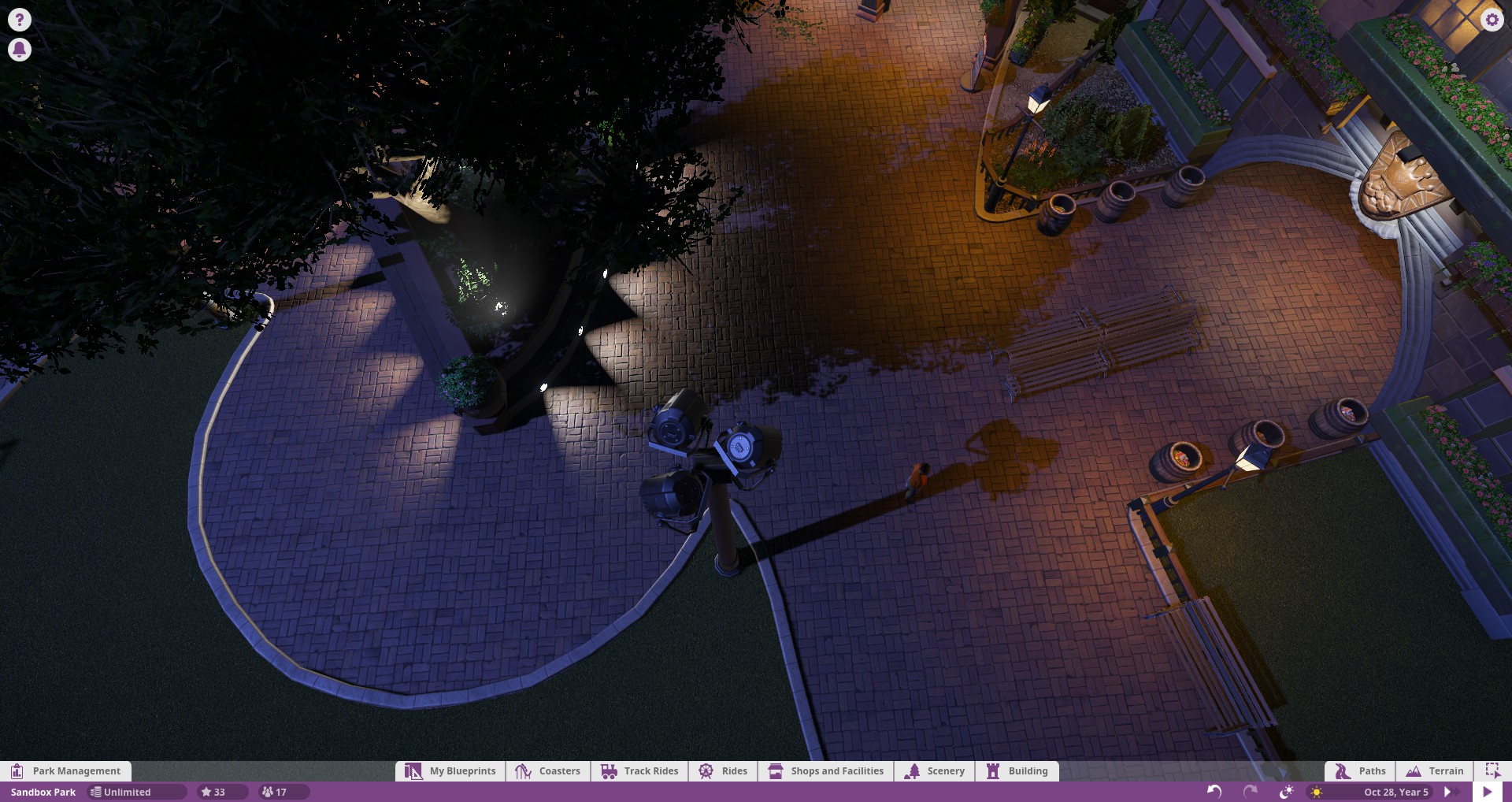
Here is an overhead comparison of how the light levels differ with just a handful of event lights turned on. The above picture they are 'blacked' out, as in the color they are is set to black. This effect translates to higher visibility and less ugly shadows and unphotographable peeps. RCT3 had serious problems with this type of thing since it could only handle so much light in a given spot but with PC the doors are wide open to exploring this type of stuff.
I won't delve too much into the aiming of the fixtures, this is largely at the discretion of the individual, but you will likely find yourself re-aiming things as more peeps pour in. It is best to do these aimings with a full pathway of peeps.
Here you see another example of how this lighting plays out. The shadows reduce with added sources. The typical pathway sources that the game gives you are added alongside the event lights. The path lamps can give an interesting lighting effect for very close by objects that draws focus to entrances, but it is important to augment this with lights that create visibility. If there weren't any people you would see almost no difference in the lighting effects on the ground plane.
The last little thing I wanna touch on is accent lighting for pathways. Often times to indicate where you're going it's easier to just put light directly onto the pavement. It is very efficient considering how close the source is to the path and can look really pretty if used to create rhythm. There's a billion different ways to do things like this. You've no doubt seen bollards and low path lights to light the way.
Here's a handful of installations that do this to varying artistic degrees. All equally valid approaches to the same design.
Now what I have initially explored is just recessing the boxlights into wall surfaces. If you recess them just right you can even get the effect of optics and glare control. (Real light sources aren't just a flat piece of white luminescent material, they have reflectors etc.. Optics are one of the biggest problems in real light sources and for now, Planet Coaster has basically decided to ignore the problem entirely and make everything point sources.) The goal here is to create a rhythmic lighting pattern that is both interesting and functional. A quick Google of pathway lighting will return hundreds of creative design solutions and there is some real opportunities in the future with PC if they choose to expand their lighing capabilities.
--------------------------------------------------------------------------------------------------------------------
That is all I have for now. I plan on expanding the scope of this thread in the future to include things like floodlighting for supports and coaster structures, lighting ride structures, station lighting, landscape lighting, and others.
I'm barely scratching the surface here, but I'm hoping to do my due dilligence here to spread my knowledge of lighting to the forums. Lighting is one of those weird things that you don't notice until you notice.. but then you notice it all the time. Especially bad lighting. It's inherent purpose isn't really to celerate itself but to celebrate the work of others so it often gets swept under the rug but I hope I can change that.
Apologies on having such a formal presentation approach as well.. I suppose endless college reports have conditioned me into intensely organizing and justifying every little meaningless thing.
Thanks for reading, all. If you have any questions or really anything at all you wish to contact me about please do! I will try and make myself available if I can.
Last edited: