[Suggestion] Additional HUD elements

In my humble opinion there is some pretty important information missing in the current HUD layouts which would improve the ability to do combat a lot, especially for those people who often switch off FA.

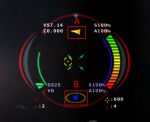
I'm talking about some way to quickly identify your travel direction vs your viewing angle (A) and the position of the locked target relative to your own position (B). To illustrate what I mean I have made a simple image based on a screenshot from Jumpgate, a game I used to play a lot some time ago.
JG HUD.png
The upper arrow (A) indicates that the ships nose is pointing about 90° to the right of the actual travel direction
The lower arrow (B) indicates that the ships nose is pointing slightly above but in the general direction of the locked target


Another thing you can see in the image is the values for the players and targets velocity, shield strength and armor each represented by simple numbers. I think having this info available at a glance also would prove quite helpful.

Is there anybody else who thinks that some more information in their HUDs could be useful?
 
I think most of us think there's room for improvement, but I'm not sure this precise idea would be helpful. It's far too much information, frankly, especially for the middle of the screen - and much of it's duplicated elsewhere in the UI. It looks cluttered and has too many numbers for my liking - after half an hour's bountying it would just be tiring. I also don't understand how having velocities (is that relative to target or something else?) would be more useful than the ETA indicator we have now. I do agree with a directional velocity indicator - but I would much prefer it to be added just above and to the right of the throttle indicator, mirroring the nav orientation thing on the other side. Looking at this and thinking about it, I can see why FD have chosen the route that they have. This idea has been enlightening and interesting, even if I don't agree with it - you have my thanks. :)
 
Yes, I agree, too much information and looks extremely cluttered. Reminiscent of a 1980's arcade game where a lot of information had to be crammed into a small, low res screen. Quite honestly, such a screen would drive me insane now since I want to see the much better graphics outside that we have these days, I don't want 90% of my view taken up by the UI.
 
Maybe you thought that would be nice to duplicate and compact info in the HUD that is present in other instruments, much like fighter jets do. The thing is that Elite doesn't offer such loads of information worthy of being duplicated in the HUD. The cockpit informations already are few, simple, clear and straightforward (i'm not taking in account if it lacks something or not), unlike a jet cockpit where a myriad of instruments are at your disposal and the HUD shows up the most important variables according each situation. Not that i deslike your idea but IMHO Elite doesn't require such HUD. That will only clutter cockpit view. If Elite had multiple views or an external first person view (without cockpit, like FreeSpace was) then it would be another story.
 
Last edited:
Some more info in the HUD would be very useful, though I agree with the other posters that the above is a bit TOO much. ;)

I'd like to see a directional indicator - you might think it's already in the scanner, but if you have a VR headset, head tracking or just use headlook, then you're constantly having to look back and forth between the scanner and looking up to see the ship itself. Considering the number of holographic displays and all the orbit lines etc. in the HUD, it's odd it doesn't already have this.

I'd also like to have a target speed indicator somewhere (maybe in the target pane, lower left if not in the HUD itself).
 
I think most of us think there's room for improvement, but I'm not sure this precise idea would be helpful. It's far too much information, frankly, especially for the middle of the screen - and much of it's duplicated elsewhere in the UI. It looks cluttered and has too many numbers for my liking - after half an hour's bountying it would just be tiring. I also don't understand how having velocities (is that relative to target or something else?) would be more useful than the ETA indicator we have now. I do agree with a directional velocity indicator - but I would much prefer it to be added just above and to the right of the throttle indicator, mirroring the nav orientation thing on the other side. Looking at this and thinking about it, I can see why FD have chosen the route that they have. This idea has been enlightening and interesting, even if I don't agree with it - you have my thanks. :)

Yes, I agree, too much information and looks extremely cluttered. Reminiscent of a 1980's arcade game where a lot of information had to be crammed into a small, low res screen. Quite honestly, such a screen would drive me insane now since I want to see the much better graphics outside that we have these days, I don't want 90% of my view taken up by the UI.

Maybe you thought that would be nice to duplicate and compact info in the HUD that is present in other instruments, much like fighter jets do. The thing is that Elite doesn't offer such loads of information worthy of being duplicated in the HUD. The cockpit informations already are few, simple, clear and straightforward (i'm not taking in account if it lacks something or not), unlike a jet cockpit where a myriad of instruments are at your disposal and the HUD shows up the most important variables according each situation. Not that i deslike your idea but IMHO Elite doesn't require such HUD. That will only clutter cockpit view. If Elite had multiple views or an external first person view (without cockpit, like FreeSpace was) then it would be another story.

Looks like I have totally failed to make my point here. I wasn't suggesting to change the current HUD in any way and the image above is actually just a small fragment from a much larger screenshot. I wanted to lay focus on the small arrows in the red frames (which I have added with a paint software as well as the letters A and B). I tried to explain what those little arrows do and that I think something similar could be a helpful addition for the hud in ED.

I'm sorry that my limited knowledge of the English language has prevented me from making myself more clear.

[...]I'd like to see a directional indicator - you might think it's already in the scanner, but if you have a VR headset, head tracking or just use headlook, then you're constantly having to look back and forth between the scanner and looking up to see the ship itself. Considering the number of holographic displays and all the orbit lines etc. in the HUD, it's odd it doesn't already have this.

That's more like what I mean! The scanner doesn't work so well for this imo. The dot on the dashboard would work for indicating a targets position but it's not used for that atm.

And I still would like to have an indicator of my movement direction when I'm turning my ship with Flight Assist off.

I'd also like to have a target speed indicator somewhere (maybe in the target pane, lower left if not in the HUD itself).

Would work for me, too.
 
Last edited:
Back
Top Bottom