A lot of space games are very dark, and this really grinds my gears.
Perhaps the worst example of this I can think of is the otherwise decent "Nexus: The Jupiter Incident".
It had dark and almost black metal with bright shiny highlights, and lots of dark and shiny space rocks all dimly lit against a black background with white dots. Good luck spotting a fighter or a missile which were often nothing more than white dots on the black background themselves.
The only real holding point in the game was the beam weapons shining brightly as a defining shape against a mess of white splodges moving erratically on a black background.
A game that is dark is naturally hard to see. This is bad for gameplay.
But it's also bad for aesthetics.
Let's look at how real space looks.

The space shuttle is brightly lit by sunlight, and the shadows are very bright due to earthshine. Almost nothing is black.

Even set against the sun, over the night side of the earth, there is definition and depth to the shading of the ISS.
But realism is boring, so what does popular culture views of space look like?

In Star Wars things aren't so unreal after all. Bright sunlight contrasts against deep, detailed shadows.
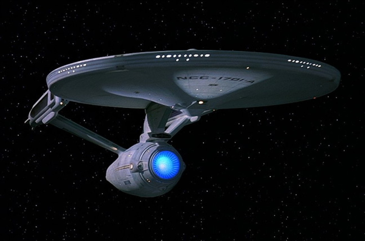
Star Trek is brighter, but follows a similar pattern, tho the sunlight is far more subdued at times.

The seminal 2001 A Space Odyssey that likely pioneered this look does the same thing. Despite floating in interplanetary space on its way to Jupiter, the Discovery has incredible depth to its dark side that allows it to contrast against the pitch black background.
How does Elite look now?

Dark, shiny, pure white on pure black, zero depth, dim. No meaningful silhouettes. Difficult to make out.
These asteroids have a slight backlight from the nearby planet, but are otherwise completely black and have little to no depth, and virtually no silhouette.

This concept art shares the problem, pure white highlights, pure black shadows, lack of silhouettes. Zero depth.
Does space have to be super bright to remedy this though? I know the game is gunning for a darker more "real" aesthetic. But I think that can be accomplished without sacrificing readability and definition.
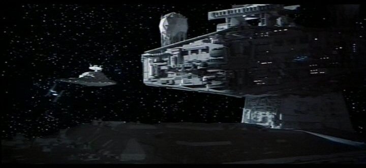
In The Empire Strikes Back, which is a lot darker than its cousins both in story and in look, the shadow of the mighty Executor blots out nearly all light leaving only a faint glow on the smaller star destroyer. This is enough to distinguish it from the background and has a very imposing and dramatic effect.
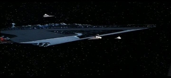
The Executor itself is cloaked in blackness too, a soft blue illumination and the lights on its darkest side is all it takes to define this massive shape.

The opening shot likewise has a dark and dramatic tone.
It's difficult for me to play a game when I can't see what I'm looking at. It's not only realistic to have deep shadows, it's also aesthetically in line with the best of the pop culture space icons. Having silhouettes and details in the ambient lighting is important to distinguish objects against a background, especially in space where many important depth cues are missing.
Using planetshine, global illumination (even faked) and a general ambient of starlight could do wonders for for the lighting situation. And it doesn't have to break with a darker direction for the visuals, it could even enhance it.
Perhaps the worst example of this I can think of is the otherwise decent "Nexus: The Jupiter Incident".
It had dark and almost black metal with bright shiny highlights, and lots of dark and shiny space rocks all dimly lit against a black background with white dots. Good luck spotting a fighter or a missile which were often nothing more than white dots on the black background themselves.
The only real holding point in the game was the beam weapons shining brightly as a defining shape against a mess of white splodges moving erratically on a black background.
A game that is dark is naturally hard to see. This is bad for gameplay.
But it's also bad for aesthetics.
Let's look at how real space looks.
The space shuttle is brightly lit by sunlight, and the shadows are very bright due to earthshine. Almost nothing is black.
Even set against the sun, over the night side of the earth, there is definition and depth to the shading of the ISS.
But realism is boring, so what does popular culture views of space look like?
In Star Wars things aren't so unreal after all. Bright sunlight contrasts against deep, detailed shadows.
Star Trek is brighter, but follows a similar pattern, tho the sunlight is far more subdued at times.
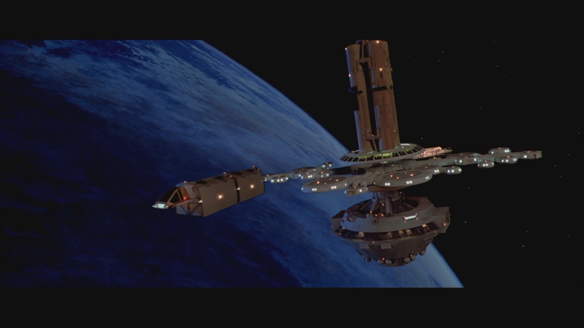
The seminal 2001 A Space Odyssey that likely pioneered this look does the same thing. Despite floating in interplanetary space on its way to Jupiter, the Discovery has incredible depth to its dark side that allows it to contrast against the pitch black background.
How does Elite look now?
Dark, shiny, pure white on pure black, zero depth, dim. No meaningful silhouettes. Difficult to make out.
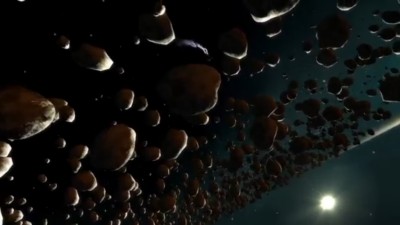
These asteroids have a slight backlight from the nearby planet, but are otherwise completely black and have little to no depth, and virtually no silhouette.
This concept art shares the problem, pure white highlights, pure black shadows, lack of silhouettes. Zero depth.
Does space have to be super bright to remedy this though? I know the game is gunning for a darker more "real" aesthetic. But I think that can be accomplished without sacrificing readability and definition.
In The Empire Strikes Back, which is a lot darker than its cousins both in story and in look, the shadow of the mighty Executor blots out nearly all light leaving only a faint glow on the smaller star destroyer. This is enough to distinguish it from the background and has a very imposing and dramatic effect.
The Executor itself is cloaked in blackness too, a soft blue illumination and the lights on its darkest side is all it takes to define this massive shape.
The opening shot likewise has a dark and dramatic tone.
It's difficult for me to play a game when I can't see what I'm looking at. It's not only realistic to have deep shadows, it's also aesthetically in line with the best of the pop culture space icons. Having silhouettes and details in the ambient lighting is important to distinguish objects against a background, especially in space where many important depth cues are missing.
Using planetshine, global illumination (even faked) and a general ambient of starlight could do wonders for for the lighting situation. And it doesn't have to break with a darker direction for the visuals, it could even enhance it.
Last edited:
")