Interview with Jon Pace...when?

The next Meet the Team interview is suppose to be with Jon Pace (Head of UI) and I'm just wondering how far off that might be?

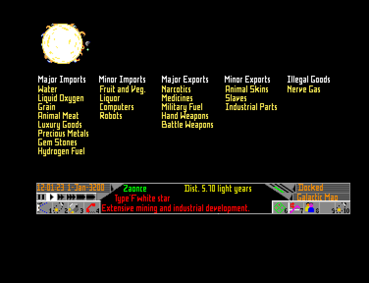
I'm quite keen on hearing more about this aspect of the game especially how the station UI is being approached now when soon more information will be put in. The current (placeholder?) UI isn't really giving us that much info about ship and equipment stats or much of the data that is written about when it comes to the trading proposal.

Is something like this still in the cards where you can get a bit more detailed info about the products and some nice graphs to show trade history and such?

NWBo3jyl.jpg


Also it would be nice to get some small description about each commodity. Right now it's sometimes a bit of guesswork when it comes to figuring out what some things are and what they are used for (and therefore who might want them).

I also think a lot of people would like to have a tighter integration between the station UI and the galaxy map. Right now you need to exit the station UI and activate the Galaxy map every time you want to check trade routes which is...less than ideal. ;)
 
There is something mesmerizing about that picture. I haven't had this tingling sensation since I played Zoids on the C-64. :)
 
Definitely needed, and also for ship upgrades. There are some things which people who are new to the game simply won't understand... K Warrant Scanner for example. The difference between shield upgrade types etc. Graphs showing how fitting X will affect jump distance etc.

Loads of additional information is needed.
 
I think we won't see these mockups...they clearly have gone in different direction. However, I would like to see how new version of this functionality looks like :)
 
I was kind of hoping that the docking stations would have an AI avatar that we could interface with.

A bit like Avina in Mass Effect:

Avina.JPG


FFE almost had it with graphic representations of the police etc:

First_encounters2_180.jpg
 
I think we won't see these mockups...they clearly have gone in different direction. However, I would like to see how new version of this functionality looks like :)

Well, it isn't the graphical layout as such I'm interested (it does look good though)...it's more about having access to more detailed information in different ways.
 
I'd like to see more in the way of information about weapons, commodities, ships, and so on.

I personally think that the X series of games is much worse than the Elite series in how it represents space, but what the did do right (at least in the games up to X3:TC) is give detailed descriptions of pretty much everything in the game.
 
Last edited:
Oddly enough I commented this on the 'peek of the week' thread. I feel the same way, esp when it comes to checking trade routes, and flipping back and forth.

Ab
 

Josh Atack

Former Frontier Employee
Frontier
Tinman Actually that concept is in large part a concept I produced, so it wasn't done by anyone with any knowledge of UI or UX ;)

I just based the original one with more panels on my love for complex UIs when I used to raid in mmos. Chris (gregory) then took it and made it into what is probably a more useable concept, the one above.

And as people have said before about the concept I was heavily influenced by the excellent visuals produced for the film oblivion.

Frontier is a large team and as such I had no contact with UI and so they went in a different direction, which probably makes a lot more sense from a UI/UX point of view.

I hope that clears that up.

Thanks for the insight! ;)

But as I said I'm more interested in the details in terms of information about trade/ships/missions/equipment. Right now we pretty much have lists of items with a name and price. Reading the design proposal about trading and the market seems to indicate far more information which we currently aren't seeing.

I realize that lots of this isn't done yet since the equipment and ships aren't balanced and other things are connected to galaxy info that also isn't done, but I'm still interested in seeing/hearing about how the UI devs are thinking and planning it out.

There have also been talks about how the outfitting menu is placeholder and how the final plan is to keep you more inside your ship somehow. Also something I'm interested in! :)

So go get Jon and drag him over here will you? :D:p
 
Well I agree that the mock up is streets a head when it comes to being visually interesting to the one we have now. I presume the current trading screen is placeholder because its rather basic - but it could certainly do with a bit of pizazz imo :)
 
I would definitely like more information on commodities. The trade route visualisation in the galaxy map is very pretty but of limited use to me (with a cargo capacity of 4 units and limited jump range), I still find myself using external trading tools.
What I'd like to see is something similar to this (n.b. I liberated this picture from elsewhere in this forum):
Frontier-EliteIIGametek1994Amiga_1.png
Or maybe the ability to drill-down into each commodity and see local importers and exporters, the galactic average price and perhaps historical prices for the current station.
I know that some trade routes are obvious based on different economies but I'd like to see where I can sell my Hel-Static Furnaces.
 
Definitely needed, and also for ship upgrades. There are some things which people who are new to the game simply won't understand... K Warrant Scanner for example. The difference between shield upgrade types etc. Graphs showing how fitting X will affect jump distance etc.

Loads of additional information is needed.

+1

Agree.
 
Well, it isn't the graphical layout as such I'm interested (it does look good though)...it's more about having access to more detailed information in different ways.

I completely agree. I'd love more detail than just a list, give us some background info, that in itself creates immersion.
 
Back
Top Bottom