Something about the design of the galaxy regions bothers me
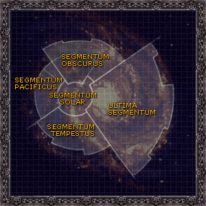
Regions:

It looks like it is graphic design that is aping the appearance of IAU constellation boundaries to fake sciencey authenticity much like "sympathetic-magic"
IAU boundaries:

There are no constellations to be divided on a galaxy map, so to put this largely-irrelevant little suspicion to bed, I'd like to find or figure out (or invent) an alternative reasoning why the regions look the way they do.
Clearly the new galaxy regions are following the spiral arms, which is cool and meaningful and useful.
Clearly using a circular grid like this is a defendable approach for mapping a circular galaxy.
But why are the divisions between regions drawn where they are? They don't seem to correspond to stellar mass, or volume, or equal divisions, or anything obvious.
Why are all the little subcuts the way they are? (Other than the suspected graphic-design reason I'm trying to get away from)
Can we come up with some good background or at least convincing handwavium for this? (I know that for most people there is zero need, but I've got a few weeks until I get my hands on this, so why not )
)
The region map does look cool - I'm not complaining - I just want to have my cake and eat it too!
Regions:
It looks like it is graphic design that is aping the appearance of IAU constellation boundaries to fake sciencey authenticity much like "sympathetic-magic"
IAU boundaries:
There are no constellations to be divided on a galaxy map, so to put this largely-irrelevant little suspicion to bed, I'd like to find or figure out (or invent) an alternative reasoning why the regions look the way they do.
Clearly the new galaxy regions are following the spiral arms, which is cool and meaningful and useful.
Clearly using a circular grid like this is a defendable approach for mapping a circular galaxy.
But why are the divisions between regions drawn where they are? They don't seem to correspond to stellar mass, or volume, or equal divisions, or anything obvious.
Why are all the little subcuts the way they are? (Other than the suspected graphic-design reason I'm trying to get away from)
Can we come up with some good background or at least convincing handwavium for this? (I know that for most people there is zero need, but I've got a few weeks until I get my hands on this, so why not
)The region map does look cool - I'm not complaining - I just want to have my cake and eat it too!
Last edited: