It fixes the immediate problem of not being able to read the HUD which I think is the main concern. Not sure why people don't elect to use 10/10 all the time tho, it's the easiest fix and hardly causes disruption (I was already using 10/10 pre 3.3 tho).
It's not a "fix" if it makes different HUD brightness settings redundant. It's a workaround at best, for lighting efefcts that should have never been implemented this way.
Doesn't matter where you are, Interface Brightness is fairly universally applied for levels above "barely on". Everyone complaining about not being able to read their HUD should post an accompanying screenshot for the IB setting so we know whether they're idiots or genuine.
It's not a "fix" if it makes different HUD brightness settings redundant. It's a workaround at best, for lighting efefcts that should have never been implemented this way.
If your HUD visibility increases when you change an ingame setting, then it's the definition of a fix. Interface Brightness is just another setting to help you tweak the brightness of the galaxy vs the HUD. But you can't really complain it's hard to read the HUD when the only setting you have available to improve readability is set for crap readability.
So after reading most of the thread, I've come to the conclusion that half of you live in your moms basement and haven't witnessed how light appears in quite some time. A quarter are moaning about the cockpit being influenced by surrounding light. The other quarter are moaning about the volumetric fog that is now all throughout the galaxy. The lighting system itself is more than fine. These other things are... personal... preferences. What a concept.
It's not easily fixable with reshade. Since the tinting depends on the star colour, you would need a preset for every single colour and intensity I guess, and that would never work.
Concerning this issue, the new lighting/colour grading works pretty much like a third party shading tool. It seems to apply a colour filter to the whole picture on the screen without distincting between close objects, light sources and far away obects.
Not only that, the tinting is dynamic, changing with the distance form the star, that's not something reshade can compensate.
It looks like there are at least two dynamic filters applied, one when very close to the star, that tints the color to that of the star, and one when far from the main star, that reduces the brightness of the galaxy background, which I'm not certain yet what it is trying to achieve, maybe helping to make the dark sites of the planets darker.
You can see that better when using the XML changes for the blue galaxy in GraphicsConfiguration.xml, since the standard galaxy is rather dark.
Tinting close to the main star (Y-type brown dwarf):
Intermediate distance to the same star:
Far from the main star:
The middle picture is the closest how it looked in 3.2
Psh, adjusting monitor / gamma settings is hard work man [haha]
Using my unadulterated monitor settings I could read the HUD fine in most screenshots of the complainers. Not sure what I'm doing different from them.
I mean, I would take a picture of my monitor rendering it, but they wouldn't be able to see the picture in theirs methinks... :x
Edit: I'm also not sure how people with the Interface Brightness setting set to 3/10 can complain with a straight face the HUD isn't visible enough, but what do I know.
If your HUD visibility increases when you change an ingame setting, then it's the definition of a fix. Interface Brightness is just another setting to help you tweak the brightness of the galaxy vs the HUD. But you can't really complain it's hard to read the HUD when the only setting you have available to improve readability is set for crap readability.
So after reading most of the thread, I've come to the conclusion that half of you live in your moms basement and haven't witnessed how light appears in quite some time. A quarter are moaning about the cockpit being influenced by surrounding light. The other quarter are moaning about the volumetric fog that is now all throughout the galaxy. The lighting system itself is more than fine. These other things are... personal... preferences. What a concept.
So your argument is that everyone is dumb and doesn't understand of lighting works because the system is fine. The same system that tints the skybox the color of the local star.
I think i've got bad news for you regarding your understanding of basic physics.
Only one useful thing about fog in space, it will help noobs not crash into rocks, other than that it's laughable. The lens flare is interesting though can be somewhat annoying.
So your argument is that everyone is dumb and doesn't understand of lighting works because the system is fine. The same system that tints the skybox the color of the local star.
I think i've got bad news for you regarding your understanding of basic physics.
Oh boy, please explain to us your optics differential equations for the light refraction in a vacuum when close to a neutron star.
Newsflash: It's a game, it's always been a game - not a physics simulator akin to the Matrix. It seems most people except a few grumpy forumdads actually love the lighting and coloring changes.
At the time he posted that comment the "recent reviews" (last 30 days) metric on steam listed 92% positive reviews. I looked at this myself at the time to check it.
Currently, the "recent reviews" metric has gone to 87% positive.
I think the presumption is that the majority of Steam users who have reviewed the game, or edited their review, in the past 30 days have probably played the new mechanics either in beta or release and are enjoying it.
So after reading most of the thread, I've come to the conclusion that half of you live in your moms basement and haven't witnessed how light appears in quite some time. A quarter are moaning about the cockpit being influenced by surrounding light. The other quarter are moaning about the volumetric fog that is now all throughout the galaxy. The lighting system itself is more than fine.
I've been pretty clear about what I dislike, and that's the color grading filters and how they influence the entire image in unnatural ways. I more or less recreated the the effect in photoshop on a flat image (not that I needed to - as videographer I recognised it immediately). It has nothing to do with lighting per se, or how natural light behaves:
I've been pretty clear about what I dislike, and that's the color grading filters and how they influence the entire image in unnatural ways. I more or less recreated the the effect in photoshop on a flat image (not that I needed to - as videographer I recognised it immediately). It has nothing to do with lighting per se, or how natural light behaves:
Everyone except the FDEV developers and artists that would need to maintain in parallel a much more diverse gamut of possible lighting / shading combinations than already exist, and develop new art that looks good in all of them. Perfect use of dev time.
Everyone except the FDEV developers and artists that would need to maintain in parallel a much more diverse gamut of possible lighting / shading combinations than already exist, and develop new art that looks good in all of them. Perfect use of dev time.
Mate, I'm just talking about the color grading filters, not the underlying lighting engine. It's not so profound a difference as to require forking the development in that way.
You don't need differential equations to know that local stars won't influence the color of background stars or stellar objects that - for all intents - are purely emissive.
Newsflash: It's a game, it's always been a game - not a physics simulator akin to the Matrix. It seems most people except a few grumpy forumdads actually love the lighting and coloring changes.
Given how the game prides itself on generating star systems from first principles, accuratly depicts real life space probes and solar system objects, pays hommage to 2001: A Space Odyssey and prominent scientist i find your train of thought a bit hard to follow, especially in light of the glaring shortcomings brought up in this thread and elsewhere.
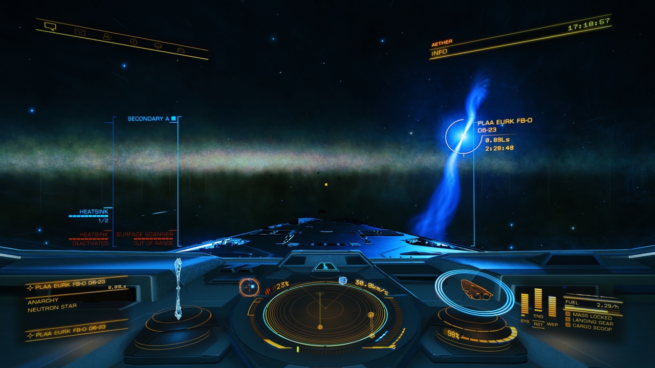
I wouldn't like my cockpit looking like that but I haven't been to that star or one like it since 3.3 released. The cockpit glass is "supposedly" adaptive so the amount of light and color shading inside the cockpit shouldn't be that badly altered. I'll see if I can find a similar system and upload an image. FDev needs to fix this, even though, as far as I can see, my cockpit view isn't impacted as badly as some.
Everyone except the FDEV developers and artists that would need to maintain in parallel a much more diverse gamut of possible lighting / shading combinations than already exist, and develop new art that looks good in all of them. Perfect use of dev time.
This whole thing sounds to me like someone high up thought it would be a 'good idea' to 'make things look more colourful', end result looks terrible, but because 'they' think it looks fine, it won't be changed.
I simply don't see any reason to not give players a choice here - don't like the new look? Here's a handy option to turn it off. Better yet, let us configure the amount of vaseline we want on our screen. Maybe color as well.
It's super easy. Especially since changing artistic direction is so simple, not political at all (wrt internal company politics) and involves no risk or effort (and this gfx overhaul was a change in their original artistic choice of a more "washed out" look for a more vibrant higher-saturation look). /s
")