But I love it. One of the main reasins I play Elite is looking at pretty things. And this is pretty.")
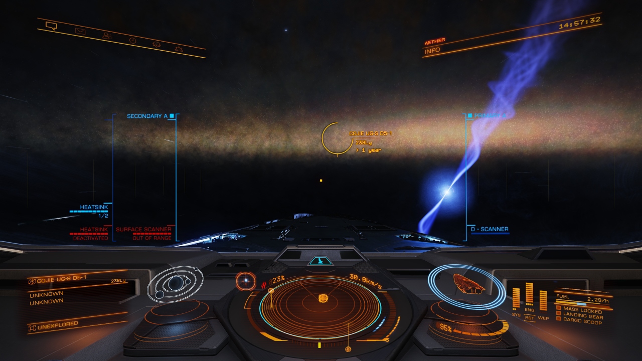
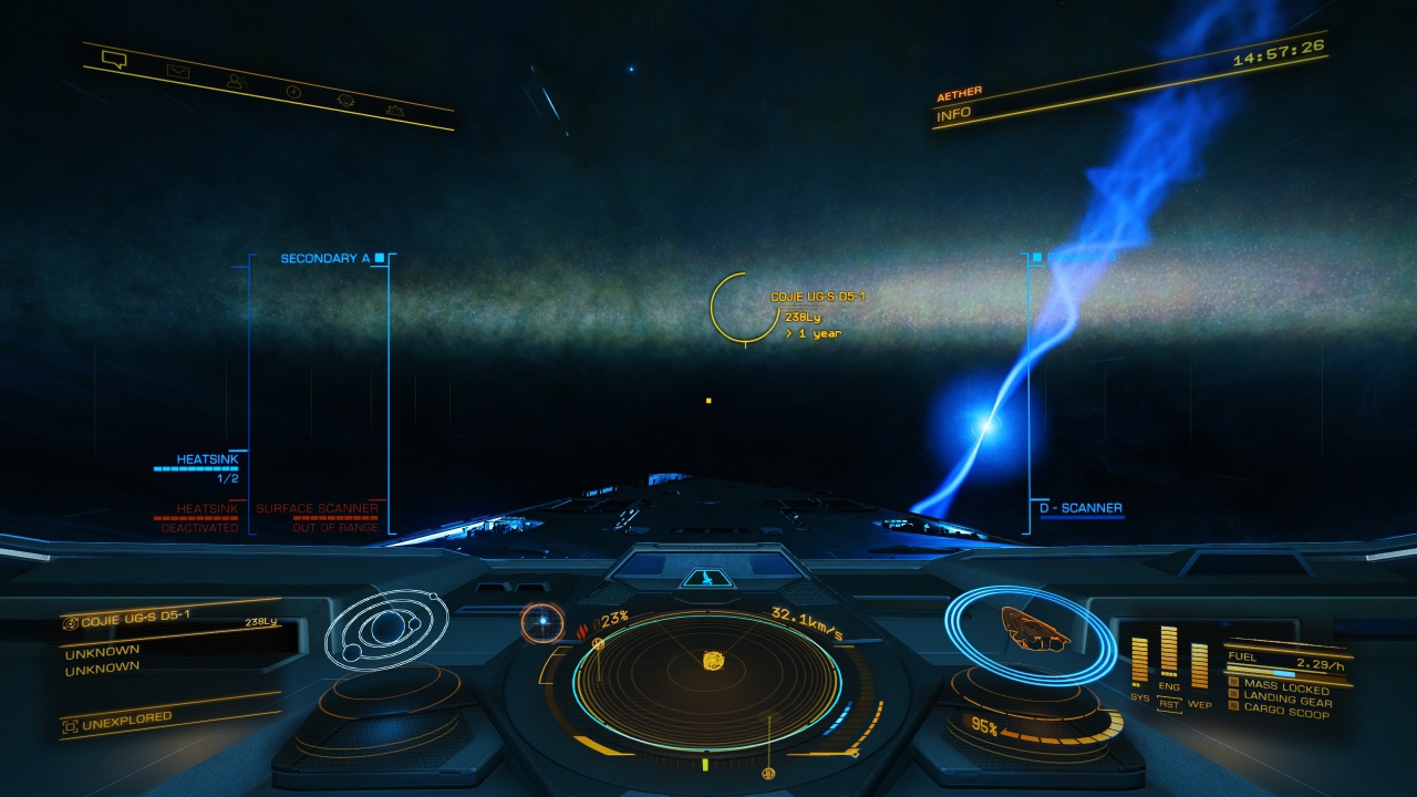
Do you think this (below) is pretty? It's vibrant and color-accurate. Many of us opposed to the new system don't hate vibrant colors (which is different than oversaturated, which this new system does suffer from in different areas). We just want realistic vibrant colors. Speaking of, I'm at a nebula right now, a place I actually want to look like "fantasy space", and it's pretty dull and pastel, at least on PS4. Give me realistic (but vibrant) space and fantastical nebula, and I'll join the rest of you singing Amazing Grace.

Last edited: