Feb 4th 2020
Generally it is best to avoid information sources that are dubious.
However sometimes there can be entertainment value in some of them. This guy has doomsday videos on everything( mostly finance stuff) but has found a new topic.
"Nothing to see here."
Source: https://m.youtube.com/watch?v=yV6IEdPc7AY
There are a few points of interest, like the model generated curve and the Chinese figures agreement ( which might be because the model is good?), but the striking thing is his death rate data. About 4 minutes in from the start of the video.
It
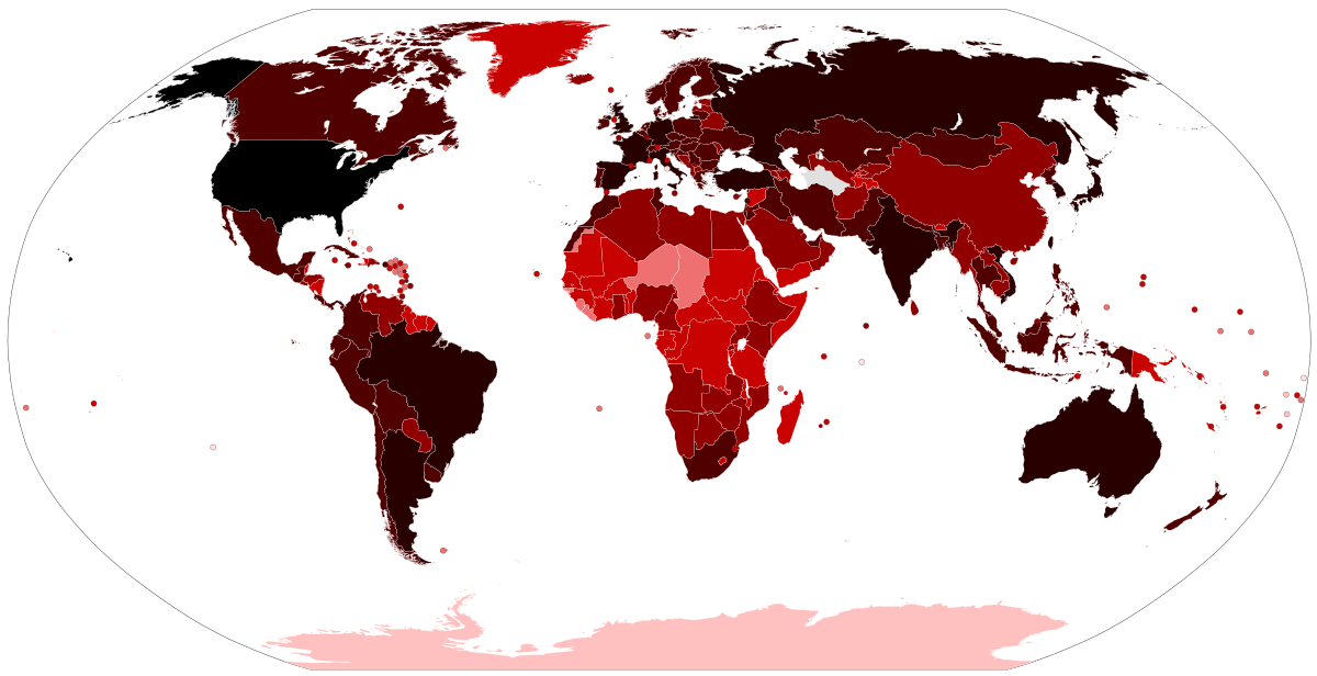
IS suspicious that Chinese provinces have >700 infected cases and zero deaths, but Hong Kong gets 15 cases and somebody dies. Or the Phillipines gets less than 5 cases, and another person dies.
Chris Martenson is a special character, with a horrible taste in music, but I think he's pretty spot on with his predictions about the global economy, energy and ecology. He used to be a CEO of some large company, but left and became a mild form of prepper, when he found out about the general state of the planet. He also holds a PhD in neurotoxicology. His videos are probably considered alarmist by some people, but honestly, I've done most of his calculations myself, and neither I nor anyone else I know of has been able to prove him wrong. On the contrary I've been able to prove that at least some of his predictions align pretty well with how the World works and available official data. His idea about energy shortage leading to a financial collapse sooner or later, is just simple facts based on physics and math. I see the exact same in my own models, and it's not something Martenson discovered himself. The Club of Rome said something similar in the 1970s. Martenson is also a big fan of Albert Bartlett and M King Hubbert, and I 100% with him on those.
He's also still very much a business man, and AFAIK he owns a company that sells gold. That does seem suspicious, considering that he's somewhat considered a doomsday prophet, but if I had money right now, I would definitely not by stocks, but gold, and if I was rich, I'd make a company selling gold or some other limited resource. To me it seems that he's trying to make money, but mostly based on what he knows.
I'm not so sure about his predictions on the coronavirus though. It seems to me that he's cherry picking, and right now the development of the epidemic is pretty easy to predict a few days ahead, but once you get further into the future, no model that I've been able to make seems to be accurate. I agree with him, that the data from China should be taken with a grain of salt, but China can't manipulate numbers in many countries outside China. One death in Hong Kong is very weak data to base any predictions on. Especially when they become slightly conspiratorial. The fact of the matter is, that we have ~215 cases outside China now (EDIT: QUESTIONABLE NUMBER), and 2 deaths. That's roughly a mortality rate of 1%, but it could very well be higher or lower. Probably lower, because many cases seem to be not registered, leading to the assumption, that the cases we know of, are the ones where people get complications.
Edit: I decided to delete the graph, since it turned out the last datapoint was from a different source than the rest of the data I'd used, and the WHO data is typically delayed ~1 day.
2nd Edit: The difference seems to be caused by some sources counting Hong Kong, Taiwan and Macau as "outside mainland China", whereas WHO count them as part of the Chinese total.
") )
)