Hello,
Not sure if this is the best place for this thread but I don't see anywhere else on the forums that discuss 3D in general.
This list of suggested UI fixes applies to all types of 3D, Oculus or 3DTV play.
Comms and Info panels: We should be able to adjust their depth plane or set them to be the same depth as the fuel and system info panels
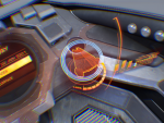
Landing Guide: This ui piece has issues for me. The target plane is not in 3D it's flat. It should be at the same depth and angle as the radar screen it replaces. Also the ship icon during this UI should be 3D as well. Right now it's a 2D sprite. Replace it with the 3D ship icons from the Starport Services windows.
Ship & Shield icons: This ui element looks ok except again the ship itself is flat. Please replace it with the 3D ships that you find in Starport Services menus.
Super-Cruise: I'll try to explain myself as clear as possible on this one. The vertical lines that scroll to the left and right of your cockpit while in Super-cruse look cool but they have depth queue issues. They appear to be coming from outside your ships canape and travel inside. Their depth queues show that they should pass BEHIND canape pillars yet they pass in front of them causing a visual anomaly that's uncomfortable to look at. The way I understand how this UI element works in game is that it's a hologram created by your ships canape windows, thus they should only be visible through the glass and not the canape pillars. Either that (which would be better) or make their depth queue pass in front of canape pillars to avoid the visual issues. Hope you guys understand what I mean by this.
The game looks awesome in 3D but some of these minor issues would go a long way to making the experience that much better. The little details matter in 3D.
Thanks.


