I am a bit of a data/data viz geek, and since in general it is a little hard to grasp what the state of the bubble is, I wanted to go a bit beyond the pie chart of systems by allegiance. I ended up grabbing the top factions by controlling systems (two or more) which comes to 1,803 factions out of 75,759 from eddb.io. This is probably not 100% reliable because it relies on systems being visited by CMDRs running one of the apps that feed EDDB, but it's as good as we can get.
Taking these top 1,803 allows us still to see some detail - add more, and the 0 and 1 system controlling factions will completely dominate.
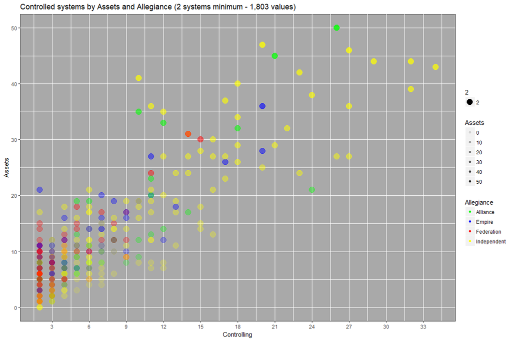
First, a scatter plot of controlling systems by assets controlled. At the bottom left, where the colors get a bit weird, this is because of overlapping data points.
The following two are histograms of systems controlled and assets owned:


What this shows is that large factions owning many systems are exceedingly rare, and perhaps even more so for factions owning a large number of assets.
Taking these top 1,803 allows us still to see some detail - add more, and the 0 and 1 system controlling factions will completely dominate.
First, a scatter plot of controlling systems by assets controlled. At the bottom left, where the colors get a bit weird, this is because of overlapping data points.
The following two are histograms of systems controlled and assets owned:
What this shows is that large factions owning many systems are exceedingly rare, and perhaps even more so for factions owning a large number of assets.
Last edited:


")
