HUD is static

Let me state from the onset that I love this game, but this post is a suggestion for features which (whilst I know will never likely end up in the game) would enhance the overall experience (at least in my opinion it would).

Disclaimer: When I say HUD I am referring to the location of your crosshair, info/chat panels, and primary/secondary weapon panels.

How about, a more active HUD? The current one feels static .. uninformative (I don't have important information where I need it most; such as selecting a subsystem.. do I really need to go digging around inside my panel to find this? Why is it not on the HUD, easily accessible through a hotkey?), bland (no real activity).

I've thought up the following:

* Active motion tracking across the entire cockpit within a certain radius (why do we have windscreens btw? It makes vastly more sense for a sealed cockpit to be using advanced telemetry and imagery projection to illuminate the interior walling of the cockpit of what's going on outside.. but I digress...).
Focusing on a target will bring up some summary information (name, rank, ship, wanted status) beside it (again, on the HUD). With no target selected, the HUD will have smaller reticles tracking movement of any object smaller than a planet (maybe a station?) in range of the sensors (like how the the current radar behaves just on the HUD with their actual positions) looking like this (on a smaller scale).
Side note: These reticles should become about 60% transparent wherever you are looking during combat so they don't get in the way, but not so much that you can't see where everything is, whether it's friend or foe.
The reticules are white for neutral, green for ally, red for foe. This way, just looking around space in your cockpit allows you to quickly point out where enemies are (I'd love this in combat instead (yes I know about the radar or and being able to select a new target either from the panel or with a button press; for me, it would add to the immersion).

tumblr_nehbjdxaJu1qdgc6io1_500.gif


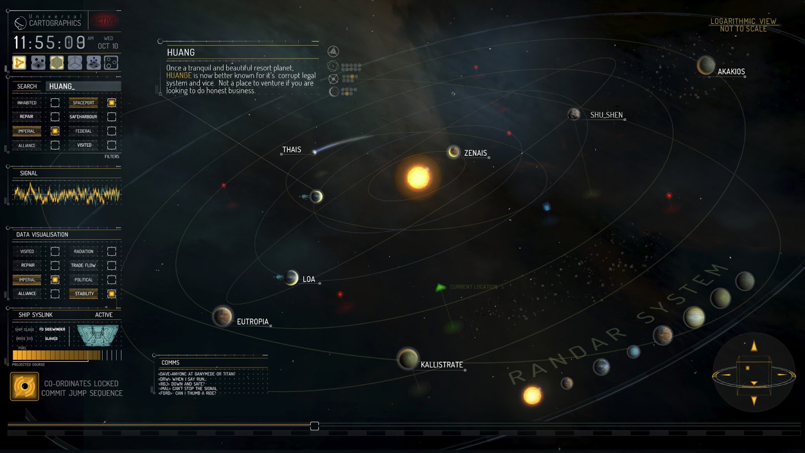
* Planetary body information displayed on the HUD when you select it, or approach a body and a summarised version is shown around the planet, it could look something like this (yes I know it's a little over kill, but I'm thinking of something similar to this not this exactly). This overlay can be turned off/on depending on your preferred play style. As a trader, this is something I'd love to see; especially if the information displayed contains some helpful information (especially when Horizon launches); this kind of overlay could be used to point out base locations, and if upgraded (make it similar to a scanner for example) then it can highlight points of interest (it doesn't know what they are, but it does know they are there).
058c5b6bed01709ac18be83a27d271ca.gif


* Perhaps communication from players/NPC could resemble more than a crummy chat window? Is this 3301 in a spaceship or 2015 in a IRC chat room?
Perhaps incorporate the chat feature into something that includes animations such as this, with the text appearing in a box/bubble beside it (I'm spitballing here):
radiohalo-800.gif


* How about interfaces that flicker like the advertising panels outside/inside the dock? Those are holograms, as are the ones inside my ship - why are my ship ones less flickery?
Perhaps include the bright edge on the advertising holograms into the cockpit panels to actually show they are holograms; plus a source of origin - I mean, I have no idea where my Systems Panel is generated from.. it's just, there...

Basically, it's the 33rd century (is that right?) and everything in my cockpit feels so ... modern .. I honestly don't feel like it's futuristic enough for me. xD

Just my 2c I thought I'd share. :)
 
*shrug*
The current design is no less cluttered; it's just painfully static.

Here's an example from Valkyrie about on HUD target tracking - note the highlighted enemy targets in red from about 2:07
[video=youtube_share;DZ4gpjwJa08]https://youtu.be/DZ4gpjwJa08?t=143[/video]

Non-intrusive, easily distinguishable enemy targets all available whilst you're looking out, instead of having to look down at a radar (very 21st century .. )
Basically just bring the existing elements into a on-screen HUD instead of a dashboard one.

As I said in my opening post, it'll likely never happen - but perhaps my suggestion will give FD some ideas (who knows).
 
Last edited:
*shrug*
The current design is no less cluttered; it's just painfully static.
All your first post samples seem to consist of almost only design elements with little to no tangible information - every element on the elite hud seems to have a good informative/underlining purpose. That said go compare the current hud to the one in alpha/beta stage. It has already improved by a huge amount and the tweaks in CQC show they are still on it.

Here's an example from Valkyrie about on HUD target tracking - note the highlighted enemy targets in red from about 2:07
This has been added with CQC and might also be part of the main game with 1.4

The radar is far too iconic and useful to be plastered over your canopy view ever. The panels to the right and left contain far too much information to be sensibly plastered over your canopy either (I do agree they could use folding for navigation/target list items to better reach important things - but you already have hot keys for all these things and don't need to delve into the panels in tight situations - you just need to use/configure them).

* How about interfaces that flicker like the advertising panels outside/inside the dock? Those are holograms, as are the ones inside my ship - why are my ship ones less flickery?
Perhaps include the bright edge on the advertising holograms into the cockpit panels to actually show they are holograms; plus a source of origin - I mean, I have no idea where my Systems Panel is generated from.. it's just, there...
I guess you've never been under heavy attack ...? They do flicker like hell if you take a few shots or die out altogether - if they were flickering all the time pilots would go mad.
Also I think in most ships you can actually see the panels/lights/cables responsible for the holograms plastered on the inside of the canopy structure.
 
Last edited:
I wouldn't mind with a few more moving parts to make certain things pop a little more, such as the KWS or missile lock.

But the other poster is right in that this stuff shouldn't be terribly distracting. There is a lot of worth in a nice and clean UI.
 
All your first post samples seem to consist of almost only design elements with little to no tangible information - every element on the elite hud seems to have a good informative/underlining purpose.
I expect you to use your imagination; not take what samples I've posted as literal. I'm referring to animated, moving HUD elements with informative information.

That said go compare the current hud to the one in alpha/beta stage. It has already improved by a huge amount and the tweaks in CQC show they are still on it.
This has been added with CQC and might also be part of the main game with 1.4
When I did play CQC I didn't notice anything all that different. I'll take another look this evening.

The radar is far too iconic and useful to be plastered over your canopy view ever. The panels to the right and left contain far too much information to be sensibly plastered over your canopy either (I do agree they could use folding for navigation/target list items to better reach important things - but you already have hot keys for all these things and don't need to delve into the panels in tight situations - you just need to use/configure them).
I've disliked the radar from day 1 (when I first launched the game), it's far too modern for my taste (a lot of elements in this game are far too modern imho; it's 3301 and it feels like 2001 in space). Of course, this is just my opinion.
They don't have to move everything onto the HUD, but I'd like to see a) consistency and b) again, animated elements. The HUD is meant to be holographic right? Except it looks like a standard desktop app has popped up on my dashboard. There's no origin for the holographic display (there is for the centre three though).

I guess you've never been under heavy attack ...? They do flicker like hell if you take a few shots or die out altogether - if they were flickering all the time pilots would go mad.
Also I think in most ships you can actually see the panels/lights/cables responsible for the holograms plastered on the inside of the canopy structure.
Of course I have - but that flicker isn't what I mean. I mean give it a real holographic look (similar to the advertisement panels you see in dock). Look at my second post about active tracking on the HUD. Plenty of games and movies through the years have had active HUD elements, look at the interface in the VOTL's in Minority Report towards the beginning of the movie.

If done well, not only can it be informative - it can add a level of real sci-fi.
Again, I don't believe this will ever come into the game - but I did feel like sharing what I though anyway. :)
 
I wouldn't mind with a few more moving parts to make certain things pop a little more, such as the KWS or missile lock.

But the other poster is right in that this stuff shouldn't be terribly distracting. There is a lot of worth in a nice and clean UI.
Each to their own; I'm a big fan of things like this...

[video=youtube;3bWzz0fBnyg]https://www.youtube.com/watch?v=3bWzz0fBnyg[/video]

[video=youtube;tsOdJuhyaFA]https://www.youtube.com/watch?v=tsOdJuhyaFA[/video]

(This one in particular, at 30 seconds you can see the System Map that should have been (imho))
( At 1:06 you have a radar that's exactly how it should be in this game; right amount of pop and non-intrusive; it's very similar to the current one it just has .. more )
( At 1:40 you have a HUD that's intuitive but compact and has the active tracking )
( At 1:44 you have a combat reticle )
( At 2:00 you have an expanded radar which could be a popup when you're scanning the area )
( At 3:16 you have the info/text popup )

[video=youtube;B-qZK1Rnbes]https://www.youtube.com/watch?v=B-qZK1Rnbes[/video]

.. I know other people aren't, and that's okay - I just asked for a more active HUD, as you so accurately said, to make certain things pop.
 
Last edited:
(This one in particular, at 30 seconds you can see the System Map that should have been (imho))
…with countless pointless visually cluttering elements, like the meaningless markings on the orbits, or the completely uninformative circles above and below some of the planets(?), or the different symbology for every displayed object that conveys no meaningful information at all.

( At 1:06 you have a radar that's exactly how it should be in this game; right amount of pop and non-intrusive; it's very similar to the current one it just has .. more )
More of what? None of the extra meaningless flashing symbols in the bottom corners and circling stuff does anything but distract.

( At 1:40 you have a HUD that's intuitive but compact and has the active tracking )
…which is filled with nonsensical animated graphs and symbols.

( At 1:44 you have a combat reticle )
( At 2:00 you have an expanded radar which could be a popup when you're scanning the area )
…which – again – both have countless elements and animations that do nothing meaningful at all. Plus, the "expanded" radar actually seems to convey less information than the previous version.

Sorry, I don't really see how any of these examples make anything "pop". They do good job obfuscating the important information with meaningless animations and symbology, though.
 
Last edited:
You're being too literal; I'm trying to use that video as example for a HUD/UI that pops (for me). Yes, there is visual "clutter" but I like that however one could easily trim it down a bit and add more useful information. Look at this map, for example:
DAHAN.jpg

Or this:
Elite+4+starmap.png

Both those maps "pop" for me; they have useful information, and could be coupled with nice science fiction (albeit meaningless) elements (such as hovering your mouse cursor over a planet, one of the meaningless elements popups in a nice sci-fi way and then a menu/info panel appears with information on it about the planet.

You prefer function over form, whereas it might appear I am form over function, but I'm more along the lines of "why not both?" The elements don't always have to mean things, sometimes they could just be there to make it look good. Windows, for example, doesn't need animated menu's or animated form collapsing, but it's there. Why? Because it looks good. The feature still functions as it should, but it does it in a way that's pleasing. Granted this might not do it for you, you might prefer Windows 2000 style of OS - but I don't and at the moment, to me, the HUD feels like Windows 2000 with a Windows 10 look - when all I ask is for Windows 10 look and feel. Functional, but aesthetically pleasing.

If you want to get picky with pointless elements .. have you turned off all the animated elements on your OS? None of it is needed, so why not just turn it off? If you haven't turned it off, why not ask yourself "why?"

Hope this helps clear up what I'm trying to say. xD
 
Last edited:
I don't have important information where I need it most; such as selecting a subsystem.. do I really need to go digging around inside my panel to find this? Why is it not on the HUD, easily accessible through a hotkey?.

You don't really need to go digging around inside the left side panel, and you do have it available through a hotkey. Selecting subsystems is a bind-able command; I use a couple of buttons on my throttle for that. Not sure what the problem is, but this isn't really related to the HUD all that much, other than the HUD clearly indicating which subsystem is selected, which it does.

As for the rest, the point of the HUD is to quickly give us all the information we need while being as "invisible" as possible while doing it - as in, without it becoming distracting. There's a reason why your car's dashboard doesn't have dozens of flashing animated widgets, same goes for airplanes. The point of the HUD itself isn't to look pretty and entertain you with cool animations, but to inform you and get out of the way. I kind of like the way it's handled now; I get all the relevant information in a clear, consistent way without being subjected to sci fi bling pretending to be a stroboscope.
 
Last edited:
… Windows, for example, doesn't need animated menu's or animated form collapsing, but it's there. Why? Because it looks good. The feature still functions as it should, but it does it in a way that's pleasing. …

If you want to get picky with pointless elements .. have you turned off all the animated elements on your OS? None of it is needed, so why not just turn it off? If you haven't turned it off, why not ask yourself "why?"
No, I usually haven't UI animations disabled – as long as they are not overly intrusive and don't distract from the important elements. There is a very thin line between aesthetical but unintrusive decorative elements and animations, and completely cluttering and distracting superfluous glimmer. The problem is that each and every of your examples so far are deep in the latter territory.

And it's somewhat funny that you give Windows 10 as an example, because that has a much flatter and simpler design with far less decorative elements and animated effects than some of the previous versions of Windows, like XP, Vista or 7. And even the few animated effects usually serve a purpose (e.g. guiding your eye, or conveying relations between menus or other UI elements) and aren't purely an end in themselves.
 
Last edited:
You don't really need to go digging around inside the left side panel, and you do have it available through a hotkey. Selecting subsystems is a bind-able command; I use a couple of buttons on my throttle for that. Not sure what the problem is, but this isn't really related to the HUD all that much, other than the HUD clearly indicating which subsystem is selected, which it does.

I meant a hotkey to bring up a list of sub-systems which I can then scroll through without taking my focus off what's in front of me. As it stands now, I have a hotkey to scroll through a list BUT I have to keep pressing it until I find the sub-system I want; this takes unnecessary time. I'd like a menu to popup that will allow me to quickly select the one I want with a key assigned to it. For example, you press a hotkey (let's use F1 for arguments sake) and a menu appears on your HUD under your info panel for example. This menu has category's (weapons, cargo, drives etc) each with a numbered hotkey (1, 2, 3 etc), after you've selected the category you want, you then press a number that corresponds with the sub-system you want to target.

(menu (F1) > drives (3) > powerplant (2))
So, once you know the system you can do the following: F1 > 3 > 2
Done. Powerplant selected.

(menu (F1) > weapons (1) > chaff (2))
So: F1 > 1 > 2
Done. Chaff selected.

I'm very active on my keyboard and I don't like taking my eyes off what's going on in front of me; as it stands now, I either have to dig through a panel or hit the "select next sub-system" a dozen times until I find the one I want, meanwhile I can't manoeuvre my ship as well or as quickly. Imho, sub-system selection is important in battle. The way I suggested above would, imho, eliminate that.. hit F1, need to dodge so dodge, hit 3, need to chaff, so chaff, hit 2 (powerplant selected), attack PP.

As for the rest, the point of the HUD is to quickly give us all the information we need while being as "invisible" as possible while doing it - as in, without it becoming distracting. There's a reason why your car's dashboard doesn't have dozens of flashing animated widgets, same goes for airplanes. The point of the HUD itself isn't to look pretty and entertain you with cool animations, but to inform you and get out of the way. I kind of like the way it's handled now; I get all the relevant information in a clear, consistent way without being subjected to sci fi bling pretending to be a stroboscope.

I prefer UI's that have both; always have. I'm a sci-fi nut and it's got that sci-fi bling I'm a happy camper. The current UI has information available (not always in a way that I find helpful) but as I've mentioned before, I'd like to see it with some sci-fi bling; it doesn't have to be hectic, but I'd prefer it to be there making the UI less static. It's a hologram right? So the panels should look like holograms instead of magic panels that appear out of nowhere.

- - - Updated - - -

No, I usually haven't UI animations disabled – as long as they are not overly intrusive and don't distract from the important elements. There is a very thin line between aesthetical but unintrusive decorative elements and animations, and completely cluttering and distracting superfluous glimmer. The problem is that each and every of your examples so far are deep in the latter territory.

And it's somewhat funny that you give Windows 10 as an example, because that has a much flatter and simpler design with far less decorative elements and animated effects than some of the previous versions of Windows, like XP, Vista or 7…

I'm expecting people to think about what I'm saying, instead of taking it literally. I've clearly stated already that I'd like informative information with nice effects; naturally that means a good balance between the two.

Perhaps I'm expecting too much and should be more clearer in the future. :p

W10 likely wasn't the best example, but it has a lot of effects. Open your notification pane on the right. It doesn't need to slide, but it does. That's a nice balance between function and form.
 
Last edited:
I'm expecting people to think about what I'm saying, instead of taking it literally. I've clearly stated already that I'd like informative information with nice effects; naturally that means a good balance between the two.

Perhaps I'm expecting too much and should be more clearer in the future. :p

W10 likely wasn't the best example, but it has a lot of effects. Open your notification pane on the right. It doesn't need to slide, but it does. That's a nice balance between function and form.
For one, you are unfortunately picking really bad examples for what you want. Secondly, I believe that the HUD and other UI elements in Elite already have exactly the right balance between information content and nice effects: the weapon labels slide into place when you deploy your hardpoints, HUD symbols slowly rotate and scale when weapons are locking on, the scanner has a unobstrusive pulsing effect, the comm panels slides open when you select it, other panels flicker into view when you look at them, and so on, and so forth.

All the important information "pop", as you like to say. Anything more and you risk drowning the important stuff in pointless adornment.

Currently, the UI in ED is like Windows 10.
 
For one, you are unfortunately picking really bad examples for what you want. Secondly, I believe that the HUD and other UI elements in Elite already have exactly the right balance between information content and nice effects: the weapon labels slide into place when you deploy your hardpoints, HUD symbols slowly rotate and scale when weapons are locking on, the scanner has a unobstrusive pulsing effect, the comm panels slides open when you select it, other panels flicker into view when you look at them, and so on, and so forth.

Excluding "the right balance between information content and nice effects" .. I can't disagree with the rest, there is adornment and what's there is nice but it's (imho) slightly too minimal (ie: static) or doesn't seem to match up (the left/right panels are supposed to be holograms but they don't have the same effect as the front-facing HUD, hell, they don't even have a source (what's generating them?) even that would be an improvement - that hologram flicker (think of the billboards outside stations) would almost make a very nice and unobtrusive UI element enhancement.

All the important information "pop", as you like to say. Anything more and you risk drowning the important stuff in pointless adornment.
We'll disagree here. :) Granted there will be a limit to the elements, I still think a few more adornments couldn't do much harm - especially if it's made to actually look like it's from 3301. It just doesn't feel all that "futury" to me.

holographic_display_technique_by_ere4s3r.jpg

Currently, the UI in ED is like Windows 10.
I see more of a Windows 2000 that looks like Windows 10 but doesn't have the animations. :p

I'm not sure how else to provide examples; I happen to like the pointless adornments. It adds that "pop" ( :p ) I like/want. Whilst that last video I linked is a little over the top, it's the best example I can think of to add (in my opinion) needed adornment.

I guess I just want to see a little more sci-fi in my ship (the irony that I'm talking about the cockpit of a spaceship whilst requesting more sci-fi is not lost on me).
 
Last edited:
You prefer function over form, whereas it might appear I am form over function, but I'm more along the lines of "why not both?" Because it looks good. The feature still functions as it should, but it does it in a way that's pleasing.
Alright, I got where you are coming from. And a UI being pleasing to the eye is a very important function in itself. It starts with proper contrast (colour/brightness/shape/...) and ends with a cohesive style (matching fonts/shapes/animations) - however all aimed at making the information easier and faster to read.

Now all your examples have an abundance of 'style' and all use much thinner lines than elite, making them look sleeker and more futuristic; however also making them much harder to read (whether the graphics contain info or not). They do look more pretty - no denying that and I can see why you prefer them over the clunky thick lines in elite, but really striking that balance of making something look that sleek yet remain easy to read is super hard (again I think they've done an amazing job already from alpha to now).
And I doubt they will change their style - I could see more animations being thrown into the mix --- or new/different hud styles to choose from all together, but this one will remain a well readable clunk.

Nothing here I can disagree with.
I think we're on the same page; perhaps different paragraphs but definitely the same page. :)
 
The HUD is very static. You cant add too much or it will be distracting, but One thing I miss after playing a few other games, like air combat games is that some games have a circular crosshair like Elite, but they have an additional ring, it could be a full ring, or half, a third whatever. This "bar" as it actually is, is reducing by the distance between you and the target. We've all been there. That "oh shi-"-moment when we're almost crashes into a larger ship, fooled by it's agility. Or all the canisters we have destroyed by crashing in them.

Here's the thing:
An ordenary gray ring around the target, or half ring at the bottom. It shows as soon as you target something. It's gray because none of your tools have reach, guns, scanners is out of range. As soon as you're in range the bar becomes orange and slighly decreases as you close in. It could also show you the optimal range of your current selected weapon, like a cannon(maybe you shouldn't snipe with it so the bar flashes a smooth yellow when you're at optimal range).
When targeting a canister the bar could change from orange to yellow to green as you close in, at a decent velocity making it easy for you to focus where the canister is, how far it is and your current speed, all in one.

But, the most important of all imo, that I have missed since launch...
Where's the velocity vector indicator???
 
The HUD is very static. You cant add too much or it will be distracting, but One thing I miss after playing a few other games, like air combat games is that some games have a circular crosshair like Elite, but they have an additional ring, it could be a full ring, or half, a third whatever.
Have a look into the manual - the cross hairs of elite depend on the weapon you have mounted and are all designed to overlay each other without intersection. And distance/out of range indications are coming with 1.4.

But, the most important of all imo, that I have missed since launch...
Where's the velocity vector indicator???
The star field speed lines you can see around yourself are all velocity indicators (both direction and magnitude). Although a single point as a toggle (like the center mouse point) would be cool I think these do the job far better.
 
Back
Top Bottom