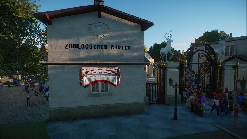
As most of you will know, flat signs with edible text can be use to add writing to a wall by sinking the sign into the wall. It gives the creator the opportunity to choose from a set of fonts without increasing the piece count to much. I use this method often in my franchise zoos, where I dont want to use one of the amazing fonts from the workshop because I want to save pieces and performance

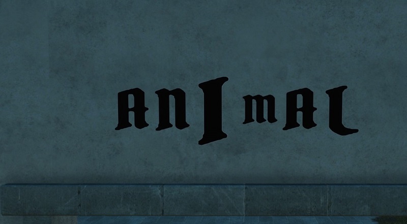
The New World Sign Editable 02 is the most suitable sign for this method, because it has the biggest font. One letter is one sign. Unfortunately. this does not work after patch 1.3 anymore. The aforementioned sign was fixed, but the letters come know in three different sizes: I, J ! are huge, most letters are medium and some letters like m are small:

I do not know if this was an intended outcome of the fix of the new world sign 2 in patch 1.3. But I do not see a possible benefit of this inconsistent letter size and thus hope, that Frontier brings back consistency.
The New World Sign Editable 02 is the most suitable sign for this method, because it has the biggest font. One letter is one sign. Unfortunately. this does not work after patch 1.3 anymore. The aforementioned sign was fixed, but the letters come know in three different sizes: I, J ! are huge, most letters are medium and some letters like m are small:
I do not know if this was an intended outcome of the fix of the new world sign 2 in patch 1.3. But I do not see a possible benefit of this inconsistent letter size and thus hope, that Frontier brings back consistency.
Last edited:
