No I really don't want cartoonish Animals.
That do really s-ck!
It's absolutely unbelievable cartoonish animals would ever exist!
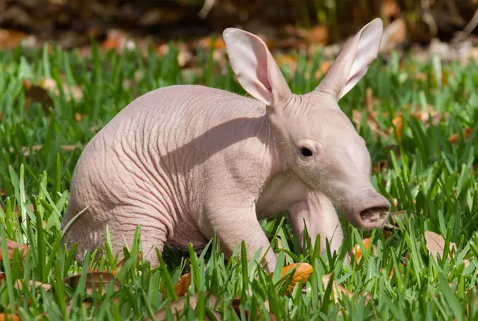
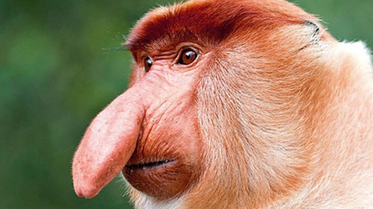
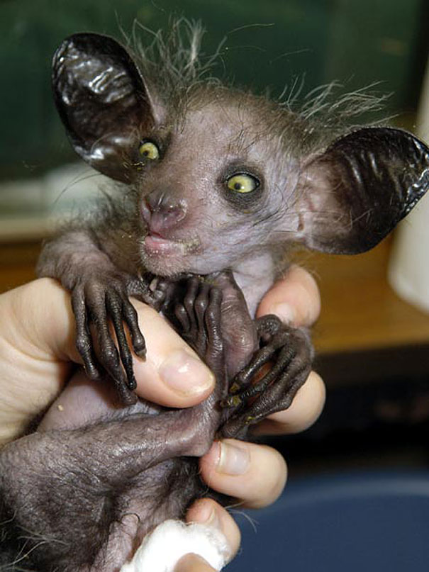
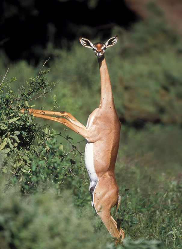
F.e. something like these:


Really! I am so happy, I live in a REAL world without any such cartoonish things !!!!
Disclaimer: Rausgehen ist wie Fenster aufmachen... nur krasser! (Going out is like opening the Windows... only starker!)
links:
http://abnormalanimal.blogspot.com/2015/
https://www.boredpanda.com/strange-animals/
That do really s-ck!
It's absolutely unbelievable cartoonish animals would ever exist!
F.e. something like these:
Really! I am so happy, I live in a REAL world without any such cartoonish things !!!!
Disclaimer: Rausgehen ist wie Fenster aufmachen... nur krasser! (Going out is like opening the Windows... only starker!)
links:
http://abnormalanimal.blogspot.com/2015/
https://www.boredpanda.com/strange-animals/
Last edited:
")