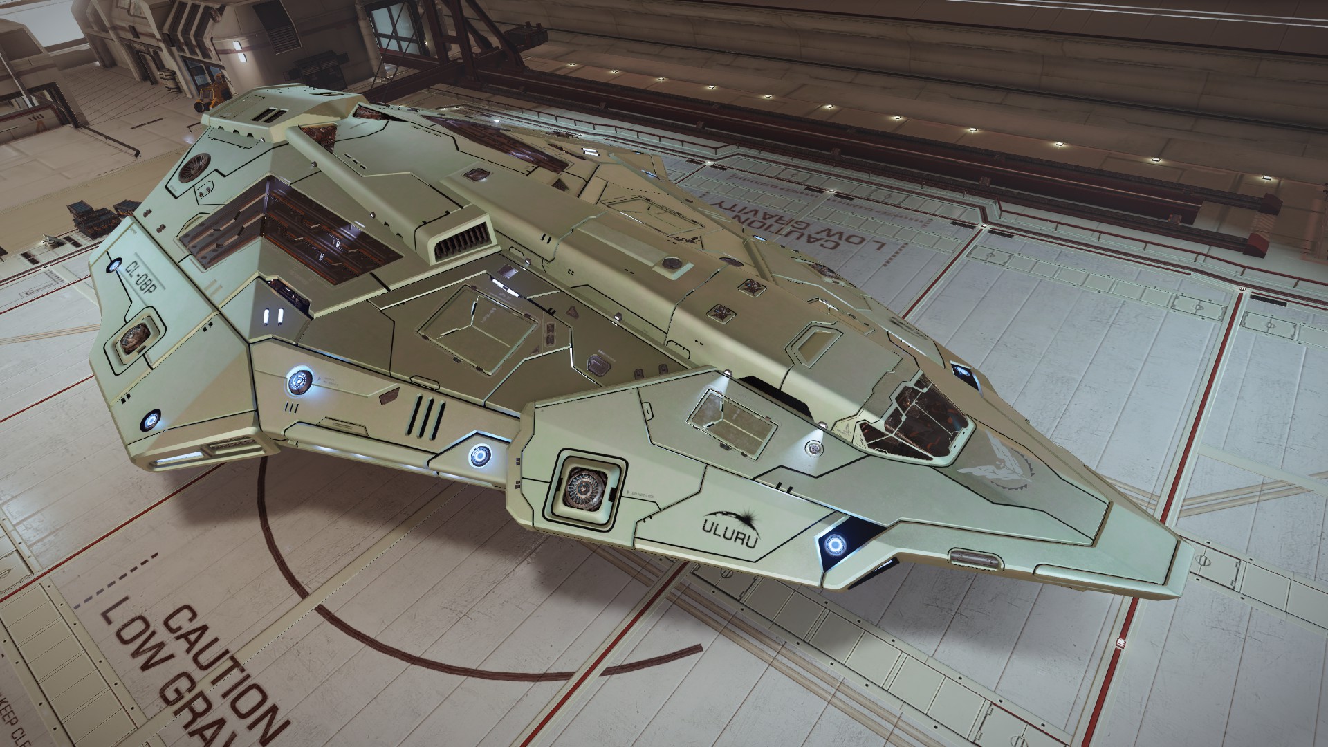
I'm still desperate to understand how this amazing metallic hue (Horizons):

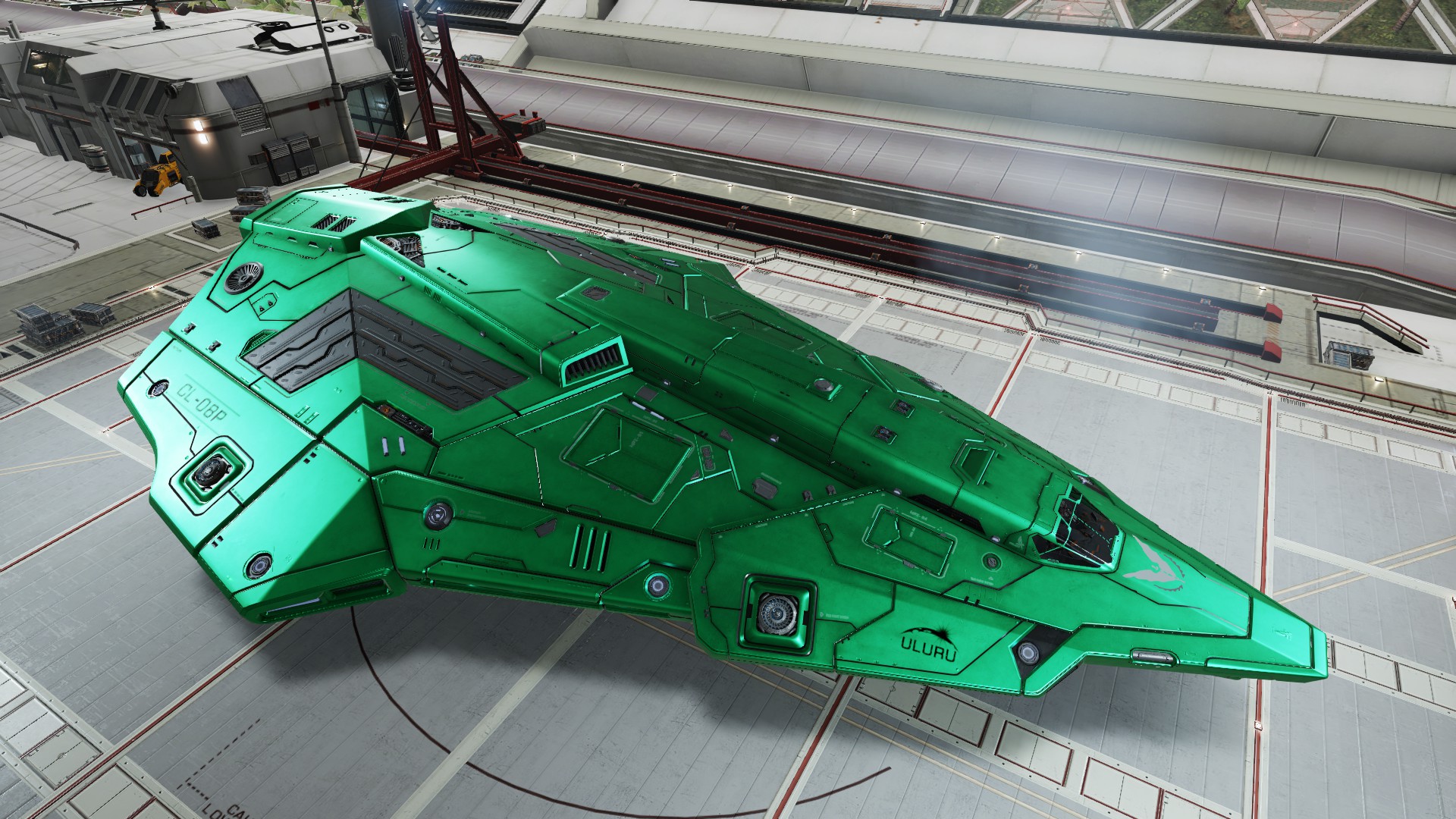
Turn out to be this horrible greenish hue in Odyssey:

No, its not "better". The point is: this is the SAME painting. If Odyssey is so amazing as Frontier said so, the result should be a BETTER version OF THE SAME HUE. Not this dull green.
Turn out to be this horrible greenish hue in Odyssey:
No, its not "better". The point is: this is the SAME painting. If Odyssey is so amazing as Frontier said so, the result should be a BETTER version OF THE SAME HUE. Not this dull green.
