Frontier VR Developers -> green colors would double DK2 effective resolution!
Forum readers: keep this post up, it needs attention
Frontier: you guys are developing for the DK2 and Oculus VRs and investing so much effort into it.
And then you fail at choosing colors that match the pentile display of the DK2 headset.
We could get twice the resolution and no disortion in texts, why do you keep the text quality at that level ?
A MINOR change would make the game MUCH more playable on DK2s. And we all suffer and wait patiently ..
All you need to do is focus on GREEN colors.
And I mean a PURE GREEN and not a mix with red.
What you did was use orange/red colors all the way for text and hud.
The result is that the display shows displaced pixels and unreadable text, even at 2k+ this would still give a bad quality!
SOLUTION (and this is something I should not have to tell you!)
Change the text color and the color of fine structures into a pure green.
Start with TEXT! That's a tiny change in your code.
You can use different variations of green but it MUST BE pure green without other colors.
Anyone with a DK2 can test this on the fly, the image is not even optimized it is just a fast hack to show the difference.
Move the browser window to your extended DK2 and look through one lense, try to read the red, then the green text.
You will notice that the green text looks sharp and can be read without any problem (it has twice the resolution on the DK2).
The red original elite text is hard to read and scraggy.
View attachment 5580
I personally can hardly read the original text at all, the green one ..
I am quite disappointed that the VR developers did not fix this already.
The whole game could be way better for DK2 owners, just give us green colors on text.
And second step is optimization of the game itself to use a green favorization on VRs.
I need YOU! If you have a DK2 then give it a short test yourself and look what difference it makes. That's better than 4xDSR (much better) at no performance loss)
First verify it yourself (move browser to your DK2) then keep this thread up, complain about it and link to my thread.
We need to make our voices loud, this is a tiny change I want to have it.
I have tested this on my DK2 and the Elite ingame screenshots suddenly become crystal clear readable. Without any panning and zooming, it's just readable like on a normal screen.
I tested for hours, pure green is the only way to go.
I have also tested mixing various things in and I tested it ingame using the Matrix in GraphicConfiguration.xml, however that's not a fix because it changes FRIEND/FOE colors as well.
<MatrixRed> 0.18, 0, -1 </MatrixRed>
<MatrixGreen> -1, 1, -1 </MatrixGreen>
<MatrixBlue> 0.15, 0.32, 1 </MatrixBlue>
As soon as you mix red into it you will have pixels which are displaced in the letters, making it unreadable.
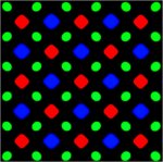
Pentile diplays have around twice the green resolution than red or blue, it's not RGB it's RGBR
Attached is an image of the DK2 display used:
So FRONTIER:
Please make a patch with priority and put the HUD font color out into the xml configuration, just separate it.
Alternatively hardcode it with a switch or something. Or distribute a separate EXE while you work on it.
Whatever you do, I do not understand why this has not been done before! However, it's more than time to fix this with priority.
We talk about a code change of one hour that solves the problems of a huge chunk of your bakers. I can not understand why we do not have this already...
I guess you can see why orange is a very bad idea.
The problem is that you have green colors in text and around that you spread red dots, resulting in a ruined text shape and half interconnecting letters.

Last edited:
