You are using an out of date browser. It may not display this or other websites correctly.
You should upgrade or use an alternative browser.
You should upgrade or use an alternative browser.
The single most annoying thing currently in ED is.....
- Thread starter Whiterose
- Start date
The forums.
Did i say that? Ooops...
Did i say that? Ooops...
Spoiled for choice really but I'll go with System Authority Anacondas firing plasma at empty space or, as is often the case previously empty space now occupied by lill ole me innocently minding my own business.
"Under attack!" *Where? Where? Search sensors for signs of red, finding none. Oh, that again...
- - - - - Additional Content Posted / Auto Merge - - - - -
Techincally not part of the game but yeah, I see your point
"Under attack!" *Where? Where? Search sensors for signs of red, finding none. Oh, that again...
- - - - - Additional Content Posted / Auto Merge - - - - -
The forums.
Did i say that? Ooops...
Techincally not part of the game but yeah, I see your point
People expecting bugs getting fixed by creating rage threads
https://forums.frontier.co.uk/forumdisplay.php/124-Elite-Dangerous-Bug-Reporting
https://forums.frontier.co.uk/forumdisplay.php/124-Elite-Dangerous-Bug-Reporting
Last edited:
Nitek [pl]
Banned
menu loggers and wire cutters
- - - - - Additional Content Posted / Auto Merge - - - - -
How many missions have you stacked to get that?:]
- - - - - Additional Content Posted / Auto Merge - - - - -
Constant interdiction's!
How many missions have you stacked to get that?:]
Have a look at the image below:
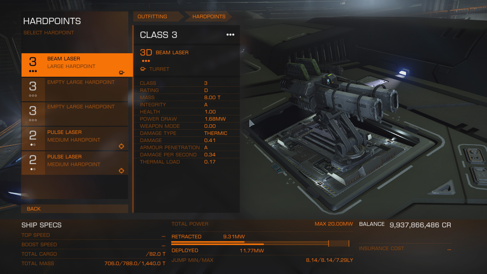
I would like to draw attention to the following:
Middle section:
Power settings - Why no method of turning modules on/off to see where the power can be found without making further changes.
You could have a selection of radio boxes to turn systems on/off... But you can't because;
Jump Range - A rather important number is hidden away at the bottom of the page in a dulled out tone.
Right section:
Balance and number are different font sizes (this may have been fixed as this is just a screenshot I found online of the new page).
Balance and number are in white - no doubt some artists way of balancing the page but instead just looks poor due to font size mismatch.
I think the Jump range numbers would be better of shown here allowing for larger numbers to be used including before and after range numbers for when changes to the ship are being made.
Balance and re-buy cost could be still on the page under the jump ranges and would look far better in the same colour scheme as the rest of the page.
I find this whole section of the game to be messy. It's better than it was but also worse at the same time. I have no way to see the whole load out at a glance. Also the page where it shows you the nice tablet friendly sections for each type of module is rather annoying due to not showing all module types but rather focusing on the types they have in stock. This just leads to a game of find the right icon. Would it not have made sense to have all the module sections showing with a notice 'Out of stock' if no items are available allowing us to get used to the positions of the items instead of the game of hunt the right selection.
You asked for personal gripes, these are my biggest two. As I reset my game for 2.1 I am using the refit screen a lot and it's painful... really really painful.
Thank-you to the people who make coriolis.io without you I would be lost!
EDIT: Do not get me started on comparison of modules...
Last edited:
The Fact that so many things annoy me right now that I can't put my finger on any single source of ire!
Interdictions. Everything to do with them.
(though the mini-game is easier in VR only because the escape vector cannot jump off the screen)
(though the mini-game is easier in VR only because the escape vector cannot jump off the screen)
The forums.
Did i say that? Ooops...
Ninja'd by 17 minutes ... getting slow in my old age
The forums.
Did i say that? Ooops...
The forum is not the game. One can play the game without going to the forums at all.
#1 for me is lack of commodity storage. Let me get this straight: I can blaze my own path and do what I want, but if I want an engineer upgrade I have to tote around these crates which will eventually be useful?
The forum is not the game.
Lighten up.
The forums.
Did i say that? Ooops...
+Rep as they are an essential part of the game needed to learn anything about what is going on, from aliens to why the AI change behaviour so often, it's all here... not in the game.
People expecting bugs getting fixed by creating rage threads
https://forums.frontier.co.uk/forumdisplay.php/124-Elite-Dangerous-Bug-Reporting
People saying raise a ticket when it is a well known bug and would serve no purpose except to waste FD's time.
Yesterday I spent about 15 minutes in super cruise traveling 143,000ls bringing an ungrateful outpost their cargo only to drop in and be given 0H 0M to deliver. Despite boosting and crash landing, I did not make it.
That was disappointing because I did get an update that gave me 3H to complete it. I thought maybe there had been a server side update.
That was disappointing because I did get an update that gave me 3H to complete it. I thought maybe there had been a server side update.