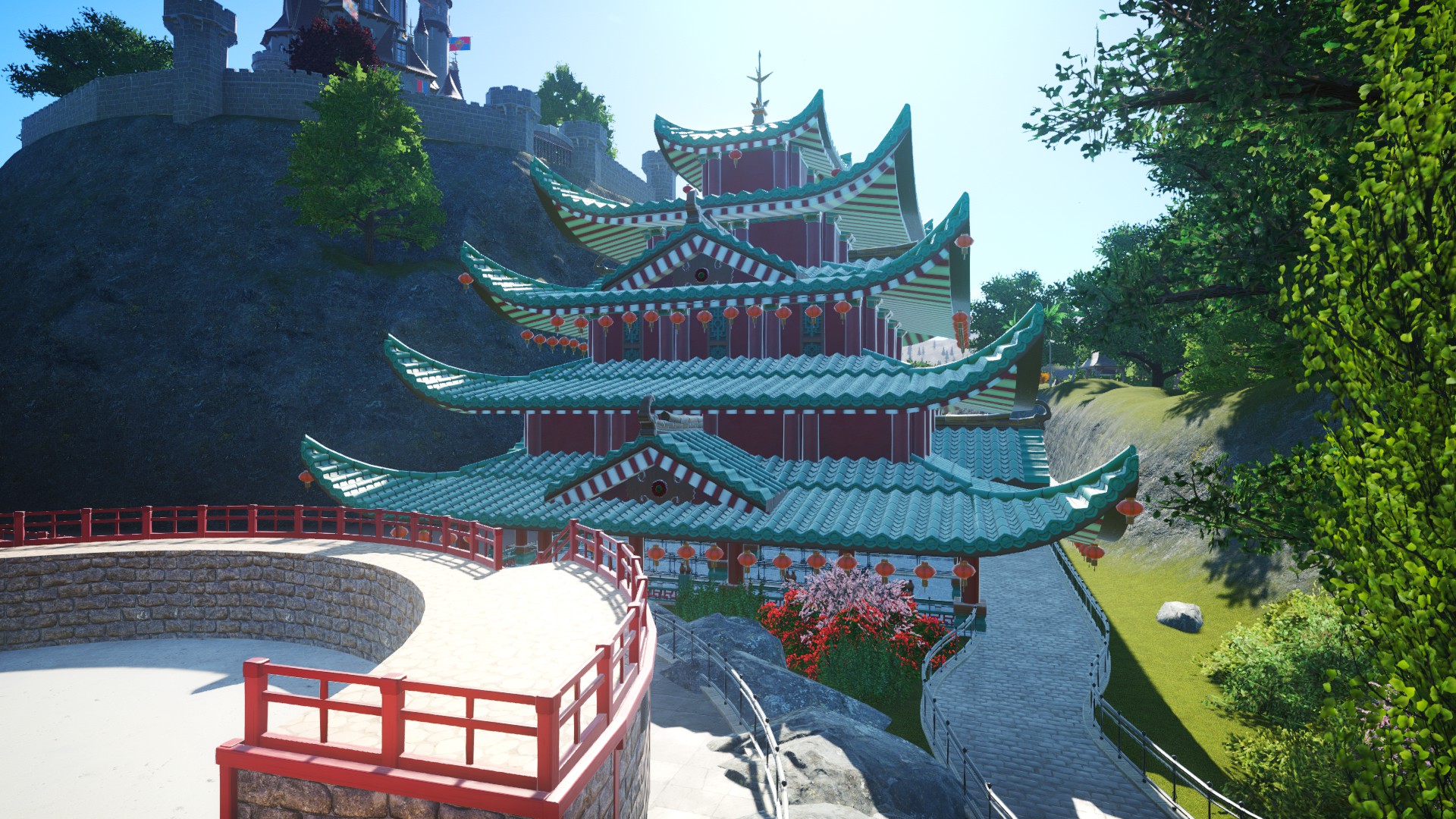
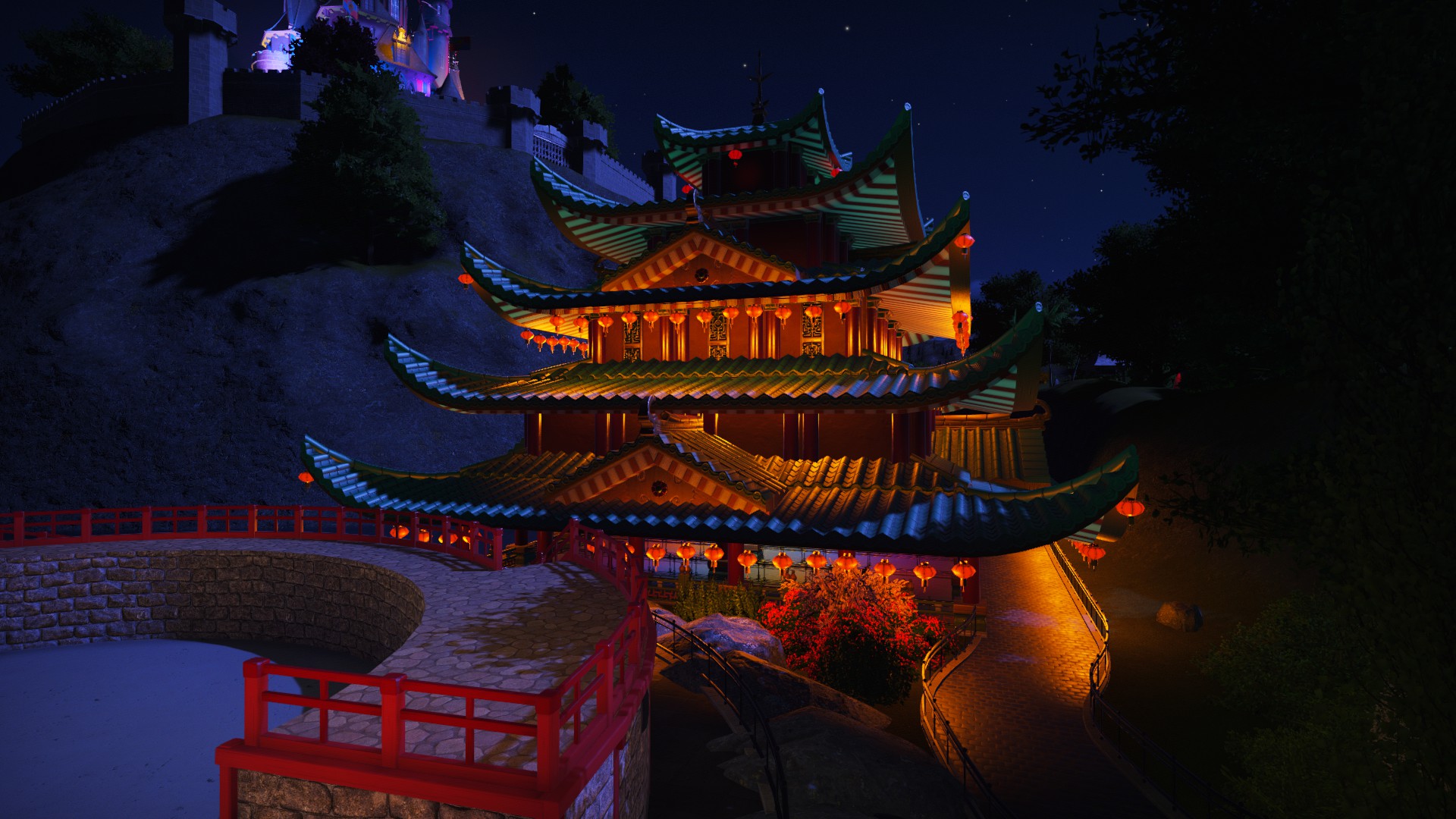
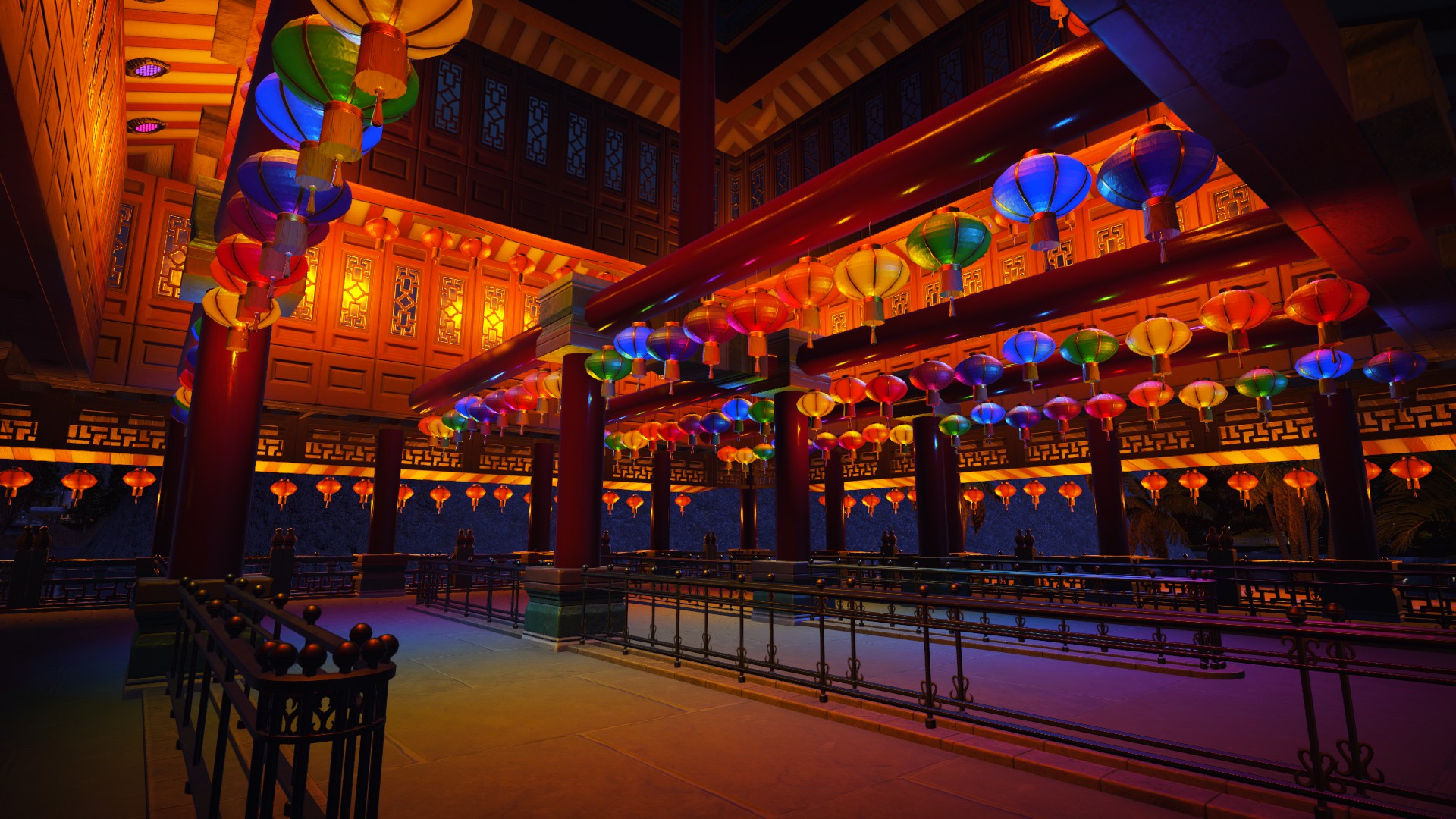
Ever since opening, Palace Chang'e (named after the Chinese goddess of the moon) had been looking a bit rushed and sorry for itself...so I built an entirely new queue, and along with it, a beautiful pagoda which houses most of the queue. I'm really happy with how the lighting turned out. 
You are using an out of date browser. It may not display this or other websites correctly.
You should upgrade or use an alternative browser.
You should upgrade or use an alternative browser.
Parks Adventure Kingdom
- Thread starter RubberKerfuffle
- Start date
My wooden coaster, Bjorn Unchained, used to be easily overlooked, but over time, the general ride experience and even the physical appearance had really grown on me. Even the first drop is possibly my favourite out of my other rides. It's also a pretty cool coaster to watch too - the 30 second dispatches, the way it flies around the track and through the trims at the end...and we even get the whole trainload with their hands in the air on the first drop!
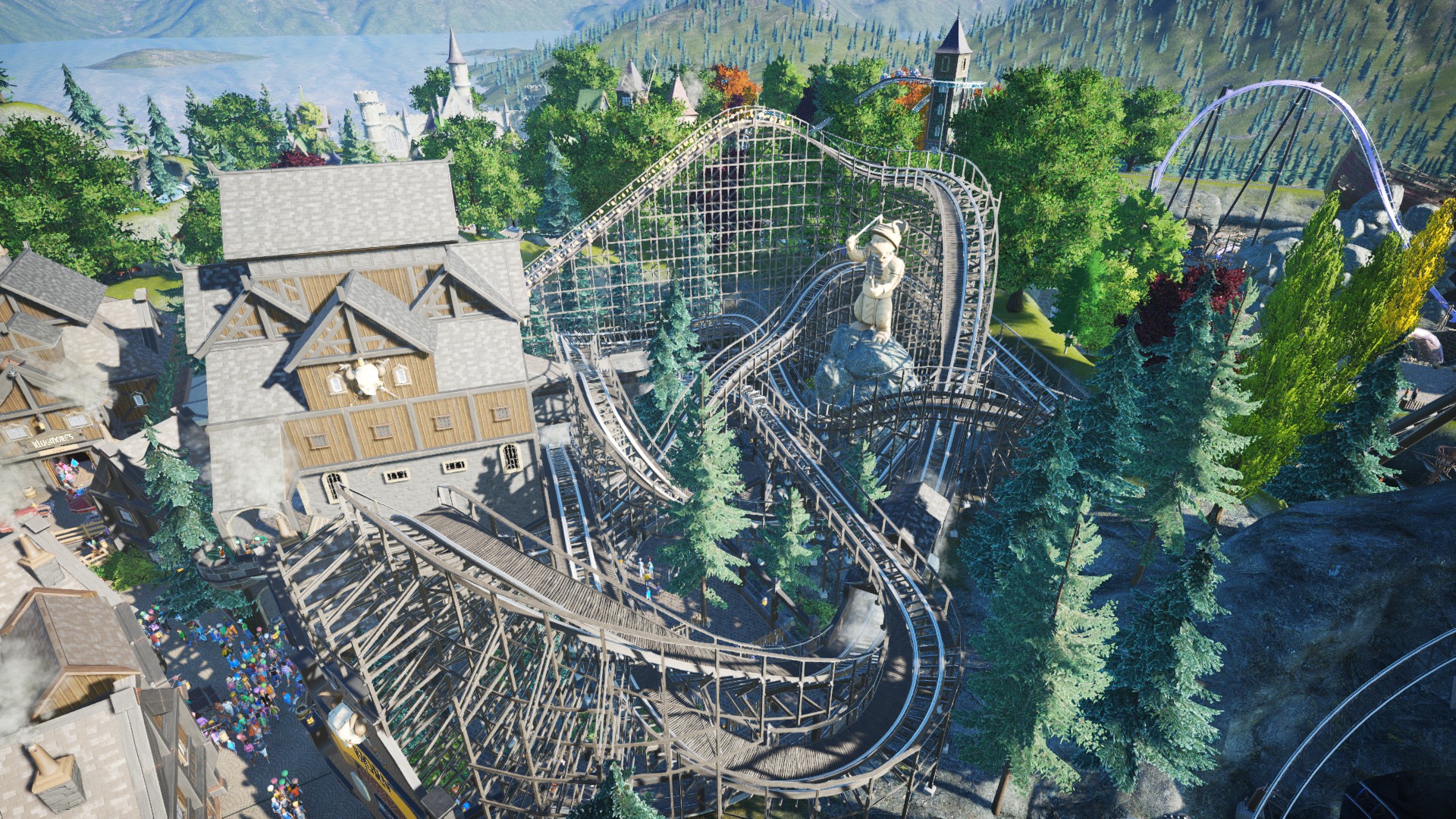
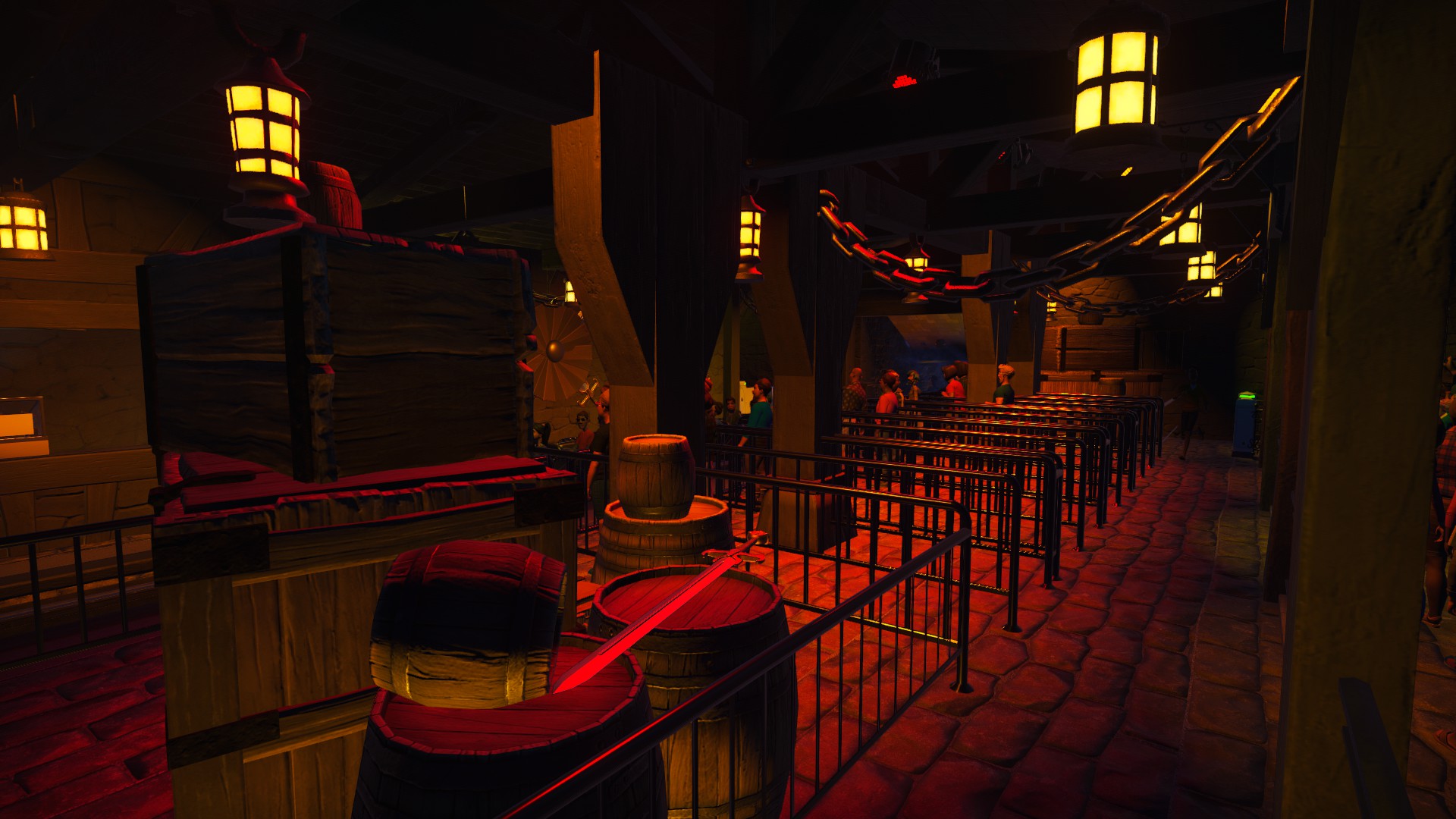
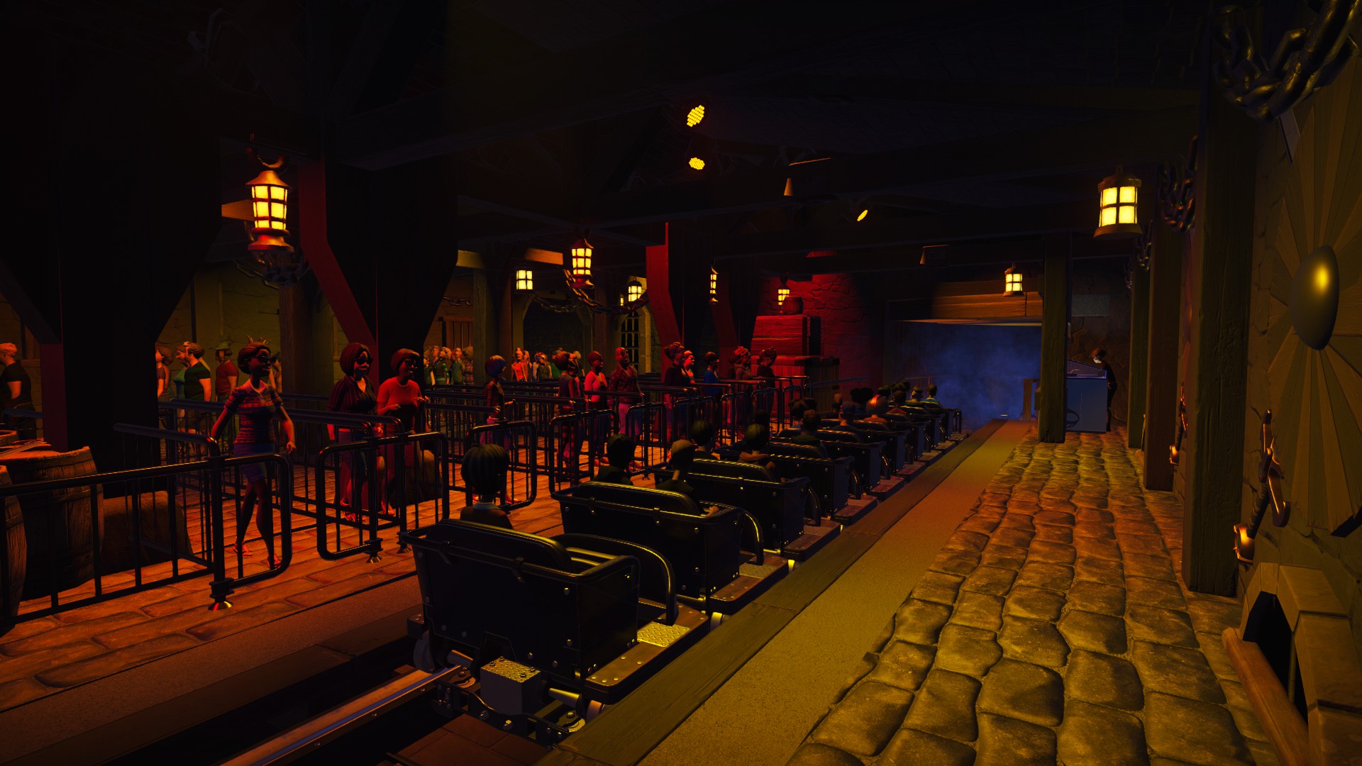
So consequently, I've been paying quite a bit of attention to the surrounding area, station...and even the coaster itself. A while back I put a bit of time into revamping the lighting in the station, as it had originally been lantern-lit, whereas now it features my usual spotlighting for much better atmospherics, tucked away out of the light in the roof along with the speakers.
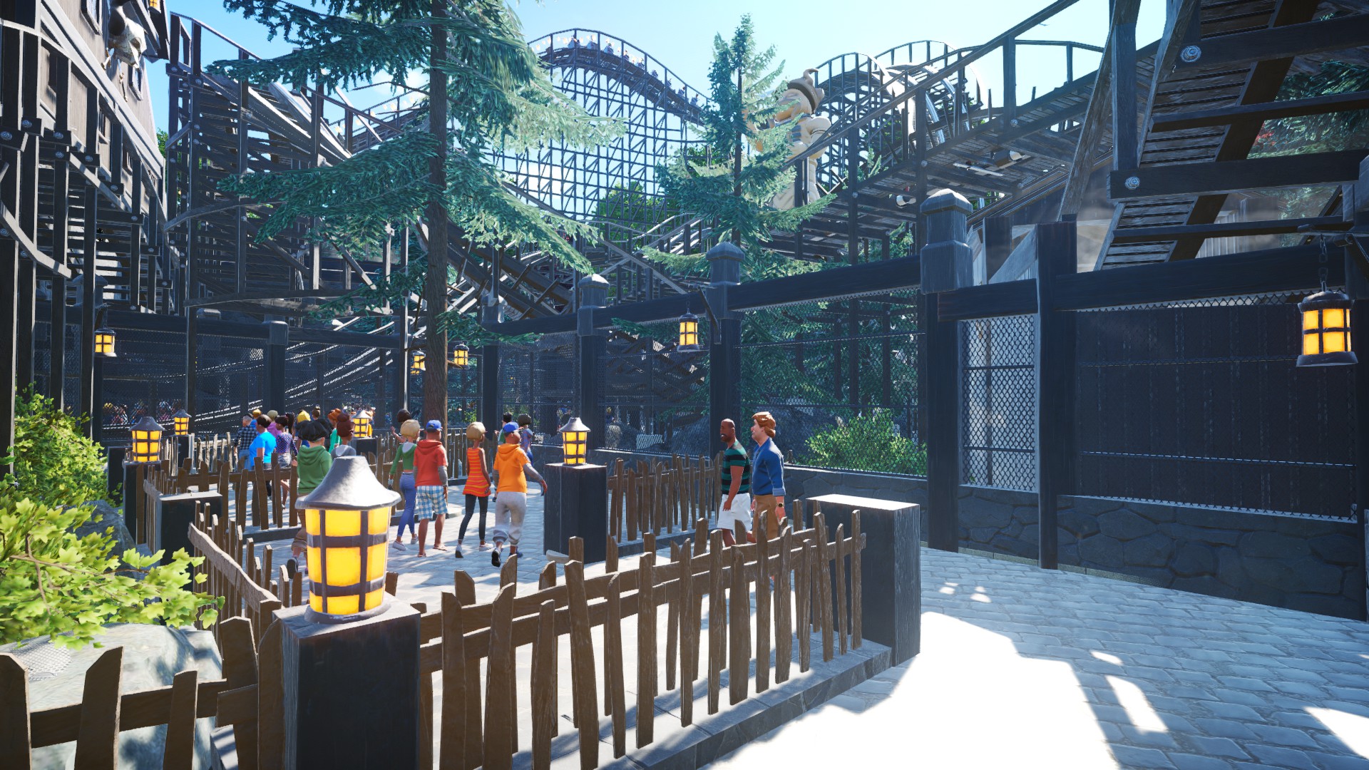
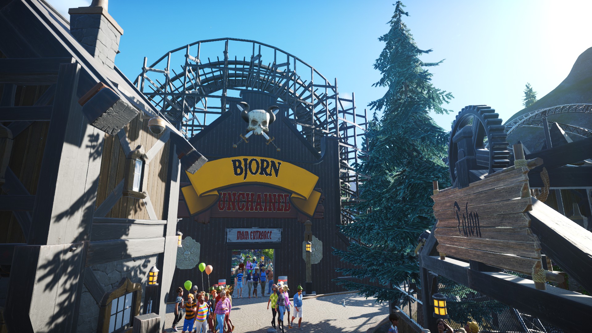
Today consisted of a couple of changes. First off, I added some new fencing in the queueline (as well as some high fencing to cordon off the ride area). I also raised the height of the statue in the background so it's in better view.
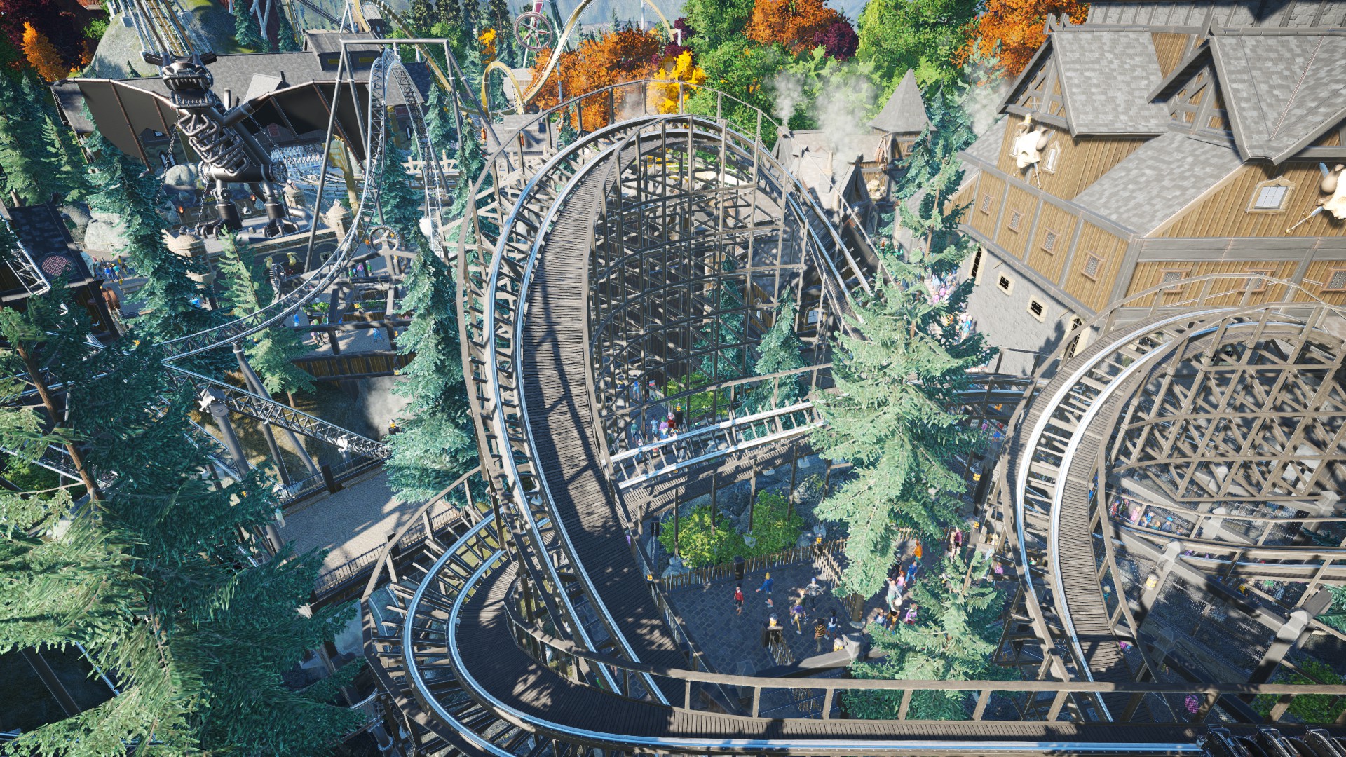
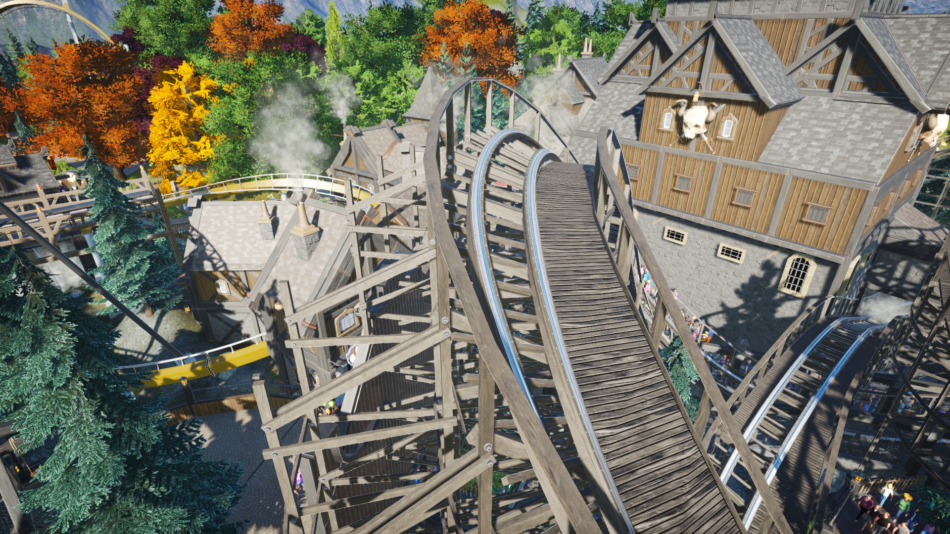
Finally, I went a bit mad and did a bit of track work Originally, this had been a simple overbanked turn to form the ride entrance, but taking inspiration from real life wooden coasters, I wanted to throw in some lateral g-forces, so I turned it into some kind of loose tophat. Talk about thinking outside the box!
So consequently, I've been paying quite a bit of attention to the surrounding area, station...and even the coaster itself. A while back I put a bit of time into revamping the lighting in the station, as it had originally been lantern-lit, whereas now it features my usual spotlighting for much better atmospherics, tucked away out of the light in the roof along with the speakers.
Today consisted of a couple of changes. First off, I added some new fencing in the queueline (as well as some high fencing to cordon off the ride area). I also raised the height of the statue in the background so it's in better view.
Finally, I went a bit mad and did a bit of track work
Last edited:
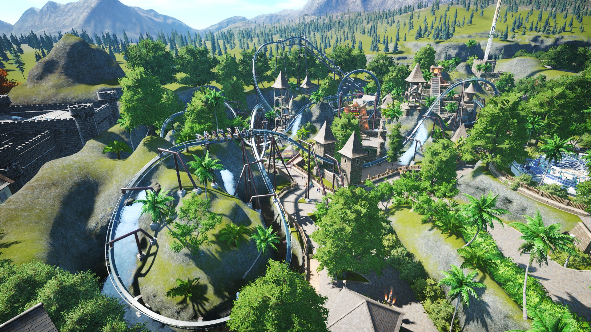
Next in line to receive its long overdue dose of TLC is none other than my ageing Aztec-themed invert, Humunga, and having been built in 2017 after a few other rides which have since been demolished, it's now the oldest remaining coaster in my park. After a period of time it became yet another coaster that I didn't pay much attention to, but over the years, I've slowly been adding more and more to it and doing some trackwork here and there...and as of more recent changes, it's turned into the masterpiece it was born to be. Below is a brief overview of the coaster, even if the picture isn't that great:
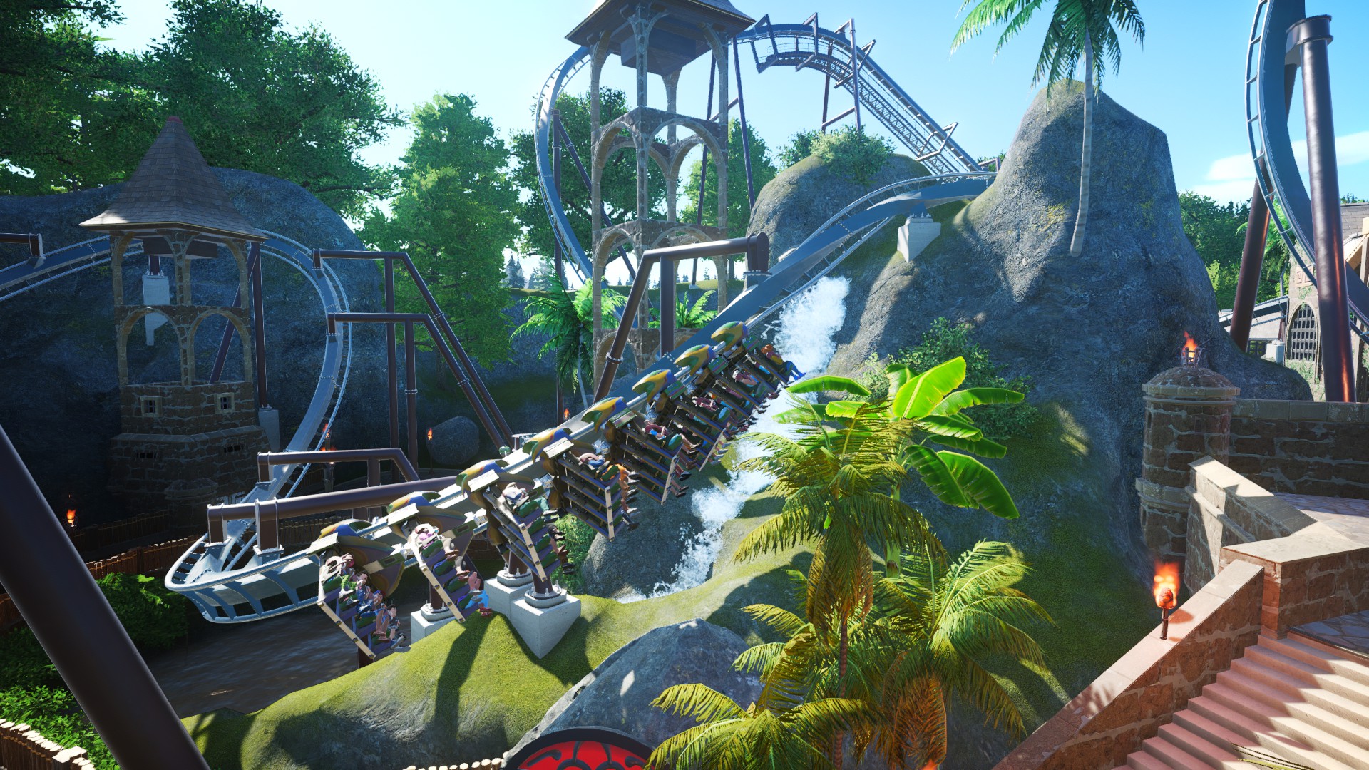
One of the earliest changes I made was the interaction with terrain and scenery surrounding the ride, as I really wanted to ensure Humunga was not only heavilly themed but also all-round an intense experience. Firstly, as my personal preference with real world inverted coasters is actually close interaction with terrain, I started here. Below is a pretty good example of guests seemingly on a collision course with an oncoming mountain!
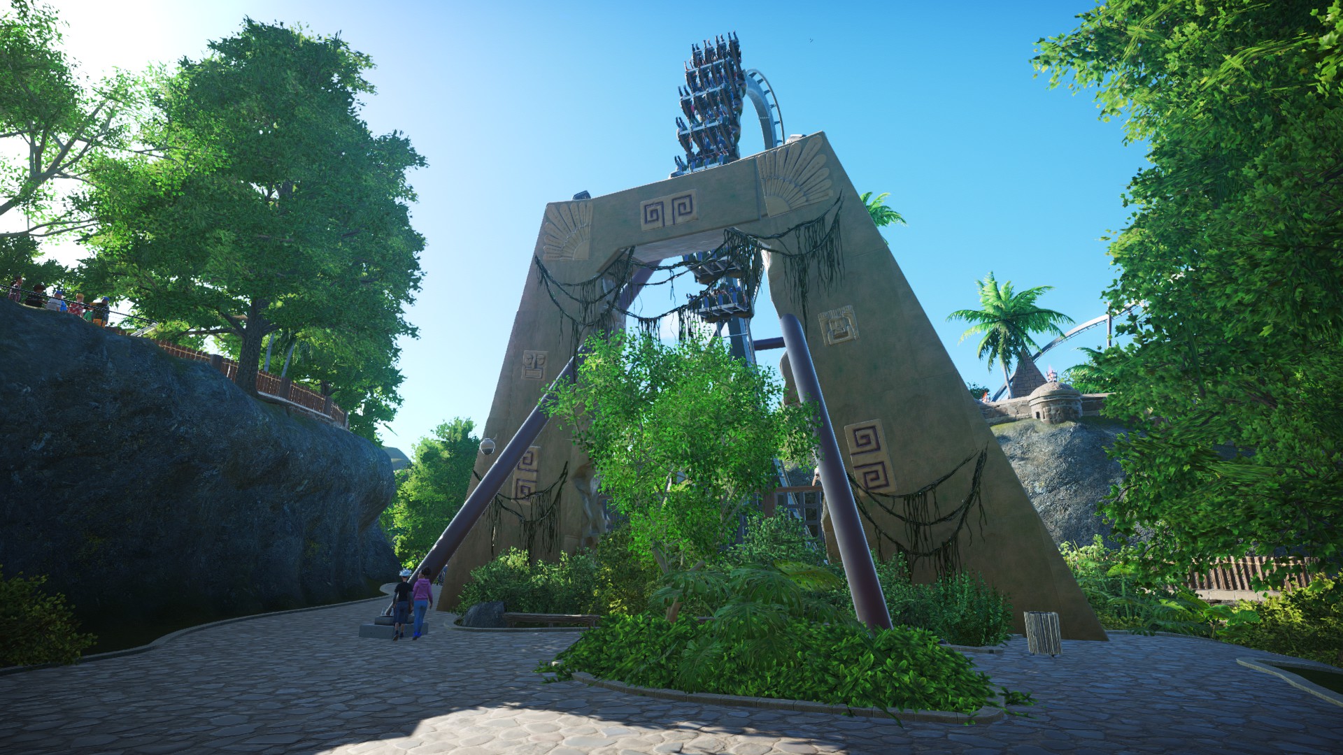
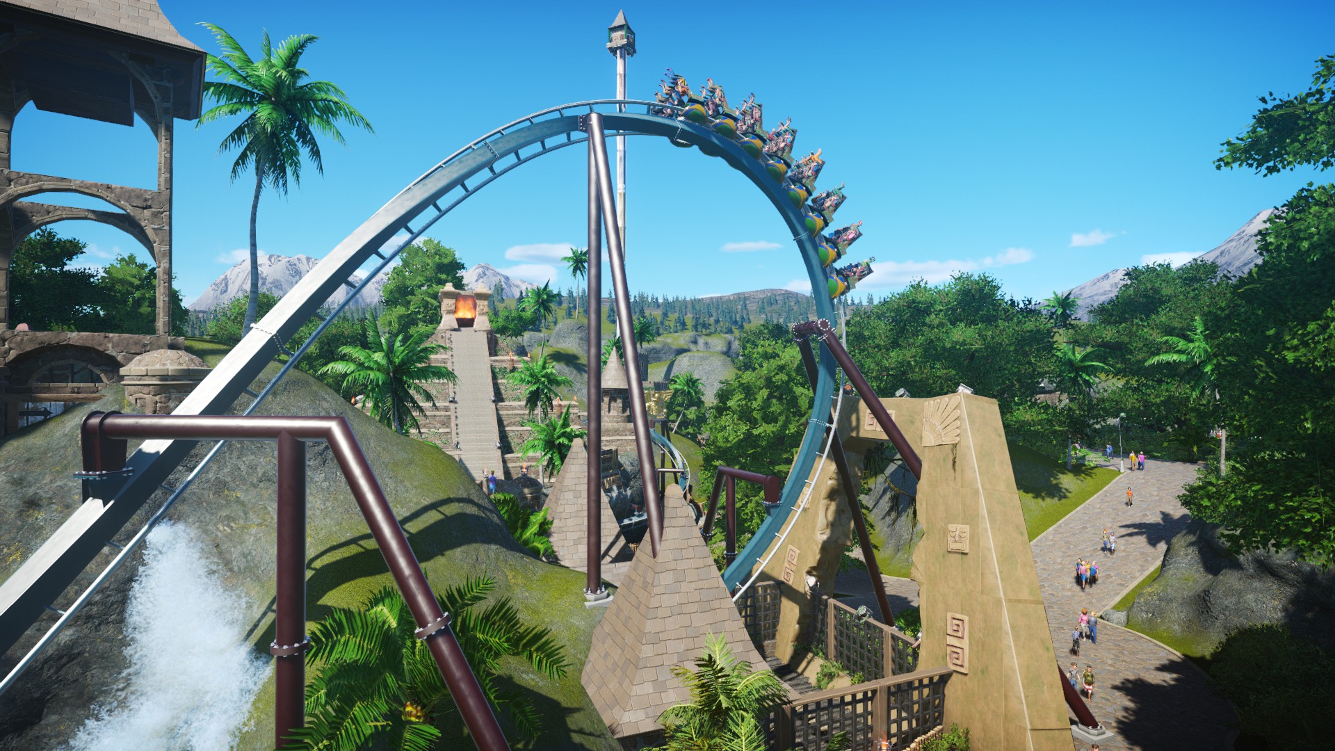
To then further expand on the ride's already huge catalog of near misses, I very recently constructed a colossal stone archway behind the coaster's Immelmann element, which riders miss by inches. Despite this image making the arch look vertical, it's actually on a slight lean, so the base of the building lines up with the coaster itself and the top half is of course well clear of riders. It also therefore creates a nice illusion of the arch being vertical as mentioned above, as well as riders once again being sent on a collision course.
Following this, the Immelmann itself needed a bit of seeing to, as the inversion had always looked a bit lop-sided (smoothing was a classic rookie error in my early days of playing this game), so after a little fiddling around, I had it looking smoother and more realistic than it had been before.
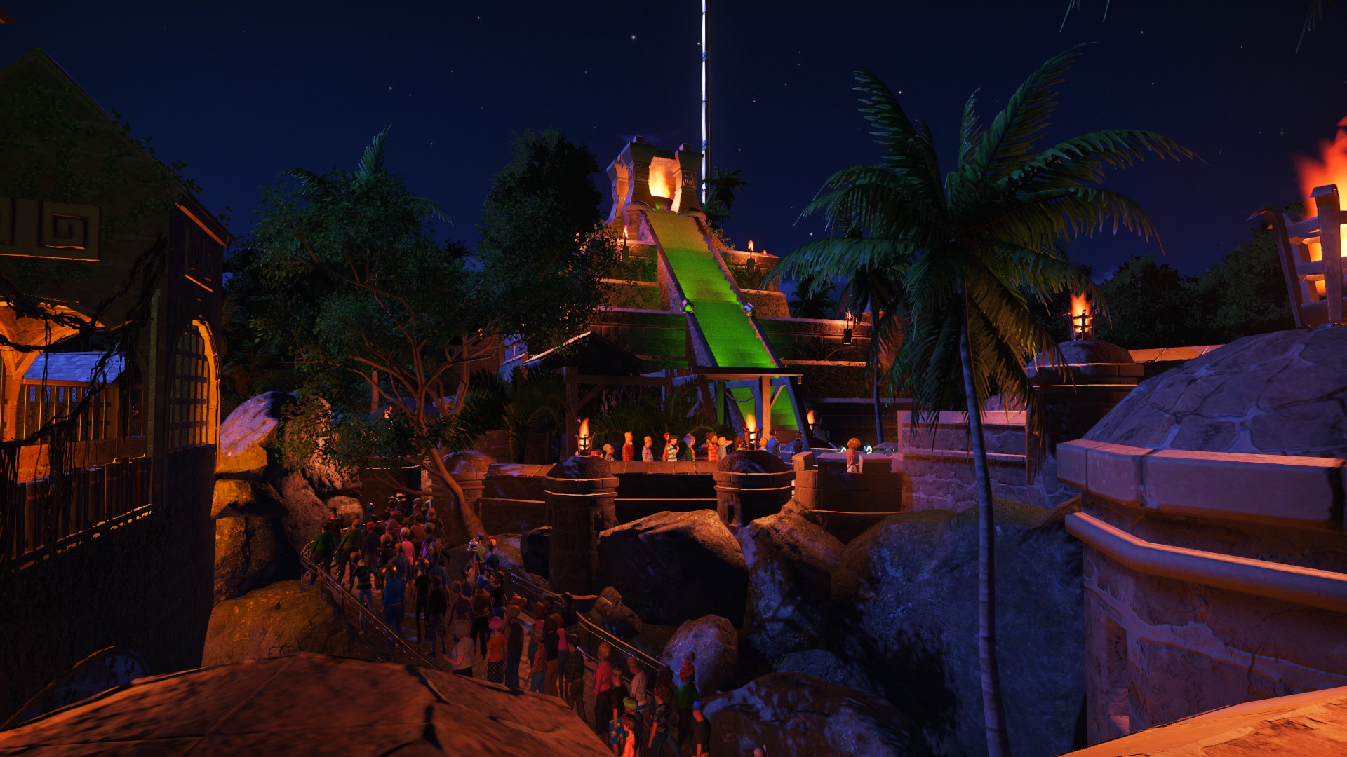
Other bits of scenery have since been added to the queue outside the station building, such as the priority pass queue surrounding the main queue being bordered off by a themed wall, various adventure pieces such as character tiles and vines have been dotted around existing buildings...and the station building itself has received an awesome lighting effect on the steps, which makes for an epic view at night.
As part of the coaster's pre-lift section (obviously inspired off Thorpe Park's Nemesis Inferno), riders begin their adventure by dropping into a tunnel in the side of the mountain, underneath the base of the station. Originally, because the building would overhang here otherwise, I'd attempted to theme that part of the building to instead appear as if it was eroding away down the side of the mountain, however this proved hard and didn't look too great in the end. So recently I instead created a separate building consisting of identical wall and ceiling pieces so that now it lines up with the tunnel entrance and looks very neat overall.
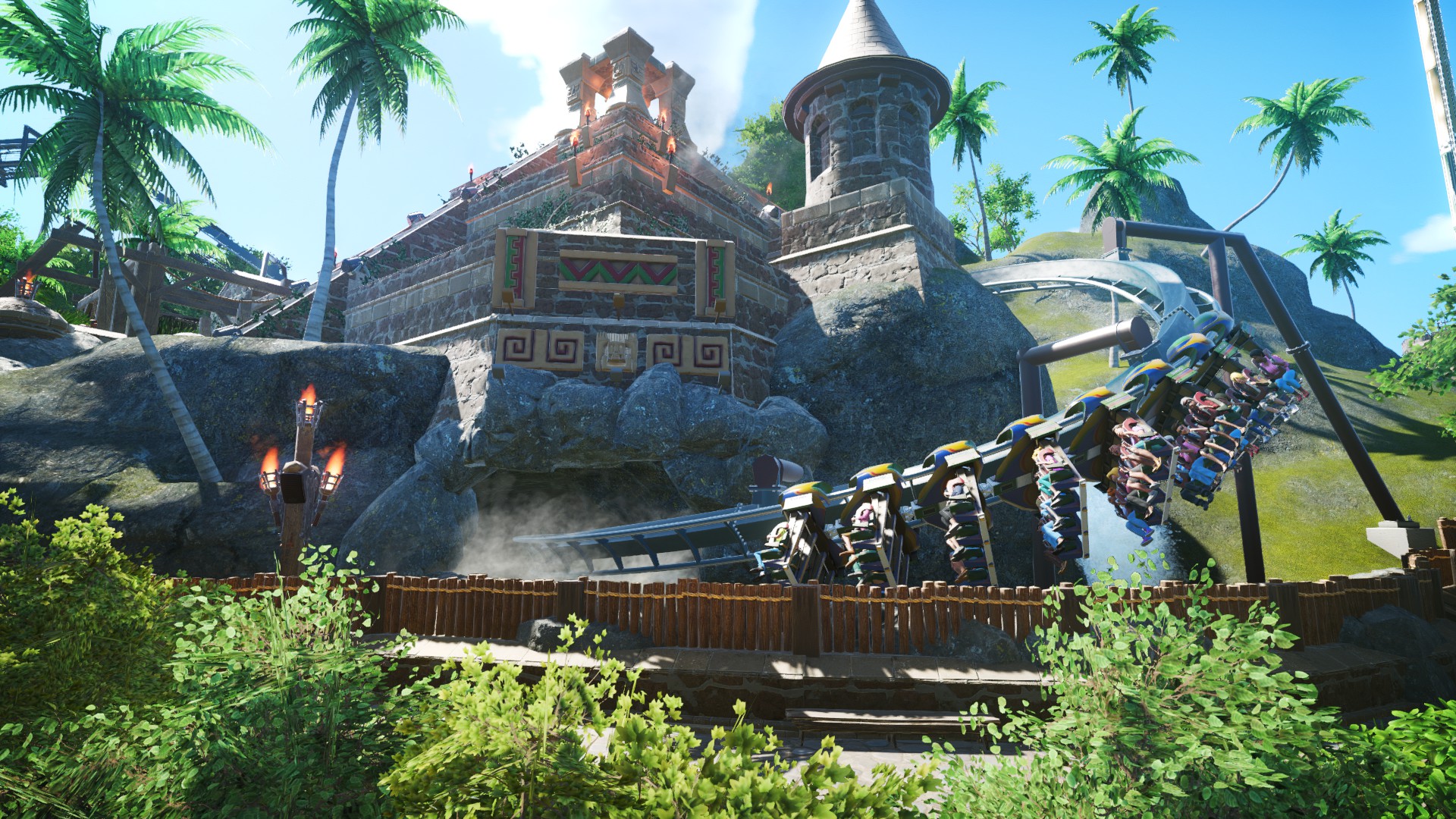
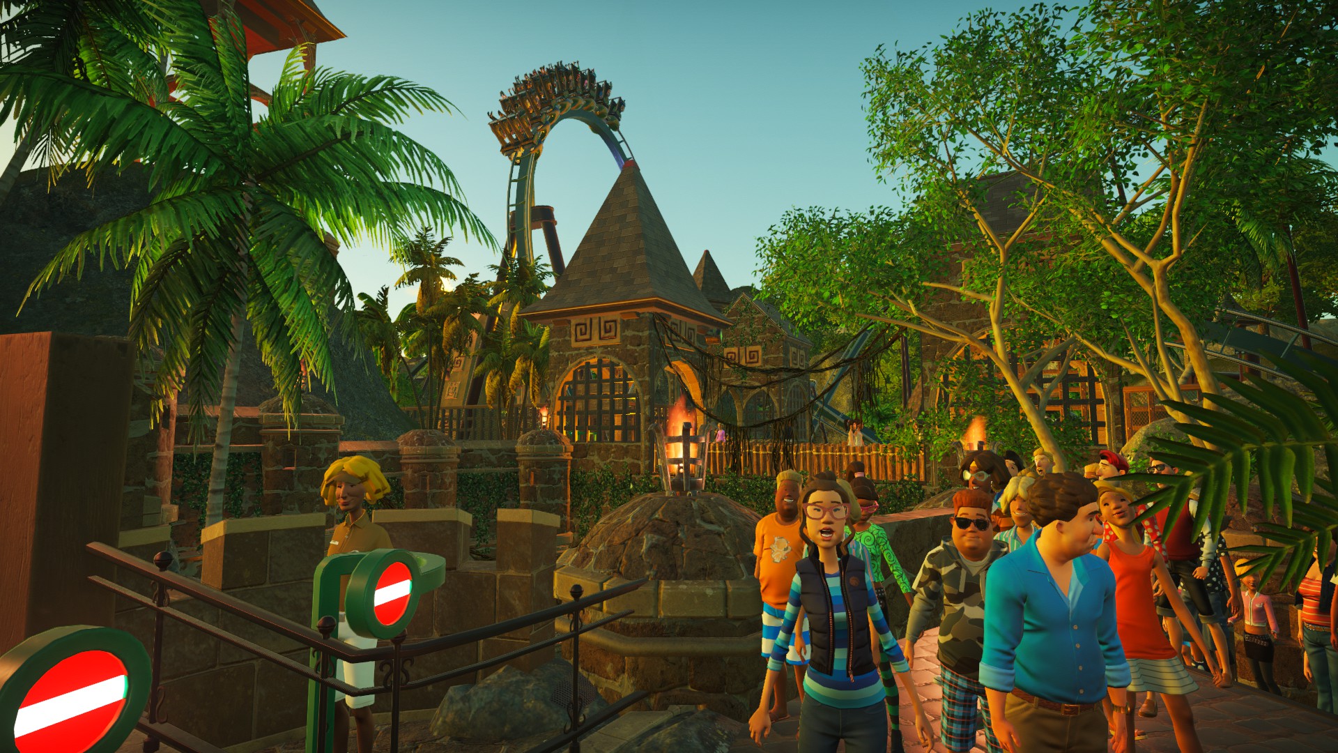
The ride entrance needed some work too, so, in similar fashion to the stone archway mentioned earlier, a similar one was built behind the existing facade which had formed the entrance previously (the stone face, wings and ride logo). The facade was then recoloured appropriately to blend in with its new backdrop. New fire effects were also added here to dramatise the train passing through the vertical loop.
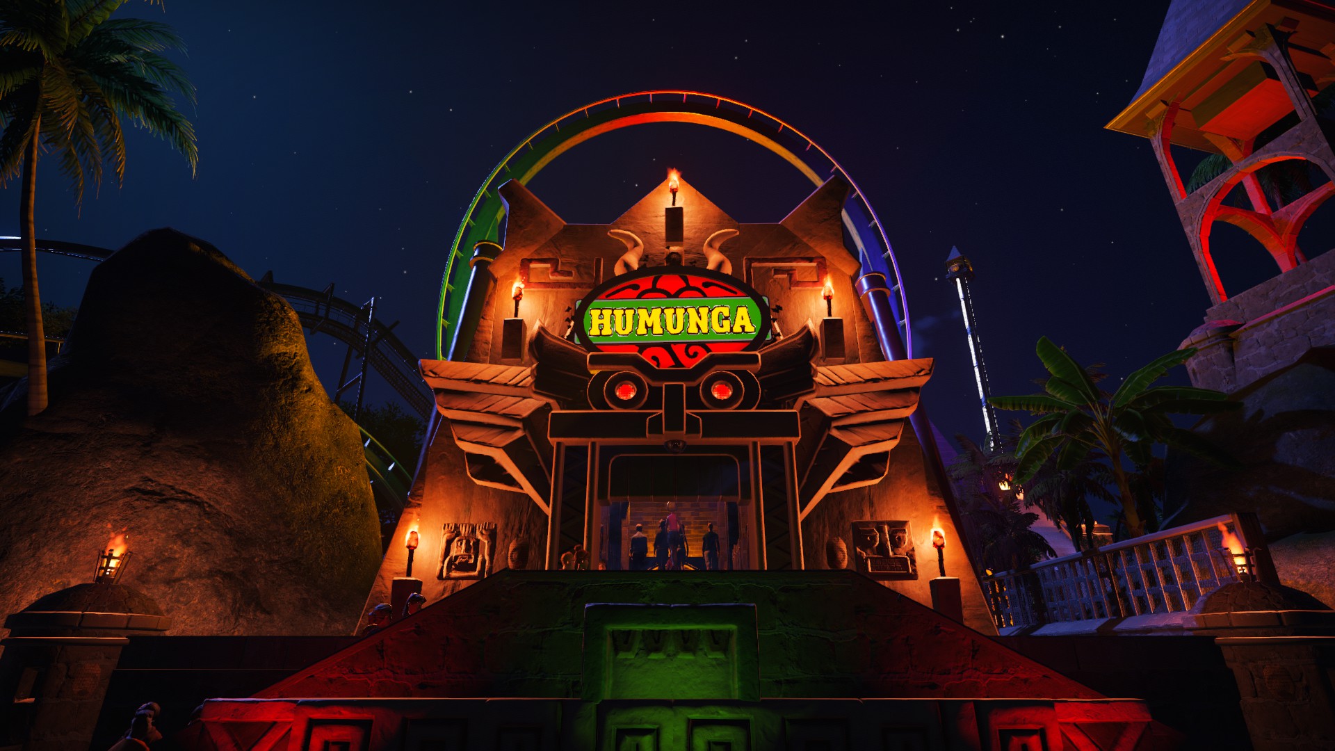
Finally, the station has also received some extra details, such as improved lighting, character tiles and vines. The lighting is quite a major improvement, as, having been shown how to change the colour of lights while they're still activated, I was able to incorporate it here to create quite the lights show. An effect seen on a lot of inverted coasters today, just before the train dispatches, the main lights on the ceiling will fade away, as red, purple and green lights either side of the train (seen below in a currently deactivated state) fade in at the same time, giving a cool "spotlight" impression on the train (the treasure chest in the corner is also illuminated by a red light at this point). Vice versa then occurs once the train behind has stopped in the station.
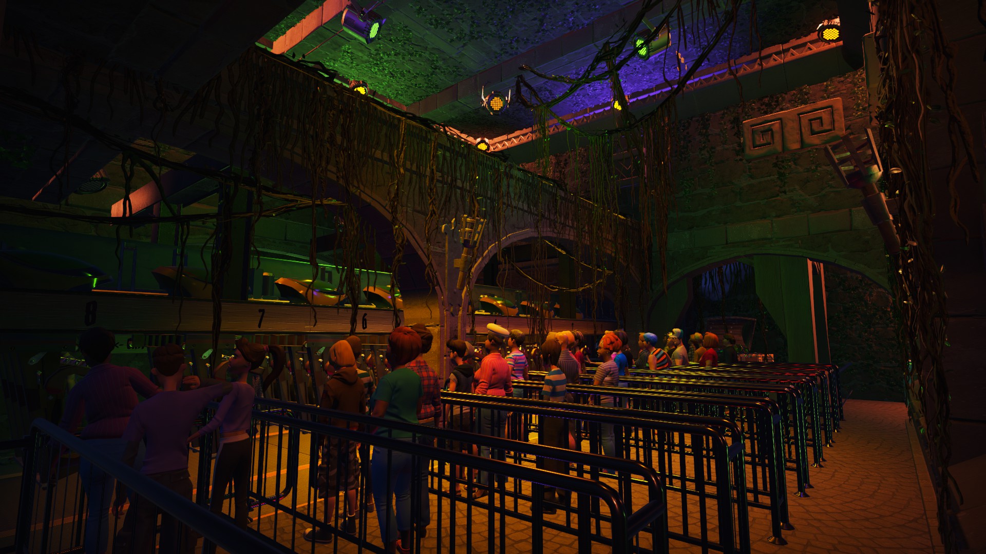
Other changes include, but are not limited to, a new paintjob for the track (originally it was dark blue with dark brown supports, in oppose to its current teal and dark red scheme), new rockwork, waterfalls and the addition of high fences to cordon off pathways close to the ride.
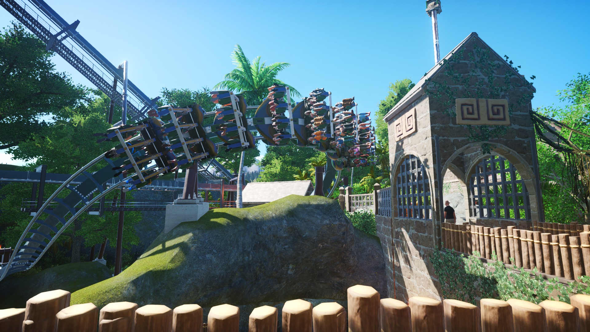
One of the earliest changes I made was the interaction with terrain and scenery surrounding the ride, as I really wanted to ensure Humunga was not only heavilly themed but also all-round an intense experience. Firstly, as my personal preference with real world inverted coasters is actually close interaction with terrain, I started here. Below is a pretty good example of guests seemingly on a collision course with an oncoming mountain!
To then further expand on the ride's already huge catalog of near misses, I very recently constructed a colossal stone archway behind the coaster's Immelmann element, which riders miss by inches. Despite this image making the arch look vertical, it's actually on a slight lean, so the base of the building lines up with the coaster itself and the top half is of course well clear of riders. It also therefore creates a nice illusion of the arch being vertical as mentioned above, as well as riders once again being sent on a collision course.
Following this, the Immelmann itself needed a bit of seeing to, as the inversion had always looked a bit lop-sided (smoothing was a classic rookie error in my early days of playing this game), so after a little fiddling around, I had it looking smoother and more realistic than it had been before.
Other bits of scenery have since been added to the queue outside the station building, such as the priority pass queue surrounding the main queue being bordered off by a themed wall, various adventure pieces such as character tiles and vines have been dotted around existing buildings...and the station building itself has received an awesome lighting effect on the steps, which makes for an epic view at night.
As part of the coaster's pre-lift section (obviously inspired off Thorpe Park's Nemesis Inferno), riders begin their adventure by dropping into a tunnel in the side of the mountain, underneath the base of the station. Originally, because the building would overhang here otherwise, I'd attempted to theme that part of the building to instead appear as if it was eroding away down the side of the mountain, however this proved hard and didn't look too great in the end. So recently I instead created a separate building consisting of identical wall and ceiling pieces so that now it lines up with the tunnel entrance and looks very neat overall.
The ride entrance needed some work too, so, in similar fashion to the stone archway mentioned earlier, a similar one was built behind the existing facade which had formed the entrance previously (the stone face, wings and ride logo). The facade was then recoloured appropriately to blend in with its new backdrop. New fire effects were also added here to dramatise the train passing through the vertical loop.
Finally, the station has also received some extra details, such as improved lighting, character tiles and vines. The lighting is quite a major improvement, as, having been shown how to change the colour of lights while they're still activated, I was able to incorporate it here to create quite the lights show.
Other changes include, but are not limited to, a new paintjob for the track (originally it was dark blue with dark brown supports, in oppose to its current teal and dark red scheme), new rockwork, waterfalls and the addition of high fences to cordon off pathways close to the ride.
Last edited:
RIGHT!!! This one's been on my mind for quite some time due to how rushed a few of the scenes in the dark ride section were, but today I turned back to my pirate themed water coaster, SkullRock Falls: The Quest for Lockjaw's Loot. Below is a brief overview of the ride as a whole, you can probably tell it was designed with a very similar layout to Splash Mountain in mind:
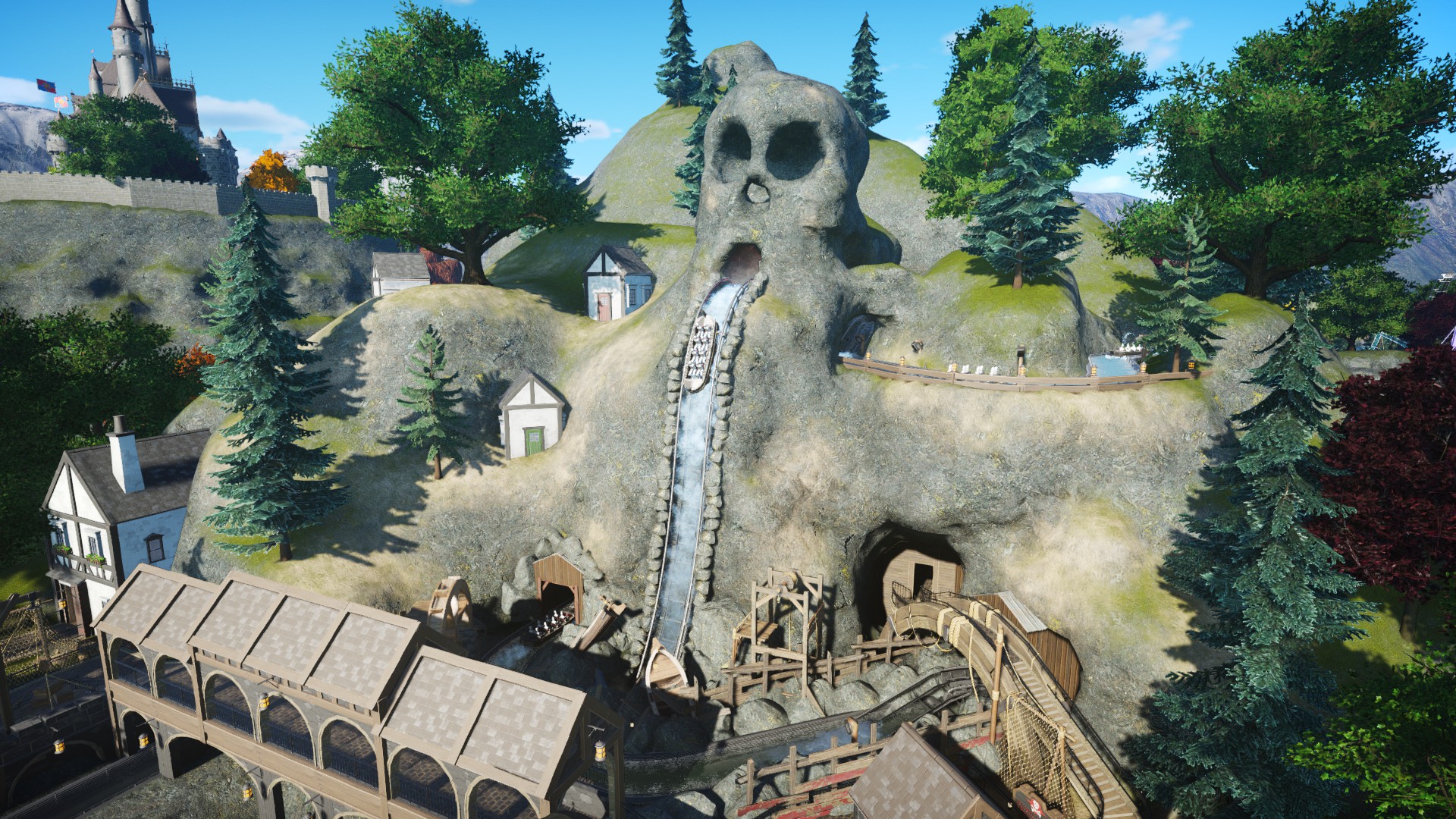
As the mentioning of Splash Mountain implies, the ride contains a multi-storey dark ride section, making this the most complex ride I've built. The ride itself follows the misadventures of a young redcoat explorer named Jack, in search of the buried treasure of Captain Lockjaw with a band of pirates hot on his tail with the same intentions.
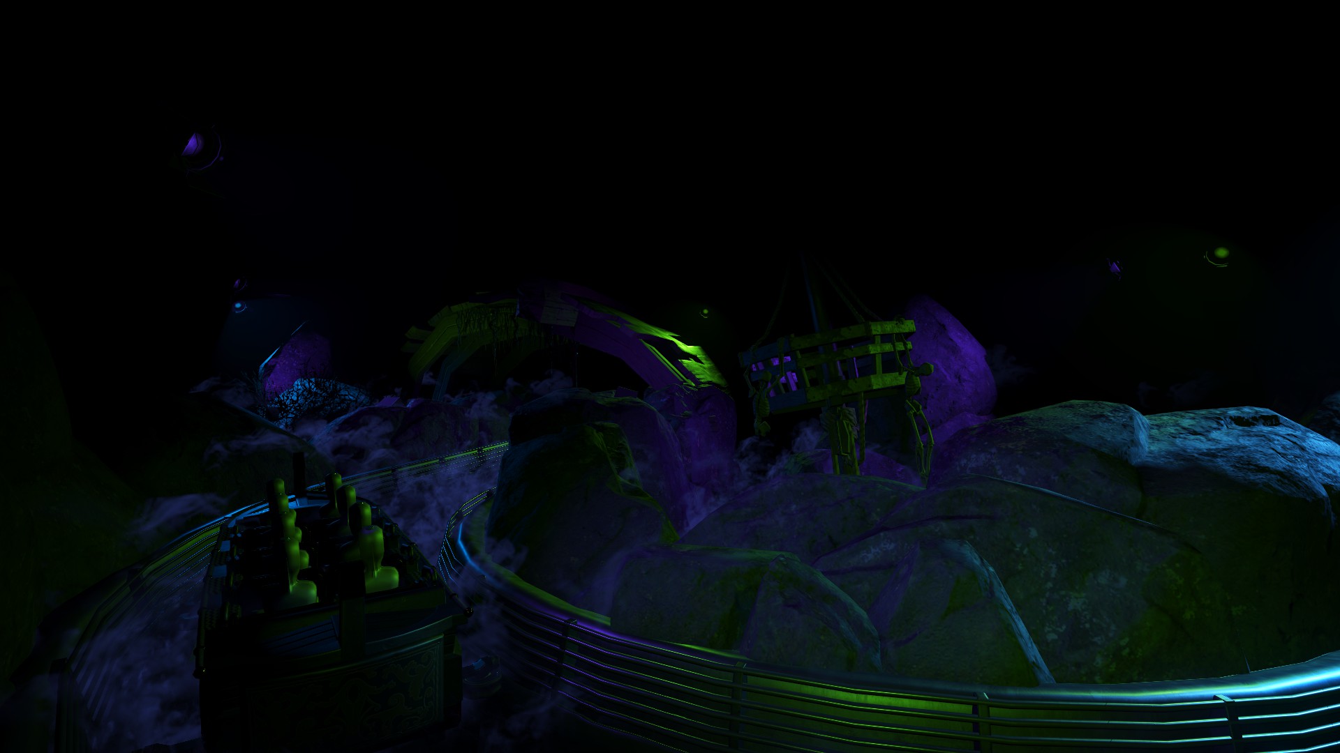
Sadly though, some scenes, especially the first two scenes of the dark ride section, as mentioned, had been very rushed beforehand, usually with minimal lighting and theming used. In recent times, including today, I've put all that aside and breathed some well-deserved life into the ride. A few weeks ago, I made a major change to the very first part of the ride. Initially, this had just been a simple tunnel through terrain. I opened this section out and got to work with a miniature show section with some great use of lighting:
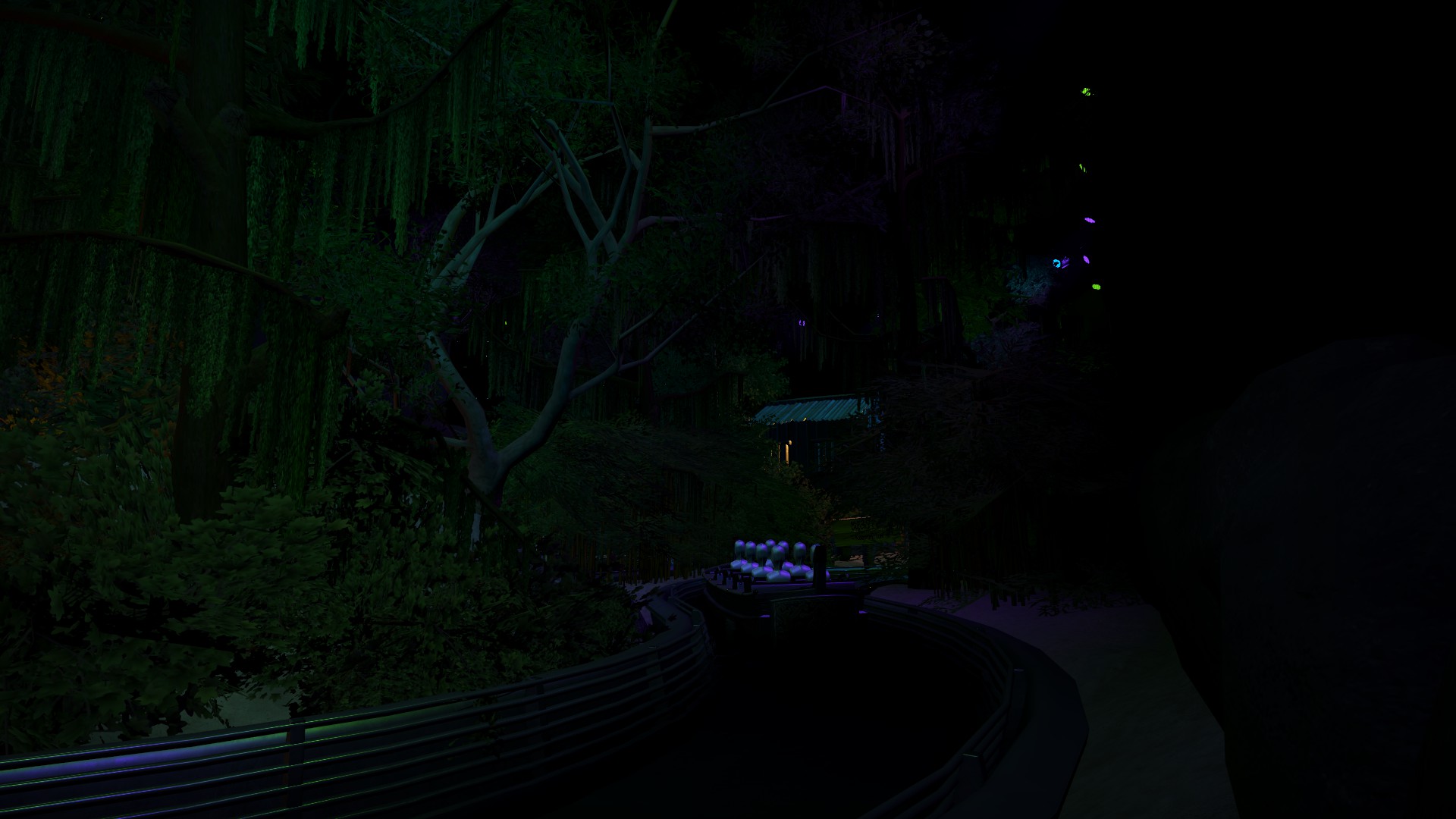
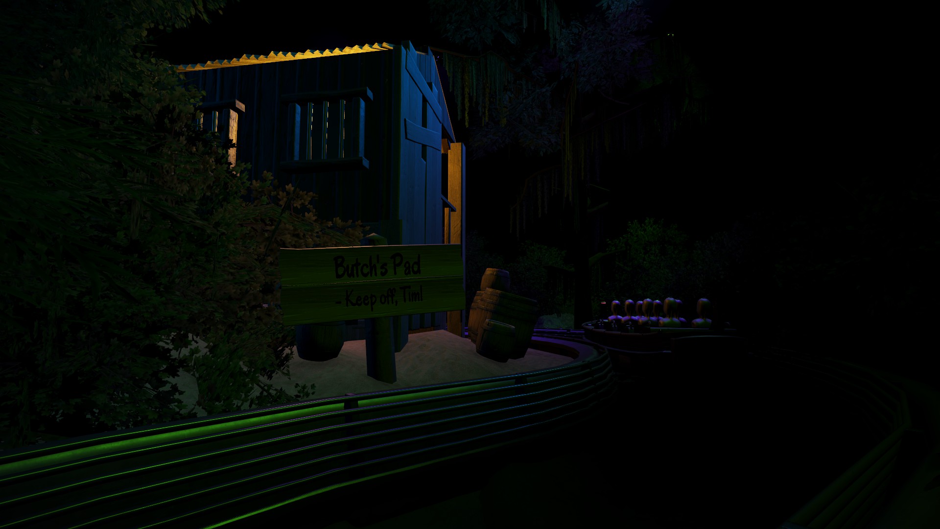
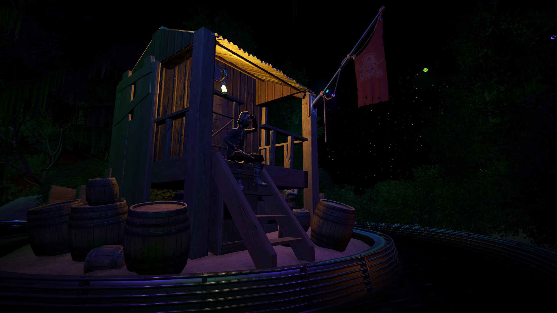
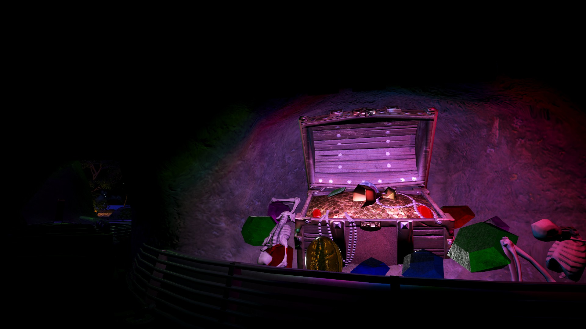
Today however, I got to work with some latter scenes in the ride which had also been lacking. The first scene covered is where you first encounter Jack, followed by the first of many pirates...and finally the buried treasure of Lockjaw. To start with, this had just been a very simple forest with hardly any lighting or scenery, besides foliage and repetitive pale blue lighting. I've since completely gutted it and transformed it into more of a swamp setting, containing additional buildings, props and far more dynamic lighting:
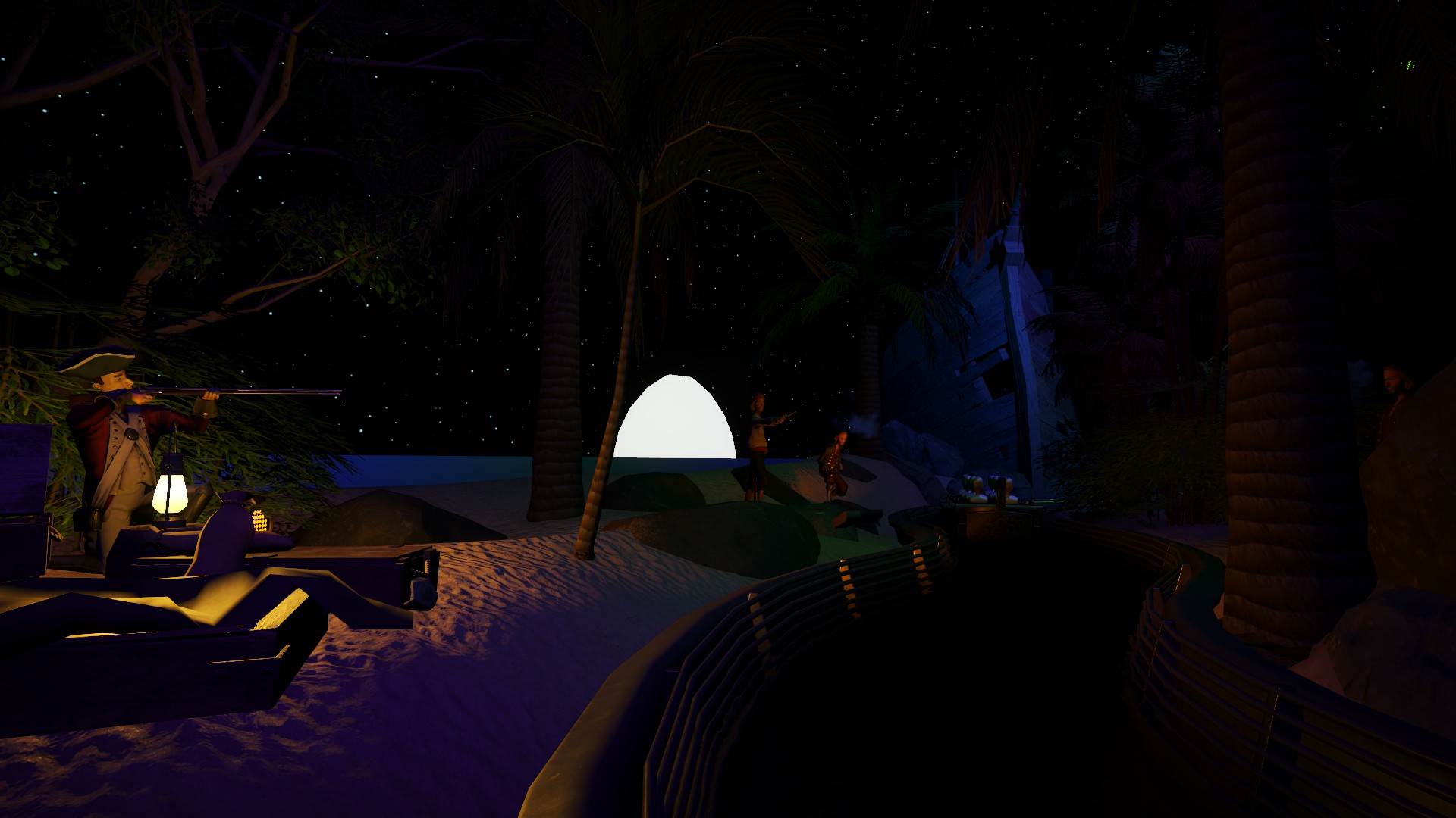
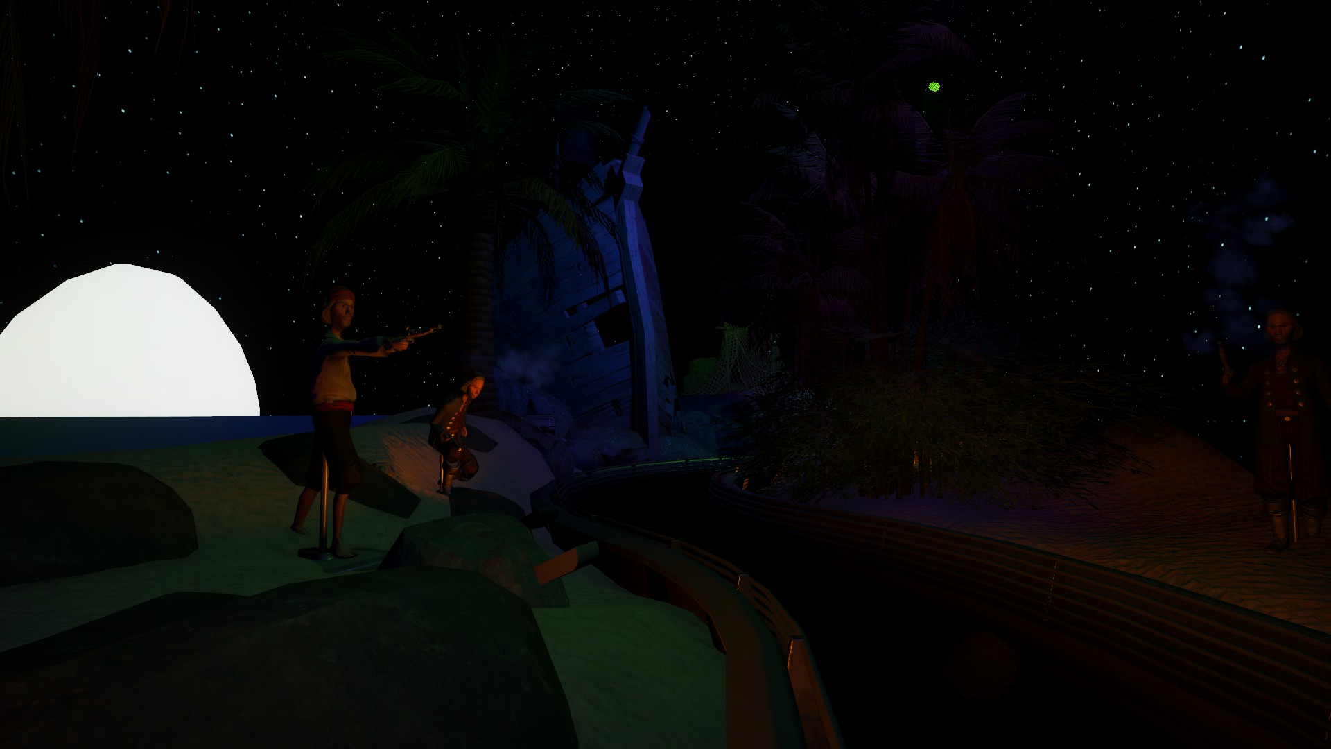
After discovering the treasure, what follows is a shootout between Jack and the pirates over the treasure. This scene I ambitiously reimagined into a beach, using different panels to create the illusion of a distant horizon over the sea, with the moon beaming in the background.
The scene after this only saw some changes in lighting and minor triggered effects, but this scene acts as a transition between Jack getting captured and the pirates attacking his home village. Suspense is built with the use of audio, lighting...and skeletons, and riders disappear into blackness. Suddenly, with a flash of lightning, what should materialise out of the darkness other than the Flying Dutchman, now on a collision course with riders! With the ghastly bow just inches away from riders, the whole thing vanishes in another flash, and riders hurtle down a steep drop.
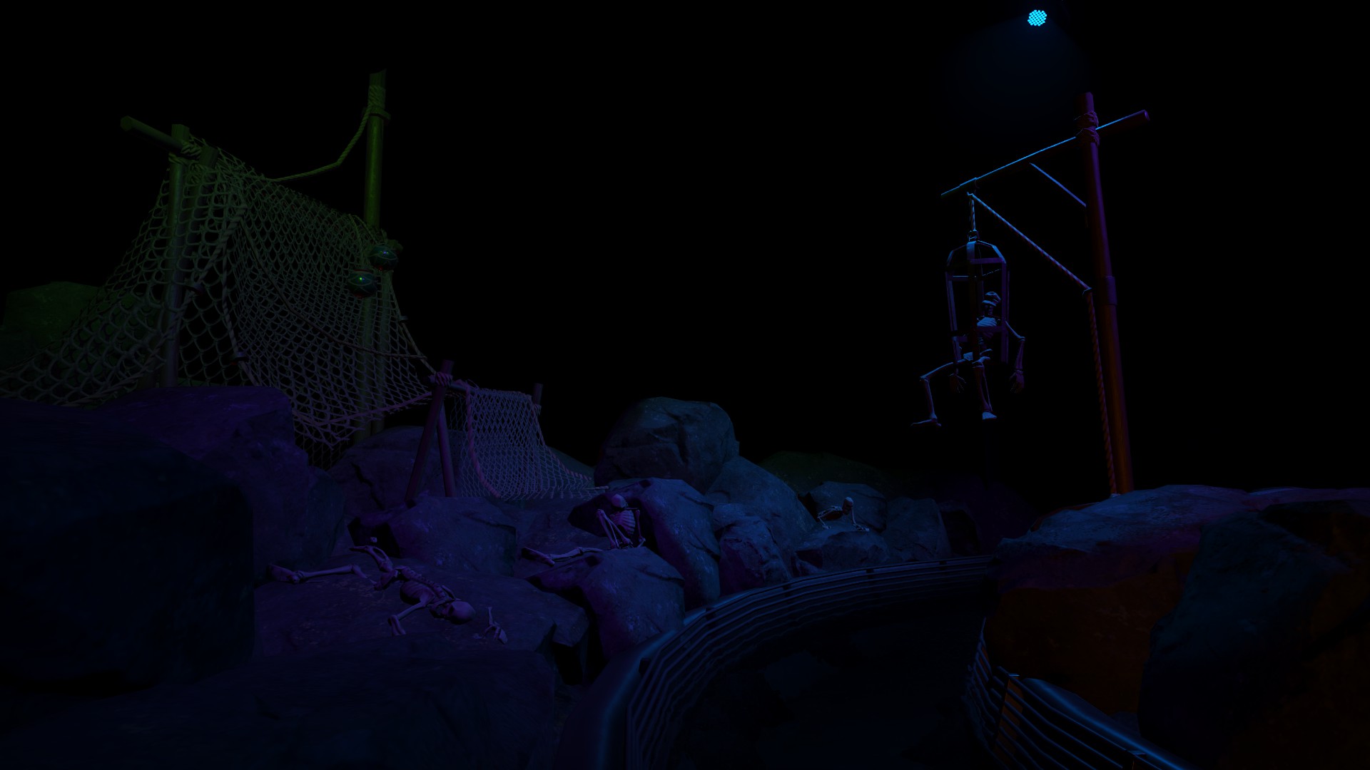
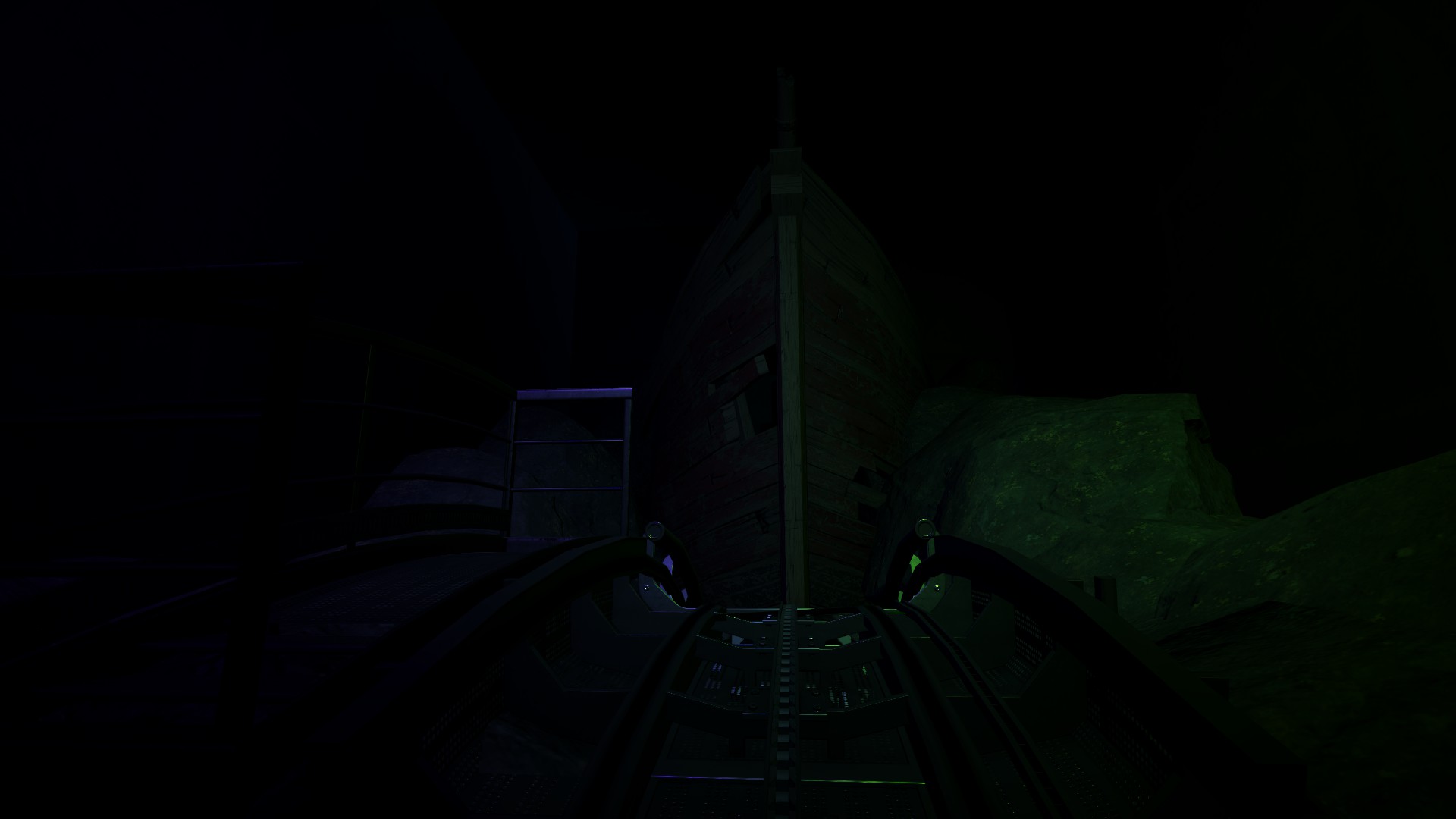
The scene after this I'm hoping to revamp slightly, as I'd originally planned on the pirates to open fire on the town from a ship...but as the scene was far too small for the galleon scenery piece, I had to settle for the pirates arriving at an adjacant jetty by rowboat and attacking from there. But as I've learned the longer I've played this game...anything is possible.
As the mentioning of Splash Mountain implies, the ride contains a multi-storey dark ride section, making this the most complex ride I've built. The ride itself follows the misadventures of a young redcoat explorer named Jack, in search of the buried treasure of Captain Lockjaw with a band of pirates hot on his tail with the same intentions.
Sadly though, some scenes, especially the first two scenes of the dark ride section, as mentioned, had been very rushed beforehand, usually with minimal lighting and theming used. In recent times, including today, I've put all that aside and breathed some well-deserved life into the ride. A few weeks ago, I made a major change to the very first part of the ride. Initially, this had just been a simple tunnel through terrain. I opened this section out and got to work with a miniature show section with some great use of lighting:
Today however, I got to work with some latter scenes in the ride which had also been lacking. The first scene covered is where you first encounter Jack, followed by the first of many pirates...and finally the buried treasure of Lockjaw. To start with, this had just been a very simple forest with hardly any lighting or scenery, besides foliage and repetitive pale blue lighting. I've since completely gutted it and transformed it into more of a swamp setting, containing additional buildings, props and far more dynamic lighting:
After discovering the treasure, what follows is a shootout between Jack and the pirates over the treasure. This scene I ambitiously reimagined into a beach, using different panels to create the illusion of a distant horizon over the sea, with the moon beaming in the background.
The scene after this only saw some changes in lighting and minor triggered effects, but this scene acts as a transition between Jack getting captured and the pirates attacking his home village. Suspense is built with the use of audio, lighting...and skeletons, and riders disappear into blackness. Suddenly, with a flash of lightning, what should materialise out of the darkness other than the Flying Dutchman, now on a collision course with riders! With the ghastly bow just inches away from riders, the whole thing vanishes in another flash, and riders hurtle down a steep drop.
The scene after this I'm hoping to revamp slightly, as I'd originally planned on the pirates to open fire on the town from a ship...but as the scene was far too small for the galleon scenery piece, I had to settle for the pirates arriving at an adjacant jetty by rowboat and attacking from there.
Francesca Falcini
Senior Community Manager
HeatherG
Volunteer Moderator
@CaptainKerfuffle Outstanding as always 
Your use of lighting throughout this whole build is genuinely impeccable, and this latest scene is incredible, the level of detail is amazing!
Thank you both!!@CaptainKerfuffle Outstanding as always
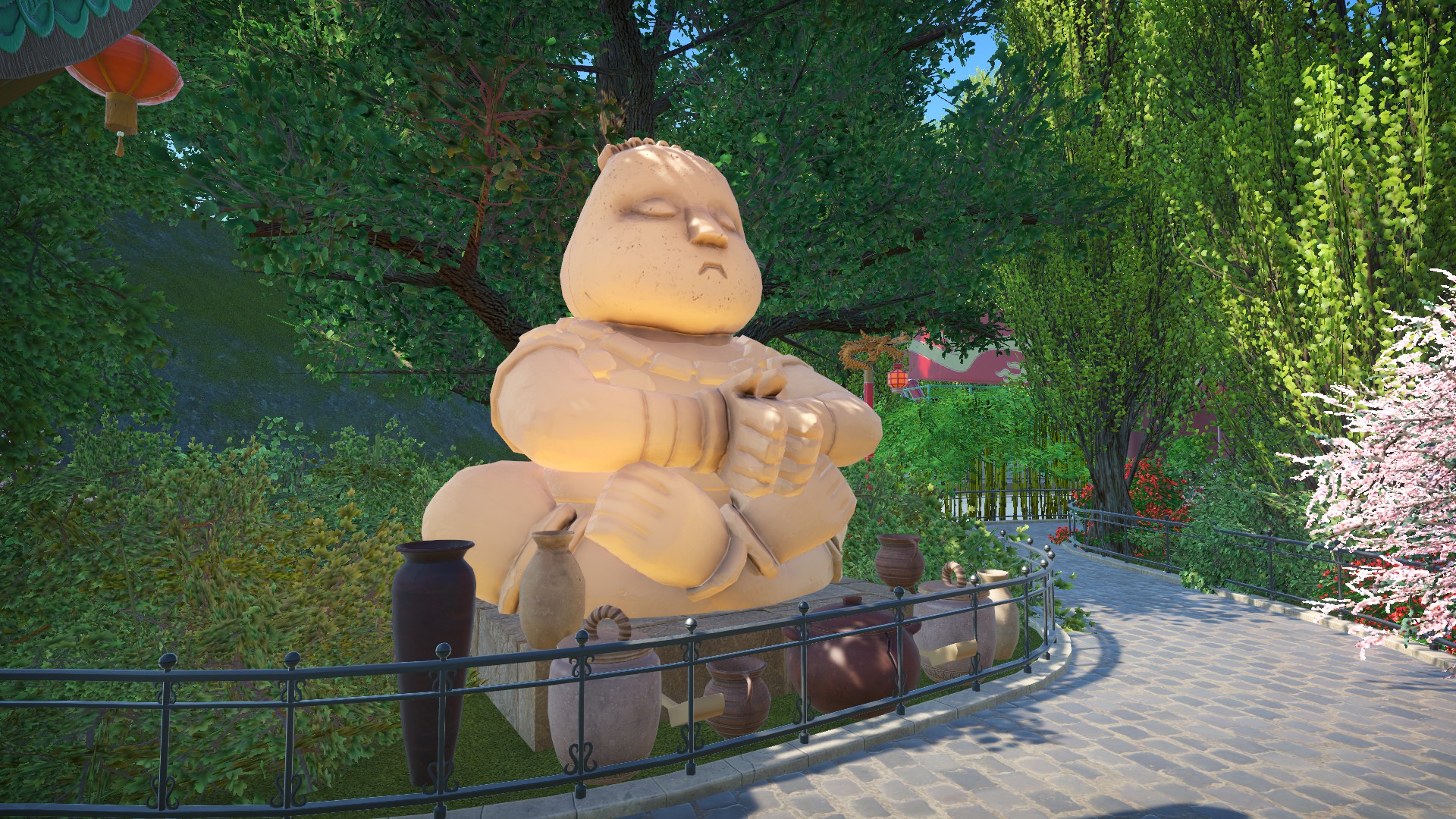
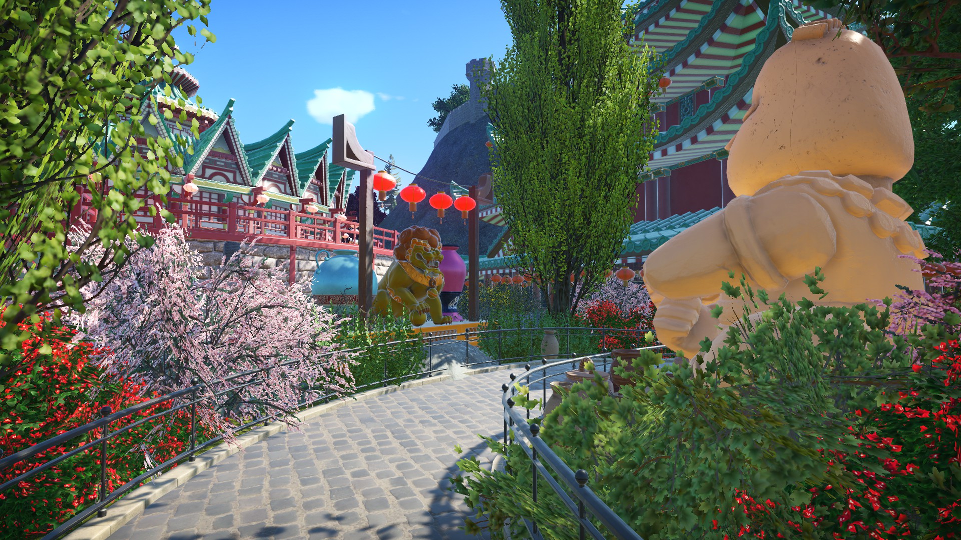
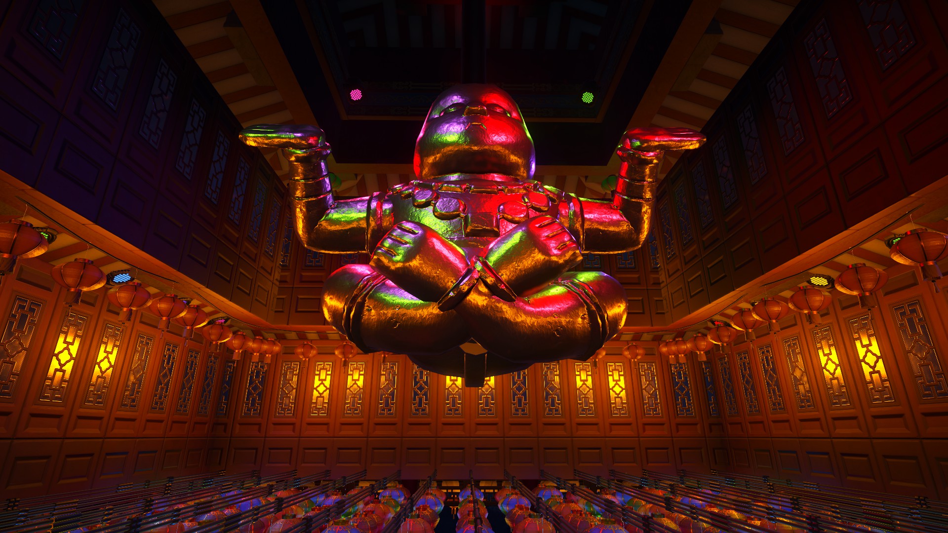
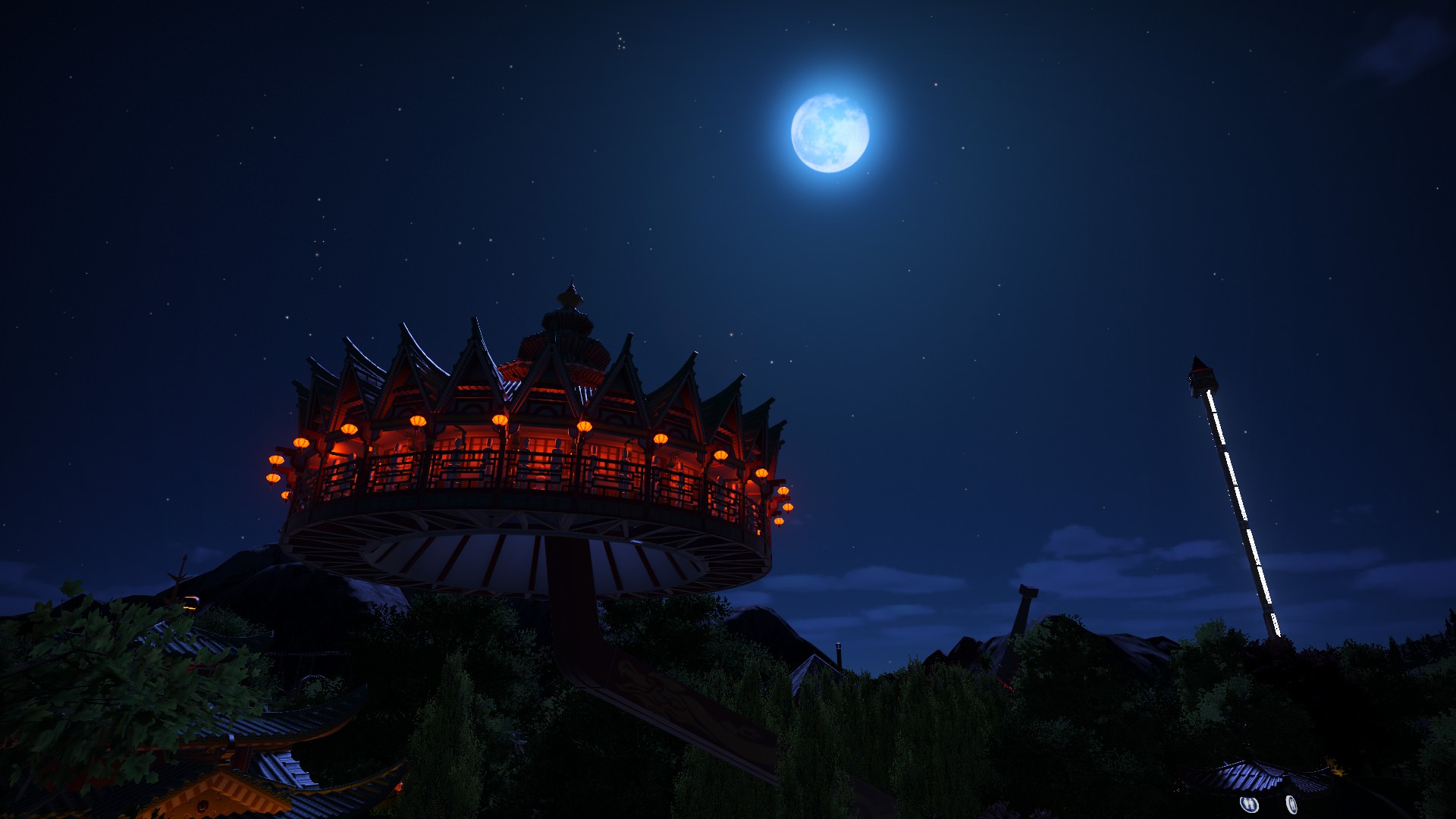
Been messing around in the queue for my Sky Temple, Palace Chang'e...and now by accident, the queue now follows one's journey towards true balance and enlightenment. 
It only makes the combined theme of not only the Chinese goddess but also meditation so much more appropriate, as from personal experience, I've had a few rare meditations where I feel like I'm floating.
...so maybe the idea is that this monk eventually achieves true enlightenment, and his spirit causes himself and the temple to float off gently towards Chang'e and her moon.
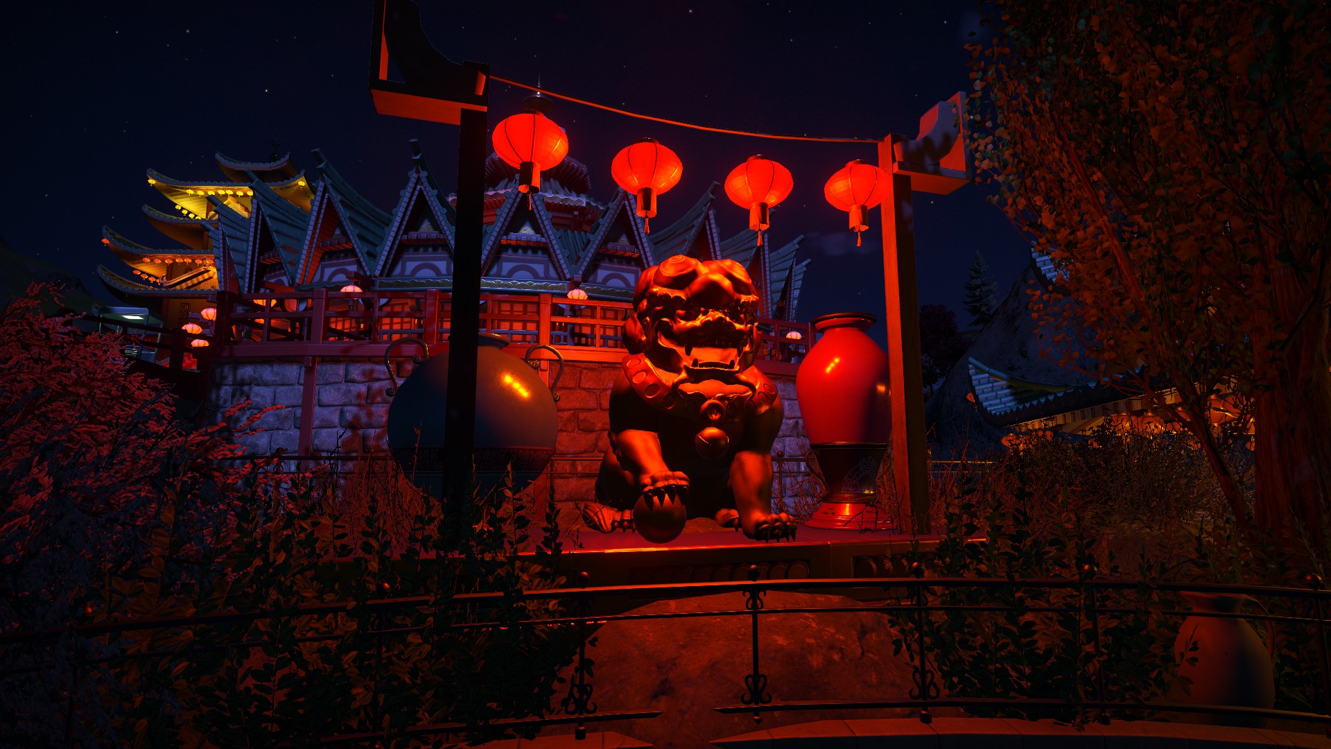
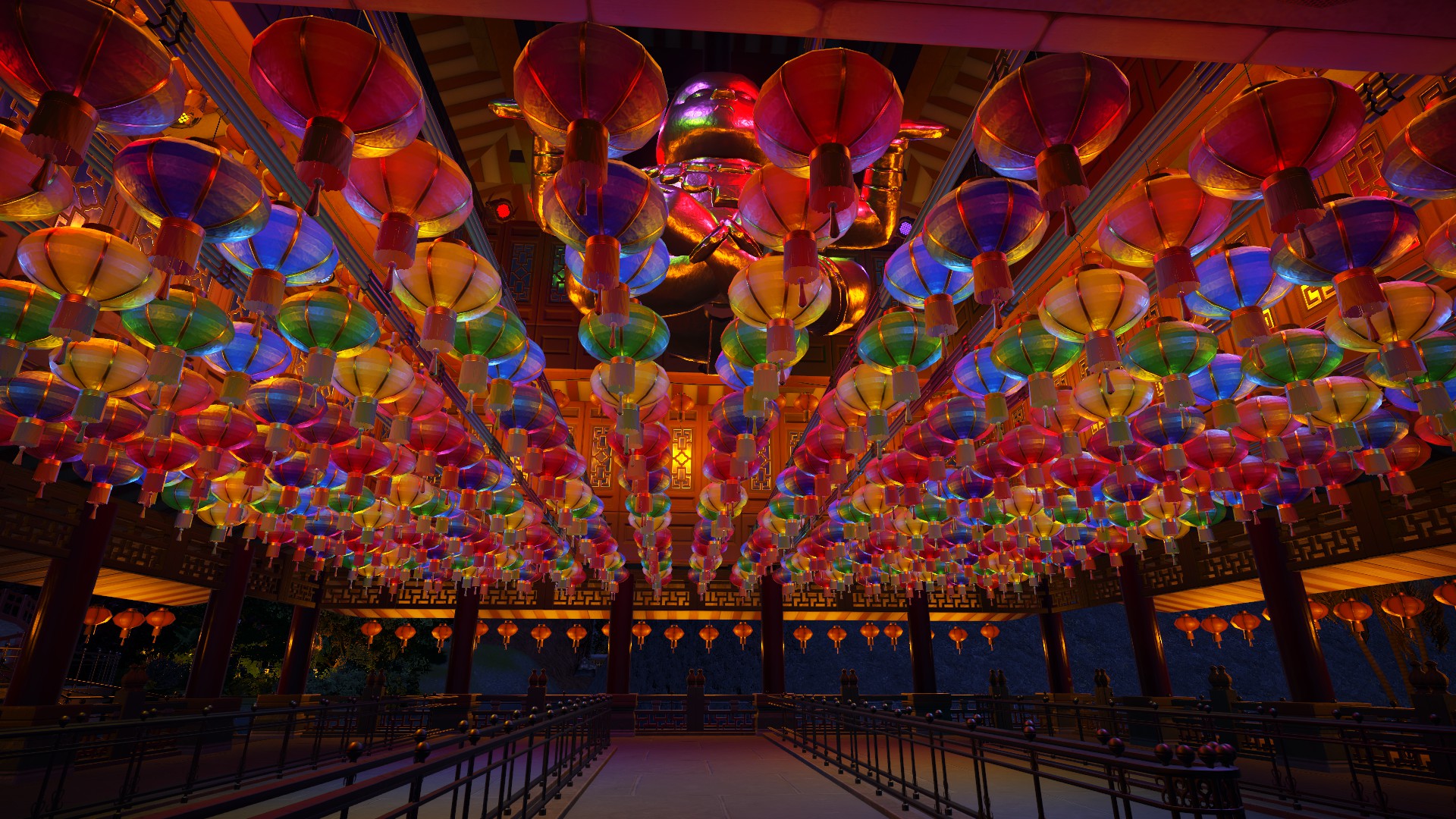
This is an incredibly minor update but I wanted to share as I'm pretty chuffed with it 
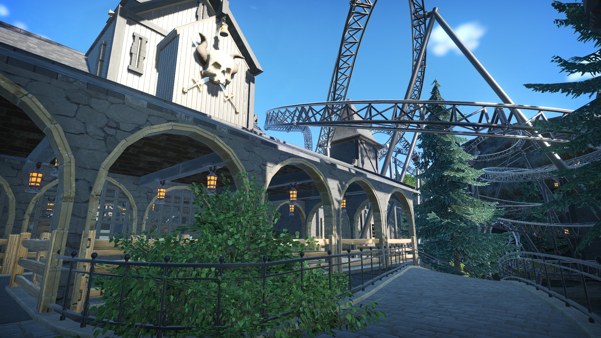
Talon is one of many coasters I'm still adding to today. One thing that had been bugging me since completion in March 2020 was the covered queue before the station, especially with its ugly wooden fences which didn't contrast with the building at all. Below are some old screenshots:
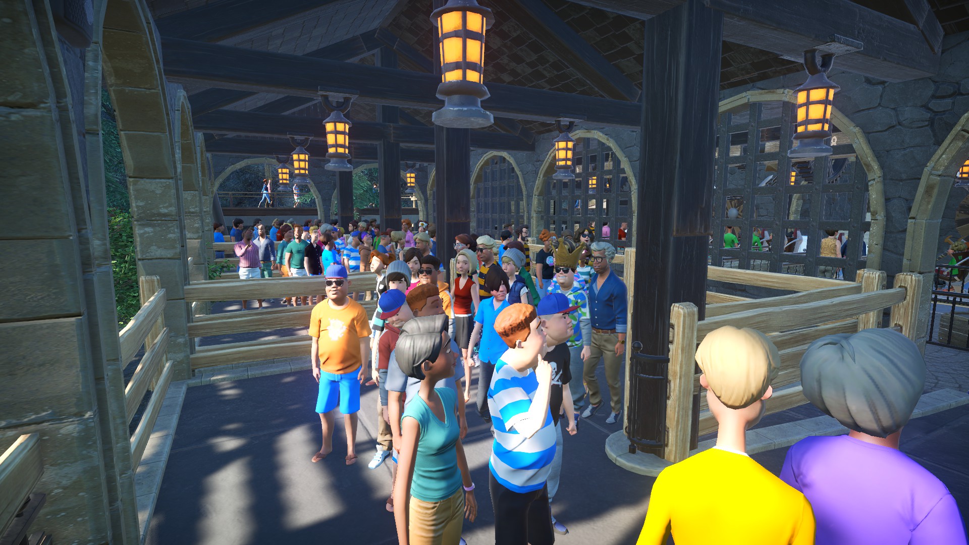
Now the archways have been boarded up, allowing for an indoor queue as opposed to a simple covered queue.
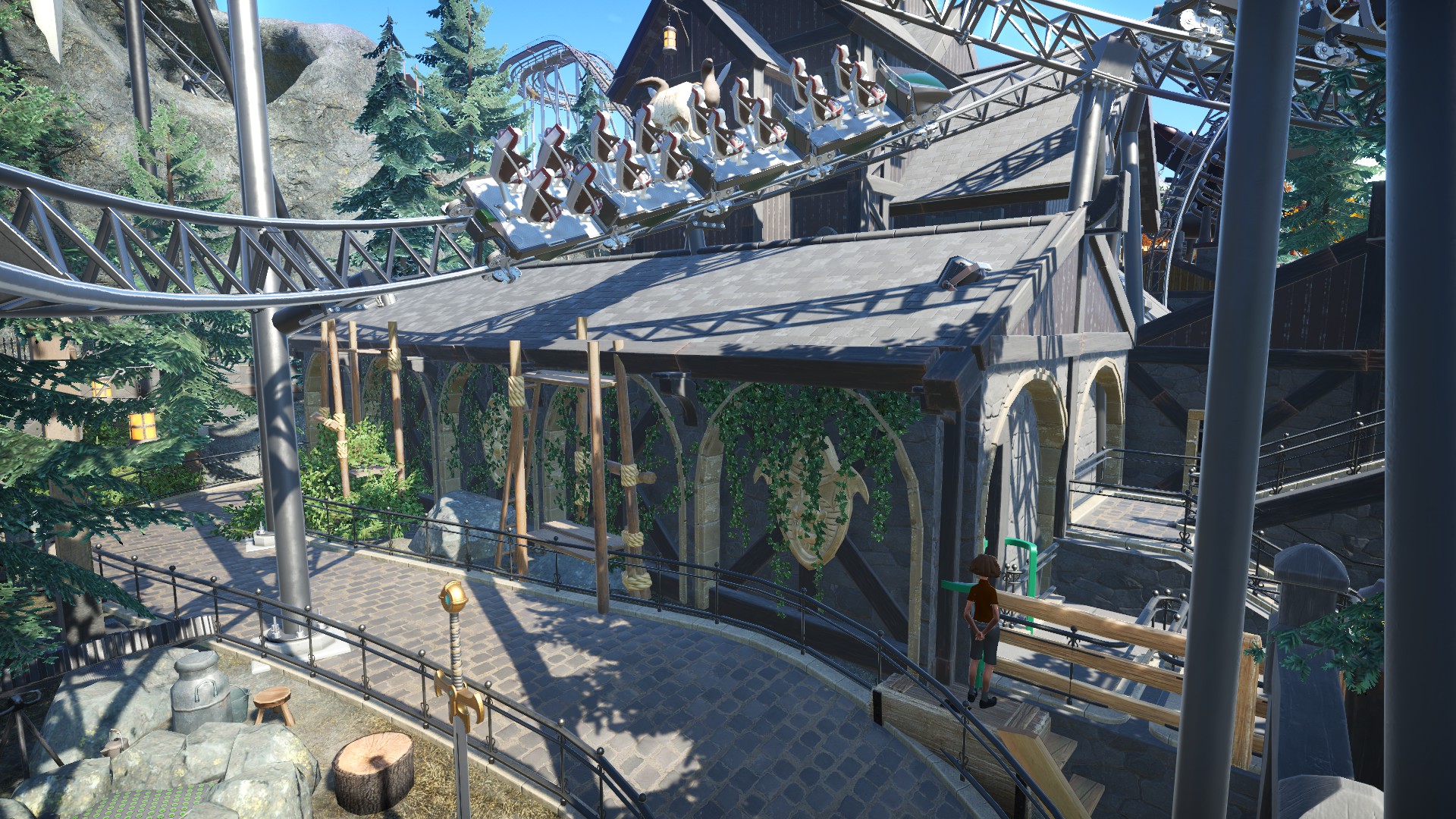
Along with the addition of new lighting, the main changes here were new pipework winding above the queue, as well as new fencing...in the form of the metal fences from the Vintage DLC. Along with some barrels and cogs dotted around, the little changes really sell the intended Steampunk-Viking theme.
The custom audio I put together for the station a while back really pumps out a lovely atmosphere as well! Combining four different ambient tracks (including a D&D 'Dwarven Forge' and a steampunk factory, as well as the same ambient track heard in the station for Taron at Phantasialand ('Cold Fear 12' by Cornelus Bolten)), with a series of sound effects from steam valves releasing to heavy cogs, gears and ratchets grinding.
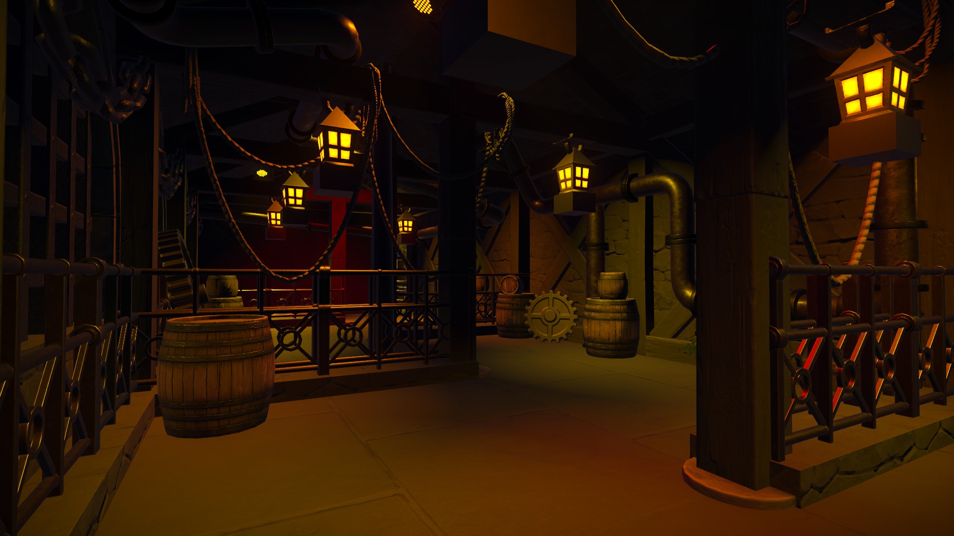
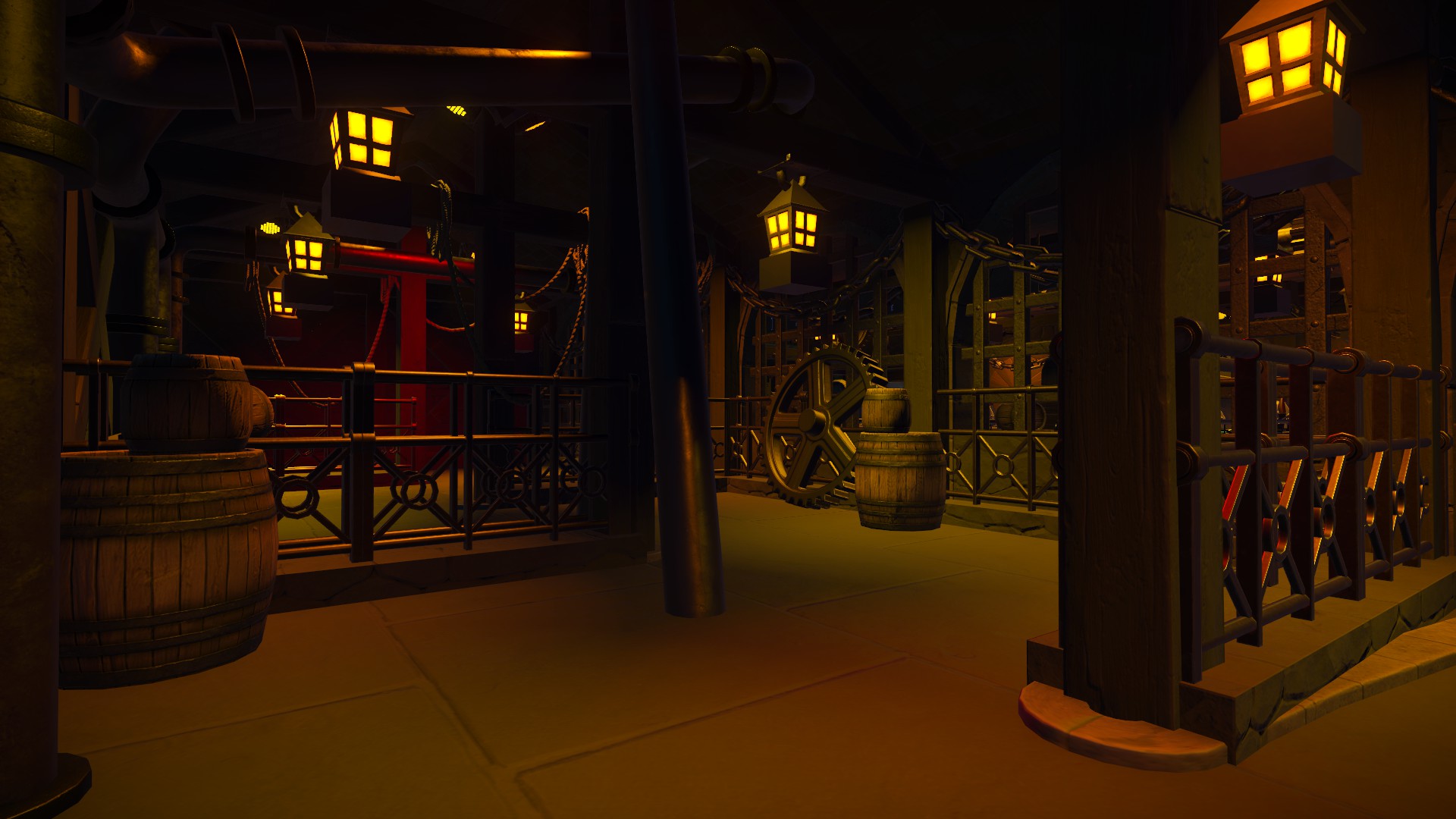
Though it isn't that clear here, the new piping continues into the station too. Lighting and props have also since been updated over time.
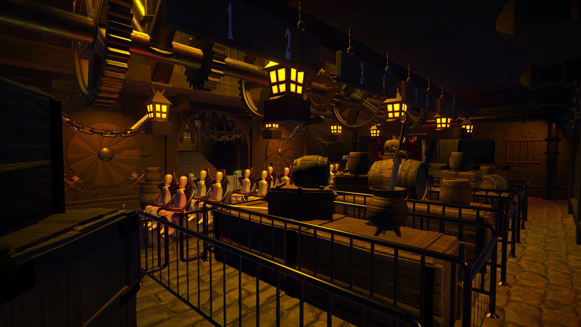
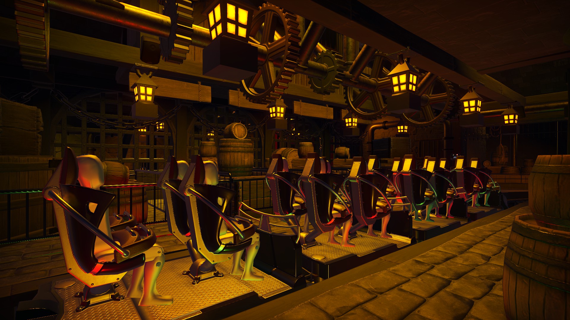
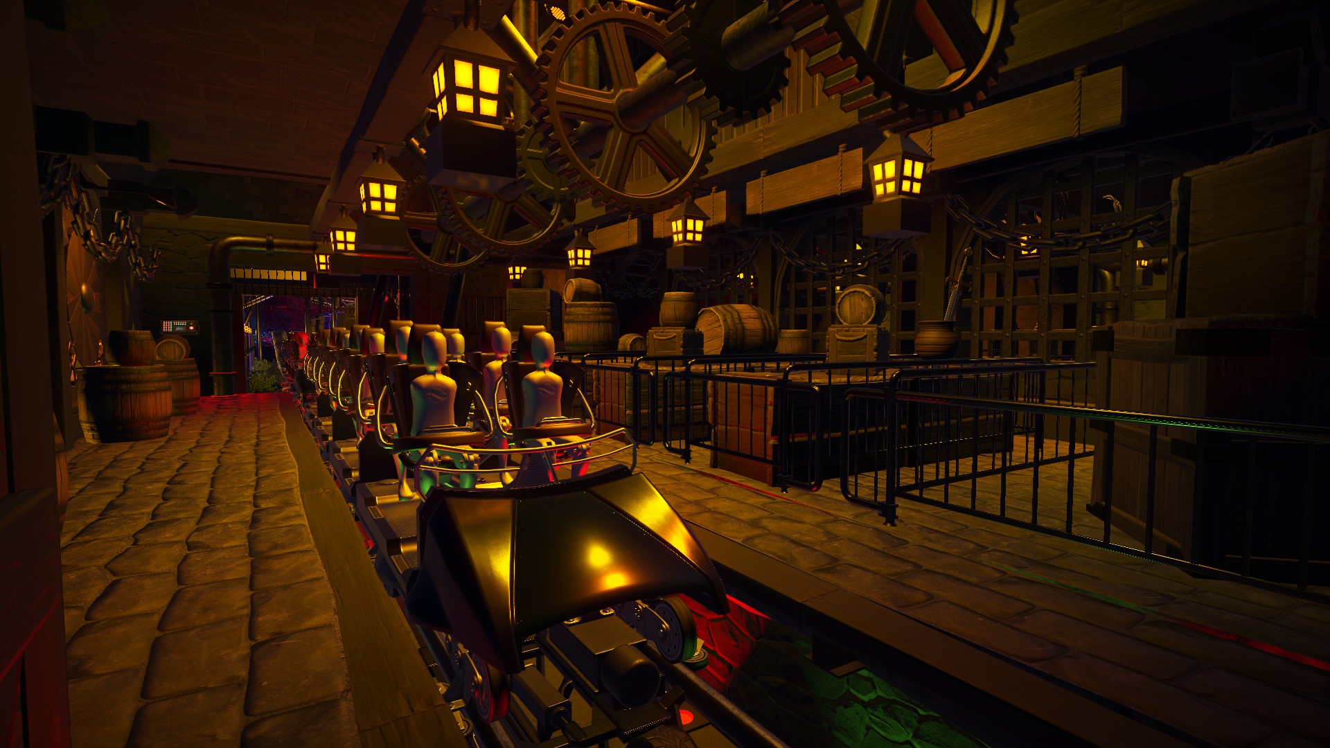
Talon is one of many coasters I'm still adding to today. One thing that had been bugging me since completion in March 2020 was the covered queue before the station, especially with its ugly wooden fences which didn't contrast with the building at all. Below are some old screenshots:
Now the archways have been boarded up, allowing for an indoor queue as opposed to a simple covered queue.
Along with the addition of new lighting, the main changes here were new pipework winding above the queue, as well as new fencing...in the form of the metal fences from the Vintage DLC. Along with some barrels and cogs dotted around, the little changes really sell the intended Steampunk-Viking theme.
The custom audio I put together for the station a while back really pumps out a lovely atmosphere as well! Combining four different ambient tracks (including a D&D 'Dwarven Forge' and a steampunk factory, as well as the same ambient track heard in the station for Taron at Phantasialand ('Cold Fear 12' by Cornelus Bolten)), with a series of sound effects from steam valves releasing to heavy cogs, gears and ratchets grinding.
Though it isn't that clear here, the new piping continues into the station too. Lighting and props have also since been updated over time.
Last edited:
