Hey Everyone,
The hud reticle needs some needed contrast when overlapping a bright star.
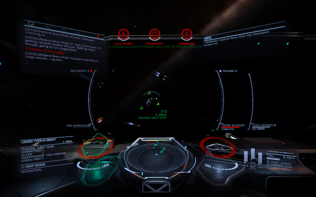
You know those times you're having some sweet dogfighting going and then you veer into the sun and lose sight of your reticle impairing your aim as it disappears into the brightness of the Star?
The other panels (comms and status panels), their text, along with left and right hud borders derfinitely have transparent shadow backdrop specifically to give necessary contrast when viewing against the sun.
I am surprised the target reticle does not have any such a feature as it is just as important, even MORE so when in the heat of combat at a nav point.
I dread those times when I have almost killed a ship that has initiated FSD and is on the verge of jumping right as we veer into the sun. I hold my breath and focus extra hard not to lose sight of the reticle hardpoint markers as I struggle to get the last shots at the targeted subsystem (FSD) before it's too late. Targeting that FSD with fixed weapons while you have no visible hardpoint target marker is disheartening.
I know you can change the hud brightness but that does not specifically help this situation. It's not just the reticle. When you target a ship, the target bracket with distance info is also made practically invisible. For instance those times you target a ship into the sun and want to close in on it you just can't see the distance reading against the star. The problem isn't only that the background is too bright for the reticle, but the color scheme of the hud/reticle is too close to the color of a majority of red/orange/yellow stars.
It would be nice to have some better contrast for the reticle and other readout text in the target box and other areas when it overlaps an exceedingly bright background (star). Nav Point combat could use this feature since combat into the sun is too common. Some simple dynamic reticle/indicator darkening would be nice if possible, or at least use the same code that is already being used to add darkened transparent background borders to the other panels/indicators/ and text. I don't know just my thoughts")
Thanks for listening and thanks Frontier and the Community for making this Game the masterpiece it is!!
The hud reticle needs some needed contrast when overlapping a bright star.
You know those times you're having some sweet dogfighting going and then you veer into the sun and lose sight of your reticle impairing your aim as it disappears into the brightness of the Star?
The other panels (comms and status panels), their text, along with left and right hud borders derfinitely have transparent shadow backdrop specifically to give necessary contrast when viewing against the sun.
I am surprised the target reticle does not have any such a feature as it is just as important, even MORE so when in the heat of combat at a nav point.
I dread those times when I have almost killed a ship that has initiated FSD and is on the verge of jumping right as we veer into the sun. I hold my breath and focus extra hard not to lose sight of the reticle hardpoint markers as I struggle to get the last shots at the targeted subsystem (FSD) before it's too late. Targeting that FSD with fixed weapons while you have no visible hardpoint target marker is disheartening.
I know you can change the hud brightness but that does not specifically help this situation. It's not just the reticle. When you target a ship, the target bracket with distance info is also made practically invisible. For instance those times you target a ship into the sun and want to close in on it you just can't see the distance reading against the star. The problem isn't only that the background is too bright for the reticle, but the color scheme of the hud/reticle is too close to the color of a majority of red/orange/yellow stars.
It would be nice to have some better contrast for the reticle and other readout text in the target box and other areas when it overlaps an exceedingly bright background (star). Nav Point combat could use this feature since combat into the sun is too common. Some simple dynamic reticle/indicator darkening would be nice if possible, or at least use the same code that is already being used to add darkened transparent background borders to the other panels/indicators/ and text. I don't know just my thoughts
Thanks for listening and thanks Frontier and the Community for making this Game the masterpiece it is!!
Last edited: