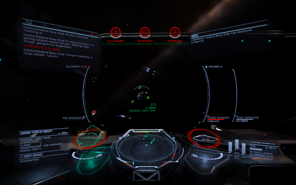
Combat into the Sun: Darkened Reticle and target Backdrop/Outline for contrast

Hey Everyone,

The hud reticle needs some needed contrast when overlapping a bright star.

You know those times you're having some sweet dogfighting going and then you veer into the sun and lose sight of your reticle impairing your aim as it disappears into the brightness of the Star?

The other panels (comms and status panels), their text, along with left and right hud borders derfinitely have transparent shadow backdrop specifically to give necessary contrast when viewing against the sun.

I am surprised the target reticle does not have any such a feature as it is just as important, even MORE so when in the heat of combat at a nav point.

I dread those times when I have almost killed a ship that has initiated FSD and is on the verge of jumping right as we veer into the sun. I hold my breath and focus extra hard not to lose sight of the reticle hardpoint markers as I struggle to get the last shots at the targeted subsystem (FSD) before it's too late. Targeting that FSD with fixed weapons while you have no visible hardpoint target marker is disheartening.

I know you can change the hud brightness but that does not specifically help this situation. It's not just the reticle. When you target a ship, the target bracket with distance info is also made practically invisible. For instance those times you target a ship into the sun and want to close in on it you just can't see the distance reading against the star. The problem isn't only that the background is too bright for the reticle, but the color scheme of the hud/reticle is too close to the color of a majority of red/orange/yellow stars.

It would be nice to have some better contrast for the reticle and other readout text in the target box and other areas when it overlaps an exceedingly bright background (star). Nav Point combat could use this feature since combat into the sun is too common. Some simple dynamic reticle/indicator darkening would be nice if possible, or at least use the same code that is already being used to add darkened transparent background borders to the other panels/indicators/ and text. I don't know just my thoughts :)

Thanks for listening and thanks Frontier and the Community for making this Game the masterpiece it is!!
 
Last edited:
+1. I would guess that it's a deliberate choice - for dramatic effect, perhaps - but even the cheap camera I had fifteen years ago had good contrast handling, never mind technology in the 34th century. As it is, it's not at all plausible.
 
Here is a screen capture showing an example. The reticle here is actually somewhat visible against this starts brightest spots, however, there are far brighter stars where the reticle and targeting data is COMPLETELY INVISIBLE.

On the contrary, the other HUD indicators (lines and text) have a much darker contrast against the star at any point over its surface. They also appear to have slight transparent border shading similar to the background of the comms and status panels on the upper left and right. The color of these indicators look similar to the reticle and both work well when viewed against the dark of space, however once overlapping the brightness of a sun these indicators remain nice and dark while the reticle and target data fades horribly.

Elite Dangerous Reticle Contrast.jpg
 
I've tried various UI colour schemes - and as it happens, I was mostly bountying at the nav-beacons, at the time. I wasn't looking for it specifically, but I didn't like most of the schemes I tried (they tend to scramble things like friendly and enemy colours). The ones I liked didn't really help much with the effect, as far as I noticed. There might be schemes that work that I didn't try.
 
I've tried various UI colour schemes - and as it happens, I was mostly bountying at the nav-beacons, at the time. I wasn't looking for it specifically, but I didn't like most of the schemes I tried (they tend to scramble things like friendly and enemy colours). The ones I liked didn't really help much with the effect, as far as I noticed. There might be schemes that work that I didn't try.
My biggest gripe with editing the colors is exactly what you mentioned - enemies are no longer red, shields are no longer blue, friendlies are no longer green.

I think if FDev added in some support for this kind thing that allowed us to change specific colors of specific elements, it would solve the issue.
 
I think changing HUD color in the options would be a very welcome feature. Currently the only way to change HUD color is via the unsupported config manipulation some have done to achieve a wide range of HUD colors in that way (I've seen in many YT videos).

However, I don't quite think these two issues (color vs contrast) are the same or interchangeable. Even different lighter colors will pose a visibility issue if they are not darkened or border shaded as the OTHER current HUD elements are as I outlined in my screen capture.

IMO, considering that the other hud lines, text, and elements are properly visible and contrast just fine against a bright sun (pic above), I don't see an obvious reason the reticle cannot be coded with the same variables given they are already implemented, JUST missing form the reticle itself.

Thanks for the input! :)

Take Care.
 
+1 for auto contrast.
I prefer the default HUD color, I like the orange side of the spectrum against the blackness of space.

I totally agree!! Even after seeing all the colors people chose with the HUD color MOD, it looks so odd to me. Blue especially looks strange. As you, I prefer the original color scheme with some added contrast to the reticle, the triangle target brackets, and ship info text that currently have NO contrast as with the other indicators mentioned.
 
I have a blue color (only hard to see with blue stars which fortunately aren't many) but I was able to keep three separate colors including green for friendlies. A lot of people who tweak their colors get the shade they like and roll with it. I tried modding for not only shade but color separation. To do this successfully I used the right panel Elite Logos for reference. If I had three separate and distinct colors then I had it right.

Screenshot_0389.png
 
Aha! So that's how you do it! Well done, that poster - have some rep, old sausage. :)

NB: For anyone reading who hasn't yet found the HUD recolouring thing, go here: http://arkku.com/elite/hud_editor/

Thank you kind sir +R to you too. The HUD is RGB based so whatever you do make sure you still got 3 distinct colors even if they are not RGB per se. Only thing I know that is a good indicator is the Elite logos.

Have fun changing it up!
 
I always thought this was purposeful - to give the tactical advantage to the player flying with the sun behind them, the same as it is with actual (plane) dogfights.
 
I always thought this was purposeful - to give the tactical advantage to the player flying with the sun behind them, the same as it is with actual (plane) dogfights.


You know I did have that thought regarding classic dog fighting tactics of ace WW2 pilots and I can't deny that it does give a bit of a tactical advantage to the player being fired upon when turning into the sun, however, I'm not sure whether it was or wasn't intentional.

If this ED universe is to make sense, manufacturers of such advanced ships/HUD tech would not leave this out given it is not some complex application for that time period.

As far as Frontier is concerned, and given that the other HUD markers have incorporated proper contrast minus the reticle and target bracket/target info, either it was deliberate for the reasons you bring up or it was a plain oversight. Either way, fair point AND thinking about it further, maybe it should remain the way it is to be exploited when "we" need the advantage by leading pilots on our 6 into the sun then turning FA off flipping head to toe while reverse trusting and firing away while they're a bit blinded. ;)
 
Last edited:
A 1px black outline would make contrast irrelevant.

And making the interface clumsy is a terrible way to impose difficulty.

What would be way better would be to give the sensors dodgy and unreliable lock when the sun's full on them, because tracking a ship's heat signature with a giant nuclear furnace behind it *should* be hard.

(heh, and running cold should make you *more* trackable against a hot background...)

This would be easy for AI to take advantage of, and be vulnerable to.

Fixed.
 
^ This. Excellent thinking, there. I should think fights at nav-beacons would become much more distinct from other places if FD did that. Bounty hunting would become more diverse, which is a very good thing.
 
Last edited:
A 1px black outline would make contrast irrelevant.

And making the interface clumsy is a terrible way to impose difficulty.

What would be way better would be to give the sensors dodgy and unreliable lock when the sun's full on them, because tracking a ship's heat signature with a giant nuclear furnace behind it *should* be hard.

(heh, and running cold should make you *more* trackable against a hot background...)

This would be easy for AI to take advantage of, and be vulnerable to.

Fixed.


Wait, I need to look up the Ship sensor/seeker missile sensor mechanics of ED. Still learning :)

OK, just looked up ship sensors, seeker missiles, silent running and heat sink use as countermeasure. Thank you for teaching me something as I learn! :) I'm, so used to Craft sensors being Radar/EM based and did not realize it is all heat based in ED

Now I understand that silent running reduces sensor heat sig, where before I thought it was due to reduced EM footprint. I see how silent running is used to evade heat detection from sensors as well as Seeker missiles heat lock. I also now understand that heat sink use is not just to reduce critical system heat BUT can be used similarly to a "flare" when deployed (per the info I've read on ED wiki??).

So everything you posted is excellent insight and I agree that these mechanics you describe are spot on on how it should function when you are at a nav point near the star. Sensors are omni 360 deg sphere. Heat from the Star should disrupt sensors positionally affecting 180 deg sphere facing the sun to some degree, more so towards the center point of the half sphere where intensity of interference may be higher?

Still aside from all this great info, Back to the reticle contrast:

I never said to make a 1px black outline for the reticle, that would be silly and would not look good.

I never said to do anything more than what the game is already coded for the other HUD indicators, lines, and text seen in my screen capture in the previous post. The HUD indicators on the side of the HUD are ALREADY coded to have PERFECT contrast while the reticle, target triangles and enemy ship name and distance info has ZERO contrast (see pic). It would make sense to use the same code for the reticle and target info that is already incorporated into the rest of the HUD. All the HUD coloring for lines, indicators and text look alike when view against the blackness of space, the only difference is how they look when passed in front of a bright background.

Anyways thanks for you great insights and teaching me something new!!
 
Last edited:
Back
Top Bottom