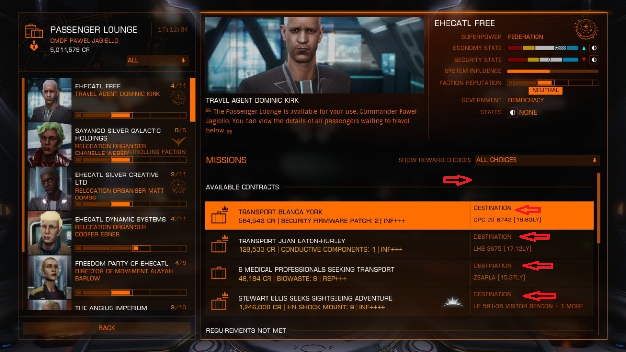
Currently our UI for Missions or Passengers looks like this >

its good but i find that right part with destinations could be easier for faster reading.
i mean exactly this part marked with arrows ( idea is to remove words "DESTINATION" from that column, and place it as a single name of that column above it)>

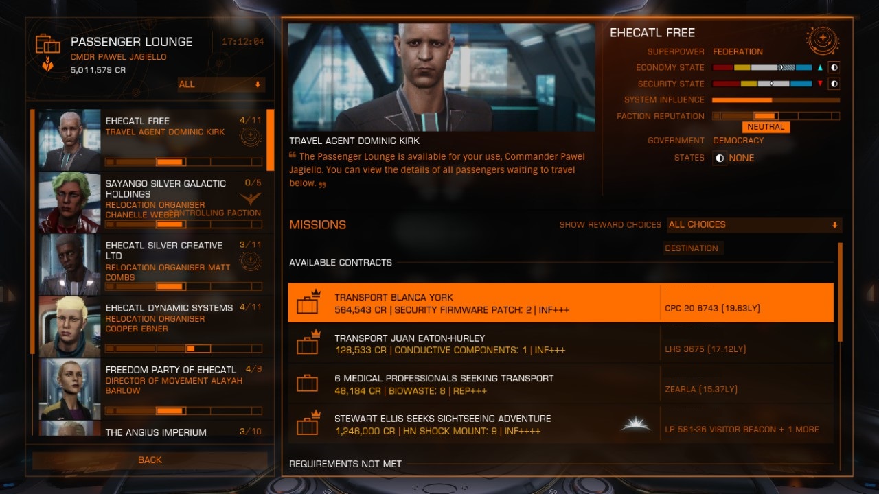
So it could looks bit something like this >

from my experience browsing through this section right now is possible, but bit eyes tiring after some time, it could be more convenient if it would be more transparent.
thank you.
its good but i find that right part with destinations could be easier for faster reading.
i mean exactly this part marked with arrows ( idea is to remove words "DESTINATION" from that column, and place it as a single name of that column above it)>
So it could looks bit something like this >
from my experience browsing through this section right now is possible, but bit eyes tiring after some time, it could be more convenient if it would be more transparent.
thank you.
