Whoever read the beta forum might remember my thread there.
This is actually my greatest, and almost the only, complain I have about Chapter 4. I can't look past it and it's everywhere. If you just play the game for a gamey fantasy space experience, you might not care about it in any way, but if you are only a little bit into the science of the game, you might hate it as much as I do.
That galaxy we live in is a beautiful thing, and the impression it makes on the night sky is absolutely impressive. Elite never really got that right, but it is there and it's basically our view on the Stellar Forge and the gameworld wie play in. So why treat it with that little respect? The new lighting and colour grading systems tint everything in a system, and in some cases that really looks impressive. Trouble is, that it also tints other light sources in the system and, which is the issue I am complaining about, it tints the background.
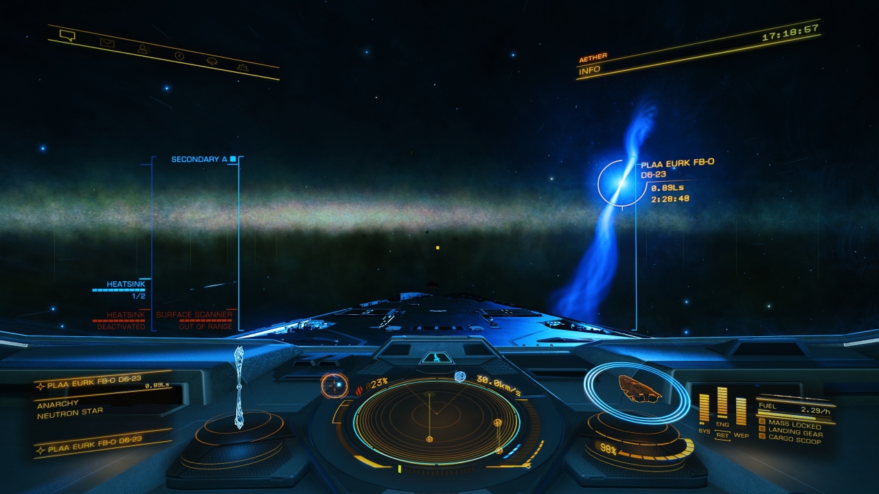
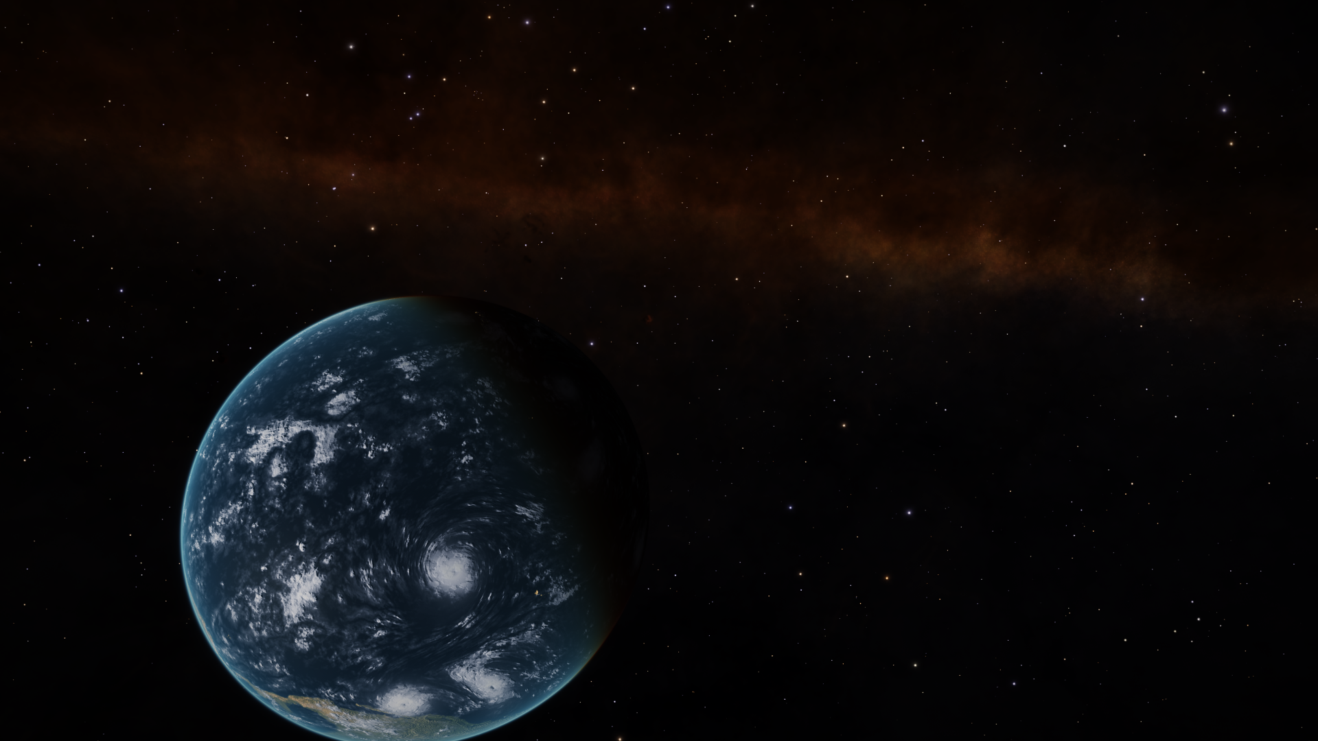
Our beautiful Milky Way is a red haze when around a red star. It is dipped in ink when around a blue one. The whole background, also containing the stars and nebulas are tinted in the star's colour.
Put simply: it's wrong. It looks wrong, feels wrong, is scientifically incorrect to an extend that I stopped making screenshots in space because it just looks horrible for me.
I mean, of course that red haze looks dramatic and atmospheric, and that's okay if we play a game like No Man's sky, which is very light hearted and set in a fantasy space. In Elite though it doesn't fit in at all.
It kinda insults all the effort the devs put into the science of the game. Sure, the game also compromises because it's a game, but it's about things like these:
- The star types.
- The gravity system.
- The sounds based on astronomical data when targetting planets in the FSS.
- The realistic textures of cracked asteroids.
- The vast galaxy simulation based on astronomic data.
- All the little things I forgot that make Elite unique and interesting simply by being closer to science than any other space game out there.
So why would treat the representation of all these things, the Milky Way and everything else in the background, in such a way? I really don't know.
And yeah, I know it's the post process effect and that it tints everything and that this seems to be intended and so on... Doesn't change that it's wrong. If you play Skyrim you know the beautiful auroras, and you know the beautiful sunrises. Imagine seeing the aurora instead of a sunrise. Still beautiful, but so wrong it's not enjoyable anymore. For me it's even on a higher level of wrong.
I'd love to see this issue killed. it's a bug. And if it's being kept in I'd love a toggle.
Milky Way in a system with a blue star
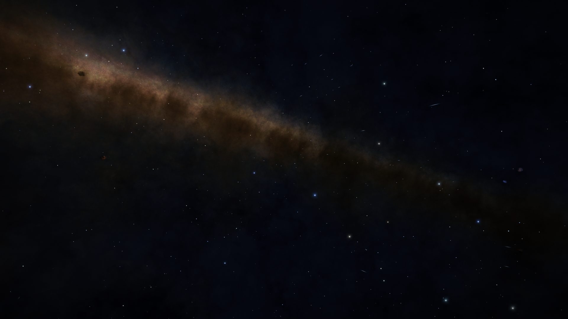
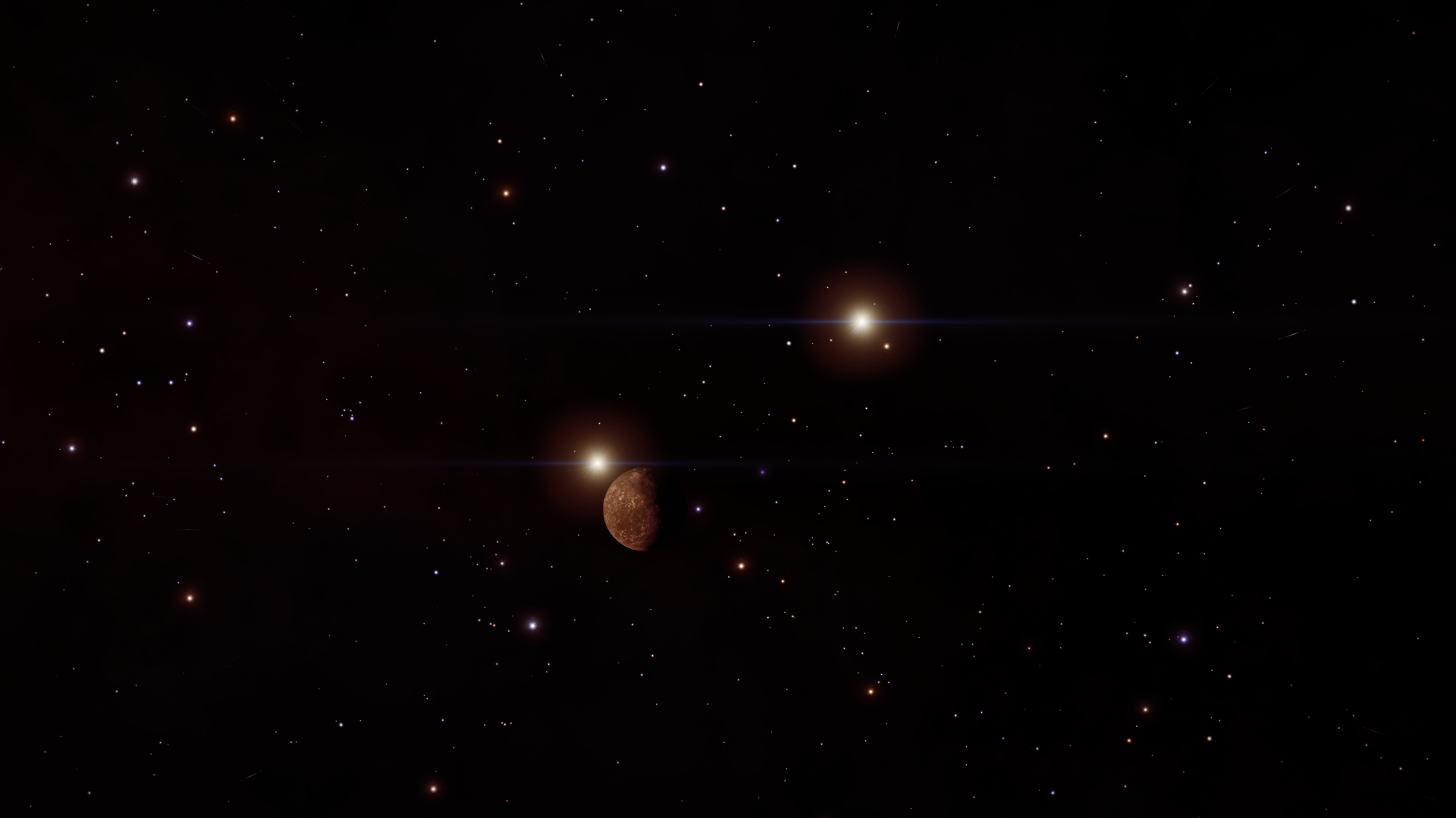
Orange star - yes the red slur is actually the Milky Way
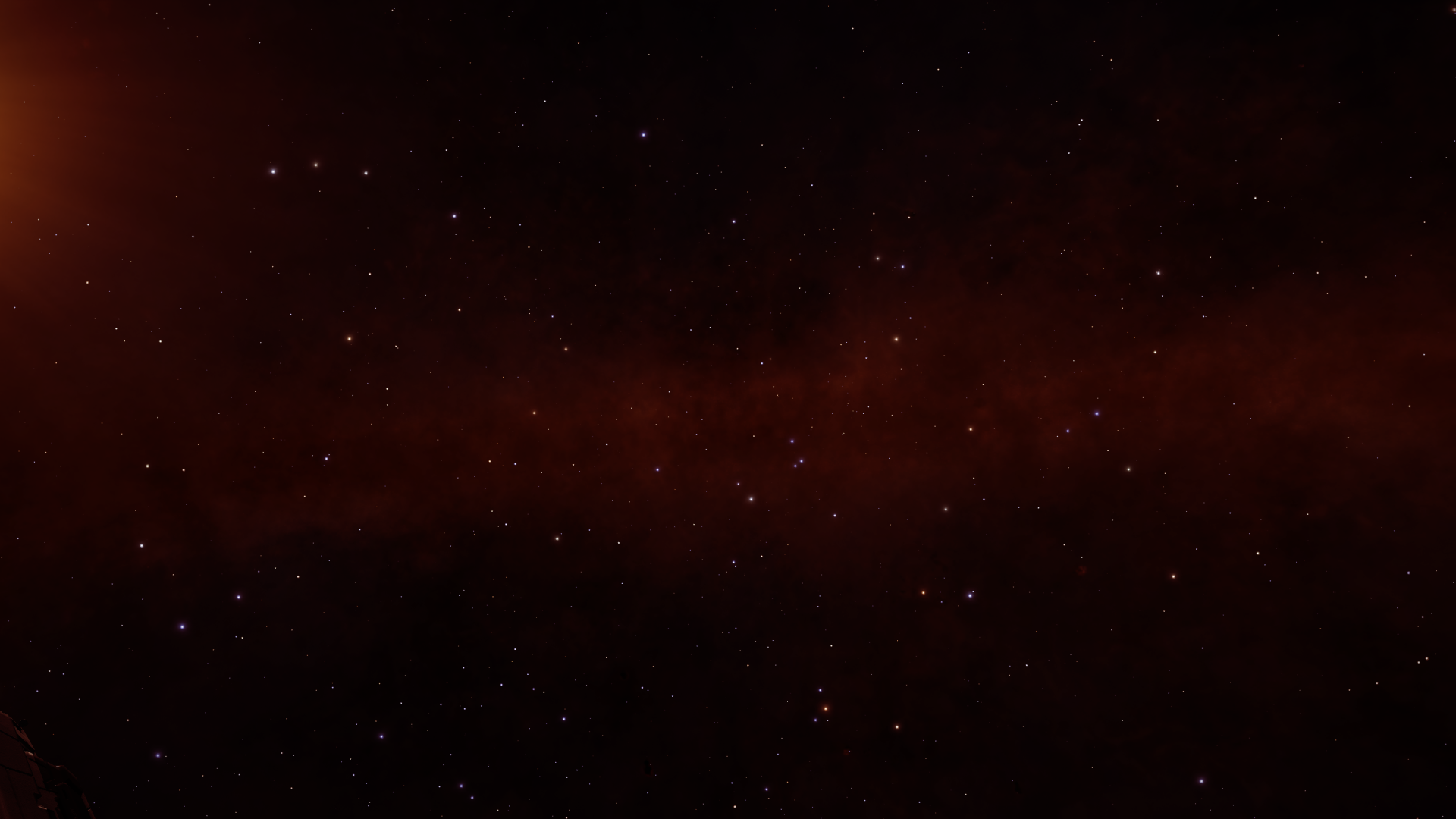
Blue star with Smurfy Way and Heart and Soul nebulas in the background
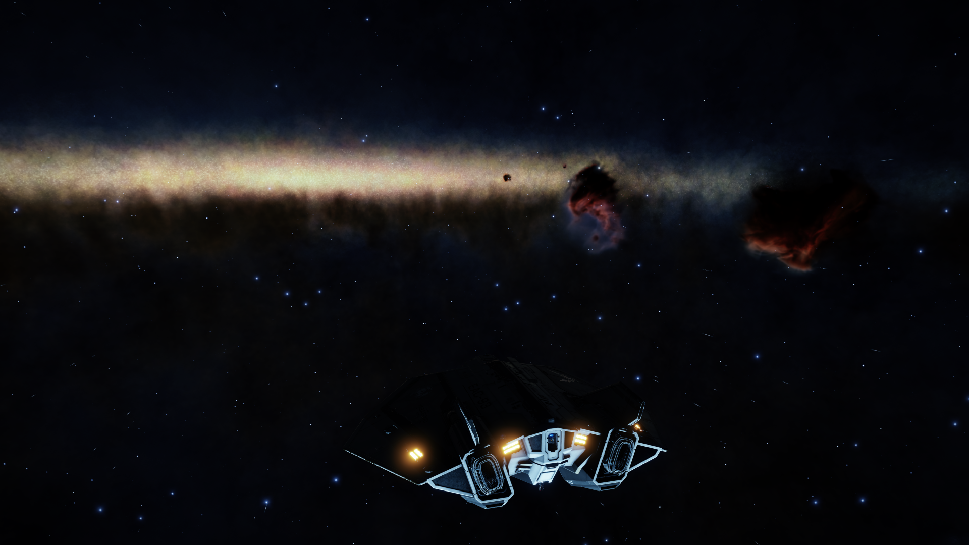
That's in Earth orbit...
That's ships in supercruise tinted by an orange star
A few of these pictures are from beta, but I didn't spot any difference in the live version. Otherwise I wouldn't have created this thread.
This is actually my greatest, and almost the only, complain I have about Chapter 4. I can't look past it and it's everywhere. If you just play the game for a gamey fantasy space experience, you might not care about it in any way, but if you are only a little bit into the science of the game, you might hate it as much as I do.
That galaxy we live in is a beautiful thing, and the impression it makes on the night sky is absolutely impressive. Elite never really got that right, but it is there and it's basically our view on the Stellar Forge and the gameworld wie play in. So why treat it with that little respect? The new lighting and colour grading systems tint everything in a system, and in some cases that really looks impressive. Trouble is, that it also tints other light sources in the system and, which is the issue I am complaining about, it tints the background.
Our beautiful Milky Way is a red haze when around a red star. It is dipped in ink when around a blue one. The whole background, also containing the stars and nebulas are tinted in the star's colour.
Put simply: it's wrong. It looks wrong, feels wrong, is scientifically incorrect to an extend that I stopped making screenshots in space because it just looks horrible for me.
I mean, of course that red haze looks dramatic and atmospheric, and that's okay if we play a game like No Man's sky, which is very light hearted and set in a fantasy space. In Elite though it doesn't fit in at all.
It kinda insults all the effort the devs put into the science of the game. Sure, the game also compromises because it's a game, but it's about things like these:
- The star types.
- The gravity system.
- The sounds based on astronomical data when targetting planets in the FSS.
- The realistic textures of cracked asteroids.
- The vast galaxy simulation based on astronomic data.
- All the little things I forgot that make Elite unique and interesting simply by being closer to science than any other space game out there.
So why would treat the representation of all these things, the Milky Way and everything else in the background, in such a way? I really don't know.
And yeah, I know it's the post process effect and that it tints everything and that this seems to be intended and so on... Doesn't change that it's wrong. If you play Skyrim you know the beautiful auroras, and you know the beautiful sunrises. Imagine seeing the aurora instead of a sunrise. Still beautiful, but so wrong it's not enjoyable anymore. For me it's even on a higher level of wrong.
I'd love to see this issue killed. it's a bug. And if it's being kept in I'd love a toggle.
Milky Way in a system with a blue star

Orange star - yes the red slur is actually the Milky Way

Blue star with Smurfy Way and Heart and Soul nebulas in the background

That's in Earth orbit...

That's ships in supercruise tinted by an orange star

A few of these pictures are from beta, but I didn't spot any difference in the live version. Otherwise I wouldn't have created this thread.

