This post proposes 3 changes — each with a "current" and "modified" version.
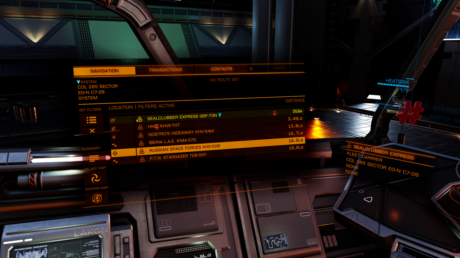
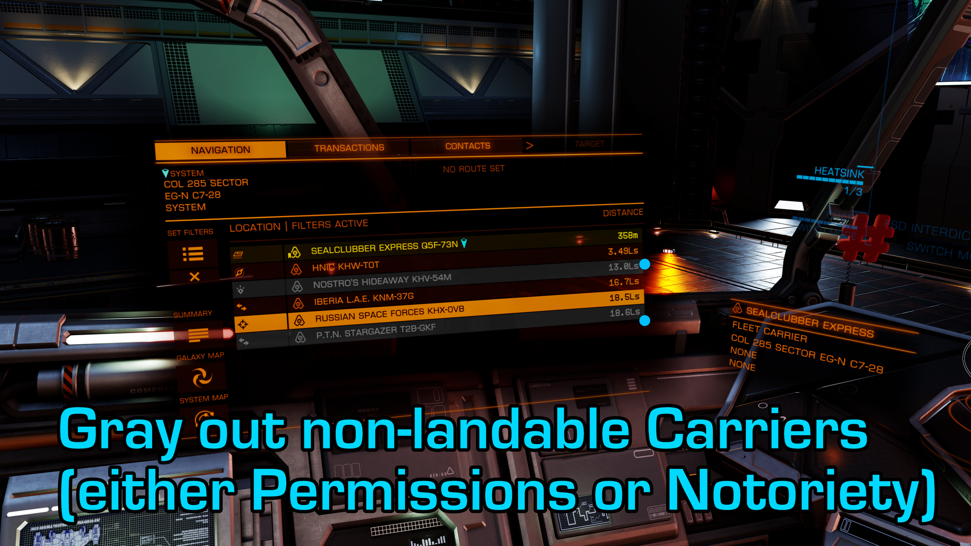
Graying out non-landables would make it easier to select which carriers to land on as you can skip over the ones that do not have any use for you. Another improvement that could be made is to add a new filter for non-landable carriers.
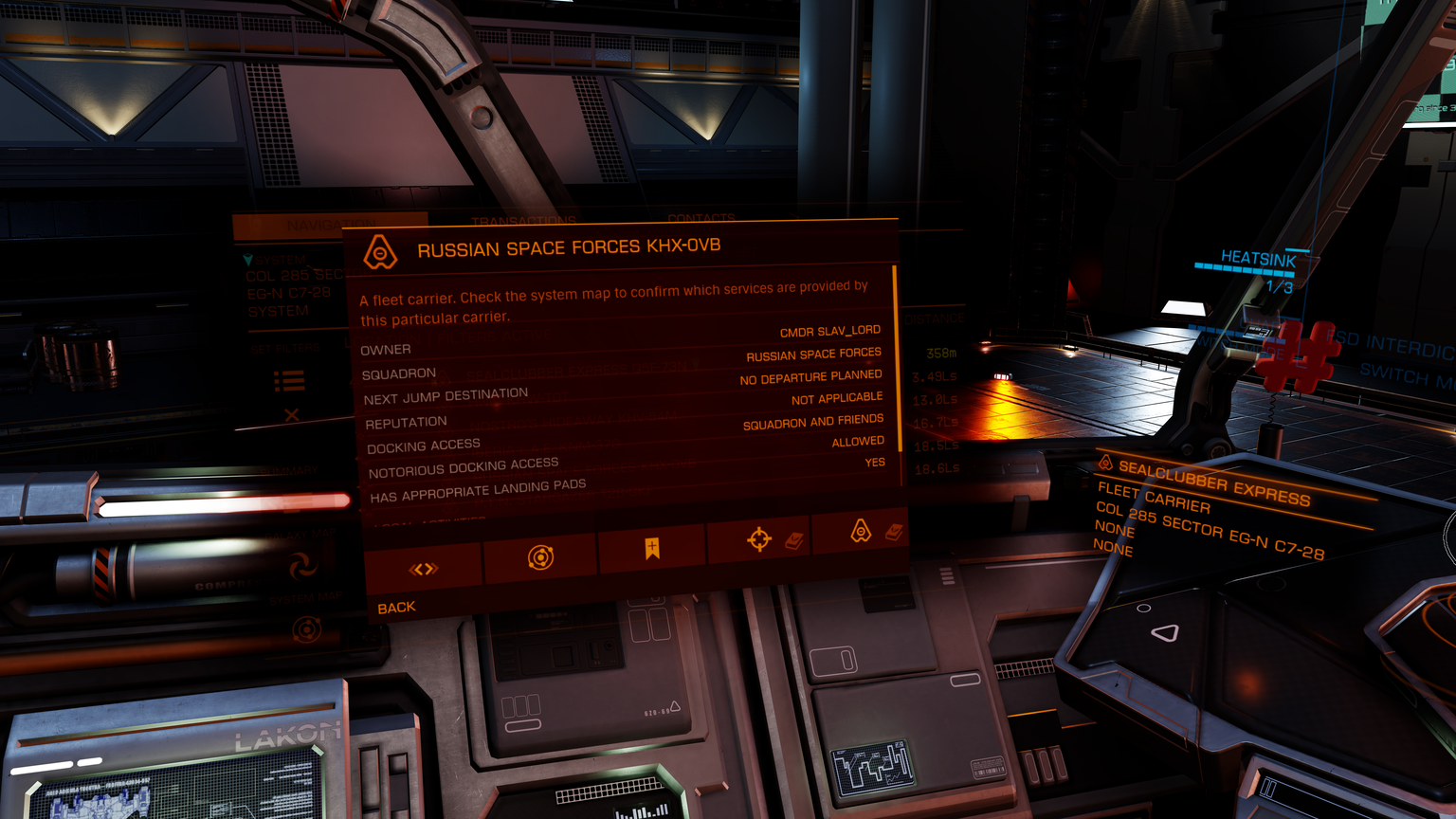
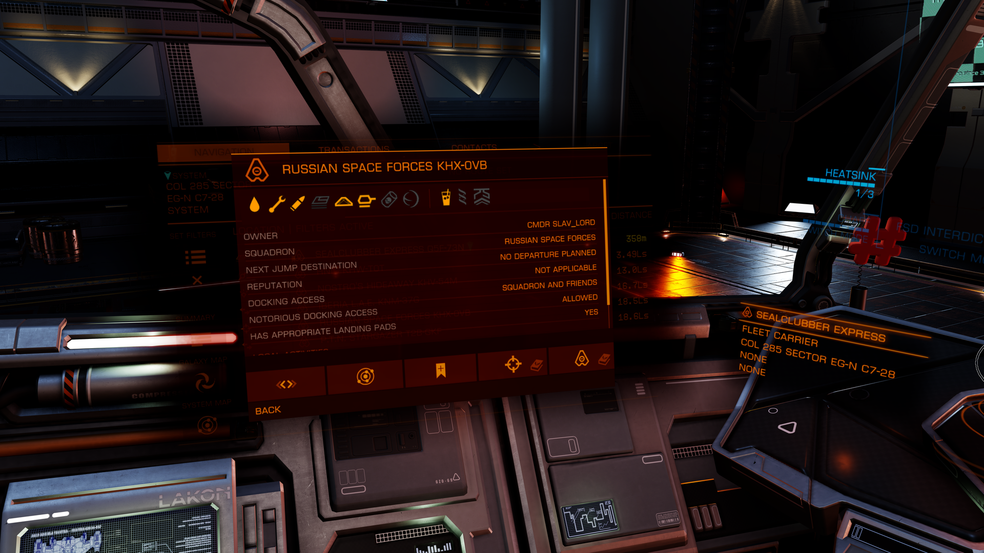
This space could be used more effectively. All available services could be visualized here. The game already has icons for all services - so why not use them?
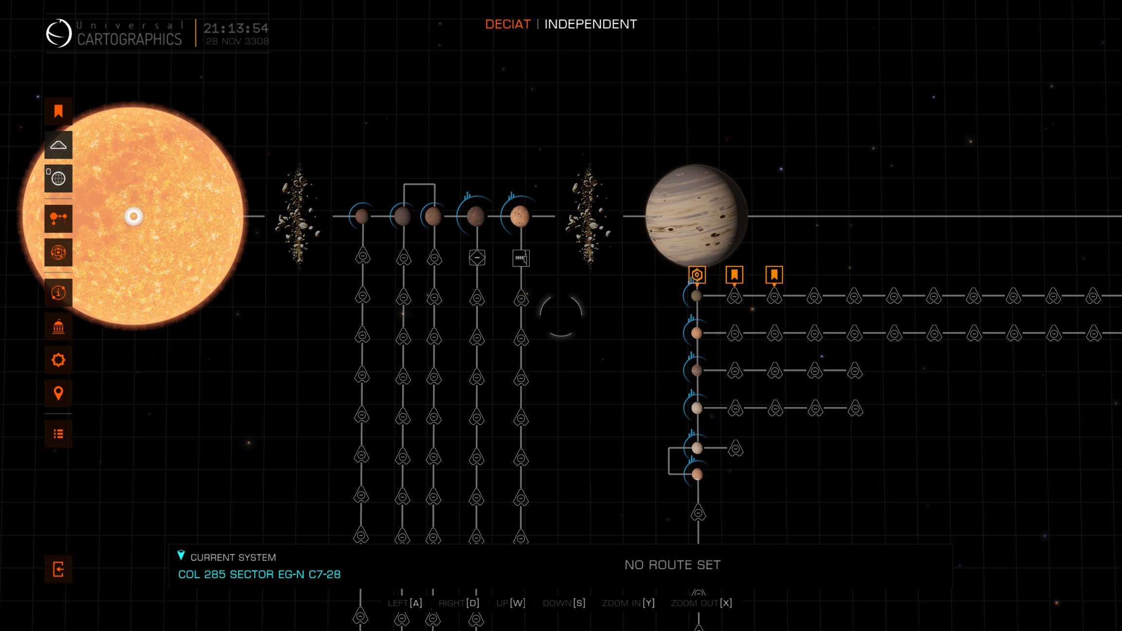
Instead these carriers could be grouped up to save space and prevent system maps being stretched out by carriers. One could even take a step further and divide the group into carriers one can land on and carriers that are locked off.
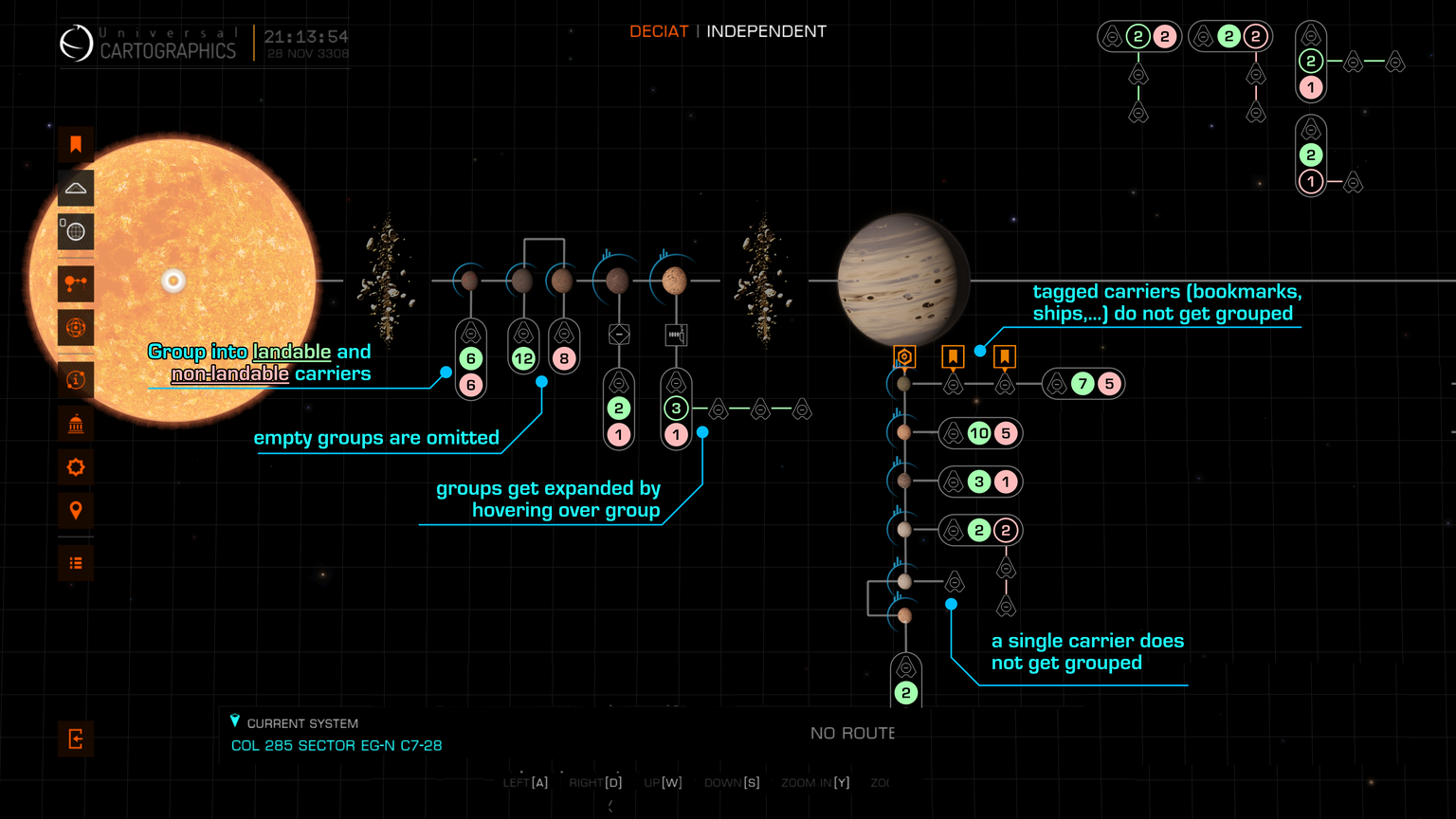
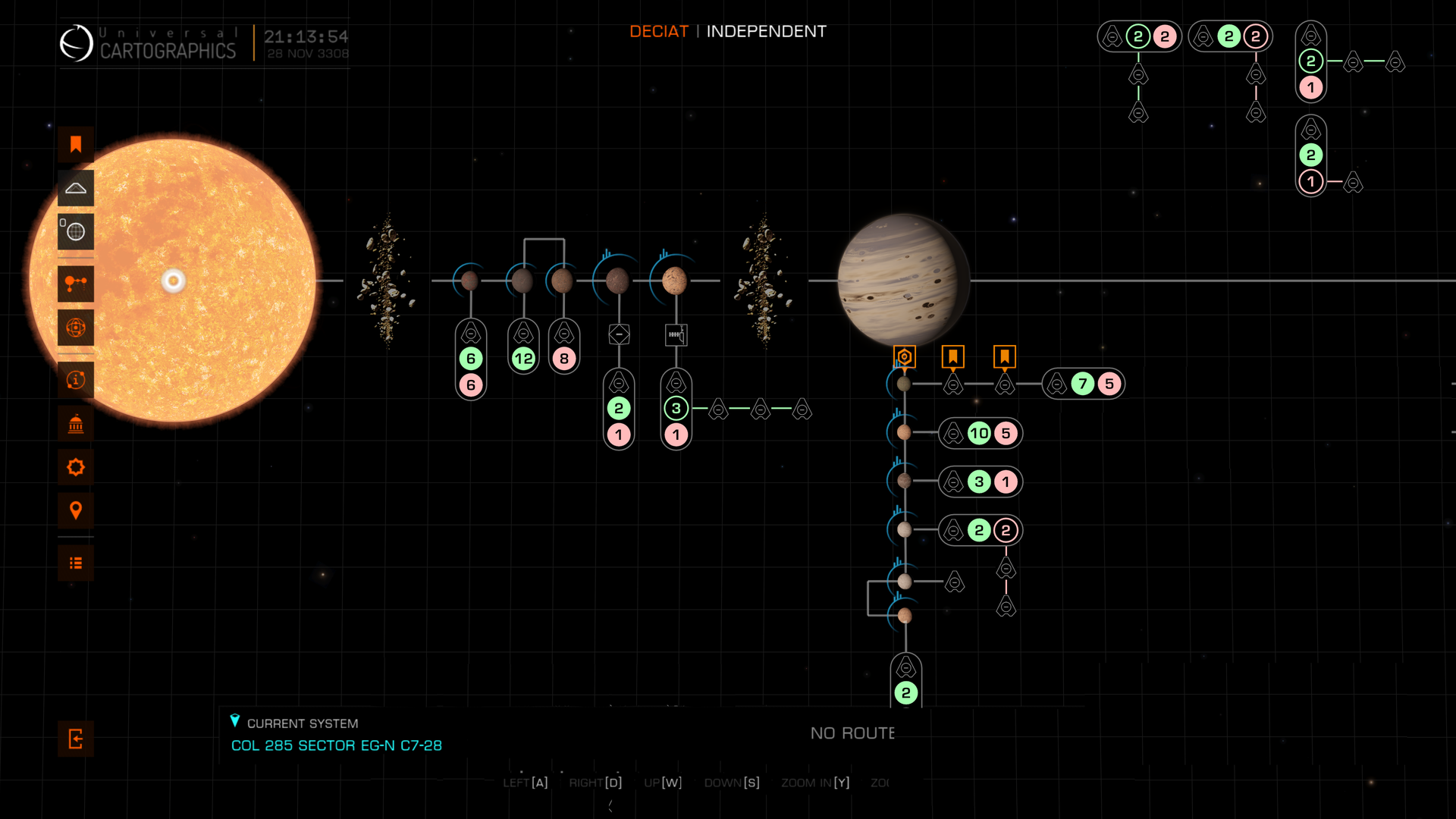
Same as above, without annotations.
Navigation Panel
This is what the nav panel currently look like. All carriers (except your own) have the same colour.Graying out non-landables would make it easier to select which carriers to land on as you can skip over the ones that do not have any use for you. Another improvement that could be made is to add a new filter for non-landable carriers.
Navigation Panel (Detail Page)
When you select a carrier, this is the page you will see. At the top, there is a text telling you this is indeed a fleet carrier. It also tells you to go to the sys map to check what services it has.This space could be used more effectively. All available services could be visualized here. The game already has icons for all services - so why not use them?
System Map
If you for example take a look at the System Map for Deciat, this will be the horror you are greeted with. The system map is littered with carriers.Instead these carriers could be grouped up to save space and prevent system maps being stretched out by carriers. One could even take a step further and divide the group into carriers one can land on and carriers that are locked off.
Same as above, without annotations.
