So who precisely of you fine folks had the vision of "improving" the graphics after 4 years?

I equate actual problems with actual problems that have been in the game since launch - like the lack of overall stuff to do on planet surfaces (introduced with launch of Horizons), lack of content, unbalanced pvp meta, repetitiveness of all combat oriented gameplay (better now with the CZ changes). There's a lot more important issues to worry about than "oh no, the color of the skybox is wrong".

Please keep educating me about these fallacies, I'm intrigued.

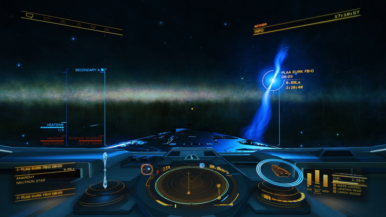
Sorry to tell you this but they're not fixing all that stuff whether or not they decide to revert the lighting changes. I like the changes for the most part but the skybox thing is ridiculous. The one thing Elite has over other space games is the attempt to retain some realism in how space is depicted and the milky way being tinted by local stars is just dumb. Just because the game needs a whole lot of work in other areas doesn't mean people can't gripe about the thing they want changed. Apparently it's important for the olds to have their space sim looking the way it used to look without some guy like you dictating what should and what shouldn't be changed because you're holding on to hope that integral gameplay elements actually get looked at.

At this point in the game's life cycle, lighting changes are probably one of the few things that can actually get fixed.
 
Yes... from my understanding, ED got a new lighting system as well as post-processing filtering. So the issue isn't as simple to solve as one might think.

However, I do hope that this thread will give the developers a hint towards what players want to be able to adjust themselves, rather than be forced upon.

Imagine that you would play this game on the most powerfull GPU/CPU setup you could imagine, and then the game, enforced by FD, would run it in 640x480 in 2 colours.

In simple terms, that is exactly what is happening now, for those that do not like the change... Of course I exaggerated to make the point go across. I do hope you get the point though. :)
Sure, and I definitely agree it's a new lighting system, but it includes colour grading. Objects and surfaces are not just brighter or dimmer or coloured differently, they are lit completely differently. I liken it to the old system lighting the edges of surfaces and objects, giving a 'technical drawing' effect, the new lighting lights the surfaces and is so much better. And the tinting is on top.

All we had before was one lighting system and people had no option to change it to the new one. Now we have the new one people demand an option to be able to go back. Thats not really how it works, surely. More importantly asking nicely if it's even possible rather than (not you) slagging off the "execs" and dismissing those who like it as somehow deluded or blind isn't the way to go.

Btw, the devs KNOW ALL ABOUT this topic. The beta feedback thread discussed it, and it was explicitly passed to them, we know this as evidence of the skybox being tinted was requested by fdev in that thread.

Some people getting all entitled and insulting the company and the devs wont help.
 
You could simply disable the tint or turn it down so the color isn't blended into the background image (which, as pointed countless times by now, makes absolutely no sense). You could also remove the additional bloom and volumetric effects, just as you can turn off ambient occlusion or depth of field. You'd just have to expose these as toggles in the graphic options. This would have to be implemented, but it wouldn't be nearly as problematic as you make it out to be.
I dont know if it would be problematic. Im all for options. I think the assumption it should be done, with added insults for the devs, is problematic.
 
Calling something bad when its true is not insulting the devs. The guy that said its broken it correct. Stars are different colours thats just how it is, now all colours are tinted to whatever. Before we had a decently accurate representation now we got some console looking mess. Its not surprising people are moaning.
 
Last edited:
Serious: who?

Four years of crisp and beautiful immersion.

Turned into a washed out, cartoony looking, garishly lightened imitation of the former, which looks like my graphics card is dying a slow and cruel death.

And for what? So that some asteroid belts glow brighter? Some planets shine more? While the rest of the universe, including, nonsensically, all HUD elements and even entirely separate screens like the galaxy map, suffer from the same "improvement"?

I am an older player. Like really older. When I can't, even with my reading glasses, read stuff on a screen easily anymore, someone goofed up.

The graphics ARE better. MUCH better. Job well done Frontier...please don't listen to these negative Nancy's in your forums.
 
Are you sure everyone shares your monitors brightness, colour and contrast settings, or that those settings are magically transferred to my screens or VR devices, so that I see the same thing as you just because you took a screen shot?
Do you know how screenshots and color profiles work? Do you think that taking a screenshot is the same as taking a picture of your monitor?

That image is for all intents and purposes identical to what everyone else will see in the game if they jump into such a system. Your monitor settings have no influence whatsoever on the screenshots you take. They only influence how they are displayed on your particular device. Your monitor will display the screenshot and the game the same way.
 
Calling something bad when its true is not insulting the devs. The guy that said its broken it correct. Stars are different colours thats just how it is, now all colours are tinted to whatever. Before we had a decently accurate representation now we got some console looking mess. Its not surprising people are moaning.

But what makes it "true" other than you saying it is? I fail to see how the complaints about the lighting system aren't subjective.
 
Sure, and I definitely agree it's a new lighting system, but it includes colour grading. Objects and surfaces are not just brighter or dimmer or coloured differently, they are lit completely differently. I liken it to the old system lighting the edges of surfaces and objects, giving a 'technical drawing' effect, the new lighting lights the surfaces and is so much better. And the tinting is on top.

All we had before was one lighting system and people had no option to change it to the new one. Now we have the new one people demand an option to be able to go back. Thats not really how it works, surely. More importantly asking nicely if it's even possible rather than (not you) slagging off the "execs" and dismissing those who like it as somehow deluded or blind isn't the way to go.

Btw, the devs KNOW ALL ABOUT this topic. The beta feedback thread discussed it, and it was explicitly passed to them, we know this as evidence of the skybox being tinted was requested by fdev in that thread.

Some people getting all entitled and insulting the company and the devs wont help.

I agree.

But...

Most of the people in this thread not liking the changes aren't offensive towards FD... at least those that have provided examples... that is what I have seen; they love the update, they love Elite, except the graphics.

Question is... how do we go further with this? So that FD knows about our concerns wihtout making it a player vs developer thingy...rather a productive thingy?
 
Do you know how screenshots and color profiles work? Do you think that taking a screenshot is the same as taking a picture of your monitor?That image is for all intents and purposes identical to what everyone else will see in the game if they jump into such a system. Your monitor settings have no influence whatsoever on the screenshots you take. They only influence how they are displayed on your particular device. Your monitor will display the screenshot and the game the same way.
Which is what I've just said since my first post.... but you think you're displaying the same thing to me, as you saw? Just because the screen shot displays for you one way, posting it and assuming it displays the same for everyone else is wrong. I'm not saying the screenshot is different, Im saying not all SCREENS are the same. A warm colour balance on my screen, and a cool colour balance on yours will make the same screenshot - but we'll see it differently - and that's before we go into brightness and everything else, like screen quality. Or do you believe a $100 no-name brand screen will display a source image identially to a $1,000 screen? - Green is Green is Green? Ie: Posting a screen shot and saying "See!" doesn't mean anything, if my screens are adjusted to my personal taste it'll also display the image you just posted to my personal taste - making your screenshot worthless
 
Last edited:
Just because the screen shot displays for you one way, posting it and assuming it displays the same for everyone else is wrong.
It does in relation to how ED is displayed on the same screen. It's identical to how the acutal game looks (excluding compression). If the background image looks green-tinted on the screenshot, it will look green-tinted in the game.

I'm not saying the screenshot is different, Im saying not all SCREENS are the same. A warm colour balance on my screen, and a cool colour balance on yours will make the same screenshot - but we'll see it differently.
Which has absolutely no impact on the validity of the posted screenshot, since the colors are identical to how the game is displayed on your screen.

Or do you believe a $100 no-name brand screen will display a source image identially to a $1,000 screen?Ie: Posting a screen shot and saying "See!" doesn't mean anything.
Again, differences between monitors isn't the issue since taking a screenshot is not the same as taking a picture of your monitor.

Case in point: if the milky way in the image appears green to you on the screenshot it will appear green to you in the game, since they are both displayed on the same device. This isn't solved by changing the color temperature either, since the tint depends on the local star.

[...]if my screens are adjusted to my personal taste it'll also display the image you just posted to my personal taste - making your screenshot worthless
It will display the relative shift in color - as it appears in the game - just fine, regardless of your personal taste (provided you are not red/green color blind).
 
Last edited:
It does in relation to how ED is displayed on the same screen. It's identical to how the acutal game looks (excluding compression). If the background image looks green-tinted on the screenshot, it will look green-tinted in the game.Which has absolutely no impact on the validity of the posted screenshot, since the colors are identical to how the game is displayed on your screen.Again, differences between monitors isn't the issue since taking a screenshot is not the same as taking a picture of your monitor.Case in point: if the milky way in the image appears green to you on the screenshot it will appear green to you in the game, since they are both displayed on the same device. This isn't solved by changing the color temperature either, since the tint is dependant on the local star.
Oh, you missed the point - The green you mentioned in a hashtag, flooding the milky way - I don't see. Like I said when I replied to your screenshot - I see a neutron star and the rest looks fine. You're posting as if I agree'd with your screenshot as an example of how bad the game is. I wasn't. Because my screen isn't yours, and its not set up like yours. I could post your own screenshot back to you as a counter point to your own argument - get it? Sucks for you tho, as I said I like how the light falls on things - you have a problem with the background. *shrug*
 
Last edited:
Oh, you missed the point - The green you mentioned in a hashtag, flooding the milky way - I don't see.

Oh, you should have mentioned that your monitor isn't calibrated - that explains things, though it also invalidates your criticism. Again, you should be able to see the shift in color in-game regardless, since it depends on the local star. The shift is pretty obvious, and most people who use a decent monitor setup should perceive it as green (the star is blue, btw, if you have trouble distinguishing the color).
 
Last edited:
I've been reading up a lot in this thread and I noticed that quite some times the quality of the "bad" lighting is revered to as being console quality.
Well excuse me but that is utter ridiculous.
I play on Xbox in 4K Quality mode and think the skybox coloring is horrible and very unrealistic.
Also the extreme bloom in stations etc. isn't my cup of tea either.
This has nothing to do with the platform the game is being played on.
I'm generaly happy with the new lighting but not all is good imho.

Besides that, Fdev said that the new lighting etc. wouldn't have an effect on performance, well it does very noticeable, maybe it's not just the lighting but 3.3 came with a significant performance drop, and not just on consoles.

A choice in order to use the new lighting or parts of it would be very preferable imho.
 
I play on Xbox in 4K Quality mode and think the skybox coloring is horrible and very unrealistic.
Also the extreme bloom in stations etc. isn't my cup of tea either.
Those are probably the major points people are complainigng about.

Incidentally, what color would you say does the Milky Way in the background have in this image:
screenshot_0015_1f6fjb.jpg
 
Last edited:
You mean like this?


Don't get me wrong - there are places where the graphics looks better, and having haze in stations is nice and fitting. But do we need to have it in places where there is no atmosphere or where the visual depth is simply not deep enough to cause it?

I don't really play any other games, certainly not on the PC. Beauty, as they say, is in the eye of the beholder. I'm not technically gifted to know how FD achieved their imaging, and in your photo above I still marvel that computers and programming are so powerful now it can take that star's blue light and reflect it shimmering off the starboard flank of your Conda, and likely (in real-time motion) move and flare that starlight as you pilot your ship.

As for the galatic disc, I'm clearly missing any point you wanted to make. With the brightness of the neutron star I'd expect the background stars including the Milky Way to be more faint. I've found that away from any close bright light source (aka a 'star') the backdrop blackness is even 'blacker' now in 3.3. I've got a very good spec laptop, bought specifically for Elite, and have all the graphics settings in-game turned up to '11' so perhaps I'm in a better situation than most, but overall, I really like the visual changes FD came up with.

The tones are now slightly muted, e.g. when looking at the GalMap with the Economy filter applied, instead of the various colours being 'primary' (e.g. green for Agri, Yellow for Ind, etc) they are now slightly 'damped down' (I don't know the technical phrasing, or how they achieved it, sorry), but I really like that it's more subtle. Of course, pre 3.3 I was fine and happy with the GalMap and all the rest, but seeing the difference now, I can both appreciate and welcome the change.

Then again, I started Elite in 1984 when it was black & white with wireframe ships and stations and flat white circles for the stars! And guess what? That was marvelous too (for its time)!
 
I sometimes (rarely) setup my personal laptop in my home office and attach to a larger external monitor (the home office setup is usually used for my work laptop where I use dual screens for more workspace). Whether my personal laptop or the work one there is always a colour contrast between laptop screen and external screen, and quite markedly.

My point? That every screen is different. I'm sure by fiddling with laptop settings and external monitor settings I could get them approximately looking the same (to the naked eye). But the same differences will be true across the thousands who play Elite, on PC, Mac, laptops, external monitors, TVs, projectors, and VR sets. FD have to find a happy balance, and if a particular CMDR feels the colour balance is now wrong then I'd be starting with their own display screens as one source of that.

I might go and check the new Elite colour scheme on the external monitor later. I forget how good the game looks on a larger pane.
 
Some things are better. The blacks are less crushed now, so most of the banding in dark areas is gone. (I’m viewing on a high end and tightly calibrated OLED display.) This is a very welcome improvement.

The colors though... It’s like what you get if you go into your graphics driver’s settings and crank the “digital vibrance” slider (aka fake HDR) up to some stupid high level. It’s okay sometimes depending on the surrounding lighting, but too much of the time it looks cartoonish and ruins the immersion.

I really hope they add a slider in the graphics settings that allows us to tone the color down a bit. Or just add proper HDR support on PC if that’s what they’re shooting for.
 
What bit are you referring to - the userbase respecting FDev for admitting a mistake? If that's what you mean then yes, you're probbaly right - for some people FDev could resurrect their recently deceased pet and they'd still be the Anti-Christ.

If you're referring to the system being broken, then I speak for all those with common sense and intelligence. IF the new lighting system was not actually broken, could be adjusted to suit AND could be disabled altogether... then I'd probably like it too. But saying you like the new system doesn't alter the fact it is BROKEN - and is causing actual problems.

So anyone who doesnt agree with you has no common sense and is not intelligent?

Even if I did agree with you (which i dont) now i would never say it..as to do so would be throwing my chips in with, for want of a better expression, an arrogant idiot.

If its working as intended..then its not broken..its a design choice.

Your opinions are not facts. Never were , never will be. And no amount of pompus, ,arrogant drivel on the forums will ever change that.

Thank Christ.

Now dont get me wrong, i literally have no desire to actually get into a conversation with you. Not after your last comment.( i would rather smear human excrement over my face) So if you can avoid responding to me that would be fantastic.

I just wanted to point out the obvious, to make myself feel better and restore some ballance to the univerese.


Actually, Consider yourself blocked.

You Sir, are a joke.
 
Last edited:
Back
Top Bottom