ED Astrometrics: Maps and Visualizations

OK, here's the first step. I have the wider version of the graph here now: https://edastro.com/mapcharts/heightgraph2W.png

That lack of white dwarfs on the right side, before getting to 1000 ly, really is quite striking. Sure enough, there aren't many in the data:

Code:
mysql> select count(*) from stars,systems where edsm_id=systemId and subType like 'White dwarf%' and coord_y>90 and coord_y<1000 and coord_y is not null;  
+----------+
| count(*) |
+----------+
|        8 |
+----------+
 
Now I'm getting tempted to extend the graph, but it may have to get super wide. One of the main reasons for making this graph was to be granular enough to see that brown dwarf layer. Maybe wide is OK. I might have to toy with it.
I'd be interested in seeing that for sure. I'm not bothered by having to scroll a wide plot, if it's wide for a good reason.

Edit: ninja'd by the very plot in question!
 
OK, here's the first step. I have the wider version of the graph here now: https://edastro.com/mapcharts/heightgraph2W.png

That lack of white dwarfs on the right side, before getting to 1000 ly, really is quite striking. Sure enough, there aren't many in the data:

Code:
mysql> select count(*) from stars,systems where edsm_id=systemId and subType like 'White dwarf%' and coord_y>90 and coord_y<1000 and coord_y is not null; 
+----------+
| count(*) |
+----------+
|        8 |
+----------+
White dwarfs are the one star type that is surely undersampled though. It's the one that pilots are most likely to actively avoid.

Sometimes I wonder if it would be possible to get a community project going to try and tackle systematic undersampling. My first thought would be by fully EDSM-ing a y-column. Certainly not a whole column of sectors, but maybe a 100x100 LY vertical column would be achievable. But then I get to wondering if that's an inefficient use of resources vs some kind of targeted sampling, I get lost going through my notes from the sampling methods course I took one time, etc...
 
Somehow i managed to miss this thread untill now. Shame on me! 🥴
Great data, really like it. On thing i noticed: there is no data on class A supergiants. Is it because it is not possible to distinguish between A and B?
 
On thing i noticed: there is no data on class A supergiants. Is it because it is not possible to distinguish between A and B?

Not sure what you mean. They're in the giants map, and the A-class "dump" spreadsheets. Do you mean there's no separate spreadsheet just for those? That's true. Most of the specific spreadsheets are there due to people requesting them for various surveys or whatever. I can always add spreadsheets for other types of giants, or one big giant-stars spreadsheet or something.

Currently it looks like the dump CSVs include about 8,535 of the "A (Blue-White super giant) Star" type.

Yes, i thought every type of star gets its own spreadsheet :)
I was particularly interested in class A I0 (hypergiants?) Last time EGO was online, there were about 20 reported, so i assume that 8535 number includes the "normal" A I class?
 
No, that's specifically just the A super-giants. If you look further down at the "dump" spreadsheets, there's over 1.8 million when you put all A-class together.
 
The name generator just gave me "OBLATE MARSHMALLOW". Ugh. The older I get, the more I fear that this may become true... lol :D
 
Hey, can you check for NS over 2.5 solar masses please ? I just visited 1
https://inara.cz/cmdr-logbook/184758/43443/
It is 8 Sols. Must not exist. Interesting if there are more any such.
And if there are less then 100 make a list of it?

There are quite a few of these. It's a bit crazy. Apparently about 1831 with SolarMass >= 2.5.

Here are the top 10:

Code:
mysql> select name,solarMasses from stars where subType='Neutron star' order by solarMasses desc limit 10;
+-------------------+-------------+
| name              | solarMasses |
+-------------------+-------------+
| XTE PSR J1810-197 |     15.9727 |
| PSR J2055+3630    |     15.8672 |
| PSR J2004+3137 A  |     15.6602 |
| PSR J1513-5908 A  |     15.3477 |
| PSR J1807-2459B A |     15.3242 |
| PSR J1713+0747 A  |     15.2695 |
| PSR J1243-6423    |       15.25 |
| Crab Pulsar       |     15.0977 |
| PSR J2145-0750    |     15.0508 |
| HIP 23520 A       |     14.9375 |
+-------------------+-------------+
10 rows in set (1 min 24.14 sec)
 
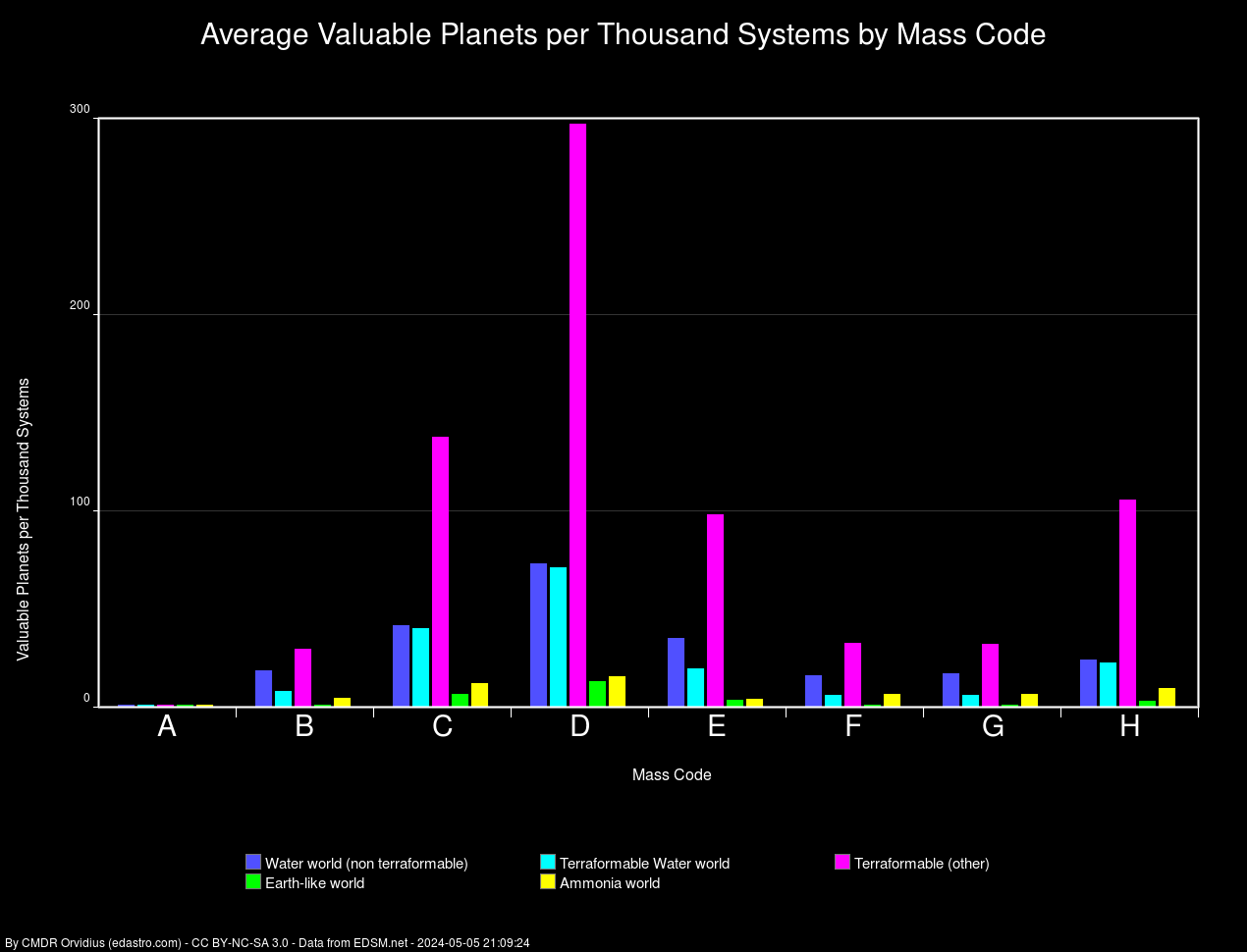
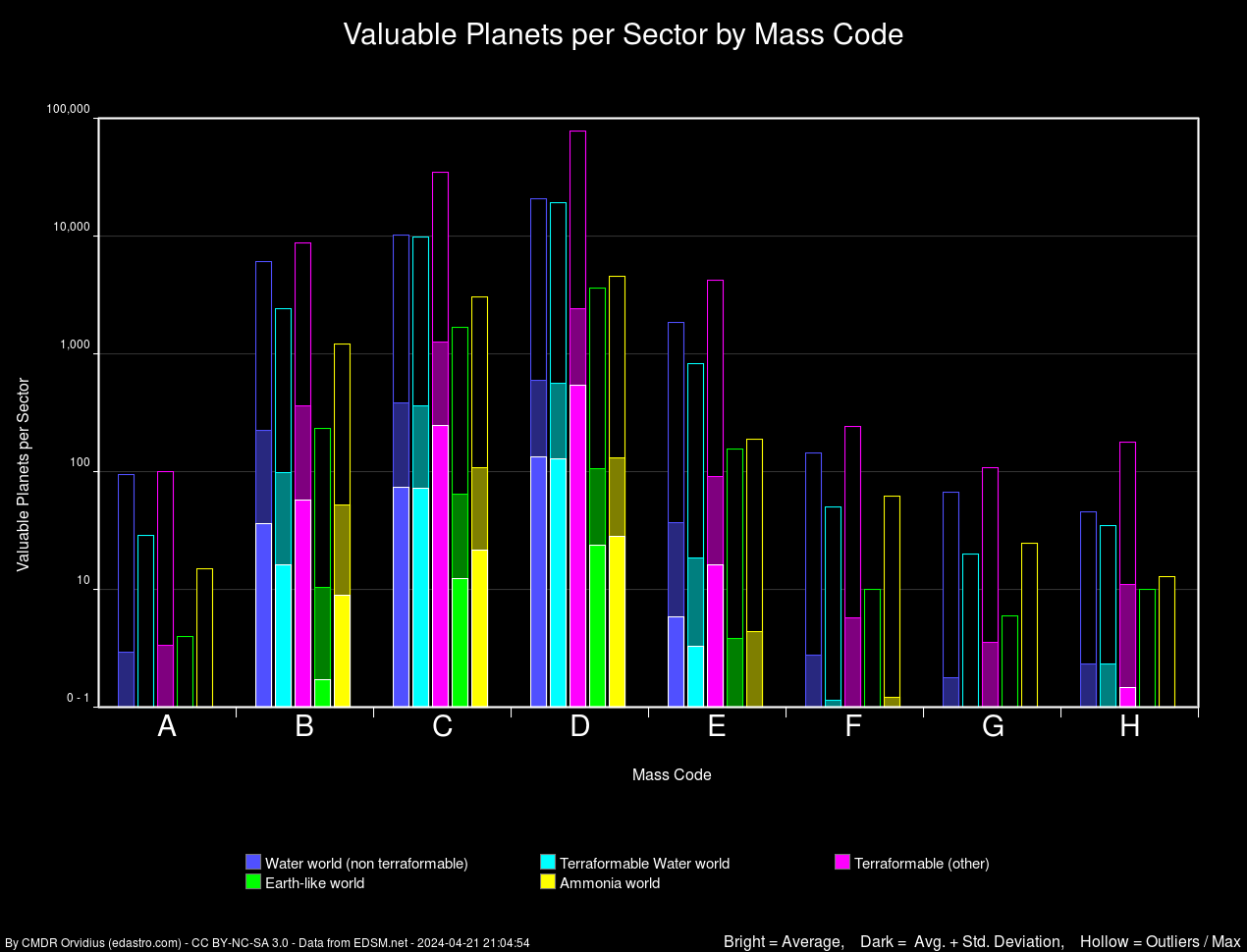
New graph added. This shows the distribution of valuable planet types, per sector, broken down by mass code. The solid bars are average + standard deviation (small white line shows where the average is), with the "T" extension showing the extremes.

sectormassplanets.png
 
That's a very interesting graphic! Would you care to elaborate a bit how you arrived at the data?
It's a log-abscissa which shows that there can be variation orders of magnitudes larger than the average "effect". Fortunately is this not a drug trail ;) .

This is also the reason why I'm wondering if the "T's" are the standard deviation, the standard error or are the whiskers of a box plot? Despite you saying it is the standard deviation, it looks like the latter. Albeit that would be a strange box plot with just the lower part showing. Thus I'm a bit confused.
 
Right, the solid box represents average +/- one standard deviation (and in all cases, the lower bound of that goes below zero since the standard deviation is larger than the average. My code will draw the lower whisker too, if the data supports it). The whiskers show the extreme outliers. So I guess it differs from a standard box plot, though I've used similar graphics. I suppose I could change it to hollow boxes instead of whiskers, or something, to make it less confusing.

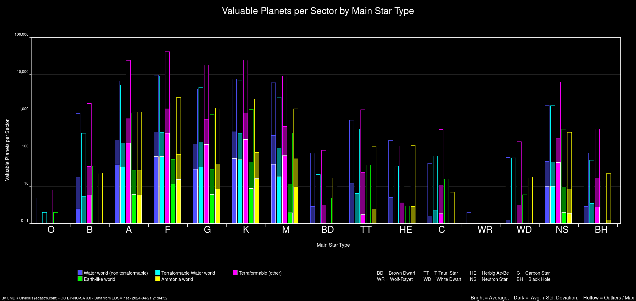
These are numbers per sector, which means it's highly variable data. For instance, sectors on the galactic rim that don't have many stars or aren't heavily explored will have very low numbers. Sectors near the core will have very large quantities.

This sort of graphic is useful if you're planning a sector survey and want some idea of the distribution that takes into account the number of systems with each mass code (or main star type as below).

Here's another one, same idea but categorized by main star type rather than mass code (below). Since these are skewed by the quantities of mass codes or main star types within the sectors, I'm also working on a set that are just "per thousand systems" of each type. I hope to have those later today.

sectorstarplanets.png
 
Last edited:
Maybe it's professional bias or the fact that I'm one of those crazy folks that downloads ED data from EDSM and writes scripts on top of those for fun, erm, I mean, thoughtful exploration planning!... but this project is outstanding for so many different reasons. Well done, Orvidius.
 
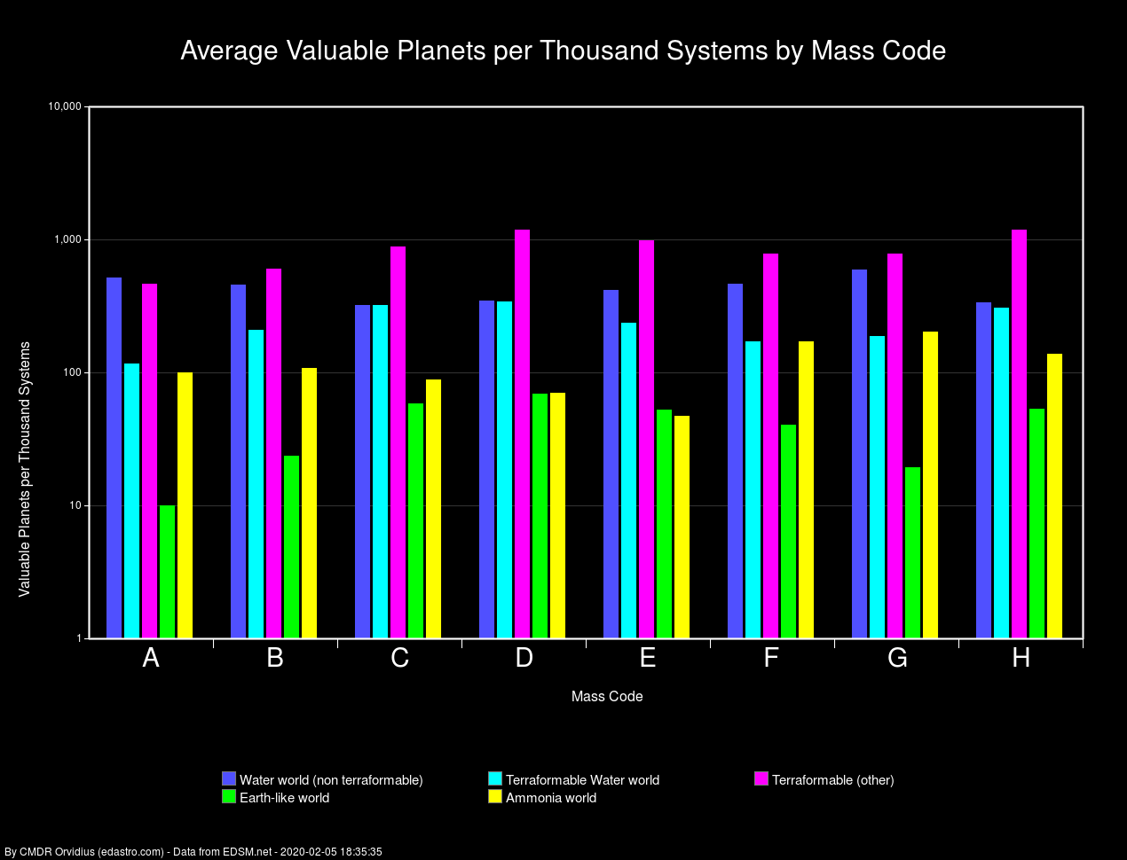
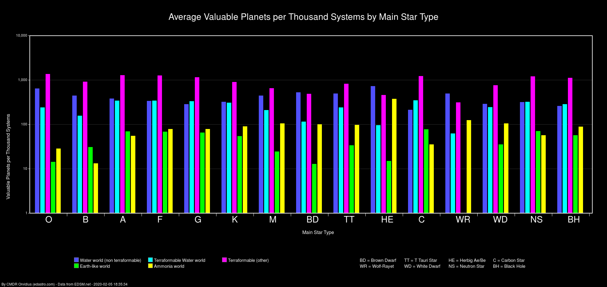
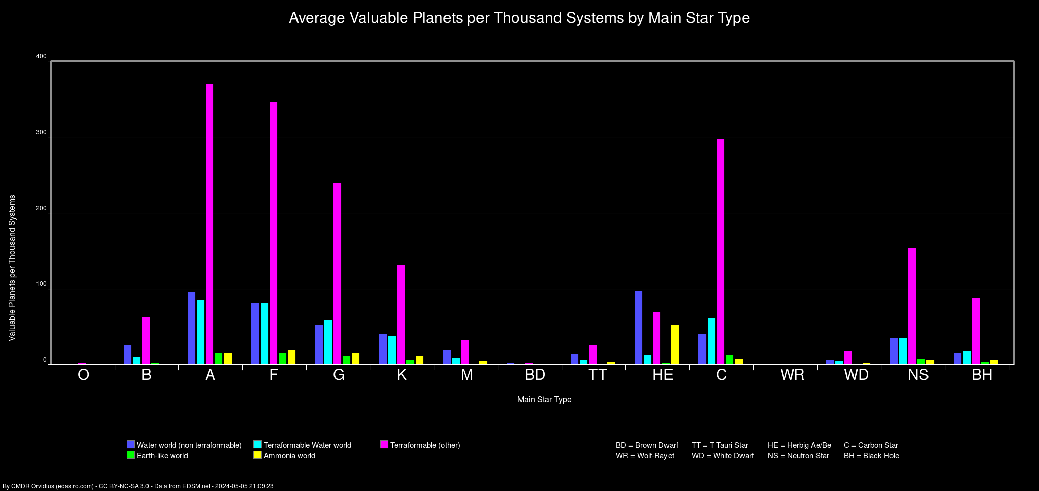
Alright, I have the "per thousand systems" versions of the graphs done. It's just plotting straight averages. Since it's a logarithmic scale, it visually compresses the differences a bit, so I'm wondering if these might be better served by a linear scale. But currently, you can see nearly an order of magnitude difference between ELWs in the O/BD systems as compared to the A/F/G systems.

systemmassplanets.png


systemstarplanets.png


Maybe it's professional bias or the fact that I'm one of those crazy folks that downloads ED data from EDSM and writes scripts on top of those for fun, erm, I mean, thoughtful exploration planning!... but this project is outstanding for so many different reasons. Well done, Orvidius.

Thanks! :)
 
Last edited:
There are quite a few of these. It's a bit crazy. Apparently about 1831 with SolarMass >= 2.5.

Here are the top 10:

Code:
mysql> select name,solarMasses from stars where subType='Neutron star' order by solarMasses desc limit 10;
+-------------------+-------------+
| name              | solarMasses |
+-------------------+-------------+
| XTE PSR J1810-197 |     15.9727 |
| PSR J2055+3630    |     15.8672 |
| PSR J2004+3137 A  |     15.6602 |
| PSR J1513-5908 A  |     15.3477 |
| PSR J1807-2459B A |     15.3242 |
| PSR J1713+0747 A  |     15.2695 |
| PSR J1243-6423    |       15.25 |
| Crab Pulsar       |     15.0977 |
| PSR J2145-0750    |     15.0508 |
| HIP 23520 A       |     14.9375 |
+-------------------+-------------+
10 rows in set (1 min 24.14 sec)

Those stars are hot, something close to 1 billion, hundreds millions degrees. SO they shine when you hyper jump to it .
Can you check if any more hot objects, but not included into those 1800 stars list?
Not sure exact what object i want, any, except those known massive NS.
 
Back
Top Bottom