You are using an out of date browser. It may not display this or other websites correctly.
You should upgrade or use an alternative browser.
You should upgrade or use an alternative browser.
Community Event / Creation The C-Pod: A DIY Command seat (build log)
- Thread starter ThereIs0nly0ne
- Start date
personally I like it. It has clean simple lines and a military feel to it IMO. The font reminds me of something but I can't think what at the moment. Maybe I've seen it in a sci-fi show. As I say, I think it looks really good but don't rely on my judgement, see what the others say, as I have the artistic taste of a stunned herring....
personally I like it. It has clean simple lines and a military feel to it IMO. The font reminds me of something but I can't think what at the moment. Maybe I've seen it in a sci-fi show. As I say, I think it looks really good but don't rely on my judgement, see what the others say, as I have the artistic taste of a stunned herring....
Thanks PF. Lol about the fish reference, you should build an aquarium into the side of your rig. Wine and fish, you'd feel right at home
I like it too, but have you tried it with the Elite logo above the text?
.
Just to see what it looks like?

Thanks AndrewF. I'll give it a go but the whole logo needs to fit into a triangular-ish window, hence the positioning. I've had another crack. I think this one is much better:
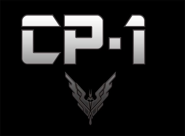
Opinions?
Opinions?
I like the new lettering, as chunky, industrial and weighted ...
The original is a more delicate flower?
Still liked it though .. I'm not being much help am I ..
I like the new lettering, as chunky, industrial and weighted ...
The original is a more delicate flower?
Still liked it though .. I'm not being much help am I ..
The original is indeed more delicate, very poetic
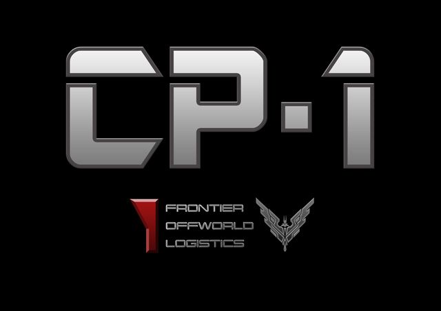
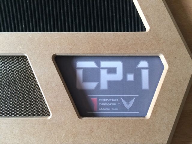
It approaching the point where I'm happy with it now. More than a nod to Elite and Frontier now
Last edited:
, you should build an aquarium into the side of your rig. Wine and fish, you'd feel right at home
Top idea sir, have some rep!
That new one looks really nice. The touch of colour will lead into it too, I think. A class act!
Thanks PF, it's appreciated sir! I consider myself to have next to no Photoshop skills but looking at a few YouTube videos and tinkering a little, I managed to assemble a meager understanding of what I was doing. I'm happy with this now and just need to measure up/re-size and send it off to the printers.
Much better, the second one that is. Getting an "Alien" (the first movie) vibe from it. Kinda Mass-Effect(ish) too.
Thanks Sanderson. Yes, definitely took some ideas from the N7 logo:

As for alien, maybe it's "Weyland - building better worlds" feel?
I inverted the red section to give more of a triangular and balanced shape at the bottom.
Edit: I can't stop tinkering unfortunately. Added a couple of likes to make it more like corporate branding:

Last edited:
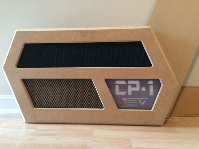
Looking fantastic. Interested to know how much it all weighs currently...
Thanks Magic Man
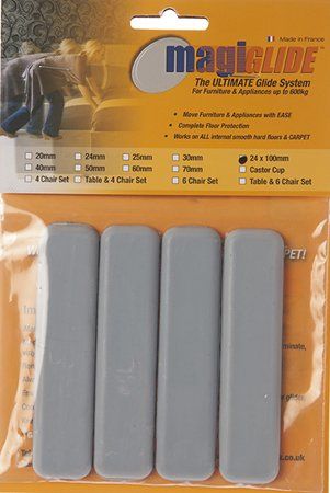
I have a laminate floor which makes moving it simpler still although they do work well on carpet provided the pile is no too thick.
Last edited:
Oooooh, looking nice!
Hello. I'm following you're work since some weeks ago, the moment I've found the thread, of the build log.
I wanted to compliment you Sir. You're craftsmanship is outstanding! You have a great gift; very professional and a great design. Have some +rep. I can't wait to see it finished and "working" with ED. Best regards.
I wanted to compliment you Sir. You're craftsmanship is outstanding! You have a great gift; very professional and a great design. Have some +rep. I can't wait to see it finished and "working" with ED. Best regards.
Hello. I'm following you're work since some weeks ago, the moment I've found the thread, of the build log.
I wanted to compliment you Sir. You're craftsmanship is outstanding! You have a great gift; very professional and a great design. Have some +rep. I can't wait to see it finished and "working" with ED. Best regards.
Thanks very much Xanix, I really appreciate your comments
I tried a different font to make the lettering pop out a little - I like the look of the original (more military) but don't like the shape of the '1'. I like both but not sure which to choose at the moment.
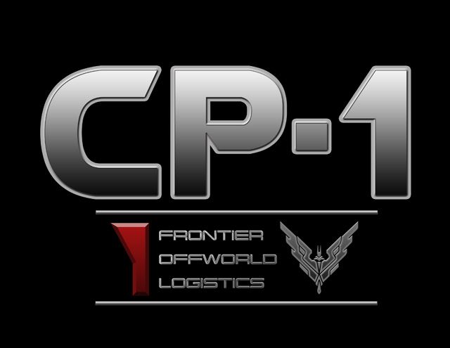
Really nice artworks there tioo!
For what its worth, I do think I prefer the former (military style) one over this last, but its a close call since they both looks great imo!
But is it important for you to do the artwork right now or will it be places at a later stage during final build?
If so, the print a copy of both, hang them in your garage or workroom and when final build comes, you will probably know which one to go for!
And if your still unsure at that time, let your wife decide. In the end, we want to impress the ladies so if they like it, so do we
It does look great .. So you can't use the letters in one font and the number from the other?
One other suggest; As they say in the music business, is to "live with it" for a day or two ..
See how you feel when coming back fresh, or before committing.
In the meantime .. allow me to introduce you to .. er .. "GERAINT" ...

At the moment a bit of a dummy .. G rolls over expressions quietly, when you're not looking (holding a random face for a random time, 30 seconds to a minute at the moment) ..
Hope to do a couple of touchscreen functions (but seems to take some working out) and might see if I can do a basic UI for voice "command" though I'm more aiming at "reaction".
(That's, again if I can work it out, by trial and error, later!)
Arduino CPU isn't very fast and the face takes a moment to load .. Found best is not to focus on the transition, and just see what kind of mood he's in every now and then ....
Apologies for difficult contrast on photos, he's pretty smooth in the silicon flesh. Smiley face.
One other suggest; As they say in the music business, is to "live with it" for a day or two ..
See how you feel when coming back fresh, or before committing.
In the meantime .. allow me to introduce you to .. er .. "GERAINT" ...

At the moment a bit of a dummy .. G rolls over expressions quietly, when you're not looking (holding a random face for a random time, 30 seconds to a minute at the moment) ..
Hope to do a couple of touchscreen functions (but seems to take some working out) and might see if I can do a basic UI for voice "command" though I'm more aiming at "reaction".
(That's, again if I can work it out, by trial and error, later!)
Arduino CPU isn't very fast and the face takes a moment to load .. Found best is not to focus on the transition, and just see what kind of mood he's in every now and then ....
Apologies for difficult contrast on photos, he's pretty smooth in the silicon flesh. Smiley face.
Last edited:
Thanks for the feedback. I will sit on this for the next couple of days. My wife prefers the second one btw 
I like the look of your Holly errr ... GERAINT (very Welsh name). Looks like a lot of fun!
I like the look of your Holly errr ... GERAINT (very Welsh name). Looks like a lot of fun!
Looking fantastic. Interested to know how much it all weighs currently...
This is gonna be my first post on these forums. Been watching this thread for a couple of weeks and this comment / question made me want to finally post
First off to ThereIs0nly0ne I love your work so far on this project. I have seen your racing cockpit before, bit of a race sim guy here myself and loved that work as well. Cannot wait to see the finished project, I am sure it will be excellent.
Now to respond to the quoted question. This thing is gonna weigh a tonne when it's finished, MDF board is stupidly heavy. I have worked with this stuff in the past and I personally despise it with all the hate I can muster but it does have it's advantages such as being very easy to sand and finishes up very nicely. I much prefer to work with real wood.
While I would love to built a sim cockpit at some point I am going to go the route of an adjustable desk add on for my X55 which I am hoping to have done this weekend. The desk is already built, it's a custom built oak desk me and my dad built earlier this year. I will post a couple of pics when the add on is done. Nothing anywhere near as elaborate or awesome as this project but very functional and clean.

